Time for another mailbag question. Jason sends the following about the non-academic behaviors workbook: I am wondering if you know of a way to account for a high number of
absences on the report? Obviously, if a student is not in class, they do
not receive any points. In essence, that is added in to the total
points for the marking period as a zero. Is there a way to modify the
point levels on the report that only accounts for days that the student
is present? For example, can you put a percentage of days present to
equal to a level 1, 2, 3, or 4?
Of course you can. Excel lives to serve, after all.
Let's start by revisiting the original set up. Here's a sample from the "Work Ethics" page.
For each student there are six weeks (M - F) of scores, each based on a four-point scale. Blank cells indicate that the student was absent---no points were earned.
Now, let's hide some of the columns so we can look at formulas:
The Total is a simple sum of the points for the student. The Level is determined by comparing the Total to a range of possibilities ("1" is for less than 59 points, "2" is between 60 and 79 points...).
Jason is interested in a percentage. We can do this by (1) changing the formula for "Total" to one that represents a percentage of points from when the student was present and (2) changing the cut values for the four Levels.
Here is one way to solve the first step:
We still need to keep the sum, but we want Excel to give us the percentage out of the points available, not including days absent. In this grading period, there were 30 days, each with 4 points possible. This gives us the 120 to start the formula in the denominator. Now, we tell Excel to count the number of blank cells in that range, multiply that by the four possible points, and subtract it from 120. We can also tell Excel to format the cell as a percentage.
For the second piece, we only need to update the cuts for each Level. Here is one way to do that:
Note that you will need to express each percentage as a decimal---in this example, .3, .45, .6, and .7.
Beyond this, you would also need to recalibrate the report to use the percentages, as opposed to a raw total of points. But we'll stop here for now.
Need to make other adaptations to the workbooks? Drop me a line and let me know how to help.
During my hiatus over the summer, a few readers were working hard with Excel and were kind enough to send along questions and comments. So, as I catch up on hosting duties here, let's pull out an item from the mailbag and see if we can share some solutions.
Mark2906 asked, "If I need to add more assignments to a particular standard (say 11 tests
instead of 7 or 8), how do I alter the formulae for calculating
predicted scores?"
Excellent question. No one wants to be stuck manually updating their spreadsheet every time an assignment is added. It's nearly 2013, dammit, and if we can't have flying cars, we can at least have our spreadsheets make an effort to help out around the place.
The good news is that Excel will tag along for most of the adjustments you make to your spreadsheets. Need to copy, move, and paste some data? It will update the formulas automagically.
But that's not quite what Mark has asked us. In many K - 12 classrooms, you don't know exactly how many assignments/pieces of evidence you will be collecting for a particular standard or unit of study. So, here is the simplest way to address this.
Leave Room to Groove
There's no rule that all of the scores in your gradebook have to butt up against one another. When you create a new section for scores, just label more columns than you think you might need. For example:
We're Off on the Road to Excel...
Two sections for standards are shown, each with space for ten assignments. So far, we've recorded five scores for the first standard, and three scores for the second.
To determine the average for Jerry Colonna on the first standard, we can use the following formula: =SUM(C4:L4)/COUNT(C4:L4). We can then just copy the formula down for the other students. Excel will not treat the empty spaces as zeros. Should you need more columns, just insert them after the last assignment and the formula for the average will keep up with you.
If blank columns are occupying too much real estate, you can always hide them.
Peek-a-boo!
Other Ideas to Consider
There are such animals as Dynamic Named Ranges, which expand to fit the data supplied. You can read more about them here or see them in action here. Although they can be very handy, I think they're overkill for this particular problem.
I'm sure there are other solutions, including VBA options. Please share your additional ideas in the comments.
In the last post, we looked at one way to display information about non-academic behaviors in the classroom---things like work ethic, participation, and attendance. These are student attributes that we value and want to report on, but need to be separated from grades and other measures of learning.
Even though I am sure that I will revisit these ideas and fine tune the data displays over time, I thought I would lift the curtain to reveal the workbook innards. No doubt some of you would like to play, too.
Before we jump into the guts, I want to say that all of the attributes and scales are just examples. We could have a lively discussion about which attributes to measure, how you (or your students) could collect these data, and what the cut scores should be in order to be in the range of performance we'd like to see. These are critical pieces to consider...ones that I hope you ponder and kick around with your colleagues and students. I am going to set them aside in this post and strictly focus on the nuts and bolts.
On the Report Sheet, I set up a data validation for the students last names. I started by selecting the range of last names on the Attendance/Grade worksheet. I named the range "LastName." Then, on the Report worksheet in the cell where I wanted the dropdown to appear, I chose Data Validation on the Data tab. In the dialogue box, I selected List from the "Allow" dropdown and then in the "Source" box, I added a formula using my named range. For the "First Name" area on the Report worksheet and the selections at the bottom of each of the other worksheets, I used our old friend, the INDEX/MATCH formula.
Let's move on to a few new tricks. Most teachers keep attendance records by marking who is absent---not who is present. But on my graph, I wanted to chart attendance as a positive measure. There are a few ways to do this. The simplest would be to change the way we keep attendance. Mark students when they're present and just count up the number of days at the end of the grading period. I didn't take the easy way out. Instead, I left each "A" for Absent just where it fell. To get the total number of days present, I used this formula: =30-(COUNTIF(C6:AF6,"A")). In other words, count the A's in a particular row (in this example, row 6 for Cathy Andrews) and subtract that number from the number of available days in the grading period (30). However, this swap won't work for creating the graphs. I need numbers to work with---not text. But a simple IF statement makes short work of that: =IF(C18=0,1,0), where "C18" is the cell from the INDEX/MATCH result for a particular student.
I also used a nested IF to have Excel convert the number of days attended (or points earned) into a level of performance. For example, here is the one that goes with the worksheets for Work Ethic, Participation, and Behavior: =IF(AG6<=59,1,IF(AG6<=79,2,IF(AG6<=99,3,IF(AG6>=100,4))))
It looks worse than it really is. (Don't most things?) Notice the repeating "AG6," which is the cell with the total number of points I want Excel to use as a comparison. In the first part of the statement, we tell Excel that if that number is less than or equal to 59, to put a 1 in the cell. If not, Excel moves on to the next part of the statement. Even though we know that "30" is less than or equal to all of the cutoffs in the equation, Excel considers only one at a time.
Shall we talk about the graphs? I used the stacked bar from the charts menu. No doubt some of you out there will want to use a regular bar chart. That is appropriate, too. I picked the stacked bar for two reasons. One was that I wanted to do more than show a comparison. I wanted to illustrate a proportion. A viewer can certainly make that inference with a regular bar chart, but it's a little less work with the stacked bar. My second reason was purely about the aesthetics. I knew I was going to want a line graph in each of the four areas (attendance, participation, work ethic, behavior). The vertical real estate claimed by a bar chart threw off the look of things.
Anyhoo, after you select your data for the graph, don't fall apart of it looks like this:
Simply hit the "Switch Row and Column" option and you will see the stacked bar. After that, you can clean up the graph.
I won't go into detail with the line graph. What I will share is that it does take time to create the labels, standardize the sizes, and get everything in place. Take your time. Don't assume that Excel knows best. It's important to make things look good---otherwise, you are missing your chance to truly communicate with the data.
The radar/star/spider chart is found in the "Other Charts" menu. Again, this chart is not everyone's cup of tea. One of the ed research articles I read mentioned using the chart with college students as a form of feedback---and they hated it. This seemed to be due to the lack of familiarity with reading these types of graphs. We see line graphs and bar charts all the time. Radar charts? Not so much. There are other reasons not to choose this type of chart. For example, it works better with cyclical data. And, the area of the graph becomes distorted with the scale. For every point increase of the scale, the size of the area becomes squared.
I would suggest that if you select this type of chart to use with students (or parents) that you spend some time talking about how to read them. Show them how to look at the connections between the spokes and the area covered by the graph. Why did I choose it, given the difficulty in interpretation? Because the attributes of student performance are not simply about comparing them. There needs to be a broader view of what is happening in a classroom---how is the student performing in light of the overall goals...and more importantly, how might non-academic factors be affecting one another (as well as student learning)? I think that you lose some of these capabilities with a clustered bar graph.
What would you do differently with this workbook and these graphs? Would you choose to put the line graphs all on one chart for easier comparison? Do you like the idea of bar charts better than a stacked bar...and clustered columns instead of the radar graph? How would you organize the workbook?
There are two broad categories of grading practices in the great wide world these days. One is termed "hodgepodge," referring to the mixing of student learning and behaviors (e.g., work ethic, attendance...) into a single score. The standards-based version of grading does not crunch scores for learning with student behaviors. There are variations within each category, of course. Even though this blog has modeled various ways to look at student data within a standards-based context, we've never considered options for visualizing student behavior. Time to change that.
I've built a model workbook that tracks four types of non-academic factors: attendance, work ethic, participation, and behavior. Each of the worksheets looks a lot like the gradebook. Names are on the left, but there is a series of dates across the top. There are six weeks (30 days) in the model.
Yeah, Baby
And, there's a reporting page which pulls information from each of the four worksheets. A data-validation dropdown menu for the "Last Name" automagically updates the sheet for each student. Here is what I'm thinking about for the display:
The top graph shows proportions. Attendance displays the number of days, the others the ratio of points earned. For the purposes of this tool, I've assumed that a four-point scale is available for each factor (work ethic, participation, behavior) each day. No points were assigned on days when the students were absent, as it is not possible to observe student behaviors when you aren't in the same room. The line graph below each stacked bar provides a sense of the 30-day trend. Gaps in the line represent days when the student was absent. Whatever was happening with Lucy here, looks like she had a real low point about mid-way through the grading period, but was starting to get back on track with her work ethic and participation by the end.
But I thought it might be interesting to consider the interaction between these factors...and a student's grade. So, the bottom of the report has a radar/spider/star chart. Most people are not fans of this type of graph. I'm a bit ambivalent about them, too. However, student achievement is not just about comparing categories, it's about looking for the confluence of all parts of learning to make decisions about instruction. To make the chart, I converted the total number of points earned in each category into a 4-point scale. I made up a summary grade.
So, here is Lucy's chart:
Lucy Van Pelt
Hmm. Lucy seems to have pretty good attendance and work ethic...but her grade isn't reflecting those strengths. Is her behavior in class keeping her from learning?
What about Dick Tracy, who appears to be living up to his name? Ahem.
Your name wouldn't happen to be "Dick," would it?
This looks like a student who could make a teacher pull his/her hair out. They show up nearly every day and act like a terror when they're there. What do we do about a problem like Dick Tracy? How do we channel his energy into something more productive?
For a final example, here's Flash Gordon.
Flash, ah-ah!
Good attendance, behavior, and work ethic...participation isn't great, but is happening. What's the deal with his grade?
In the next post, I'll lift the curtain and talk about some of formulas behind this beast, but if you're ready to play, you can download the workbook here. Let me know what you think about the graphs. Too much or too little information? Other ideas for the display?
Bonus Round
I've tried to give each student a story with the data. If you're looking for something to start some PLC conversations, you can also use the workbook that way.
When I'm out and about with educators, I always like to ask what they need their data to do. Shiny software can be great, but all too often, I hear from teachers and administrators that they're stuck with pre-packaged analysis and don't have the flexibility to do what they want. Using Excel might not fill in all of the gaps, but I like to think about the ways it can answer the questions educators have.
After prompting a discussion about what they'd like to see, a teacher talked about how she'd really like to overlay her gradebook onto the student seating chart. I thought that was a great idea. We often look at classroom data through the lens of time, but we don't often see it in space.
This exchange happened a couple of years ago, and I finally sat down to develop the idea. In this post, I'll share the most basic version; but there are plenty of additional options to add on. I started by modifying the Beginner's Gradebook to include 30 students, then drew a very traditional seating chart on another worksheet. I filled in students names below each "desk." Keep in mind that you could make any arrangement that you want with the spreadsheet: a different number of desks, four students at a table, horseshoe arrangement, the remaining room set up (with the one kid you always need to have next to your desk). Lots of possibilities.
Next, I highlighted the range of assessments on the Grades sheet. I named the range "Assessments." I'm creative like that.
On the sheet with the seating chart, I created a data validation list using the Assessments range. This way, I could display different data on the seating chart. (Need a refresher on creating the data validation? Watch here.)
Then, I added an INDEX/MATCH equation in the "desk" cell for every student. Here is the one for Cathy Andrews: =INDEX(Grades!C8:AJ8,MATCH(T3,Assessments,0)) The formula tells Excel to look on the spreadsheet with the Grades, in the range of assessments (columns C - AJ) for Cathy Andrews (row 8), and match the score for the assessment on the Grades sheet with the one selected in the dropdown list (T3).
I would like to find a different way to do that part. Having to individually list which kid matches each row of data is not particularly friendly. And, when you move kids around in the room, you'll need to remember to move their equations with them. Since you can't have the formula MATCH on two variables (name of student, title of assessment), I've done it the cleanest way I can think of...but I'll keep hunting. If you have a solution, I'd love to hear it and hope you'll share in the comments of this post.
Finally, I added some conditional formatting to the "desk" cells. The end result is a heatmap'ish thing like this:
It's kind of fun to play with. I did manipulate a few things in the data as discussion points. Does Dorothy Gale's performance second quarter catch your eye? Would you call home to find out? Are there some areas of the room outperforming others? Do you think something would change if you spent more time there or should you regroup students?
You can download the sample gradebook here. I'd love to hear your ideas about how to use this type of tool. I'm thinking about ways to incorporate attendance data...or graphs. What would you want to see from a birdseye view of your classroom?
Bonus Round
Are you attending the ISTE conference in June? Come hang out in my workshop. We'll play with Excel and other tools...and I'd love to hear more of your ideas about what would be useful data analysis for you.
Back in November, the following comment was left for me:
I have a question, though. The current gradebook has one sheet for the dashboard, and it is possible to flick through the various students one by one. What about if I wanted to be able to see the dashboards for many students? I like the idea of having a single dashboard so that I can keep customizing the report as needed, but is there a way of then exporting this to generate 30 individual sheets for the different students in my class? In other words, hit PRINT once instead of 30 times...
Fabulous question, of course. I didn't know the answer to it at the time, but have had it on my "to do" list. Then, Debra Dalgleish shared this fabulous post last week about how to Filter Excel Data on Multiple Sheets. Although the information wasn't exactly what I was needing, it showed me that finding an answer for the commenter was possible. I just had to push a little further. A little Googling led me to this post on Using Excel 2007 for Progress Tracking in the Classroom. Huzzah! The perfect model to poach.
I copied the VBA from the Progress Tracking post into my Beginner's Gradebook, and then changed it only enough to suit my own named cells/ranges. Now, I will tell you that what I know about VBA would fit in a thimble. I'm eager to learn, but my lessons are currently being driven by "What do I need to know right now?" rather than any sort of organized manner. If you have some expertise you are willing to share to tweak the code to make things work more smoothly, I welcome any and all suggestions.
Here's how things are currently set up. In the "Scores" worksheet, I have added a data validation list (in grey box) that has the last names of the students. This cell was assigned a name. There is also a "Run Reports" button associated with the VBA shown below. In the "Report" worksheet, I had to make a couple of changes. First, I removed the data validation list associated with the last name. Why the data validation works in the "Scores" worksheet, but not the "Report" worksheet when the VBA runs is a mystery to me. Beyond that, I had to name the cell in the report with the last name, and use a formula to make it equal to what I named the cell with the new data validation list.
I'll put the VBA code below, in case anyone has any suggestions. With very few exceptions, it is identical to the one in the Progress Tracking post by Danny Khen---definitely not my work. But for now, feel free to download the workbook and give things a try. It is a macro-enabled workbook, so be sure to tell Excel it's okay to play with. When you click on the "Run Report" button, a new workbook will open and populate with a separate report for every student, all on their own worksheets. All of the data will be in their places with bright shiny faces. It's magic! (Where's Doug Henning when you need him?) All you need to do is tell Excel to print the entire workbook and you're good to go.
In our last post, which introduced the Power Law, things were getting kinda hectic:
We'd looked at a whole bunch of stats, talked about our friend from high school algebra (formula for slope), and started to repurpose the original gradebook I posted. It was like old home week around here. But we're not stopping there. Nope. It's time to develop graphs for this data. So, let's take a look at the reporting tool in the workbook. I've made a couple of changes.
First of all, because the Power Law focuses attention on the most recent score, the way we look at student progress is going to look different. In fact, if you click on the "Scores" part of the workbook, you'll notice that the columns that used to contain the median scores for a grading period have been removed. In the reporting tool, I've added two items and altered a heading to accommodate the changes. I selected the colour blue to represent "student progress," which is a way to describe the scores determined by applying the Power Law. In other words, black shows the assigned score, and blue the adjusted score. I also replaced the bar chart showing process with the trendline representing the Power Law data. Finally, I changed the head of E10 to be "Learning Trend" instead of "Growth from 1st Quarter."
I'm not going to go through how to create the data validation list for the last name or the whole graph build. If you need a refresher on those items, please (re)visit the Beginner's series Part IIa (data validation, INDEX/MATCH) and Part IIb (graphs). I'm just going to show you the new stuff.
Here's the first row (Row 11) for Steve Canyon's performance. In cell C11, I've used the INDEX/MATCH function to report the most recent score (not an average or median) from the report for this standard. Our "All Scores" graph looks the same as in the original Beginner's Gradebook, but in cell E11, we can see the results of the Power Law plotted out for comparison with a Steve's scores. As you can see, this gives us a different view of student performance. His actual scores jump around, but the overall trend is one of moving toward the standard.
Here are a few other examples for your consideration. In these cases, I've plotted both the student's actual scores (in black) and the predicted scores using the Power Law (in blue).
Gonna Fly Now...
Got Viagra?
Patient flatlining. Clear!
The Power Law can provide a different sort of summary of performance vs. simple measures of central tendency, and can generate different kinds of discussions with stakeholders. Also notice that the learning curve doesn't always head in a positive direction. In the middle example, there's a student who has met standard, but never improved on the performance. And in the bottom graph, you can see that inconsistent performance leads to no curve at all.
Some commercial gradebooks have a Power Law option. It's certainly a lot simpler to have a built-in formula at your fingertips. However, I don't want you to think that you have to spend a lot of money to get this sort of information. And, I firmly believe that you should be in control of your data. You're the expert about your students. You can download the final version of the Power Law Gradebook, which has all of the report completed to use as a model for your own data sets.
I had a request for an Excel Gradebook that used Marzano's Power Law to determine grades. So without further ado (press play for a musical accompaniment for your continued reading):
You've got the power!
What's the Power Law?
I'm glad you asked, although I don't know a whole bunch about it. If you want a deeper look, check out Transforming Classroom Grading, which goes into the research behind the Power Law of Learning and provides a step-by-step for using it in calculations. But, lemme sum up.
If you were to plot out the scores of a student learning a skill which was brand new to them, which graph do you think would represent their scores over time---the one on the left...or the one on the right?
Inquiring optometrists want to know: "Which looks more clear: #1 or #2?"
Both lines have the same start and end point. They describe the same number of assignments. But one is a better representation for what happens during the learning process. Did you guess the one on the right? Yup. You were correct. When new skills are introduced, there is a big gain in learning at the beginning. With repeated opportunities, learning still increases, but at a much slower rate. Devotees of the Power Law believe that the most recent score for a student is the what should be reported as a grade.
Okay. So now what?
Oh, that student scores followed the exact same trajectory every time. But that's not what happens. Learning is impacted by all sorts of factors both inside and outside of the classroom. The graph above shows the average increase. We need to be able to make an individual student's scores apply to that learning curve. This is where the Power Law comes in handy. Here it is:
Hello...Newman...
It might have been many moons since high school algebra, but perhaps the Power Law reminds you of the one used for slope: y = mx + b. Makes sense as we are trying to look for a trend in learning. In our Power Law formula, y is the student score that is predicted and x is the original student score. The roles of m and b are to act as constants. They take into account the number of scores for a given standard and the position of a score within that range.
Calculating m and b requires some statistics, because in a way, we're "normalizing" the data set to the curve. If it's been awhile since you had to deal with this sort of thing, remember that the "E" symbol means "sum of" and "N" = "Number" (in this case, referring to the number of assignments for a given standard. Don't get too sweaty looking at these, because our buddy Excel is going to do all of the heavy lifting for you. I just want you to see them before we look at the gradebook.
omgwtfbbq
And now, a musical interlude:
Back to our regularly scheduled workbook...
I'm going to build this workbook using the finalized Excel for Beginners workbook. Keep in mind that these formulas will work the Intermediate and Advanced versions, too. Just plop the formulas any old place and they'll do your bidding. Here is the first chunk of student scores:
Now, we need to transform them using the Power Law. I've set up a column for the variables we're going to use: x = (natural log of) Assignment #, y = (natural log of) Student Score, then the various combos we'll need using these. Please note that they here is not the same as the one in the Power Law itself---it is just a statistical variable assigned to calculate m and b. (Confused yet?)
And here are the formulas generating these values:
I've probably made this look far more complicated than it needs to be, but I also like the idea of breaking down the steps---especially if you're new to Excel or just need the opportunity to follow along with what is happening. The formulas in D26 and D27 use the natural log (LN) to transform the ordinal number of the assessment (x) and the student score on that assessment (y). Cells D28 - D34 are used to process x and y so they are ready to use in our equations for m (D35) and b (D36). The "predicted score" showing in Row 22 shows you the result of the Power Law formula (y = mx^b) for each student score.
Here is the link for the Power Law workbook with formulas. We'll talk about the graphs for this function in the next post, as well as reveal the final version of the workbook. Download this one first so you have something to play with.
Each comes with a screencast tutorial and links to both the "before" and "after" version of the gradebooks. Make classroom data dance to your tune and shake its little moneymaker for your stakeholders using Excel.
In the intermediate series, we integrated two sets of data into one report. But let's face it, most teachers do not have the luxury of teaching two classes or subjects. If you're an elementary teacher, you're juggling multiple subject areas and assessment sources. Secondary teachers have several class periods. You can still use a single reporting tool. You just have to master one more formula: the nested IF statement.
You already know how to construct an IF statement. In fact, if you've been following this series, you've already done a fairly complicated one involving the addition of INDEX and MATCH. This time, we're just going to expand that to "nest" (read: embed) a couple more IF statements in the formula. You can download the gradebook for this tutorial here.
In this workbook, there are 4(!) classes. We still have biology and chemistry from the intermediate series, and now we have physics and earth science. We also have the same Report we've been using since the very beginning. I've already added the named ranges for you in the Formulas worksheet. You will not need to update the data validation lists for the report.
In the Intermediate gradebook series we used the following formula to fill in the cell marked in yellow: =IF($C$4="P1 Biology",Formulas!B2,Formulas!C2)
We had two classes, which fit perfectly into the plain Jane IF statement: a place to tell Excel to look if the first part ($C$4="P1 Biology") was true (the first cell with a biology standard), and a place to look if the first part was false (the first cell with a chemistry standard).
Now, we have to tell Excel to look in one of four places. Oh noes! It doesn't fit in an IF statement anymore. But we can fool Excel with an Inception-style solution: an IF statement within an IF statement within an IF statement.
Here's what it will look like: =IF($C$4="P1 Biology",Formulas!B2,IF($C$4="P2 Chemistry",Formulas!C2,IF($C$4="P3 Physics",Formulas!D2,Formulas!E2)))
Here's what it means. The red text below shows the beginning of our IF: the statement to evaluate ($C$4="P1 Biology") and what to do if that is true (Formulas!B2), but instead of directing Excel to another cell for a false statement, we feed it another IF. This is the statement in purple, which leads to another false statement in blue. Once you have this formula in place for the report, use your fill down option (look for the crosshairs when your cursor is placed in the bottom righthand corner of the cell) to complete the three cells below.
That's not so bad, is it? Keep in mind that you can have up to 7 IFs nested in a single statement. If you have more than 7 options, you will have to use a workaround that we can talk about in another post.
Okay, now you need to take a deep breath and modify the IF/INDEX/MATCH statement from the Intermediate series of tutorials. The bad news is that this is going to look a little scary. The good news is that you only have to do it once. After that, you can copy and paste the formula into other cells, then just edit the columns you need.
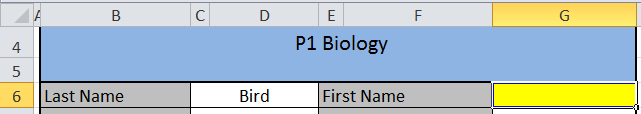
Let's start with the box for the student's first name, shown in yellow in the diagram shown below.
In the Intermediate series, we used the following formula: =IF(C4="P1 Biology",INDEX('P1 Biology'!B8:B17,MATCH(C6,P1Biology,0)),INDEX('P2 Chemistry'!B8:B17,MATCH(C6,P2Chemistry,0))). This time, due to juggling four classes, you're going to have to manage a much larger formula. You've trained for this. You can do it.
It's not as bad as it looks. See the pattern? IF, INDEX, MATCH...IF, INDEX, MATCH...Lather, Rinse Repeat. And you know what? For all the "Current Scores" cells, you only need to change the highlighted columns in the formula.
When you're ready to fill in the formulas for the dynamic graphs, you can copy and paste the formula again, but you will have to make a couple of adjustments. Excel won't know that cells C4 and C6 refer to the Report worksheet unless you tell it. To make the fill go more easily, make some attributes absolute (with the $) so that Excel only changes the columns you want it to change. Here is an example for cell H2 of the Formulas sheet:
because only the Chemistry and Physics worksheets have assignment scores in Column J (Biology and Earth Science have median scores in those columns). The "" at the end of the formula tells Excel to leave the cell blank if it is not a Chemistry or Physics class. If you're still a little confused about this part, you might want to go back and review the last part of the Intermediate series.
Here is the YouTube version of the tutorial. Enjoy!
Don't be sad that we have reached the end of the gradebook build. There will be plenty of new permutations to explore. (I've already had an inquiry about adding in the Power Law formula.) We will also look at other types of dashboard reports to summarize activity in your classroom. Keep leaving your ideas and suggestions in the comments and we'll keep on trucking with this.
Bonus Round
Does the thought of managing these formulas make you queasy? Remember that you can just use what's included with the Beginner's series and create a separate workbook for every class or subject. Or, if you have more than one period of the same subject, list all students in the same worksheet. This will decrease the number of IF statements you need to develop.
Hey! You came back. I'm glad the IF/INDEX/MATCH combo didn't scare you off, because you're going to need it again for this final tutorial. But hey, you're turning into a real pro with your fancy-schmancy reporting tool. No harm in putting in a bit more practice, right?
If you need some review, have a look at the posts for Part I and Part II of the Intermediate series. Remember that you can download the workbook here, if you want to play the home game. And you can always pop some corn and hang out on my YouTube Channel, should you find yourself in need of seeing things again from the very beginning.
Okay, back to work.
First up is some housekeeping on the Formulas worksheet. We're going to place formulas here for the dynamic graph data. The graphs will appear on the Report. They are considered to be "dynamic" because they can autoupdate based on changes to the other worksheets. We had dynamic data and graphs in our Beginner gradebook, but we just used the space below student scores. Where you put this data is really a matter of personal preference---Excel doesn't care. If I have more than one worksheet feeding a dashboard report, I like the formulas for it on their own worksheet. It helps me stay organized and keeps the workbook looking clean. Feel free to do whatever works best for you.
For each of the four reported standards, I'm going to create a space for the student scores and then on another row, a place for the end of quarter grades. Then, it's time to add the IF/INDEX/MATCH functions.
The formula for the first score for the first standard is =IF(Report!$C$4="P1 Biology",INDEX('P1 Biology'!C$8:C$17,MATCH(Report!$C$6,P1Biology,0)),INDEX('P2 Chemistry'!C$8:C$17,MATCH(Report!$C$6,P2Chemistry,0))) This is identical to the formulas you used in Part II to display a student's first name and current score, with a couple of minor changes (highlighted below):
What's the deal? The "C" column is specific to the column of data from the worksheets. This will change as we move across the sheets with the scores, but the rows (8 - 17) will not. Therefore, there is a "$" symbol before the row numbers to "lock" these and create absolute references. The columns can be relative and move when we fill to the right. Secondly, I've had to add Report! before the cells associated with the class and last name for the student. We didn't have to do this last time because the formulas were on the Report worksheet already. If we don't add it now, Excel will think we're talking about cells on the Formulas worksheet.
Okay, now fill the formula to the right. How many cells? Well, the first biology standard occupies Columns C - I (7 columns) and chemistry C - J (8 columns). Since we're going to have to draw from one set of dynamic data for our graphs, we need 8 columns total. So, pull your formula over for 7 more columns. Alas, we're going to have alter the last one slightly. Why? Because even though there is data in the "J" column on the biology spreadsheet, it doesn't belong with this data set. Fortunately, this is very simple. Just delete the first INDEX/MATCH function and replace it with "". The "" tells Excel to leave the cell blank. Your formula will look like this:
If you're wondering if you can just use a simple INDEX/MATCH function here and skip the whole IF part, well, that would be nice. If you do that, then Excel will give you an error anytime the Report is set for a biology student. You can use another formula to eliminate displaying the error (we'll cover that another time), but why bother when you can just use the double quotes to tell Excel to leave things blank?
You're all set for the first line graph on the Report. Let's get the bar graph set up. For the first standard to be reported, only Chemistry has both 1st and 2nd quarter grades---so it's the only one we need to set up. We can use the same equation we just used (leaving the "" for Biology).
Finally, add "3" in the rows below each score. Remember from our beginner series that this will allow us to add a line for "at standard performance" to each graph. When you've done this, your worksheet will look something like this (depending upon which class/student you have selected):
Get to work setting up the information for the other three standards. Remember to pay attention to how many columns you need and when you might need blank data.
Your last step is to go back to the Report and create the graphs, just as you did for the Beginner workbook. (Don't remember how? Go here.)
If you want to check your work, you can download a finished version of the gradebook here. The last YouTube video in this series is below for your edification and enjoyment. Let me know if you have questions or need help. We'll look at some advanced strategies for building a gradebook soon. Keep practicing!
In Part I of this Intermediate series for Roll Your Own Gradebook, we took some time to get organized. We added a worksheet to manage some of the ranges and formulas we need and created two data validation lists---one for sorting our information by class period and another for sorting by the last names of students in each class. Now it's time to get going on the rest of the report.
We'll get started with the basic version of the "IF" formula first. An "IF" formula tells Excel what to do based on whether the comparison is true or false. The first one we'll do is in cell B13. The formula will look like this: =IF($C$4="P1 Biology",Formulas!B2,Formulas!C2) We are telling Excel to compare the information in cell C4 with the text "P1 Biology." If these two items are the same (true), then Excel should use the information from the first cell with our biology standards. But, if "P1 Biology" isn't selected (false), it automatically picks the first chemistry standard. We don't have to tell Excel something special just for chemistry. Because we just have two options at this point, we can just go with biology or not biology as options. (Want to know what to do if you have more than two choices? We'll tackle that in the Advanced Gradebook in a future post.)
Now, click on the bottom righthand corner of the cell and fill down to complete the three cells below.
You're ready for the big leagues now. We are going to combine our brand-new knowledge of the "IF" statement with our old knowledge of the "INDEX" and "MATCH" functions. Go back up to cell G6---the space for a student's first name. Don't freak out when you see this next formula, okay?
Congratulations---you've just put the INDEX/MATCH formula from the beginner's series into the IF statement you used above. You're telling Excel that if the report is for P1 Biology, then it should index the list of first names on the P1 Biology worksheet and match them by using the last name shown on the dashboard...but if the report is not for P1 Biology, it should use the list of chemistry students. I know. It looks like a lot, but just take each piece at a time---little bites until, Lo and Behold!, you've eaten the whole elephant.
Now, take another deep breath and use the same formula to build the "Current Score" column for your report. The only things you have to change in the entire formula above are highlighted below. You just need the new column letters from the worksheets.
That wasn't so bad, was it? (I feel like Mr. Rogers. "I knew you could!")
Watch the tutorial below to see the formulas in action. Come back next time for the coup de grâce: using IF/INDEX/MATCH to create a dynamic table for our graphs.
Welcome back to the Roll Your Own Gradebook (RYOG) series. This post builds on the lessons from the beginner's series (see Lesson One; Lesson Two, Part I; and Lesson Two, Part II). In those posts, we used a single worksheet with student scores and another as a reporting tool. Now it's time to step it up a bit. We're going to use two different classes of data and one reporting tool. First, we'll set up a page just to organize many of the formulas and lists that will drive the reporting too. Then, we'll learn how to set up two data validation lists so we can sort by class and student name.
There is a "how to" screencast at the bottom of this post. You can also download the workbook for these sessions to use at home. Ready to earn your yellow belt in Excel?
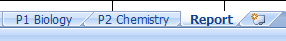
When you open the workbook, you'll notice that there are three tabs for the worksheets: P1 Biology (which is the same data from the RYOG Beginner series), P2 Chemistry, and Report (which is nearly identical to the version in RYOG Beginner). We're also going to create a new one. So, click on the little icon next to the "Report" tab. Name this new tab Formulas. While you certainly can place the lists and formulas we will use on existing worksheets, you will have a cleaner and more manageable product if you place the "engine" that drives the dashboard in its own space.
While you're hanging out on the Formulas page, let's add some information to draw from later. Using cells A1, A2, and A3, create a range for the classes. (See example on the left.) While it might seem a little silly with just two classes for now, you can imagine what this might look like if you had multiple class periods to track or multiple subjects at elementary. If you're an administrator, this list might represent classrooms in your school or schools in your district. We're just going to ease into things with two for now. Then, create a named range for this information. If you've forgotten how to do this, highlight cells A2 and A3, then on the Formulas tab on the ribbon, click "Define Name." Choose a name like "Classes" and hit Enter. You're good to go. You can also revisit Part I of the Beginner's series for a refresher. Now, using the last names of the students on the P1 Biology and P2 Chemistry worksheets, create two more named ranges. I used P1Biology and P2Chemistry as the names. We're also going to insert two lists: one with the names of the standards for biology and one for chemistry.
Now, click on the Report tab. Let's get the data validation lists going. Highlight cells C4 through F4 and then the "Merge and Center" button on the ribbon.
This will create a single cell in that space. This is where we will put our first data validation (i.e. "dropdown") list to select a class. Remember how to do that? On the Data tab, select "Data Validation" and then in the Settings, choose to allow a List. For our source, type Classes. Hit enter and your list should be set up. Now, let's do something similar for the data validation for the Last Name. The difference will be what you use as the Source:
We're going to use a formula here instead of a range like we did above. Why? And what the heck do "INDIRECT" and "SUBSTITUTE" mean? Well, first of all, we need more than one list available for this cell. We need it to display one list if we're wanting to look at Biology data and an entirely different list if it's for Chemistry---and we just want to use one cell. The "INDIRECT" function tells Excel that the source used there depends on our cell with the first data validation. It will then match things up for us. The "SUBSTITUTE" piece is necessary because we have a space in the class names. Excel doesn't do well with that. So, by telling it to substitute a space (that's the part with the " ") with no space (the part with ""), we've eliminated the source of a possible error. If you do get an error message (e.g. "currently evaluates an error), don't freak out. All Excel is saying is that there's nothing selected in the first data validation list, therefore, it doesn't know what to do with the second one. Now your workbook is organized and ready to use.
Watch the tutorial below. Come back for the next post to find out how to use the IF function in order to fill in the information for the Report. In the final tutorial for this gradebook, we'll make use of our Formulas worksheet to create the dynamic data for our graphs on the Report.


