
 Last week, a counterpart in a neighbouring school district sent me the picture you see at the right.
She'd been talking with a principal about their data and he'd been sketching what it was that he thought needed to have represented.The administrator wants to compare student performance on the reading strand of the state test with their performance on the writing strand of the same test. Although his drawing shows four levels of each, there are really only three reported: below, at/near, and above. Her question for me: Could this be done in Excel?
Um, sure...why not? We're just talking a scatterplot here. Replace the text of the labels with numbers (1, 2, 3) for reading and writing, then just get all up in that scatter chart's business. I sent my friend some basic ideas about how I would approach it, and said I would pull some sample data to model things.
I grabbed some information on 50 of my own students as a start.
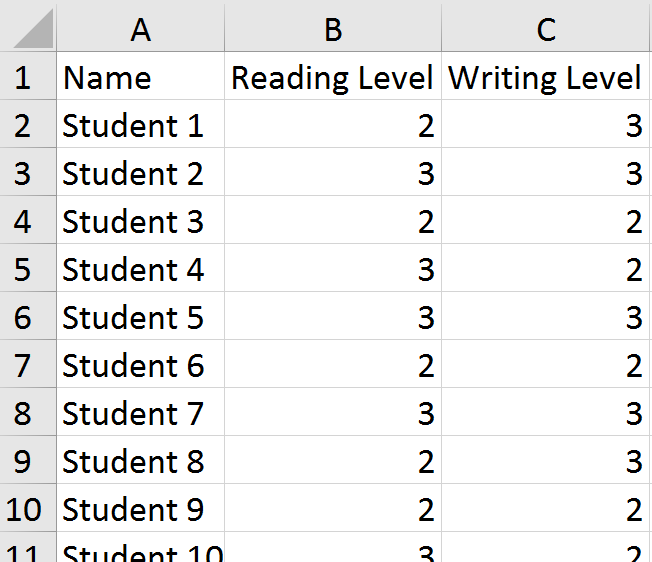 I replaced the levels reported for each student with numbers (above = 3, at/near = 2, below = 1). Then, I selected the columns with the numerical data and inserted a scatter chart. Easy-peasy, right?
Except, I forgot something important. Many students have the same scores. For example, on the left, we can see that students 3, 6, and 9 all scored in the "at/near" (2) range in both reading and writing. When we plot their points on the chart, they overlap and appear as a single point instead of three students. This was no good. Part of what the principal wanted to be able to see were hot spots---areas of the chart where the school would need to focus for next year. He also wanted to get information about individual students.

So, back to the drawing board for me. I know...I could have left her in the lurch ("Good luck!"), but I appreciate a challenge. Excel was not going to win this one, dammit.
It was then that I decided to jitter the data points. Jittering introduces a tiny bit of randomness to the values so that the points don't overlap so much.

The formula in C2 is =B2+(RAND()-0.5)/5. The purpose is to combine the original value with a randomly generated number. It uses the RAND function to create the random values. In this case, I didn't want a lot of noise added to the data, just enough to separate things on the chart. Once in place, the formula is copied down through the rest of Column C, and then applied in Column E to the writing data.

We now have a chart that reflects the principal's request. I sent off the file with the sample data and chart to my friend and hoped that it might spur some discussion with the administrator about whether or not this was the right tool for the job he had in mind. Just because we can use Excel doesn't mean we should.
 |
| https://twitter.com/fleurdevie/status/2810755338 |