Recently, someone shared a visualization from Periscopic about the Trump Emoto-coaster. While the subject matter itself was not of particular interest to me, I did like the presentation of it.
Strap yourselves in. Your hands must be this small to ride this ride.
The line chart at the top made me think about the rises and falls within a school year. March seems like an especially cruel month, with teachers' tempers growing short. (Just ask me about how I ended up in a conversation with a five-year old about why we need to wear pants at school.) How do attendance and discipline intertwine? And, when I looked at the horizontal bar cum sparkline plots shown above, it also made me wonder what we would see if we plotted individual classrooms over time. Maybe something like this:
Let's say there are four teachers at a particular grade level in a school. If we looked at the number of student absences and office referrals from the beginning of the year to the end of the year...what might we see?
If I was a principal, I might use something like this to either look for "hot spots" in my school that I might not know about...or monitor how well my school improvement initiatives are being implemented at the classroom level...or even to show staff for input. If I was a teacher, this might give me a general way to compare outcomes in my classroom. It might also piss me off (This just shows you that I have ALL of the bad kids!).
My challenge was how to build this. At its most basic level, this is a floating bar chart. And Ann Emery has a great tutorial for doing just that in Excel. But I didn't take that particular route this time because of how I need these charts to lay out. You see, absences for any given classroom total no more than 70 in a month...but referrals are no more than 13. Excel isn't going to let me push the edge of the chart off the lefthand side of the worksheet if I keep the x-axis the same on both sides, meaning I ended up with a ton of blank space. I suppose I could put attendance on the left and discipline on the right, but hey, what's Excel without some challenges?
So, how do you build a backwards bar chart?
Create your horizontal bar chart the usual way, then fuss a little bit with the axis settings.
Once you do this, then remove the gridlines and axes themselves, you'll be able to position this bar smackdab against the other one. You know it's worth it...you can work it. Just put that chart down, flip it, and reverse it.
Holla!
Another to know about this chart is the addition of the line down the middle. Since I deleted the gridlines and axes, I need some sort of visual between the bars. So, a simple line shape in grey 1.5 pt is all that was added.
In terms of labels, I'm going to leave them off. If you understand how one is laid out, then you can understand a whole school's worth. The numbers themselves aren't the big idea with this visual. It's the patterns and comparisons we're after. When we've identified those, we're ready to ask some deeper questions and dig into the numbers in a different way. These charts are the starting point for conversations...not the end...even if that seems a little backwards.
This is the third year that I've been on the hunt for high-quality data tools in the Exhibit Hall at the ASCD annual conference. The first year (2013) was downright depressing. Last year was better---I ran across a couple of promising tools, although neither are represented at the conference this year. Here are the trends I'm seeing this spring.
Data Capture
This is a brand new theme this year. I saw three different tools yesterday that are meant to support teachers in recording student conversations or other "in the moment" data points and then associate those with a gradebook or spreadsheet. I am intrigued by these. I think their benefit may be somewhat limited right now. Teachers would need to be outfitted with tablet devices and know how to seamlessly integrate those with their classroom work. I suspect that more and more teachers fit that description each year, but my school district is not quite there yet. One thing that I really like about these tools, however, is that they put the power of assessment back into the hands of teachers. In an age where we large-scale district and state assessments carry the weight and propel the discussions, these tools give teachers another way to show student learning. Yes, these demonstrations were always there, but now there are supports for teachers to share the very important daily learning with others. The best tool of the bunch? Just open Sesame.
Item Development
With the advent of new online assessments in many states, such as Smarter Balanced and PARCC, there is a new emergence of tools that allow classroom teachers to build items and assessments that have many of the features of their large-scale brethren. SchoolCity was the first one I saw last year, but there are a couple of new players showing their wares at this year's conference. The best one of these is Edulastic. Most of these tools promise integration with your gradebook or data warehouse. I think we have to be cautious, however, that just because you can make all sorts of new-fangled items for kids to answer doesn't mean you should. If your goal is just to have kids practice responding to particular sorts of items (e.g., drag-and-drop) for "The Test," then I hope you'll think a bit harder before purchasing this kind of software. We also need to support teachers with the basic assessment literacy required to write good items to measure student learning. We haven't done that much with paper/pencil tests---and online forms mean we have even more background knowledge to build.
Design Is Better
Most of the tools I saw yesterday show some thoughtful design. As a whole, they're far better than they were two years ago, but there is still a long way to go. I didn't find a single vendor who uses a data designer for their displays---they all depend on developers to code whatever charts and visualizations they have. Some claim that their charts are "designed by teachers." This is also a bad answer. Teachers and other educators should definitely have input---they are the end users for the tool, but they are not data designers. Listen to the stories classroom experts need to have told, then create the interface to communicate in a powerful way.
One vendor has the biggest, ugliest, exploded 3D pie chart on their screen. I asked them why they had chosen it. The rep wasn't sure. I probed further: Why is it in 3D when you only have two dimensions of data? His reply: Because it looks cool. No, honey...it doesn't.
We have to demand better from our vendors.
If you're in Houston in the next day or so, swing by the conference and check out all the new data tools for the classroom. Or, if you've already wandered through the vendor area, feel free to leave your new favourite option in the comments.
I recently attended (and presented) at the 69th annual ASCD conference. If you're unfamiliar with the acronym, ASCD is one of the largest and oldest professional organizations for educators. The letters used to stand for the Association for Supervision and Curriculum Development, but that definition was scuttled a few years ago when the organization outgrew its original boundaries. The acronym was kept for branding purposes.
You might remember that I went hunting last year for data tools in the exhibit hall. I did so again, along with attending a couple of presentations on how data is being used in schools. So, here's the wrap-up.
Vendors
I looked at three different tools in the exhibit hall. None were quite to the level of a student information system, but all integrated assessment and performance data. Two are not worthy of further discussion (one, in fact, admitted that they do no testing/accommodations for accessibility).
A third, Schoolzilla, didn't totally blow me away; however, they are using Tableau to build their reports. The reports follow the Shneiderman mantra of "Overview first...then zoom and filter...details on demand." To be fair, I don't expect any product to knock my socks off in an exhibit hall setting and where I spend <5 minutes at a booth. However, Schoolzilla may be worth a more in-depth look, if your district is on the hunt for that sort of thing.
I also spent a chunk of time at another venue chatting with a rep from SchoolCity. Their product is recently undergoing a complete redesign, but I got a behind the scenes peek at things. I suspect that this product may well be worth a second look in the coming months.
Presentations
Again, my socks remained firmly on my legs. Okay, so they were imaginary socks---the conference was in Los Angeles and it was too warm to wear such things---but let's just go with the metaphor here. The presentations I attended were focused on sharing how a particular school or program was using data. The common thread among all these was that no one starts with a question---and I find this worrisome.
While it's good practice for student assessment to guide the next steps in teacher instruction, it is impossible to use every single piece of data derived in the classroom. We have to focus---we need to be picky about where we dig. I know it isn't as simple as that. The hardest part of any analysis is that very first step: Asking a good question---the one most worth asking.
I was pleased to hear one presenter talk about how too many teachers see the purpose of data as sorting and selecting. I became worried, however, when she mentioned how "all the data is spewed across the wall in the War Room." My colleague often says that we have to get beyond admiring the problem. Data can be used in strategic ways, to be sure, but that means respecting what we collect and being thoughtful about how we move forward with it. There is something troublesome, for me, in any terminology that involves spewing and war.
As for me, my presentation went well enough---I even ran short, although no one complained about getting away early. :) The next morning, this happened (well, after the earthquake):
I'm at a conference this weekend. It's ASCD's annual conference. For those of you unfamiliar with this organization, it's mission is to develop "programs, products, and services essential to the way educators learn, teach, and lead." It is my all-time favourite conference and the place where I get the greatest amount of professional learning.
Like most conferences, there is an exhibit hall here...a place for vendors to strut their stuff. I like a brisk walk through the aisles. I don't like stopping long enough for a badge scan (and the ensuing spam in my inbox), but it is always good to see what the trends are. Or, if you're like me, keep an eye out for what's happening with data visualization options for education.
Spoiler alert: It isn't pretty.
I should clarify here and say that there are no data viz tools specific to education. Rather, I was looking for software that helps capture and report educational data: gradebooks, course/content management systems, and so on.
The first two things that caught my eye were meant to be more traditional tracking/reporting tools. I talked to reps from each company, asking them about the development process for their products. When I specifically asked who determined what their reports looked like, they said "our software engineers." I pushed a little further---didn't they have anyone with data viz expertise at least provide some input on things? Nope. End of story...so I moved on.
The third vendor had a content management system for teachers to build online lessons. It was connected to a reporting tool that could show the teacher progress, notes, etc. I had a lengthy discussion with a rep here, not because their stuff is particularly good or bad, but rather about the theory that underpins the need for the software. For example, they had previously built a "standards-based gradebook" based on teacher input...only to discover that the tool didn't represent best practices in grading. What had happened was that the teachers wanted to say they were doing that sort of grading, but in name only. The philosophical differences that should have driven the tool didn't get implemented. Ah, a company that is starting to wise up. Their visualizations for teachers were okay---better than I had seen, but nothing that knocked my socks off.
As I was leaving the exhibit hall, I ran across one tool that did. And it pains me to say the name, because there is so much else I do not like about the company...but it's Pearson. Good use of sparklines...well-selected color schemes...even some bean plots to show some of the distributions. Someone has been providing good counsel on what the best charts are to use for the various forms of data in the system, and I applaud that.
I'm still keeping an eye out for additional tools for schools. If you've found a vendor that you think deserves a shout-out, let me know and I'll add them to the list!
I've posted several versions of reporting tools over the young life of this blog...but I haven't shared any dashboards. I've been holding onto my ideas for other purposes, but that doesn't mean I haven't spent time perusing what others are doing.
I have yet to find a commercial product that I would recommend. Every implementation of Cognos I've seen so far has been awful enough to make me beg for eyebleach.
3D Stacked Cylinders. Yes, really.
I spoke with an Edmin rep for awhile this summer. Very enthusiastic about their product, but admitted that they'd never consulted with any designers about the interface. It shows. Engrade suffers from the same issues. Here in Washington state, something called Homeroom has rolled out to most districts. When I talked to these reps nearly a year ago, they bragged about how their design was based on what teachers wanted. In fact, all these companies say that---and that's great. Knowing what data your audience needs to see is critical. But most educators are not designers and the incredibly poor output for all of these companies reflects this. I am disheartened by all the rich meaning that is hidden or lost because none of these companies can be bothered to consult with someone about line, color, and other basics.
But what happens when we build a design and don't have audience input? You get a very pretty dashboard...but is it useful?
Stephen Few recently hosted his annual dashboard design competition. (For a full discussion of the entries and selection process, visit his blog.) And this year, the challenge was to develop a student performance dashboard. Here is the winning design, by Jason Lockwood:
It's very pretty---and very Few'ish: the colors, the style, the fonts, and so on. Once you know what Stephen likes, all of the dashboards look the same. (I'm not sure that's a good thing, but we'll save that discussion for a different post.) The second place design, by Shamik Sharma, is below:
I think the challenge with educational data is simply that it's hard to "snapshot." We need to see every student---not just the Top 5. And there is a lot of stuff to consider---not all of it fits neatly into little quantitative variables. As I mentioned to Mr. Few at the workshop I attended, schools aren't making widgets: we're about people.
Those who entered this contest used a dataset that was provided to them, so I can't blame them for the volume of information contained here. But as I look at these as a teacher, I see information that isn't necessary for a dashboard (e.g., the standardized assessment results) and a lot of very poor grading practices represented (e.g., averages and letter grades). The designs are completely disconnected from the real-world audience. It is a limited audience, at that. These dashboards might be adapted for use in a secondary (or higher ed) core subject classroom, but not for elementary (multiple subjects) or performance-based classes (like PE). In short, the designs have a beautiful form and almost no function.
Can't we all just get along? How do we get those with expertise in the classroom connected with those who have expertise in data design? What would you like to see included with a dashboard?
Hey! You came back. I'm glad the IF/INDEX/MATCH combo didn't scare you off, because you're going to need it again for this final tutorial. But hey, you're turning into a real pro with your fancy-schmancy reporting tool. No harm in putting in a bit more practice, right?
If you need some review, have a look at the posts for Part I and Part II of the Intermediate series. Remember that you can download the workbook here, if you want to play the home game. And you can always pop some corn and hang out on my YouTube Channel, should you find yourself in need of seeing things again from the very beginning.
Okay, back to work.
First up is some housekeeping on the Formulas worksheet. We're going to place formulas here for the dynamic graph data. The graphs will appear on the Report. They are considered to be "dynamic" because they can autoupdate based on changes to the other worksheets. We had dynamic data and graphs in our Beginner gradebook, but we just used the space below student scores. Where you put this data is really a matter of personal preference---Excel doesn't care. If I have more than one worksheet feeding a dashboard report, I like the formulas for it on their own worksheet. It helps me stay organized and keeps the workbook looking clean. Feel free to do whatever works best for you.
For each of the four reported standards, I'm going to create a space for the student scores and then on another row, a place for the end of quarter grades. Then, it's time to add the IF/INDEX/MATCH functions.
The formula for the first score for the first standard is =IF(Report!$C$4="P1 Biology",INDEX('P1 Biology'!C$8:C$17,MATCH(Report!$C$6,P1Biology,0)),INDEX('P2 Chemistry'!C$8:C$17,MATCH(Report!$C$6,P2Chemistry,0))) This is identical to the formulas you used in Part II to display a student's first name and current score, with a couple of minor changes (highlighted below):
What's the deal? The "C" column is specific to the column of data from the worksheets. This will change as we move across the sheets with the scores, but the rows (8 - 17) will not. Therefore, there is a "$" symbol before the row numbers to "lock" these and create absolute references. The columns can be relative and move when we fill to the right. Secondly, I've had to add Report! before the cells associated with the class and last name for the student. We didn't have to do this last time because the formulas were on the Report worksheet already. If we don't add it now, Excel will think we're talking about cells on the Formulas worksheet.
Okay, now fill the formula to the right. How many cells? Well, the first biology standard occupies Columns C - I (7 columns) and chemistry C - J (8 columns). Since we're going to have to draw from one set of dynamic data for our graphs, we need 8 columns total. So, pull your formula over for 7 more columns. Alas, we're going to have alter the last one slightly. Why? Because even though there is data in the "J" column on the biology spreadsheet, it doesn't belong with this data set. Fortunately, this is very simple. Just delete the first INDEX/MATCH function and replace it with "". The "" tells Excel to leave the cell blank. Your formula will look like this:
If you're wondering if you can just use a simple INDEX/MATCH function here and skip the whole IF part, well, that would be nice. If you do that, then Excel will give you an error anytime the Report is set for a biology student. You can use another formula to eliminate displaying the error (we'll cover that another time), but why bother when you can just use the double quotes to tell Excel to leave things blank?
You're all set for the first line graph on the Report. Let's get the bar graph set up. For the first standard to be reported, only Chemistry has both 1st and 2nd quarter grades---so it's the only one we need to set up. We can use the same equation we just used (leaving the "" for Biology).
Finally, add "3" in the rows below each score. Remember from our beginner series that this will allow us to add a line for "at standard performance" to each graph. When you've done this, your worksheet will look something like this (depending upon which class/student you have selected):
Get to work setting up the information for the other three standards. Remember to pay attention to how many columns you need and when you might need blank data.
Your last step is to go back to the Report and create the graphs, just as you did for the Beginner workbook. (Don't remember how? Go here.)
If you want to check your work, you can download a finished version of the gradebook here. The last YouTube video in this series is below for your edification and enjoyment. Let me know if you have questions or need help. We'll look at some advanced strategies for building a gradebook soon. Keep practicing!
In Part I of this Intermediate series for Roll Your Own Gradebook, we took some time to get organized. We added a worksheet to manage some of the ranges and formulas we need and created two data validation lists---one for sorting our information by class period and another for sorting by the last names of students in each class. Now it's time to get going on the rest of the report.
We'll get started with the basic version of the "IF" formula first. An "IF" formula tells Excel what to do based on whether the comparison is true or false. The first one we'll do is in cell B13. The formula will look like this: =IF($C$4="P1 Biology",Formulas!B2,Formulas!C2) We are telling Excel to compare the information in cell C4 with the text "P1 Biology." If these two items are the same (true), then Excel should use the information from the first cell with our biology standards. But, if "P1 Biology" isn't selected (false), it automatically picks the first chemistry standard. We don't have to tell Excel something special just for chemistry. Because we just have two options at this point, we can just go with biology or not biology as options. (Want to know what to do if you have more than two choices? We'll tackle that in the Advanced Gradebook in a future post.)
Now, click on the bottom righthand corner of the cell and fill down to complete the three cells below.
You're ready for the big leagues now. We are going to combine our brand-new knowledge of the "IF" statement with our old knowledge of the "INDEX" and "MATCH" functions. Go back up to cell G6---the space for a student's first name. Don't freak out when you see this next formula, okay?
Congratulations---you've just put the INDEX/MATCH formula from the beginner's series into the IF statement you used above. You're telling Excel that if the report is for P1 Biology, then it should index the list of first names on the P1 Biology worksheet and match them by using the last name shown on the dashboard...but if the report is not for P1 Biology, it should use the list of chemistry students. I know. It looks like a lot, but just take each piece at a time---little bites until, Lo and Behold!, you've eaten the whole elephant.
Now, take another deep breath and use the same formula to build the "Current Score" column for your report. The only things you have to change in the entire formula above are highlighted below. You just need the new column letters from the worksheets.
That wasn't so bad, was it? (I feel like Mr. Rogers. "I knew you could!")
Watch the tutorial below to see the formulas in action. Come back next time for the coup de grâce: using IF/INDEX/MATCH to create a dynamic table for our graphs.
Welcome back to the Roll Your Own Gradebook (RYOG) series. This post builds on the lessons from the beginner's series (see Lesson One; Lesson Two, Part I; and Lesson Two, Part II). In those posts, we used a single worksheet with student scores and another as a reporting tool. Now it's time to step it up a bit. We're going to use two different classes of data and one reporting tool. First, we'll set up a page just to organize many of the formulas and lists that will drive the reporting too. Then, we'll learn how to set up two data validation lists so we can sort by class and student name.
There is a "how to" screencast at the bottom of this post. You can also download the workbook for these sessions to use at home. Ready to earn your yellow belt in Excel?
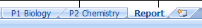
When you open the workbook, you'll notice that there are three tabs for the worksheets: P1 Biology (which is the same data from the RYOG Beginner series), P2 Chemistry, and Report (which is nearly identical to the version in RYOG Beginner). We're also going to create a new one. So, click on the little icon next to the "Report" tab. Name this new tab Formulas. While you certainly can place the lists and formulas we will use on existing worksheets, you will have a cleaner and more manageable product if you place the "engine" that drives the dashboard in its own space.
While you're hanging out on the Formulas page, let's add some information to draw from later. Using cells A1, A2, and A3, create a range for the classes. (See example on the left.) While it might seem a little silly with just two classes for now, you can imagine what this might look like if you had multiple class periods to track or multiple subjects at elementary. If you're an administrator, this list might represent classrooms in your school or schools in your district. We're just going to ease into things with two for now. Then, create a named range for this information. If you've forgotten how to do this, highlight cells A2 and A3, then on the Formulas tab on the ribbon, click "Define Name." Choose a name like "Classes" and hit Enter. You're good to go. You can also revisit Part I of the Beginner's series for a refresher. Now, using the last names of the students on the P1 Biology and P2 Chemistry worksheets, create two more named ranges. I used P1Biology and P2Chemistry as the names. We're also going to insert two lists: one with the names of the standards for biology and one for chemistry.
Now, click on the Report tab. Let's get the data validation lists going. Highlight cells C4 through F4 and then the "Merge and Center" button on the ribbon.
This will create a single cell in that space. This is where we will put our first data validation (i.e. "dropdown") list to select a class. Remember how to do that? On the Data tab, select "Data Validation" and then in the Settings, choose to allow a List. For our source, type Classes. Hit enter and your list should be set up. Now, let's do something similar for the data validation for the Last Name. The difference will be what you use as the Source:
We're going to use a formula here instead of a range like we did above. Why? And what the heck do "INDIRECT" and "SUBSTITUTE" mean? Well, first of all, we need more than one list available for this cell. We need it to display one list if we're wanting to look at Biology data and an entirely different list if it's for Chemistry---and we just want to use one cell. The "INDIRECT" function tells Excel that the source used there depends on our cell with the first data validation. It will then match things up for us. The "SUBSTITUTE" piece is necessary because we have a space in the class names. Excel doesn't do well with that. So, by telling it to substitute a space (that's the part with the " ") with no space (the part with ""), we've eliminated the source of a possible error. If you do get an error message (e.g. "currently evaluates an error), don't freak out. All Excel is saying is that there's nothing selected in the first data validation list, therefore, it doesn't know what to do with the second one. Now your workbook is organized and ready to use.
Watch the tutorial below. Come back for the next post to find out how to use the IF function in order to fill in the information for the Report. In the final tutorial for this gradebook, we'll make use of our Formulas worksheet to create the dynamic data for our graphs on the Report.
A couple of weeks ago, I posted a "Roll Your Own Gradebook" series for beginners. The advanced version will be available soon, but in the meantime, some of you might be interested in the GoogleDocs version of the gradebook.
I like GoogleDocs for a variety of reasons. "Cloud-based" documents are accessible from anywhere I have an internet connection, collaboration is simple, and sharing a snap. Mind you, these are exactly the same attributes which can be deadly for student grades. In the U.S., the Family Educational Rights and Privacy Act (FERPA) outlines the responsibility institutions have when it comes to student data. So, even though you can keep your gradebook on the web, please think carefully about whether or not you should.
The spreadsheet feature of GoogleDocs is really not ready for primetime, but it does afford some functionality. You have very few colours to choose from (and no way to adjust RGB values), limited formulas, and no way to pretty up your charts and graphs (even though you have some types unavailable in Excel). However, if you just need a down and dirty way to look at scores, it's good enough.
Here is a link to the unadulterated version of the gradebook. You can copy this to your own Google account and play with it to your heart's content. You can follow (nearly) all of the same steps as I posted for the Excel version (see Part I, Part IIa, and Part IIb). Or, create a new beast.
I have also developed a final version of the gradebook and reporting tool, with all of the steps applied, if you just want to skip ahead to the ending. This, too, can be copied to your own Google account for hours of amusement.
Ow! My eyes!
Keep in mind that many people have created gradebook templates in GoogleDocs and have posted them to share. Look around and see how you can improve on what's there.
It's now time for the big finish for our beginning gradebook: using Excel's built-in chart functions to create sparkline graphs for our student reports. Just a reminder that you can download the workbook and play along at home.)
To do this, you'll need to create a table in the gradebook for some dynamic data. You could actually put this table anywhere in the workbook that you like. I put it below the student scores because it makes it much easier to associate the numbers with their labels.
Use your INDEX/MATCH combo function from yesterday's post to get things kicked off:
Be sure to make the cell on the "Report" sheet that contains the list of names an absolute reference. Otherwise, when you use the fill option to create the data points for the other cells, Excel will also change the location it references on the report. Not good. All you have to do is click on the "C4" in your formula and then hit the F4 key. This will lock the cell for your formula. Then, add a row of "3" underneath the student data. This will represent the number for "at standard" performance and be useful for the charts.
Now, you're ready to make a line chart using the student scores for an individual standard, and a bar chart (A/K/A "column chart" in Excel) to show growth. You'll need to clean up the starting graphs that Excel barfs up, then lock the cell size and shrink it down to fit in a cell on the gradebook. When you're done, you'll have something like this:
The charts will auto-update anytime you change the student name. They will also update if you add scores to the gradebook. Just set them up once and let 'er rip.
Here's the "how to" video:
This concludes the beginner series of "Roll Your Own Gradebook," but we have certainly not exhausted the options. Some of you are going to want to pull multiple classes, subject areas, or other data sets into a single dashboard. You're going to need a couple more formulas to make this dream come true. But I'll help.
If you've watched the videos and are still feeling lost, you can download a copy of the finished workbook to adapt and use. Don't be afraid to click and play.
Once you have your data all in their places with bright shiny faces in your spreadsheet, you're going to want to have a clean way to extract it. This is where a Dashboard is handy. A Dashboard is a type of reporting tool which pulls together different kinds of data.
In our model, we'll have space for a student's name, a rundown of current scores, an overview of total performance and a space to show progress/growth. There are other things you might want to report---such as attendance or qualitative information. Do what you need to do.
In order to get individual pieces of data from the sheet with the scores to the dashboard, you are going to need two things:
A data validation list in a designated cell. I pick the cell beside "Last Name" for this. In creating this list, you will have a dropdown menu to select any student and the cell will become the "key" that will be used to extract the right data for the student and plug it into the empty spaces in the dashboard.
A formula that uses both "INDEX" and "MATCH" functions. The INDEX function will tell Excel which column/table of data to draw from and MATCH will tell it which name the data goes with. Your formula will look like this: =INDEX(Column with Data for a Cell,MATCH(Cell on Dashboard with Last Name,Column with Last Names,0)) Why is there a zero at the end? It's part of the MATCH formula---it tells Excel that the match must be exact...no room for error.
Want to see it in action? Watch the tutorial below.
Next time, we'll do the final piece: the sparkline graphs for the dashboard.