A couple of months ago, I was working with some people who claimed to know nothing about data analysis. After we'd constructed the most godawful and useless table imaginable (they insisted that people would want it), their next step was for colour to be added. That's fine---I don't have anything against using colour in a purposeful way for communication. But that's not what they wanted. Their goal was to make the table "pretty." Not in a design-centered way. Just a "Let's whore it up and send it out on the street!" way.
I attended a conference this week in which data had a starring role. I stopped by to talk to a vendor about their product. We'll disregard, for the moment, the blatant FERPA violations with the actual student data they were so proudly displaying, and get to the moment where they were explaining the visualizations generated by the software. The "stoplight" effect (red, yellow, green) is very popular in education for sorting students, but is not so friendly for users with vision issues. I asked them about colour choice. And what did the salesmen say? "It's pretty."
At this same conference, several districts proudly showed off their data dashboards or Excel add-ins. The fact is, there is a lot of very exciting and in-depth work being done with all kinds of school data. I was energized by what I saw, except for one thing: sloppy and ineffectual data displays. I get that the numbers and analysis are the focus. But to get to the end of all the hard work with ginormous data sets and not pay attention to the output was like having sex without the big finish (or, more likely, a premature one): very unsatisfying and frustrating as a participant.
I understand that how easy it is to be blind to errors. I also know that once you've applied blood, sweat, and tears just to make your Excel spreadsheet to work that the last thing you want to do is fight with the output. But take the time, educators, to respect your data and audience. Yes, it's okay to want something "pretty," but that is not enough. Use your lines, colours, graph choice, layout, and text to create powerful ways to communicate. If you're not sure what looks good, ask for feedback. Collect samples of visualizations that you like and use those for inspiration. Read articles and find resources on using colour and line as a fine tool instead of a blunt instrument. Now get back in there and try it again.
Necessity is known as the Mother of Invention. What is less well-known, however, is that she is also responsible for a son: Justin Time. Over the years, Invention’s attention-seeking behaviors and drama queen ways have meant that Justin has labored away in obscurity. But no more. Today we celebrate Justin Time and his contributions to new learning. Without him, I might never have been prodded into developing my first Excel project using VBA.
For those of you Excel Ninjas out there who wield VBA like a weapon, my paltry excursion will not look like much. But we all have to start somewhere…and these are my humble beginnings.
One reason why Justin has not been given proper credit is that he is more commonly known as “You want me to do what? I don’t know how to do that.” But his advantage is that with Justin, you only have to learn something new to you---not new for everyone. And this is what I realized when I was asked to replicate the function of this website using Excel:
It’s a calculator for schools/districts to use to figure out one variable (number of tests, number of computers needed, number of test sessions, number of test days) if they know the other three. The calculations themselves aren’t all that sophisticated. The first variable (number of student tests) is the product of the other three. So, a bit of basic algebra will tell you how to calculate the others.
In Excel, each of the buttons you see—such as “Calculate Minimum Days of Testing Required”—needs to be assigned to a different formula. And, we need some way to update the information when schools want to test out different scenarios (e.g. change the number of test sessions from two to three). It’s possible to do something similar without resorting to writing your own macros. You could use a dropdown menu to allow users to pick the variable they wanted to calculate, then populate a table below based on that (fill in the other variables, assign a formula). But the people who wanted this calculator wanted something sexy. They wanted Justin.
I started by setting up the basic layout of the calculator. I found out later that this is extra important, because when you move cells around on the worksheet, the formula in VBA does not autoupdate the way a formula within the worksheet will. It’s not an insurmountable issue. It just means you’ll have to go back and update some of the code. Whatever you can do to plan ahead now will mean less work later. So, here’s what I’m starting with:
For the next part, I needed Justin Time. So, here is what he taught me about creating the buttons (you can read about my learning-to-learn strategies here). On the Developer ribbon, click on Design Mode in the Controls area. Then click on Insert. This will bring up a menu of items you can use to build a form. If you’ve created a form in MS Word, then this part won’t look new to you. Then, click the item in the upper lefthand corner to create a button. Draw your button on the worksheet. Don’t worry too much about getting the size or other attributes right. You can go in and make changes later. When Excel brings up a dialog box to assign a macro, hit “Cancel” for now. We’ll go back and deal with this after we create the macro. You’ll now have a generic box like this one to use:
Now comes the fun part. It’s time to write the code. On the lefthand side of the Developer ribbon, you’ll find the “Visual Basic” button. Be brave and click it. It will open up a new window where you can tell Excel what to do. We will then assign this code to the button on our worksheet. In the VBA window, click Insert and then Module. This will open another window for you to place the code. Here is what we are going to write:
“Sub” at the beginning stands for “subroutine.” (We all live in a yellow subroutine…) The word “students” follows in order to name this subroutine. The second line tells Excel what to do. Range(“C2”) tells Excel that we want things placed in cell C2 of the worksheet. We then say to execute a Formula. Finally, we have to include what that formula will be. This looks like a formula we would write for the worksheet itself: =C4*C6*C8. Notice the placement of quotation marks and the use of two equals signs. Finally, we tell Excel that we have reached the End of the Subroutine (End Sub).
Now we’re ready to assign the module to the button on our worksheet. Right-click the button and select “Assign Macro.” You should see the “students” macro. Select it and click “OK.” Your button is now ready to use. Fill in the other three variables and see what happens. Don’t like the name “Button 1”? Right-click on the button and edit the text. You’re ready to build the modules for the other three buttons.
Keep in mind that when you save this workbook, you need to save it as an Excel Macro-Enabled Workbook:
Uh-Oh
I discovered that after you calculate one of the variables and then clear out the box, you get ugliness like this:
And this is where Justin let me down. I tried inserting IFERROR as part of the formula statement in the macro, and Excel barfed it up. I looked and looked to find out why or what I could do instead and didn’t have any luck. At least not yet. If you have VBA wisdom to share about this issue, I’d appreciate learning from you.
My workaround was to create a “Clear Contents” button so that users could start over. This one I built a little differently. In the Developer ribbon, I selected “Record Macro.” This brought up a new window where I could name the macro (e.g. “Clear Contents”). Then, I used control+click to select cells C2, C4, C6, and C8, then hit the Delete button on my keyboard. After that, I clicked on “Stop Recording.” Now, I could associate the macro with the Clear Contents button, just like I did the other buttons.
Here is the link to download the completed workbook, if you need a place to play around with the VBA and don’t want to torture your own spreadsheet.
Invention may get all the credit out there---and she deserves some of what occurs when Necessity comes knocking at our door. But don’t forget about Justin Time and the learning he provides along the way. I’m hoping, however, that Necessity will find out about family planning in the near future.
It's time for a little chat. I'm not going to name any names here, but some of you have been using these to represent your data:
Worse than that, a few of you have been using these:
Look, I know how it is. You start off with an x- and y-axis, and a few data points. Later on, line graphs just aren't good enough anymore. You move into bar charts and start colour-coding. Then Excel comes out with an updated version with even more features and you're in a multimodal haze with all the things you can do. Before you know it, you're hooked.
And you know you've hit rock bottom when a pie chart is your "go to" graph. I know you're better than that. Sure, there are times when a 2D version is appropriate, but it's time to face some cold hard facts. It's time for an intervention.
Pie charts work best when comparing the proportions of two categories. But the problem with pie slices is that it is difficult for users to compare the area of the slices. If you just need to communicate something very basic ("A is bigger than B"), it's probably okay. However, if you need users to understand details (or change over time), then a bar chart is a better graphic. People are much more accurate at reading length, rather than wedges. Labels are simpler to apply. (Although this is kind of an ugly example of pie vs. bar, it does make a good point about why bar graphs are better.) Take a look at this redesign of a pie chart to bar graph on Junk Charts for a good illustration of some of the issues.
As for 3D pie charts? Um, hey, who has three variables that they're trying to plot on a pie graph? (If you do have three, there are other---better---ways to show your data.) Not you. Annie Pettit's Prezi pretty well sums things up on this point. (Hat Tip to Jon Peltier for this.)
In our last post, which introduced the Power Law, things were getting kinda hectic:
We'd looked at a whole bunch of stats, talked about our friend from high school algebra (formula for slope), and started to repurpose the original gradebook I posted. It was like old home week around here. But we're not stopping there. Nope. It's time to develop graphs for this data. So, let's take a look at the reporting tool in the workbook. I've made a couple of changes.
First of all, because the Power Law focuses attention on the most recent score, the way we look at student progress is going to look different. In fact, if you click on the "Scores" part of the workbook, you'll notice that the columns that used to contain the median scores for a grading period have been removed. In the reporting tool, I've added two items and altered a heading to accommodate the changes. I selected the colour blue to represent "student progress," which is a way to describe the scores determined by applying the Power Law. In other words, black shows the assigned score, and blue the adjusted score. I also replaced the bar chart showing process with the trendline representing the Power Law data. Finally, I changed the head of E10 to be "Learning Trend" instead of "Growth from 1st Quarter."
I'm not going to go through how to create the data validation list for the last name or the whole graph build. If you need a refresher on those items, please (re)visit the Beginner's series Part IIa (data validation, INDEX/MATCH) and Part IIb (graphs). I'm just going to show you the new stuff.
Here's the first row (Row 11) for Steve Canyon's performance. In cell C11, I've used the INDEX/MATCH function to report the most recent score (not an average or median) from the report for this standard. Our "All Scores" graph looks the same as in the original Beginner's Gradebook, but in cell E11, we can see the results of the Power Law plotted out for comparison with a Steve's scores. As you can see, this gives us a different view of student performance. His actual scores jump around, but the overall trend is one of moving toward the standard.
Here are a few other examples for your consideration. In these cases, I've plotted both the student's actual scores (in black) and the predicted scores using the Power Law (in blue).
Gonna Fly Now...
Got Viagra?
Patient flatlining. Clear!
The Power Law can provide a different sort of summary of performance vs. simple measures of central tendency, and can generate different kinds of discussions with stakeholders. Also notice that the learning curve doesn't always head in a positive direction. In the middle example, there's a student who has met standard, but never improved on the performance. And in the bottom graph, you can see that inconsistent performance leads to no curve at all.
Some commercial gradebooks have a Power Law option. It's certainly a lot simpler to have a built-in formula at your fingertips. However, I don't want you to think that you have to spend a lot of money to get this sort of information. And, I firmly believe that you should be in control of your data. You're the expert about your students. You can download the final version of the Power Law Gradebook, which has all of the report completed to use as a model for your own data sets.
I had a request for an Excel Gradebook that used Marzano's Power Law to determine grades. So without further ado (press play for a musical accompaniment for your continued reading):
You've got the power!
What's the Power Law?
I'm glad you asked, although I don't know a whole bunch about it. If you want a deeper look, check out Transforming Classroom Grading, which goes into the research behind the Power Law of Learning and provides a step-by-step for using it in calculations. But, lemme sum up.
If you were to plot out the scores of a student learning a skill which was brand new to them, which graph do you think would represent their scores over time---the one on the left...or the one on the right?
Inquiring optometrists want to know: "Which looks more clear: #1 or #2?"
Both lines have the same start and end point. They describe the same number of assignments. But one is a better representation for what happens during the learning process. Did you guess the one on the right? Yup. You were correct. When new skills are introduced, there is a big gain in learning at the beginning. With repeated opportunities, learning still increases, but at a much slower rate. Devotees of the Power Law believe that the most recent score for a student is the what should be reported as a grade.
Okay. So now what?
Oh, that student scores followed the exact same trajectory every time. But that's not what happens. Learning is impacted by all sorts of factors both inside and outside of the classroom. The graph above shows the average increase. We need to be able to make an individual student's scores apply to that learning curve. This is where the Power Law comes in handy. Here it is:
Hello...Newman...
It might have been many moons since high school algebra, but perhaps the Power Law reminds you of the one used for slope: y = mx + b. Makes sense as we are trying to look for a trend in learning. In our Power Law formula, y is the student score that is predicted and x is the original student score. The roles of m and b are to act as constants. They take into account the number of scores for a given standard and the position of a score within that range.
Calculating m and b requires some statistics, because in a way, we're "normalizing" the data set to the curve. If it's been awhile since you had to deal with this sort of thing, remember that the "E" symbol means "sum of" and "N" = "Number" (in this case, referring to the number of assignments for a given standard. Don't get too sweaty looking at these, because our buddy Excel is going to do all of the heavy lifting for you. I just want you to see them before we look at the gradebook.
omgwtfbbq
And now, a musical interlude:
Back to our regularly scheduled workbook...
I'm going to build this workbook using the finalized Excel for Beginners workbook. Keep in mind that these formulas will work the Intermediate and Advanced versions, too. Just plop the formulas any old place and they'll do your bidding. Here is the first chunk of student scores:
Now, we need to transform them using the Power Law. I've set up a column for the variables we're going to use: x = (natural log of) Assignment #, y = (natural log of) Student Score, then the various combos we'll need using these. Please note that they here is not the same as the one in the Power Law itself---it is just a statistical variable assigned to calculate m and b. (Confused yet?)
And here are the formulas generating these values:
I've probably made this look far more complicated than it needs to be, but I also like the idea of breaking down the steps---especially if you're new to Excel or just need the opportunity to follow along with what is happening. The formulas in D26 and D27 use the natural log (LN) to transform the ordinal number of the assessment (x) and the student score on that assessment (y). Cells D28 - D34 are used to process x and y so they are ready to use in our equations for m (D35) and b (D36). The "predicted score" showing in Row 22 shows you the result of the Power Law formula (y = mx^b) for each student score.
Here is the link for the Power Law workbook with formulas. We'll talk about the graphs for this function in the next post, as well as reveal the final version of the workbook. Download this one first so you have something to play with.
Do you have mad skillz when it comes to Excel, SPSS, or other data tools? Know a regression from a box plot? Are you anal retentive when it comes to cleaning and organizing data sets?
Then you should consider becoming a volunteer for Data Without Borders. From their site:
Data Without Borders seeks to match non-profits in need of data analysis with freelance and pro bono data scientists who can work to help them with data collection, analysis, visualization, or decision support. Big companies like Google and Amazon recognize the importance of dedicated data science teams and can support fulltime analysts, but non-profits, though they may have rich and interesting datasets, don’t have the resources to capitalize on their data or may not even know the value of the data they already collect. Data Without Borders aims to close that gap through a data scientist exchange, bringing exciting new problems to the data community and helping to solve social, environmental, and community problems alongside nonprofits and NGOs.
They have a Datadive coming up in San Francisco early in November. I watched the NYC Datadive recently, and was both fascinated and deeply heartened by the work that weekend. You can check out the project wiki here. It provides you with links to each of the presentations by the NGOs/non-profits, as well as project pages where you can get an idea of the scope of the work that was completed 48 hours later.
Data Without Borders has many different options for volunteers. So, if you're not into coding, don't know a bar graph from a pie chart, or are prone to fainting at the sight of a normal distribution, fear not. There are still opportunities for you to support others in this work.
You might be interested in the Redesign the Report Card contest happening over at Good. You can vote on one of seven entries through Sunday, October 23.
The standard report card is in need of a major redesign. Grant Wiggins once opined that report cards should be more like baseball cards. I agree. Not only has the basic report card format remained more or less unchanged over the last 150 years, it rarely reflects the whole child. While the Roll Your Own Gradebook series here is an attempt to look at a different way to display student data, it is only a first step toward giving teachers control of the data they have and how they share meaning with others. We still have a ways to go to making things pretty.
But click on over and take a look at what has been suggested. Here are the two I liked best.
This submission, by Polly Avignon, uses colour-coding for assignment categories and simple graphics to communicate a variety of data: scores, attendance, observations. (Click here for a larger version.)
I also like this one by Larry Buchanan (larger version here):
Although I personally wouldn't choose to display the class average (or any average at all, for that matter), I do like the area graph with comments. I also like the separation of grades from student behaviors, such as participation and effort.
Each comes with a screencast tutorial and links to both the "before" and "after" version of the gradebooks. Make classroom data dance to your tune and shake its little moneymaker for your stakeholders using Excel.
In the intermediate series, we integrated two sets of data into one report. But let's face it, most teachers do not have the luxury of teaching two classes or subjects. If you're an elementary teacher, you're juggling multiple subject areas and assessment sources. Secondary teachers have several class periods. You can still use a single reporting tool. You just have to master one more formula: the nested IF statement.
You already know how to construct an IF statement. In fact, if you've been following this series, you've already done a fairly complicated one involving the addition of INDEX and MATCH. This time, we're just going to expand that to "nest" (read: embed) a couple more IF statements in the formula. You can download the gradebook for this tutorial here.
In this workbook, there are 4(!) classes. We still have biology and chemistry from the intermediate series, and now we have physics and earth science. We also have the same Report we've been using since the very beginning. I've already added the named ranges for you in the Formulas worksheet. You will not need to update the data validation lists for the report.
In the Intermediate gradebook series we used the following formula to fill in the cell marked in yellow: =IF($C$4="P1 Biology",Formulas!B2,Formulas!C2)
We had two classes, which fit perfectly into the plain Jane IF statement: a place to tell Excel to look if the first part ($C$4="P1 Biology") was true (the first cell with a biology standard), and a place to look if the first part was false (the first cell with a chemistry standard).
Now, we have to tell Excel to look in one of four places. Oh noes! It doesn't fit in an IF statement anymore. But we can fool Excel with an Inception-style solution: an IF statement within an IF statement within an IF statement.
Here's what it will look like: =IF($C$4="P1 Biology",Formulas!B2,IF($C$4="P2 Chemistry",Formulas!C2,IF($C$4="P3 Physics",Formulas!D2,Formulas!E2)))
Here's what it means. The red text below shows the beginning of our IF: the statement to evaluate ($C$4="P1 Biology") and what to do if that is true (Formulas!B2), but instead of directing Excel to another cell for a false statement, we feed it another IF. This is the statement in purple, which leads to another false statement in blue. Once you have this formula in place for the report, use your fill down option (look for the crosshairs when your cursor is placed in the bottom righthand corner of the cell) to complete the three cells below.
That's not so bad, is it? Keep in mind that you can have up to 7 IFs nested in a single statement. If you have more than 7 options, you will have to use a workaround that we can talk about in another post.
Okay, now you need to take a deep breath and modify the IF/INDEX/MATCH statement from the Intermediate series of tutorials. The bad news is that this is going to look a little scary. The good news is that you only have to do it once. After that, you can copy and paste the formula into other cells, then just edit the columns you need.
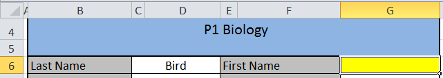
Let's start with the box for the student's first name, shown in yellow in the diagram shown below.
In the Intermediate series, we used the following formula: =IF(C4="P1 Biology",INDEX('P1 Biology'!B8:B17,MATCH(C6,P1Biology,0)),INDEX('P2 Chemistry'!B8:B17,MATCH(C6,P2Chemistry,0))). This time, due to juggling four classes, you're going to have to manage a much larger formula. You've trained for this. You can do it.
It's not as bad as it looks. See the pattern? IF, INDEX, MATCH...IF, INDEX, MATCH...Lather, Rinse Repeat. And you know what? For all the "Current Scores" cells, you only need to change the highlighted columns in the formula.
When you're ready to fill in the formulas for the dynamic graphs, you can copy and paste the formula again, but you will have to make a couple of adjustments. Excel won't know that cells C4 and C6 refer to the Report worksheet unless you tell it. To make the fill go more easily, make some attributes absolute (with the $) so that Excel only changes the columns you want it to change. Here is an example for cell H2 of the Formulas sheet:
because only the Chemistry and Physics worksheets have assignment scores in Column J (Biology and Earth Science have median scores in those columns). The "" at the end of the formula tells Excel to leave the cell blank if it is not a Chemistry or Physics class. If you're still a little confused about this part, you might want to go back and review the last part of the Intermediate series.
Here is the YouTube version of the tutorial. Enjoy!
Don't be sad that we have reached the end of the gradebook build. There will be plenty of new permutations to explore. (I've already had an inquiry about adding in the Power Law formula.) We will also look at other types of dashboard reports to summarize activity in your classroom. Keep leaving your ideas and suggestions in the comments and we'll keep on trucking with this.
Bonus Round
Does the thought of managing these formulas make you queasy? Remember that you can just use what's included with the Beginner's series and create a separate workbook for every class or subject. Or, if you have more than one period of the same subject, list all students in the same worksheet. This will decrease the number of IF statements you need to develop.
I'm starting to put together a workshop on Excel dashboards that will be in December. I'm playing around with a few different data sets and options, and have a quandary I'd like your help with: What is the best layout option when using stacked bar charts?
If you don't know what a stacked bar chart is, here is an example:
There is one bar representing 100% of whatever is being measured: numbers of students, percentage of scores, speeds of African and European swallows, and so forth. In the stacked bar chart shown above, there are four categories which have been numbered. Instead of each category having its own private bar, they get together and party in one space. The size of the categories, indicated by different shades of green in the example, shows their proportion of the 100%. It is a simple way to compare the relative sizes of categories...and all without some ridiculous pie chart.
But stacked bar graphs do not have to take things lying down. They can be vertical, too. Which leads me to my problem: When should you use the horizontal format...and when should you use the vertical format? My Google Fu hasn't turned up any rules. Seems like everyone is just letting it all hang out.
There are three layout options shown below. I know I don't have the categories labeled, but I just want to consider layout at the moment. Just FYI, the data represent scores on the 2011 Washington state test for reading. The shades of green, from lightest to darkest, show the percent of students at a school who scored at Levels 1, 2, 3, and 4.
The first layout has a very traditional look:
Labels for each grade are to the left. The graphs are (more or less) placed so that you can make a quick comparison among the grade levels. But is this better?
Same data. Same graphs. Just rotated 90 degrees. I don't know about you, but I find this easier to "read" when looking across the grade levels. It's true that there would be some issues with how closely the graphs can be pushed together due to the labels, but the overall format is okay.
And finally, my least favourite, but deserving of discussion is this:
Considering that there will be more graphs for mathematics, science, and writing, would it be more important to look at performance for a subject area across and review data for a grade level along a vertical axis (not shown here, but imagine there are stacked bar charts for the other subject areas underneath).
What do you think? Just from the standpoint of layout, which format is most meaningful for you?
Welcome to Spreadsheet Day 2011 on Excel for Educators. Personally, I think every day should be Spreadsheet Day. But then, I was also disappointed when I couldn't change my Facebook status to show that I am in a relationship with Excel.
The theme of this year's Spreadsheet Day is to help students. I have been traveling for work the past two weeks, and so my preparations for this day have not been made. I will, however, have a post later this week which finishes fleshing out the standards-based gradebook for teachers.
What I would like to share today, however, is a word of encouragement. You see, Excel and I were not always BFFs. In fact, I used to be afraid of even clicking on its weird-looking green alien icon. And then I found myself teaching a class where we were going to help chemistry students do a regression. I had to man up, as it were, and dive into the world of spreadsheets. And I've happily been there ever since.
I wish I had known all of the things I could have done with Excel to help me as a teacher. Not only for tracking student scores, but for all types of record-keeping: attendance, calls to parents, student behavior notes, observations, tracking time for lessons. I could have used the graphs to look more closely at student grades and reflect on what was happening. And, I could have helped students do more with Excel. I was a science teacher, for crying out loud. We could have integrated spreadsheets with so many labs.
So, my advice for today is simply to go forth and double-click. Open Excel and play around. Think about the ways it could automate some of the tasks for your classroom and change your workflow. And if you don't know how to make Excel bend to your will, ask me or someone else who can help. We'll learn with you. Can you think of any better way to model the power of spreadsheets for your students?
Debra Dalgleish says that next Monday (October 17) is Spreadsheet Day. So, you know what that means: It's time to get your nerd on.
Her challenge to us this year is to create a template or add-in to help a student. (If you don't have time, drop by her blog on Monday and leave a helpful tip for others.) What say you, educators? Can you spare a formula? Perhaps a free Excel sample to hook a young impressionable student? Because if you don't talk to your kids about spreadsheets...who will?
Debra provides the following instructions, for those of you who wish to participate:
Next Monday, October 17th, post your Spreadsheet Day contribution on your blog, or Facebook, or Twitter (use hashtag #spreadsheetday), or create a public Google spreadsheet. If you send me a link to your free and useful Spreadsheet Day tool, I’ll post it on the Spreadsheet Day Blog, to help students find your work.
Please do go read the full post. There's still plenty of time this week to ask your students what sort of tool they would use, if offered. Then, be fruitful and let Excel multiply!
Nearly two years ago, I had an assistant superintendent of a large school district tell me that one of his biggest wishes for displaying data would be to overlay his student achievement data with a Google Map. At the time, I thought it was a very intriguing idea, but at the time, I was unaware of any tool which would automate that process. It seemed unlikely that anyone would actually take the time to build a map in Google Maps (or Google Earth), student-by-student. I had seen visitor maps on websites that somehow captured IP addresses and then pulled them into a map displayed on the sidebar, but I was sure that required way more code than I was interested in dealing with.
In the intervening time period, I have discovered several tools for mashing a spreadsheet of data and a Google Map. The first link sent my way was for MapAList: "a wizard for creating and managing customized maps of address lists."
I pulled some public data off the state website and stripped off what I needed (name of school, address, score on 10th grade 2010 math test) in Excel. I then uploaded the spreadsheet into GoogleDocs and logged into MapAList. After fussing a bit with the settings, this is the result (or click this link):
What you're looking at is a map representing nearly every high school in the state and their performance on the 2010 10th grade state math test. (Be sure to zoom in so you can have a better view of things.) My divisions by percent meeting standard are arbitrary. Perhaps other pieces of data would be more valuable to show. But for proof of concept, it's a start.
I do find it interesting to see just how much the Cascades really divide our state geographically---there is a clear division of east and west with nary a school district in sight. The map also gives an interesting view of population. While not every school is the same size, the effect of clustered pins provides a different way to think about distribution. The yellow and green "outliers" definitely grab your attention. What's happening in those schools that are all by themselves (in terms of geography) and are doing all right?
Right now, you are restricted to two pieces of data/information showing in the pop-up for each pin. This is a bit of a limitation---I would like to show school district name or % free/reduced lunch or size of school or ethnicity data in addition to school name and score. The tool is also clunky if you want to go back and change any settings---for the most part, you just have to start over. The map will autoupdate if your spreadsheet changes, you're just stuck with the labels and appearance of the things.
As an educator, what are the uses for a tool like this? Might I want to mash my district achievement data (however that's defined) with a map? Would I see intriguing things as the neighbourhoods changed or gain other insights? I do believe that one would have to be very careful of running afoul of FERPA. I'd want to leave student names off the spreadsheet---they're unnecessary in some ways if the goal is just to visualize the interaction between geography and achievement.
I mentioned at the beginning that there are other tools which will accomplish similar goals. We'll take a look at those in future posts, as well as add the dimension of time to mix.
There are a lot of Excel tips and tricks out there---whole blogs, YouTube Channels, message boards, and more devoted to all of the things that make Excel such a versatile piece of software. While the purpose of this blog is not to replicate all of that amazing content, I do want to pull out ideas and functions that educators might find the most useful.
Have you ever set up an equation in Excel and gotten an error message---such as #N/A, #VALUE!, #REF!, #DIV/0!, #NUM!, #NAME?, or #NULL!? Total buzzkill. On one hand, these alerts serve a greater good. They let you know if your formula has gone awry. And, on the other hand, they can show up in an embarrassing places.
In our Roll Your Own Gradebook series, we made the assumption that we had classes of Stepford children: every student completed every assignment. But let's face it, that's not what really happens. For example, let's say that Flash Gordon wasn't enrolled in the course for the first quarter. If there are no scores, then Excel gives us an error message when it tries to apply the formula:
Uh-Oh, Spaghetti-O
You can change this, without altering the outcome for other students, by using IFERROR. This function tells Excel to evaluate what's happening, placing one value in the cell if there's no error (e.g. score for Stepford child) and another if there is an error message (e.g. "Trash" Gordon, lazy athlete). In short, it allows you to bypass the error message.
How It Works
You could apply the formula to more than one location in the gradebook and get the same result, but for now, let's look at the worksheet with the scores.
Superhero Behaving Badly
The cell on the right---the one with the "###" is the one we need to address. The current formula is =MEDIAN(H14,J14). Alas, there are no scores to find the median for---hence the error.
Instead, we can use =IFERROR((MEDIAN(H14,J14)),"") The double double-quotes at the end tell Excel to leave the cell blank. However, you can put another value there or even a text string (e.g. "No Grade"). Here is what we see now:
Ahhh...That's Better
What do we see on the Dashboard?
A blank. Wow. Excel is doing just what we told it to do. Imagine that.
Recently, I was working with some educators who didn't know a pie chart from a hole in the ground. It was actually worse than that, but as we see more and more information communicated via charts, graphs, and other data visualizations, there is also a corresponding literacy needed to read and write these. And while my internal monologue may run along the lines of "OMG...you can't interpret a bar graph?!", my overall goal is to make data viz accessible to educators. Sometimes, that means I will have to start at the beginning.
But fret not if you don't know a bar chart from a scatter plot---let alone when to use one. Tuck a copy of the Choosing a Good Chart diagram in your back pocket and you'll be ready for action.
Featured on the Extreme Presentation Method blog, the chart is available in several languages. What I like about this tool is that it starts with "What would you like to show?" The purpose of the communication is front and center. This can really guide the thinking of beginners. Even if they're not familiar with all of the charts they see on the page, it's a way to broaden their view beyond pie charts and line graphs.
Bonus Round
For a more interactive way to select a chart, try the Chart Chooser over at Juice Analytics.
In the last post, Jennifer mentioned one of her favourite Excel add-ins: ASAP Utilities. If you don't know what an "add-in" is, it's a little program that works inside Excel. (There are add-ins for other Microsoft products, too.) Some are fee-based and others are free. When you find an add-in that you want, download and place the file(s) in a location you associate with Excel files. You can place the add-in files anywhere, but once you've told Excel to use them, it doesn't tolerate the add-in being moved around.
You will need to tell Excel to use the Add-in. In the Options menu, select "Add-ins":
You'll see a list of ones that can be accessed and used. If you don't see the one you downloaded, hit the "Go" button at the bottom of the window. This will bring up another dialog where you will be able to browse for the add-in and then use the checkboxes to tell Excel to use it.
And now, I'd like to introduce my favourite add-in for Excel: Sparklines for Excel. (It's free!) A sparkline is a "data-intense, design-simple, word-sized graphic," according to Edward Tufte, one of the godfathers of modern data visualization. The idea is that you don't always need a full-size chart or graph to illustrate a point. Small and simple is powerful.
Excel 2010 includes 3 sparkline options, but they don't hold a candle to what the freeware add-in can do. You have the-sky's-the-limit options in terms of using colours and marks. Here's a quick overview of the types of visualizations you can do with your data:
Scales and Performance
I haven't used the Scales very much, but the Performance graphs are amazing. Bullet graphs are something every educator wants...and no one seems to have. These are fabulous for showing student progress. You can divide the block into regions (the sample on the left has dark, medium, and light blue bands) representing below, at, and above standard performance. The black bar in the center can show performance for the first/previous grading period, while the red marks growth (or lack thereof). What an awesome and simple way to communicate with parents. Perhaps a student isn't at standard yet, but we can still honour the progress they make.
Evolution and Comparison
I'm sure you're familiar with the Line graph shown in the Evolution section, but you might not have used Area and Horizon graphs. We'll have a look at these another time. As for the Comparison tools, you can imagine the variety of uses for these. They're great for summarizing student performance, either by examining individuals in a class or assignments across a standard.
Composition, Distribution, and Correlation
This section has some more advanced styles of graphs. You might not have had much call for Treemaps and Heatmaps in your classroom, but you might have used a Box and Whiskers or Scatter Plot. In the coming weeks, we'll spend more time with these types of graphs (along with their full-size counterparts).
Fabrice (the author of the add-in) also has a user manual and colour design manual you can download. All for free (with opportunity for donation). The add-in is also available for Excel 2003 and 2007, with the occasional Mac option. If you've got Excel, chances are there's a version of the add-in for you.
Here is one example of what you can do with this add-in. Take a sample of scores:
We have student names, formative and summative (bold) assignments, and scores. But this doesn't give us a good handle on what's happening in the class. What if our gradebooks looked more like this?
We get a picture of each student's performance. We can look for patterns and have a very concise view of what is going on. Notice that each of the line graphs are about the size of a student's name. This is what sparklines do: they condense a lot of data into one bite (byte?) sized container.
At the bottom of the list is a bar graph. This graph summarizes the performance of the entire class. The median for each assignment has been derived and "stop light" coding applied so a teacher can easily see how the class is doing. This format would take some getting used to, but what an awesome option to include for teachers.
The Downside of Add-Ins
If you use an Add-In, keep in mind that in order for other people to use the workbook, either they have to have the add-in or you will have to save the workbook as a macro-enabled workbook (it's one of the options you have). The other downside isn't so much one associated with add-ins as it is with freeware: your options for support are pretty minimal. In other words, you get what you pay for. When it comes to sparklines, there are commercial options. So, if you like the idea, but are nervous about being on your own, you might want to check out Microcharts. This is one of the reasons why I built the graphs in the "Roll Your Own Gradebook" series as full-size before minimizing. I am totally sold, so to speak, on the freeware sparklines. But they don't auto-update and can sometimes be quirky as you close/re-open a workbook. Just something to consider as you work with various projects.
We'll explore more charts, graphs, and add-ins in future posts. Is there something you'd like to see? Leave your suggestions in the comments.
Hello, my name is Jennifer (aka @DataDiva) and I’m an Excel addict. Thank you for your concern and I’d like to say I’ve been clean for *checks file history* two hours but as soon as I finish this blog post, I’m going to use Excel to organize and sort a list of teacher emails. Excel is one of the greatest tools available to educators and I’m thrilled to see this blog exploring all the ways it can be used. In addition to the great resources that Science Goddess is offering, I strongly recommend installing a tool called ASAP Utilities. It’s free and fantastic. Think of it like hundreds of macros designed to make your Excel work easier. I promise it will save you hours of time.
Developing your skills with Excel is very much a form of literacy. And like an emergent reader, one of the skills you’ll need to become comfortable is identifying your purpose for using Excel. When we work with young readers, we generally provide three reasons why an author has created a text: to entertain, inform, or persuade. Once they have a handle on how to recognize an author’s purpose, it can make it easier for the reader to engage with a text or know what to trust or what to question. In order to keep this at blog- and not chapter-length, I’m going to touch on a few issues you should think about as you open Excel and start your data work. Although an educator can use Excel to answer an infinite number of questions or organize a plethora of data, generally speaking, there are three basic purposes for using Excel.
Purpose
What the mindset of this purpose might look like
1.To organize and analyze information
“I am going to use Excel to organize and analyze that I already have. I want to make charts and graphs and may need to do some calculations.”
2.To share information with others
“I am going to share raw data with other people. It’s important to me (and them) how the information is presented and formatted.”
3.To collect evidence from others
“I need people to give me information in a certain way. I will then organize and analyze the data after I collect it.”
If your purpose is to organize and analyze information, don’t worry about formatting.
click to enlarge
Your data don’t have to look pretty or appealing. Use color options provided through conditional formatting to indicate patterns in your data, rather than decoration. Focus instead of keeping your data clean and logically arranged. Don’t spend your time centering and bolding and rather invest your energy in taking advantage of all of the tools Excel offers. Label your columns in row A so you can access the plethora of filter and sort options. If you’re working with people’s names, combine them in one cell (Yup, ASAP Utilities can do that for you) unless you’re doing a mail merge where you need the first name to be a separate field. Generally speaking, you want to focus on keeping your data simple, clean, and accurate. This means formatting numbers as numbers, text as text, etc. I prefer to start with charts and graphs on the same page as my data and then once I’m happy with the layout, move them to their own sheet.
Sharing raw data is different than sharing a chart or display. Consider the items in theData Display Checklist when sharing data visually. If you’re sharing numbers, take advantage of linking cells. The display below contains the same data as the previous image, except they’ve been formatted to share with a teacher. Note that the actual numbers are linked back to my original data sheet. (I set the options for Excel to show formulas rather than data in the example below)
click to enlarge
If you need to collect information from others and are using Excel as the means to collect the data, linking cells can be a life saver. A good rule of thumb is to separate your data entry from your data analysis whenever possible. It can be incredibly frustrating to find that someone has typed over your carefully constructed formulas. It’s worth it to explore setting up drop-down option boxes or locking or hiding cells.
The most important take away is that spreadsheets will look different, depending on their purpose. You can quickly and easily copy sheets between books or indicate your purpose in your file name (such as English data_analysis.xls versus English data_collection.xls). While there’s no wrong way to use Excel recognizing and identifying your purpose when you begin can save a headache down the road.
Many thanks to Jennifer for supplying our first guest post here at Excel for Educators. She describes herself as a "Defender of Quality Rubrics. Advocate for learner-centered ed & informed use of data - at same time. More geek than diva, fan of alliteration. Straight ally." You can follow her on Twitter or visit her Quality Rubrics wiki.
I hope Jennifer will be back to share more ideas. Do you have something to post here? Let me know.


