Wednesday, August 7, 2019

Nine: Chart a Course

I'm so excited to share this project with you. It's been a long time since I felt like there was some magic in the air...and when The Muse came back, she did so with a vengeance.

This is a story about whether students who have similar paths (in the form of schools, teachers, and courses) experience similar outcomes (in the form of performance).

The Data
There are a lot of data packed into the representation of each student: gender, race, with/without disability, eligible/not eligible for free/reduced lunch, performance level for grades 3 - 7 on the state math assessment, teacher for grades 3 - 7. I built a template to pull these pieces from our student information system, but beyond that, I did not need to transform any of the data—no formulas, pivot tables, etc.

I did generate an alias for every student and teacher, because I fed their connections (which student had which teacher/course) into the Connect the Dots tool on databasic.io. I will explain the reason for this later on in this post.

The Build
The entire display is paper and glue, with map pins to attach each "student" to a board. That's it. The representations were built by quilling paper. I love that these data look fragile, but I have to tell you that the pieces are strong and resilient...much like our students. Also like our students, nearly all of them are unique.

Here's what you're looking at for a student. The star is made of 5 rays, representing the five grade levels (3 - 7). Grade 3 is in the 12 o'clock position, and the rest follow as you move clockwise around the star. If a student didn't attend one of our schools for a given grade level, there is no ray at that position.


The paper colour for each ray shows what the performance level was on the state math assessment for that grade. Orange is level one (well below standard), yellow is level two (below standard), light blue is level three (at standard), and dark blue is level four (above standard). Each ray is wrapped in a piece of coloured paper to indicate a particular teacher/school. We have six elementary schools serving grades 3 - 5, so there are six sets of colours: orange, purple, green, blue, red, and yellow. There are two middle schools serving grades 6 - 7, represented by blue and red. If a student attended one of our schools at a given grade level, but didn't take the test, the ray has the outer wrapper and is empty for the performance level.

On the inside of each star are four round disks of paper in white (w) and grey (g).


Note that we did not have any non-binary students at this grade level last year, so male and female were the only categories. I also collapsed our students of colour into one category, and while I strongly believe that this is not best practice, I am also legally obligated to protect personally identifiable information about students. At this grade level, we have some racial populations with only two or three students. When faced with a choice of leaving race out of the conversation completely or summarizing it into two categories...I chose Option B. Certainly, there are other data points I could have selected here, such as attendance or discipline. But I like that the center of the star includes some "internal" attributes that students bring with them, while the outer rays represent the "external" pieces in the form of teachers and system outcomes.

Here is a small group of students that shows the variations by missing grade levels, missing scores, gender, etc:


Now that I had 452(!) of these objects, I needed to figure out the connections between them. This is where the Connect the Dots tool helped. For each school, I uploaded a coded list of students and teachers. The online tool produced a network diagram like the one below, but more importantly, it provided me with a table showing me who was in each group, as well as the connections.

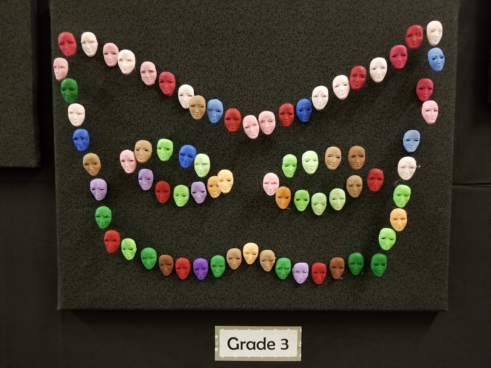
I selected the stars in each group and laid them out as a constellation. I placed stars that had teachers/courses in common closer together. Most of our elementary schools had 6 or 7 constellations. Here is one of them (before labels).


Each elementary school was organized on its own 24" x 36" cork board that had been covered in fabric. Stars were attached with map pins and then annotations were added to share what the group had in common. The six schools were organized into two sets of three, because we have two feeder patterns into middle school. This allows a look across the district.


Lessons Learned
When people use the phrase "labour of love," I will now know what they mean. I personally wove every piece of paper used in this display. I spent about 300 hours total building this story out of 3200 pieces of paper and a bottle of glue. Most of the work was done during my summer vacation: early mornings, late nights, weekends, at home and while visiting others. I drank a ton of coffee (mostly decaf, I promise). I got glue all over everything—my computer, my dining table, me. I have never devoted so much time and energy to creating one of these stories. But it was all worth it. This is the most beautiful display I've ever built. But beyond that, it is fascinating to look at. There is so much meaning packed into this. It captures and holds one's attention.

One of the things I have to remind myself is that when I uploaded the information about students and teachers, that was it—no information about gender, race, etc. And yet, it is obvious with some of groups that they have some of these attributes in common. In other words, the system either does or does not support certain types of kids. Now, this is not new learning, especially at a large scale level. But we are talking about small groups here. Let me give you one example. For students who take the advanced math track on one side of our district, one school only placed males there...the second nearly all males...but the third placed about even numbers by gender. What was most interesting about this third school is that nearly every girl who was in this track and successful in math had the same third grade teacher. That one teacher was the common denominator...and that group was different from every other in the district. And until I built this display, I would never have seen this. I was also surprised at how different every student appeared. Yes, I know that every child is an individual, but this display really drives it home. While there are a few (but not many!) students who had the same five teachers, they did not have the same internal attributes or the same outcomes.

If you'd like to see more pictures or learn more about our data stories project in our school district, please visit the companion page on our district web site.

Tuesday, August 6, 2019

Eight: Unmasking LAP

I have had this post in my queue for a few months. Last school year was a hard year, for a variety of reasons...and I didn't feel like publishing to create any reminders of it. But I have something super-special (finally!) to share tomorrow, so I'm pushing this one out the door today.


I finally built and shared my first data story for the 2018 - 2019 school year. While I originally had some big plans for data stories this year — including community involvement — this has not turned out to be anything like a normal school year. I'll spare you the gory details, but just say that the impact of all the turmoil has been that I mostly don't feel interested in creating anything...even though my passion for this project remains. So, over the last three months, I have been chipping away at doing something and hoping that this will rekindle some joy.


Background
I have been wanting to look at our intervention data. In our state, supplemental funding is provided via the Learning Assistance Program (LAP). The goal is to work with students who are at least one grade level behind in reading or math and accelerate their learning so they can meet grade level expectations. Our district uses nearly all this funding in our elementary schools to buy teacher and paraeducator time. These interventionist use a "pull out" model where students come to a separate space each day for up to 30 minutes of extra instruction, tutoring, and support. Each school determines which grade levels to serve, which area (reading or math), how to group students, and what materials to use. There are a lot of variables, but the bottom line is really about outcomes.

What I've noticed over the last several years is that once a student is identified for LAP services, they rarely make enough progress to exit the program. The primary reason why they leave the program is that it's the end of the school year and there's no more time. However, the news isn't all bad, but it's still challenging to identify what it means for the program to be effective.

The Data
For this story, I pulled student performance data from fall and winter for every K - 5 student who has been served in LAP this year. I wanted to look at both growth and proficiency across schools. I also wanted to show some of the difference in the populations we serve — for example, a student with low-performance might receive support at one school, but not another, just because of program capacity and the volume of students to serve.

After I pulled assessment data for each of these students, I found the raw difference between the number of points earned between fall and winter. I compared that with the amount of growth necessary to maintain an "at grade level" performance between those two time points and identified each of the LAP students as having less than or at least that amount of growth.

The Build
I used Sculpey clay and a mold to create a face for each student. We have six elementary schools, so six colours (orange, blue, purple, red, green, brown) were used. The clay was tinted to create a gradation of each colour to represent the number of years the student had spent in the intervention program. More years equaled a darker hue. Faces representing students who had made more than the required amount of grade level growth were attached to a pin so they would stick out from the board, creating a 3D effect.

 I used six boards, one for each grade level. Students were placed on the board based on how much overall growth they had made between fall and winter. This was not an exact placement—I used a bit of artistic license to group students. My goal was to create a mask shape with the faces, with the idea that we were trying to reveal something about the program.


Lessons Learned
I have to admit that this was not my favourite project to do. It was important from the standpoint that I needed to get back into producing stories again and this forced me to at least think about communicating with data. However, it did reveal some things about our intervention program, including that it's not particularly effective. Considering the state gives us nearly 2 million dollars to run it, I'm not convinced it's a good investment of taxpayer dollars. This is not to say that students don't grow or that for some individuals it provides good support. It doesn't mean that there aren't some adults in our buildings busting their rears to make a difference for students. But if the goal is to get every child to be able to perform at grade level for reading...well, there's not a lot of good news in this story. When I think about the students who have spent multiple years in the program, I wonder why we keep exposing them to the same intervention and expecting a different outcome. What should we be doing instead? We still haven't had that conversation in our district and honestly, I don't know if anyone is interested in doing that.

Monday, February 25, 2019

You Can Count on Me

I don’t remember where I first read about these programmable buttons from Amazon. Sure, many of us have seen the “Dash” versions you can get which allow you to place an order at the click of a button, but there is potential for more. And while I’ll let your own minds wander to all of the possibilities, I just want to talk about one: using these as data collection devices.

You can configure each button to communicate over wifi. It can receive and transmit data related to a single, double, or long click. Slip one in your pocket. What are the kinds of things you might like to track? How many minutes in a class period the teacher is talking…or how many boys, girls, or non-binary students s/he calls on? What if you gave one to a student and asked him/her to push a button every time an adult in the building greeted him or her by name? We could even go bigger. What if you put a set in the office with a different question each week and asked visitors to respond?

I had these and other questions in mind. So, last summer, we ordered one of these Amazon Internet of Things (IoT) Buttons for our office…and since then, it’s been sitting in its little box, staring at me, waiting for its opportunity to be useful. When I found myself with a gift of time this week, I decided it was finally the moment to program the little beast. Now it’s time to share my learning with you, in case you want to jump in on this, too.

My only disclaimer here is that what I know about coding would fit in a thimble. There will be, no doubt, more elegant solutions to what I implemented—and if you know them, I hope that you’ll share. Here are the resources on which I relied most heavily:
  • Caroline Dunn has a great video on YouTube to help you set up your button and get you started. The code and IFTTT recipes have some useful background, but they did not work for me “as is.”
  • This code from Joseph Guerra, however, works like a dream. The only limitation is that it shows you how to capture information from a single click—not the double or long-click (if you want to use all three options with one button).
  • To overcome this last issue, I was able to use some code from here. I still had to figure out where to place it…but I did. And you can, too.
You will need
I won’t get into the nitty-gritty here with the button set up—watch Caroline’s video or hit teh Googles for some additional support. Basically, you’ll install the apps on your mobile device and use those to configure the button to a designated wifi source and select its first task. 

Next, set up your IFTTT (If This, Then That) recipes. You'll need three: one for a single click, one for a double click, and one for a long click. Use the Webhooks app as the trigger (If then...) and the "add a row" option from Google Sheets (...then that) to capture the type of click. Even though you set this stuff up first, it's really the second part of what happens when the button gets pushed. But you need some information from this to add to the first part of process.

So let's take care of that. Log into your Amazon AWS account and find the Lambda app. This is where your code for the button lives. There's some placeholder stuff there from when you first configured the button using the app on your smartphone. Delete that and replace it with the stuff from Joseph Guerra. You'll be all set for one type of click (single, double, or long). If you want to have the button collect two or all three types of clicks, modify the code so it looks like the sample below. Note that you're just copying the stuff for your first click type (e.g., Single) and pasting it in two more times for Double and Long. Replace the words "Single" with the other clicks.


That's it. You can do it. I did---and I didn't even have this to get started. Keep in mind that you can modify your code here to associate different names with your IFTTT recipes (applets). If you don't want single, double, long showing in your spreadsheet, you can have yes, no, maybe or thumbs up and thumbs down. Or start and stop. The possibilities might not be endless, but the variations are completely up to you.

What I like about the button is not just its options for simplified, automated, and "mobile" data collection, but also the anonymous nature of it. The Google Sheet only captures a timestamp and click type (or whatever word you tell it). When I handed the button off to a principal to use in his building, I told him that whatever shows up in the spreadsheet is all his---I don't need to know who he gave the button to or what the clicks represent or what questions he had in mind. As long as he can extract what meaning he needs, then that's all that matters. And even if the spreadsheet was public, the data won't mean anything to anyone who doesn't know what the various clicks represent.

Now that I survived my first foray into this world, I'm ready to go further. We ordered 19 more of the buttons and I will get started this week getting those programmed and ready to check out to principals. I'm excited to see all the different ways that they use these to gather information in their buildings.

What will you do with yours?