Monday, December 31, 2012

Come and Get It

The field of education currently has an insatiable appetite when it comes to data, and there is quite the buffet of sites out there presenting an assortment of flavors. This will be the first in a series of posts about sites that showcase educational research and data. So, pull up a chair and dig in.

Civil Rights Data Collection

Click here to visit the collection. No admission fee.

The Civil Rights Data Collection contains data sets about enrollment demographics; pre-K; math and science courses; AP, SAT, and ACT results; discipline records; incidences of bullying; school expenditures, and teacher experience. You can run customized reports for (large) schools or districts---very handy for looking at the breakdown of enrollment or discipline by different demographics. Data is currently available through 2009, with promised updates in the near future. You also have the ability to make comparisons across schools and districts.


ED Data Express

Touch here to check out ED Data Express. Ooo...that tickles!

If you head over to ED Data Express, you can get a different sort of overview of the states. Data from federal programs, such as Title I, Title IIA, and Migrant/Bilingual (Title III), can be sorted and analyzed. There is also information on graduation rates, NAEP results, and other comparative factors.


National Center for Education Statistics

You can check out the NCES by clicking here. C'mon. You know you want to.

The grand-daddy of them all is the National Center for Education Statistics. There could be several posts about just this one site. There is so much there to explore. You can download questions used on the NAEP...sift through national research initiative...find out about various statewide initiatives to build sites for public educational data...and much much more.

For most classroom-level purposes, these data sites are interesting...but not useful. The lens is pretty wide for these sites. However, looking at the world from a school or district viewpoint, these sites start to get interesting. They change the introspective focus we tend to have and get us thinking about a wider set of factors. A child is far more than a test score (regardless of what the feds say), and these data sets let you see a bigger picture. Is our school/district "normal"? By what sorts of measures---demographics, enrollment in science courses, how we spend our Title IIA dollars? What do we want for our kids and what do schools "look like" that have those attributes? These datasets will allow you to dig into background in ways that were not available even a few years ago. So go poke around...see what questions they bring to mind.

I'll have another post in the near future to showcase a few more sites. Do you have a suggestion to add to the list? Let me know and I'll include it.

Happy New Year!

Thursday, December 27, 2012

Do You See What I See?

While driving to work the other day, I heard that men only see one shade of red; therefore, women shouldn't spend so much effort picking the "right" shade of lipstick. Now, I don't believe everything I hear on the radio any more than what I read on the Internet. But the tidbit did get me thinking.

I taught biology for many years. Every year when the genetics unit rolled around, we looked at sex-linked traits. These get their name from the genes being physically located on the X chromosome (one of the chromosomes involved in determining gender). Generally speaking, human males have one X and one Y chromosome...and females have two X chromosomes. Because men end up with only one X, any bad code on it will be expressed. Women have a "spare," so a mutated gene doesn't matter so much---the good copy will always pump out the right stuff. Color-blindness is a sex-linked trait, appearing far more often in men because the genes that support color perception are on the X chromosome. If you're male and get a bad copy from mom, you're doomed. This is the incredibly oversimplified way we teach about (a) sex determination (b) being able to see a full range of colors, and (c) sex-linked traits.

The reality, of course, is far more complex. I think it's worth exploring in a bit more depth because of the impact this has on how we design our data displays.

I should say at the outset here, that this is really about color perception, not vision. There are people who have perfectly formed retinas, capable of capturing the full range of wavelengths, but who are color blind because of dain bramage...er, brain damage. There are a few different parts of the brain involved with interpreting the wavelengths that activate the retina and assigning a color/name to them. (For a friendly, but in-depth analysis, I recommend Island of the Colorblind by Oliver Sacks.) But perception happens in the eye.

Remember this from your high school bio textbook?

from here
Light comes in the pupil, hits the back of the eye where the retina is, and those little red, green, and blue "cones" in the back (far right of above diagram). If the cones are stimulated, a nerve signal travels to the brain for further processing. Again, I'm oversimplifying...but the part to really pay attention to are those three cartoonish-looking cones in the diagram. Each one contains a protein that responds to different wavelengths of light...and each of those proteins is determined by a specific gene. And those genes? Somewhere on a chromosome.

Only the genes for the pigments used in red and green color perception are on the X chromosome. They sit right next to one another at the end of the long arm of chromosome.
You are here! (image from here)
Captain K gets a lecture re: Green Jeans (source)
You might remember from your high school biology days that chromosomes engage in something called "crossing over." This has nothing to do with death or getting to the other side, but a way to make new combinations of genes. Variety really is the spice of life, especially at the molecular level. During crossing over, matching parts of chromosomes swap genes. Sometimes, this leads to pieces getting lost, put in the wrong place, or inserted backward. This crossing-over-gone-wild (not the technical term) is the source of most red-green color perception problems. But over the generations, it has also resulted in an extraordinary variety of "red" genes---about 3 times the number of variations in most other human traits (source). Meanwhile, most of us have multiple copies of the green gene, all lined up in a row, but only the one next to the red gene gets used. So, even if there are lots of dittos for green sitting around, if the first one is messed up, your color perception is hosed (source).

So what?

Remember, men only get one copy of this chromosome...women get two. The variations mean that women are more likely to see a wider range of colors, especially in the red part of the spectrum. It may be that 60% of women actually have four different types of cones in their retinas, but research has not yet identified successful ways to test what this means in terms of what these women see. And fellas? It doesn't mean that they only see one shade of red, but the range of wavelengths perceived may differ from man to man. With ~85 different versions of the gene, there are a lot of possibilities.

When developing data displays, you will never really know if someone can "see" them the same way you do. There's no way to know which gene variant is present and which wavelengths will be activated. But perhaps there are some lessons to learn about using color. Here is a diagram of the wavelengths our cones respond to (the dotted line is a curve for the rhodopsin used in night vision...just ignore it):

If you only have genes for S&M, do you see 50 shades of grey? (image from here)
Notice that there is some overlap between the S (for short wavelength; blue), M (for medium wavelength; green), and L (for long wavelength; red) curves. You might not be able to guarantee that your viewer will see the same color as you, but you will probably stimulate some activity in the cones if you need to differentiate your data if you stick within a particular range. So ladies, go ahead and choose any color of lip rouge you like---there will be some guy out there who can see it just like you.

Does this mean that you should go to extremes when developing your design? No. Most people (~92% of men and 99% of women) have fully functional cones. They might not be activated at exactly the same wavelength as yours, but it's a pretty good bet that it will be close. But it is important to remember that if you have a critical point to make, you should choose a color that is highly visible to anyone who needs the information. (Oddly enough, medical illustrations and charts about color vision seem to rely on red/green. Hmmm.)

All of this reminds me of the Color Survey done by xkcd, where people were asked to assign names to colors...and the ensuing interpretations, like this one from Doghouse Diaries:

from here

Perhaps the variety of genes and combinations in women mean that they see more subtle variations in color. No way to prove that's the explanation for the difference in results, but another idea to ponder.

Bonus Round
What about ole blue? The pigment that responds to blue wavelengths resides on a regular chromosome (one not involved with sex determination). Because everyone inherits two copies of the gene, this variation of color blindness is not as common (i.e., everybody's got a spare). Blue-yellow colorblindness affects 1 in 10,000 people, its effects distributed equally between men and women.

Monday, December 24, 2012

Have an Excel-lent Christmas

These days, even Santa uses the power of data to manage his work. Two recent posts highlight the role spreadsheets and big data play in his workshop.

from Santa Claus & the DD Xmas
IBM shares an interview with Santa on their Big Data Hub blog: Santa Claus and the Data-Driven Christmas. As you can imagine, an operation as one as large as Santa's requires a significant data center and analysis software. He has big plans for the future, too.

"So, for example, moving forward we will keep using geo-location, mapping, mobile device and third-party data to help create ideal transportation paths for my sleigh route on Christmas Eve. We call it 'chimney mapping,' and it provides optimal delivery patterns to ensure that we get every gift delivered on time.  Imagine if FedEx had to deliver all of their packages processed during the year… in a matter of 12 hours. That takes a lot of data, a lot of advanced analytics, and a fair amount of strategic planning. (Not to mention a dash or two of Christmas magic!)"


from What Is Metadata
Meanwhile, over at Scientific American, Bonnie Swoger shares the importance of metadata. She advises us to "Be like Santa and make sure your data is findable and re-usable."

Bonnie seems to think that Santa is a fan of Google Docs. But let's not quarrel.

"I think we can agree that Santa would use sound data management practices, including the creation and use of proper metadata, to keep track of his gift giving and logistical data.  He would want the rest of us to use good metadata so we can always locate that 30 year old picture of him, too."

I wonder how these interface with Santa's Privacy Policy. Hmmm...

Merry Christmas to you and yours!

Friday, December 14, 2012

Moving Points to Percentages

Time for another mailbag question. Jason sends the following about the non-academic behaviors workbook: I am wondering if you know of a way to account for a high number of absences on the report? Obviously, if a student is not in class, they do not receive any points. In essence, that is added in to the total points for the marking period as a zero. Is there a way to modify the point levels on the report that only accounts for days that the student is present? For example, can you put a percentage of days present to equal to a level 1, 2, 3, or 4?

Of course you can. Excel lives to serve, after all.

Let's start by revisiting the original set up. Here's a sample from the "Work Ethics" page.


For each student there are six weeks (M - F) of scores, each based on a four-point scale. Blank cells indicate that the student was absent---no points were earned.

Now, let's hide some of the columns so we can look at formulas:


The Total is a simple sum of the points for the student. The Level is determined by comparing the Total to a range of possibilities ("1" is for less than 59 points, "2" is between 60 and 79 points...).

Jason is interested in a percentage. We can do this by (1) changing the formula for "Total" to one that represents a percentage of points from when the student was present and (2) changing the cut values for the four Levels.

Here is one way to solve the first step:


We still need to keep the sum, but we want Excel to give us the percentage out of the points available, not including days absent. In this grading period, there were 30 days, each with 4 points possible. This gives us the 120 to start the formula in the denominator. Now, we tell Excel to count the number of blank cells in that range, multiply that by the four possible points, and subtract it from 120. We can also tell Excel to format the cell as a percentage.

For the second piece, we only need to update the cuts for each Level. Here is one way to do that:


Note that you will need to express each percentage as a decimal---in this example, .3, .45, .6, and .7.

Beyond this, you would also need to recalibrate the report to use the percentages, as opposed to a raw total of points. But we'll stop here for now.

Need to make other adaptations to the workbooks? Drop me a line and let me know how to help.

Monday, December 10, 2012

Let Them Eat Cake

When you think of an analogy for how well two things go together, do you choose "peas and carrots"? I often think of the old-school Reese's commercials where someone's chocolate was always ending up in someone else's peanut butter. But I doubt that anyone ever tells you that "X and Y go together like Excel and GoogleDocs."

It's an uneasy partnership, to be sure, but there is no reason to think that these two tools can't be used together. I was thinking about this recently while looking at some templates for school administrators. Some use Google Forms to capture information (for example, from classroom observations). The templates developed from these have all sorts of analysis built from the data collected in the forms. There are definite advantages with using the Google Forms to collect data. You only need wifi and an Internet connection---no special apps, no worries that Excel doesn't run on a tablet, and it can be platform agnostic. The disadvantage is simply that Google Spreadsheets can be a bit fussy to work with...and, the results are often crude and visually unappealing.

But why can't you have your cake and eat it, too (and isn't eating cake better than peas and carrots)? Is it so much to ask that you be able to marry the convenience of a Google Form with the genius of Excel?

I know some of you are saying, "Duh...you just download the spreadsheet from Google and open it in Excel." And you're right---you can certainly do that. And every time something is updated in Google, you have to download a new version of the spreadsheet. But perhaps you didn't know that you can connect Excel with the Google data source...and then just refresh your Excel workbook?


Bake the Cake
For this example, I started by creating a Google Form. The purpose of the form is to capture observations of students. This is just a "proof of concept" deal, so I only included three classes. You could certainly add lots more classes, or if you're an elementary teacher, you might skip this piece and just kick things off with your class list.

This Google Form has five pages. The first is what you see on the right, and depending upon which radio button is checked, the user is sent to one of three pages (Biology, Chemistry, Physics). The final page contains the "submit" button. Makes things a little clunky---I'd rather be able to submit data from each class page, but sometimes you have to take what Teh Googles gives you.

Each class page has a dropdown menu with the class list and another menu that allows the teacher to choose a standard. Finally, there is a space to include a description for the observation.

Lots of possibilities here for teachers. You could add choices for student behaviors...parent contacts...classroom management ephemera (hall passes, pull-outs, etc.). Make a form that suits whatever your needs may be---and don't forget that there are already lots of templates out there for both students and teachers.

Okay, once you've set up your form, you can test it out and have a look at your Google Spreadsheet. I actually did three tests---one for each class period. You can see how the data are organized:


Your final tasks are to Share your document and Publish it. If you don't want to change the settings for this spreadsheet such that anyone with the link can view it (even though that "anyone" will only be you), you will just need to remember to be logged into your Google account each time you want to sync with Excel. Secondly, while choosing to "Publish to the Web" (under the File menu) is not required to sync with Excel, doing so will give you a much cleaner result. After you have published the document, copy the link that appears for sharing the document. You'll need this for the next part of the set-up.

Make the Icing
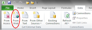
Now it's time to set up things with Excel. Open Excel and click on over to the Data tab. In the Get External Data section, choose "From Web."

We're going to use this feature to link Excel with our Google Spreadsheet, but keep in mind that you can use this trick to pull data from most websites. Need stock info? Weather data? Sports scores? Excel will be happy to collect that for you.

After you click on the "From Web" option, a pop-up browser window will appear. Paste the link for your GoogleDoc to bring up that spreadsheet. Anything on the webpage that is fair game for pulling into Excel will have a yellow arrow beside it. Click on the arrow beside your data (the arrow will turn green). Then click "Import." Excel will ask you if you want to put the data in cell A1 of the workbook. You can click "Yes" or choose another spot.


Now, when the data imports, you will probably get some extraneous bits. Notice in the sample below that cell A1 has the name/sheet from Google, there are some extra rows (2, 4, and 5), and a footer in row 9. But still, we're pretty clean. Just save your workbook and you're good to go.


Serve It Up
This is where the magic really happens. Keep collecting data using your Google Form. Whenever you want to sync the information with your Excel version, open your Excel spreadsheet. Go to the Data tab and click the "Refresh All" button. Abracadabra! Excel will grab all the new data for you.

You can also check out the "Connections" and "Properties" options if you want Excel to check for new data on a particular schedule or you have other adjustments to make.

Now that your data is nested in the comforting arms of Excel, you can build additional reporting tools or data analysis options within your workbook. Just set up whatever you need on other sheets and let those update every time you refresh, too.

But you don't have to take my word for it, you can try all this for yourself.
  • Here is the link for the Google Form. Add some data.
  • Then, check out the Google Spreadsheet. You can view all of the data, including what you've added. If you like, you can save a copy to your own account to play with.
  • Finally, download the Excel workbook and refresh the connection.
I'd love to know what possibilities you see for your classroom or school. Bon appetit!

Friday, December 7, 2012

The Perfect Match

Heading back into the mailbag, Alison sends us this problem: I have some students with the same last name and the index/match doesn't seem to be doing what I need it to.  It's only finding the first name in the list with that last name.  So I can pull the report for Y. Gordon in 1st period, but not T. Gordon down in 4th period.

I pointed her to Debra Dalgleish's post from July that does a lovely job of showing how to check multiple criteria with INDEX and MATCH, but Alison still felt a bit overwhelmed. I knew what she meant. Sometimes, it's hard to translate an example that doesn't look like yours into the problem you're trying to solve---even when the formulas are the same. So let me share a classroom example.

We need some music to set the stage for our Match Game, don't you think?


Here is our class list. We have a Charlie and Sally Brown in the same class. Ditto for Linus and Lucy Van Pelt. If we want to build a report or find scores, we can't just use the last name to find a student. This isn't unusual for any given class--and while you might end up with a class list of unique last names, you are more likely to end up with 2 or more kids with the same first name.

The easy way out of this problem when building reports is to use the student number or another unique identifier for each student. Then, just use your regular INDEX/MATCH coupling to drive the report. But we're not taking the low road today, my friends.

Suppose we're building a report and need to find the score for each student at the end of the quarter (Column J). For the purposes of this example, we'll use cell C16 on the Report page (Report!C16) as our reference for a cell that already has the last name of a student.

Ordinarily, we might build a formula like this: =INDEX(J8:J17, MATCH(Report!C16,A8:A17,0))

We tell Excel to INDEX the range of scores for second quarter (J8:J17) and MATCH our reference cell (Report!C16) with the list of student last names (A8:A17). Alas, this isn't going to work if we need to find scores for Sally Brown or Lucy Van Pelt. Excel is going to stop when it runs across the first instance of the last name "Brown" or "Van Pelt."

We're going to need an array formula to do some heavy lifting here. Remember, these are formulas where you have to use CTRL+SHFT+ENTER (not just ENTER) to get them to work. This formula is structured very similarly to the plain Jane version.

To keep things simple for this demo, let's say that the formula is going in cell J19 for Sally Brown. (Yes, I know you would just look it up if you were on the same page. Work with me here.) Here is our new and improved INDEX/MATCH formula:

=INDEX(J8:J17,MATCH(1,(A19=A8:A17)*(B19=B8:B17),0))

We're still INDEX'ing the same column (J8:J17), but we're going to shake up the MATCH part of the equation to connect with two variables. We set up one set of matchmaking between cell A19 (Brown) and the range with the last names (A8:A17) and another between cell B19 (Sally) and the range with first names. In between, we put a "*" to direct Excel to combine these values.

Want to play with it? Have it in the embedded worksheet below. Change the names and watch the magic happen.

You can also click the Excel icon at the bottom of the window to download the workbook.


Bonus Round
Have an Excel question you want to air out here?  Drop me a line. I do have a couple more unanswered comments from previous posts to respond to...so if you've been waiting for an answer, stay tuned.

Tuesday, December 4, 2012

The Back End of the Shaggy Dog

I work in tech, and people are forever referring to the "back end" of software, databases, and so on. I find the reference amusing (because inside, I'm 12), but I have to admit that the euphemism fits. The code, meta-data, and other unseen features are not the pretty face that gets shown around. So let's take a look behind the scenes, as it were, of my Shaggy Dog Story with Excel.These instructions are all about MacGuyvering a spreadsheet. While I hope that no one needs them "as is," there are a few tricks here that you might find handy for other projects.


First, I organized my resources on one spreadsheet. Then, I made it into a table. You can do this in Excel by clicking in the cell that will be the uppermost lefthand corner of the table, then using CTRL+T. My table had headers (unit, resource, title description), so I checked that box and hit ENTER. You don't have to turn the data into a table, but (1) I think it makes the formulas easier to manage and (2) you don't have issues with adding records.

Now I have something that looks like this. If you don't like the formatting Excel applies, you can go into the Table options and fuss around with it.


Then, set up your sheet where you want the results displayed. If you're using Excel offline, just use data validation. Don't bother with my "X marks the spot" strategy. However, if you're trying to webify this content, carry on. This is how I set up the demo for the blog post. I used the four column headers (in brown) on this sheet to organize the display.


There are two more small pieces before we get knee-deep with generating a list of items based on user input. First, on the sheet with the list of resources, I set up two IF statements, one for the choices underneath "Unit" and the other for "Category." I needed to tell Excel how to recognize the selections made by the user. Here is how I set up the formula for Unit:

This formula is placed on the other sheet, but since cell references are on this one, I'm showing it here.
Keep in mind that if you're building an offline version using dropdown menus, you can skip this part.

Finally, I set up a COUNTIFS statement based on the user selections. This was also placed on the page with the data set: COUNTIFS(List[Unit],G2,List[Category],G3). This tells Excel to count all of the cells in the table that matched the results of the two IF statements. I named this formula Item_Count. The one I did for work ended up with nearly 30 choices and two extra layers of IF statements...but we won't bother about that now.

An aside here...

I mentioned earlier in the post that converting the data into a table made things simpler for the formulas. Notice that in the COUNTIFS formula that I don't need to state a particular range (e.g. A1:A50). I can just tell Excel to use the table (List) and column header in square brackets (Unit, Resource).

Okay, let's go back to the sheet with the results. We have one more formula to apply...and it's a doozy. Why? We need to generate a list of results based on user input. Our old friends, INDEX and MATCH, are great at identifying the one item that fits a set of criteria...but we need a list. We need Excel to find the first one, the next one, the next one...and so on. Also, the results of each list might not be the same in number--could be one item, could be ten.  I found the basic answer here, if you want to watch a video tutorial; but here's the basic idea for cell B11 shown below. Keep in mind that this is an Array Formula, which means you need to use CTRL+SHFT+ENTER to make it work.

=IF(ROWS($B$11:B11)>Item_Count,"",INDEX(List[Title],SMALL(IF(List[Unit]&List[Resource]=List!$G$2&List!$G$3,ROW(List[Unit])-ROW(List!$A$2)+1),ROWS($B$11:B11))))


If you're hyperventilating after looking at that formula, find a paper bag and come back. We can do this.

The first part of the formula (=IF(ROWS($B$11:B11)>Item_Count,"") means that we want Excel to count the rows from B11 to B11 and compare them to the result of the COUNTIFS formula (named "Item_Count"). If there are more rows than the Item_Count, Excel should leave the cell blank. This part is important because we are going to have a variable number of results based on user input. By including the option for the blank result, we will keep error messages from showing up.

Next, we have the FALSE part of the IF statement---what Excel should do if the Item_Count is smaller than the number of rows. In this case, I want it to INDEX the Resources and display the title based on the following criteria:

  • It must match both the Unit and Category as indicated by the results of the IF statements we set up earlier. (IF(List[Unit]&List[Resource]=List!$G$2&List!$G$3)
  • It must be the "smallest" (first) item that matches the criteria that is equal to the number of rows we've specified +1:  SMALL(IF(List[Unit]&List[Resource]=List!$G$2&List!$G$3,ROW(List[Unit])-ROW(List!$A$2)+1),ROWS($B$11:B11))
The good news is that you only have to build this formula once. And trust me, you will do your Happy Dance when it works. Use your fill tool to copy the formula down. You can also copy and paste the formula to cell E11 for the description, then change "List[Title]" to "List[Description]" in the formula.

You can download the workbook here, or go back to The Shaggy Dog Story and see how things work in the embedded version.

See? That isn't so Ruff! Ruff!

Bonus Round
The gigantic formula shown above has a lot of different uses. Don't discount it just because it looks scary. For example, think of how you might use it to sort a list of students into different classes (i.e. take a master list and sort it onto multiple spreadsheets). Although Excel is not a database tool, this formula gives you some options to use it that way when you need to.

Saturday, December 1, 2012

The Shaggy Dog

Stop me if you've heard this one: Excel, Web Apps, and GoogleDocs walk into a bar...

Okay, maybe that isn't the basis for the story I'm about to tell, but I was nearly driven to drink by these three, um, tools.

As part of my day job, I work with a small database of resources. Until recently, the database has lived on a Moodle site---a long and painful sidebar to this story, which I will spare you. As our story really begins, this database is downloaded into a csv file and begins its new life as a spreadsheet. The goal is to webify this content and make it interactive---all without the expertise (and expense) of a developer. We do have the ability at our workplace to have a table on the web with alphanumeric sorting---but no filtering. This is great for things that you only need to sort on one attribute (and for a small dataset). My pseudo-database didn't fit these criteria.

Part One: The Easy Way Out...Or Not
I tried using the Excel Web App first. I really wanted this to work for two reasons. First, it would be awesome to have the first idea work and be able to end the story at this point. The other reason was simply an IT one: in my workplace, it will be a lot simpler to argue to embed a Microsoft product vs. a third-party app. So, I converted my spreadsheet to a table, uploaded it to SkyDrive, and if you know what you're doing, you can filter the results using the app. But this just wasn't going to work. By the time you built in enough directions to navigate the filters, a novice user would probably just give up on the damned thing. Plus, you could only filter one column, so I was no better off than just the simple sorting we already had.

Part Two: Back to the Drawing Board
I went back to Excel to see if I could get a handle on the some of the mechanics (formulas) I would need to build in the filtering. It's simple enough to build some data validation (dropdown) menus that allow a user to choose. But I had to learn how to generate a dynamic list from these choices. It's one thing to use INDEX and MATCH to find one item on a spreadsheet...but how do you use it to find all of the items for a set of criteria? A list that will change with every possible combination of input from the user? Yikes. I did find the answer to this and built a little interactive form. It worked great offline, but I couldn't move it onto the web, because the Excel web app doesn't support data validation. But hey, Google does!

Part Three: A Move to the Dark Side
Let's give Google Spreadsheets a crack at things, eh? I uploaded the workbook..even figured out how to make the array formulas work. The dropdown menus were functional. But then, Defeat was snatched from the jaws of Victory. You see, the dropdown feature only works in the spreadsheet---it doesn't work if you embed it in another webpage. Argh. So, I decided to build a Google Form for the input and connect that with the spreadsheet to generate the dynamic lists of resources. Um, no. Again, it worked great in the live worksheet, but didn't make a bit of difference for the embedded one. Le sigh.

Part Four: Gee, It's Good to Be Back Home Again
I'm starting to get pissed. Twice now, I've gotten down to the very last piece of the puzzle, only to find that it doesn't exist. But I'm also a bit more focused on what needs to happen. Whatever gets developed needs to (a) live on SkyDrive, (b) be intuitive for the user (c) not need data validation or VBA. So, I'm back to square one with Excel, begging my old lover to take me back and teach me some new tricks. I ended up building some IF statements based on whether the user placed an "X" beside a choice and used that for the input. The only final piece was to use the HYPERLINK formula to piece together the title and location of a resource from the spreadsheet with the data into the list for the user, so they could just click-n-go.

Part Five: It's Alive!
After some final formatting, I uploaded my Frankenspreadsheet to SkyDrive, and it worked. I suppressed my urge to run around the office like Colin Clive in Frankenstein and scream "It's Alive! It's Ah-liiii-ive!" I admit that it's a little clunky, but it meets the criteria it has to satisfy.

I've mocked up a sample using different a different dataset for you to see (without hyperlinks, since these refer to documents instead of webpages). If you're viewing this post via RSS, you'll have to click through to the original post to see the embedded spreadsheet.I'll give you the background on building this in the next post. For now, any suggestions for improvement?


To play with the spreadsheet, place an "X" beside one item in the list of Units and an "X" beside one item underneath Category.