Showing posts with label bar. Show all posts

Sunday, April 2, 2017

Backwards Bar Charts

Recently, someone shared a visualization from Periscopic about the Trump Emoto-coaster. While the subject matter itself was not of particular interest to me, I did like the presentation of it.

Strap yourselves in. Your hands must be this small to ride this ride.
The line chart at the top made me think about the rises and falls within a school year. March seems like an especially cruel month, with teachers' tempers growing short. (Just ask me about how I ended up in a conversation with a five-year old about why we need to wear pants at school.) How do attendance and discipline intertwine? And, when I looked at the horizontal bar cum sparkline plots shown above, it also made me wonder what we would see if we plotted individual classrooms over time. Maybe something like this:

Let's say there are four teachers at a particular grade level in a school. If we looked at the number of student absences and office referrals from the beginning of the year to the end of the year...what might we see?

If I was a principal, I might use something like this to either look for "hot spots" in my school that I might not know about...or monitor how well my school improvement initiatives are being implemented at the classroom level...or even to show staff for input. If I was a teacher, this might give me a general way to compare outcomes in my classroom. It might also piss me off (This just shows you that I have ALL of the bad kids!).

My challenge was how to build this. At its most basic level, this is a floating bar chart. And Ann Emery has a great tutorial for doing just that in Excel. But I didn't take that particular route this time because of how I need these charts to lay out. You see, absences for any given classroom total no more than 70 in a month...but referrals are no more than 13. Excel isn't going to let me push the edge of the chart off the lefthand side of the worksheet if I keep the x-axis the same on both sides, meaning I ended up with a ton of blank space. I suppose I could put attendance on the left and discipline on the right, but hey, what's Excel without some challenges?

So, how do you build a backwards bar chart?

Create your horizontal bar chart the usual way, then fuss a little bit with the axis settings.
Once you do this, then remove the gridlines and axes themselves, you'll be able to position this bar smackdab against the other one. You know it's worth it...you can work it. Just put that chart down, flip it, and reverse it.

Holla!
Another to know about this chart is the addition of the line down the middle. Since I deleted the gridlines and axes, I need some sort of visual between the bars. So, a simple line shape in grey 1.5 pt is all that was added.

In terms of labels, I'm going to leave them off. If you understand how one is laid out, then you can understand a whole school's worth. The numbers themselves aren't the big idea with this visual. It's the patterns and comparisons we're after. When we've identified those, we're ready to ask some deeper questions and dig into the numbers in a different way. These charts are the starting point for conversations...not the end...even if that seems a little backwards.

Friday, November 4, 2016

Two: A Month in the Board Room

When I first shared this month's topic for a data story, I received a lot of quizzical looks in return. A month in the board room? Whaaaa? Why would anyone care about that? But I didn't know why anyone---including me---would care. I wasn't sure what I'd see. However, that is one of my larger goals with this project. I want to find out what happens when we pay attention to data that are typically ignored.

A Month in the Board Room is the second in my "10 for 10" challenge I have set for myself this year. It is my goal to tell ten new data stories in ten months. Truth be told, I'm running a bit behind. There is a huge learning curve with these. What I have in my head is never quite what appears on the board and on the web. I try to remind myself that perfect is the enemy of the good. It is more important to finish and post something rather than wait until everything is just right. If I go that route, I might manage to put up only one of these. I am learning more each month. Maybe by the time I get to number ten---whatever and whenever that will be---I'll be a well-oiled machine in terms of getting things posted.

Working with the Data
On the right, you'll see a mini-version of the display that I built from the data. After selecting a month (February), the data were exported from an Outlook calendar into Excel. Each meeting was coded into one of nine categories after reviewing the full list: teacher/principal evaluation, curriculum, assessment, operations, parent meetings, private groups, special services, district office, and administration.

A basic layout, with time of day across the top and days of the month down the left side, was set up with blocks of time for each meeting in the calendar.

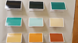
I went through several iterations of color coding. There were several combinations of colors I tried that I actually liked better than the one shown at the right. However, while they looked lovely together in some other types of charts, they looked terrible as big bars. This version seemed not only pleasing on the eyes, but also allowed me to divide the information into things that are initiated from within our department (green) and things that are generated elsewhere (brown).

I knew that I had hit on the right display when I showed it to my boss. He appreciates and supports the work I do, but really isn't all that into data. But when he saw this, he actually started engaging and noticing things. After a minute or two, I pointed out to him that he was talking about data...at which point, he smiled and left. Gotcha.

Offline
Just like last month, there is an offline component to the data display---a bulletin board outside my office. The graphic you see above was sent to Costco in two parts and printed as two 16 x 20" photos. A swatch of each color was also sent to be printed as 4 x 6" photos.


This photo is of the board in progress. We have some explanatory text on the left...the poster in the middle (there's more coming) and the "legend" on the right. Each of the swatches is on a card that viewers can lift to see more information about a category, including its name. We decided not to put the names of the categories on the front of the card to encourage viewers to spend some time first trying to interpret or make sense of what they see in the larger poster.

The additions to this display include a second large poster attached over the one you see. The top one has some of the bars turned into options that open and reveal details of the meetings represented. We also have data about occupancy and other meeting spaces attached to the board.

Online
Our companion web page uses an embedded PowerPoint to enable users to see details of every meeting, including links to additional documents and sites. Users can also download a larger data set to explore on their own.
It is my goal to prompt conversation and reflection about data. I am encouraged by the comments I have received about the project and some of the discussions I've had. For example, a couple of people suggested that I not represent weekends on this month's data display. Those days do contribute to a lot of blank space, but it is also an opportunity to think about the importance of what we choose to represent...and what it means when we don't represent something. Sure, our board room is rarely used on weekends, but it just makes me wonder about what activities we might see if we represented what people did when they weren't at work.

Bonus Round
So, what did we learn by representing the data? Maybe no large insights, but it does make it easier to see how different groups access the space. Parent groups are only there in the evenings. Administrators meet either before or after the school day. Special Services only uses the room when no subs would be required. Work around curriculum (science, math, career and technical education, and so on) is the heaviest user. In terms of what we don't see, students are rarely in that space. This is not a surprise. Neither is the lack of meetings around construction and infrastructure---we have a ton of those due to ongoing bond work around the district, but those involved don't need such a large meeting space. If I'd plotted things over the course of the year, I'm sure there would be different patterns revealed, but someone else can take that on.

I am already planning the next one, even as the paint is barely dry on this. At some point in the future, I will have a high school stats class help design a story...and there are plenty of other ideas cooking in the background. I hope that we'll push our data discussions far beyond simple red, yellow, and green-filled cells representing assessment results and into more well-rounded conversations about what we value...and what we do when we don't see those values on display.

Wednesday, September 7, 2016

Cheater Bullet Charts

Another school year has started. That means the last month has looked something like this for me:

Art by Allie Brosh
One thing I wanted to try this year was building bullet charts in Excel. We have some change in test scores to represent and I thought this would be a meaningful and compact way to represent the data.

As you likely know, there is no bullet chart option in Excel. Bummer. There is no shortage of workarounds on the web. Many people, who are far smarter than I, have posted tutorials. The one by Jon Peltier is, of course, the most thorough, but Stephanie Evergreen has written about her easy version and Jon Schwabish has offered another idea. They are all worthwhile to review and I thought about them a lot. I just had one problem. I was too lazy to work through all the steps.

Bill Gates has been attributed as saying that "I choose a lazy person to do a hard job. Because a lazy person will find an easy way to do it." And if that's true, then when it comes to building bullet charts, I must be the go to person. Because I found an even easier way to get them done in Excel.

Are you ready? Here's my secret: Make two charts that are the same size. Lay one on top of the other, ensuring that the fill on the top one has been set to transparent and change the gap width to make one set of bars skinnier than another. That's it. That's all you need.

No fancy finagling. Just one data set represented on the bottom and one on the top, as god Few intended.

You can change the widths of the bars, of course (might be better if I made the bottom ones a little wider..."Fat-bottomed bars you make the rockin' world go round..."). Need a third data point to show a target? Why not? Just make another chart with transparent fill and plop it on top of these. I won't tell you no.

Any cheats you've discovered as of late? What have I missed while I've had my nose stuck in the back end of Excel for the last several weeks?

Tuesday, December 29, 2015

Show the Data: Distributions

Last spring, we looked at a couple of ways to show the data: Cluster diagrams and bump(s) charts. The idea here is that when we summarize data and represent it in bar or line charts, we miss nuance. Instead, when possible, we should look for ways to show all of the data.

I had this in mind when I recently tried to tell a story about student performance in my school district. The district does a pretty good job with about 80% of its students, and because that's far better than the state average, no one asks the hard questions about the remaining 20%. Shouldn't they learn to read and graduate from high school, too? I certainly think so...but I often run into roadblocks when I try and raise this conversation. Maybe I need a different visual to use as persuasion.

I remembered some information for another post about recent research in using distributions to replace bar charts and thought I might give it a try.

Here is Exhibit One:

This is typically what we provide to schools (and the public) regarding student performance. This chart represents one grade level at one of our elementary schools. Levels 1 and 2 (L1, L2) represent the percent of students who did not meet the standards ("pass"), while Levels 3 and 4 show the percent of stuents who met (L3) or exceeded (L4) the standards for English Language Arts. Generally speaking, this doesn't look so bad. Lots of kiddos did well enough, and L1 is the smallest category. Yea, Team!

But who are these kids in each category? Do we have the same distribution in performance if we look at student demographics? Let's find out.

Here is Exhibit Two:

A little orientation to this beast. We still have levels of performance (1, 2, 3, 4) on the x-axis, but the y-axis shows the actual scale scores. In other words, for this grade level and subject, Level One is actually made up of scores in the range of 2114 - 2366, Level Two ranges between 2367 and 2431, Level Three is represented by 2431 - 2489, and Level Four includes performance between 2490 and 2623 (source). Every child's score (n = 69) is represented by a circle on the chart.

It might be interesting in itself to just look at the distributions. But I've added some information based on student ethnicity. The grey circles that you see represent students who are white (n = 54). The pink circles represent students of color (n = 15). Overall, only one-third of scores from students of color are in Levels 3 or 4, while about two-thirds of the white student performance are in those levels. And, one-third of all students of color are in the lowest category (Level One).

If you're wondering about why I am not representing different groups (American Indian, Asian, Black, Hispanic, Pacific Islander, Two or More Races, White) with different colors...well, I can tell you that I wrestled with that decision quite a bit. Our district has very small numbers of students of different races. For example, for the school and grade represented above, there are no black students. There is one American Indian student shown on the chart (I can't tell you where, due to FERPA restrictions). This student as an individual is important and worthy of all of our best efforts. When represented by a score, conversations become problematic because there is no way to compare it with others in the same group.  Disaggregation of the data at the grade and school levels does not cause the sorts of inquiry that it should because "it's just one score." Trust me---I've heard that refrain quite a bit. But when I add the "just one score" with others in a building who represent non-white students, there's a bigger argument to be made. Your mileage may vary, based on the populations you are working with. All that being said, I am very open to feedback on this. What are some other options I should consider that will balance tiny n-size against the overall story to be told? Stacked bars, perhaps?

I realize that that two charts I've shown in the post represent different things. One is just the overall percentage by category...while the other is distribution by category. So, one isn't necessarily a replacement for the other. Even if I altered things a bit by showing numbers of students in the first one, it would result in the same chart. But I think there is some real power in looking at the second chart---even if it was not coded---and understanding that every child is there. It's not a blob of summary performance...and goes beyond a simple count of who is in each box.

So, here's looking at you, kid. (Especially if you aren't white.)

Bonus Round
The distribution of performance chart shown above was built in Excel (of course). It is a basic scatter plot chart, with specific scores selected and colored either grey or pink. If you visit the research site I mentioned earlier (Beyond Bar and Line Charts), they have some workbooks you can download and easily modify.

Wednesday, April 29, 2015

Hide and Seek

I want to circle back to an article I wrote a few years ago about my favourite data visualization.

Hierarchical Cluster Analysis by Alex J. Bowers from http://www.pareonline.net/pdf/v15n7.pdf
It shows all of the grades earned by students during their K - 12 journeys in two school districts. I love this chart because it finds a way to show all of the data in a dense, but succinct, format.

In The Visual Display of Quantitative Information, Edward Tufte states that Above all else, show the data. While the quote was applied to a different concept for visualizing data, when I look at the chart above, the quote rises to the surface of my thinking. Showing the data is no small task, and as educators, we spend a lot of time and energy not doing that. We summarize the data into neat little one letter grades or one number test scores. As teachers, we might see a set of scores...but we are the only ones to do so and we typically view them as numbers, not visual displays.Things hide in numbers and number sets.

But a recent paper shared in the Public Library of Science (PLoS) makes the case that things can be hidden in simple visuals, too.


CC-BY Weissgerber, Milic, Winham, Garovic

The authors of the article Beyond Bar and Line Graphs: Time for a New Data Presentation Paradigm assert that the ever-popular bar chart is a summary, and therefore "full data may suggest different conclusions from the summary statistics."  (It reminds me of Anscombe's quartet.) We often claim that pie charts are used to hide data. Et tu, bar charts?

I won't claim that the scatterplots and bump charts in the article are ground-breaking, but this paragraph in particular caught my interest (emphasis mine):

The infrequent use of univariate scatterplots, boxplots, and histograms is a missed opportunity. The ability to independently evaluate the work of other scientists is a pillar of the scientific method. These figures facilitate this process by immediately conveying key information needed to understand the authors’ statistical analyses and interpretation of the data. This promotes critical thinking and discussion, enhances the readers’ understanding of the data, and makes the reader an active partner in the scientific process. In contrast, bar and line graphs are “visual tables” that transform the reader from an active participant into a passive consumer of statistical information. Without the opportunity for independent appraisal, the reader must rely on the authors’ statistical analyses and interpretation of the data.

As educators, we might not view our work as a scientific process, but we must engage with our data. I feel pulled between the notion above that we may be oversimplifying our data presentations and some of the research about how an audience likes their data presented---which is typically charts that are the most familiar. This is not the Great Divide, mind you. We can bring these two things together with some education in the area of data literacy.

Or perhaps we underestimate our audience. I've introduced cluster maps, bump charts, and box-and-whisker diagrams to various groups this year. The first two required very little explanation. Box-and-whiskers did require a bit more orientation, but I never felt like the group using them struggled with the interpretation. I do think that concept of engagement between the visualization and the reader, as posed by the article is important. It's a different way to view interaction---a key piece of a good quality visual. It's not that the visual need be physically interactive...people don't have to be able to click, sort, or filter every chart---but we need to at least cause some thinking about what is presented.

After reading the PLoS article, I'm more convinced than ever that we need to when and why we share all the data. Bar and line charts may well be the fast food version of data viz, but we can begin to add to our visual diet by finding ways to show all of the ingredients.

Bonus Round
If you view the article on PLoS, you will have access to two Excel workbooks to help you make the charts presented in the article.

I'll share some of my own attempts to "show the data" in coming posts. Visit bump charts and cluster charts to learn more.