 |
| Art by Allie Brosh |
As you likely know, there is no bullet chart option in Excel. Bummer. There is no shortage of workarounds on the web. Many people, who are far smarter than I, have posted tutorials. The one by Jon Peltier is, of course, the most thorough, but Stephanie Evergreen has written about her easy version and Jon Schwabish has offered another idea. They are all worthwhile to review and I thought about them a lot. I just had one problem. I was too lazy to work through all the steps.
Bill Gates has been attributed as saying that "I choose a lazy person to do a hard job. Because a lazy person will find an easy way to do it." And if that's true, then when it comes to building bullet charts, I must be the go to person. Because I found an even easier way to get them done in Excel.
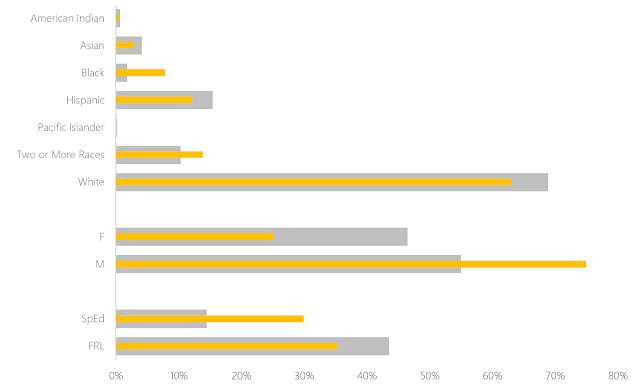
Are you ready? Here's my secret: Make two charts that are the same size. Lay one on top of the other, ensuring that the fill on the top one has been set to transparent and change the gap width to make one set of bars skinnier than another. That's it. That's all you need.
No fancy finagling. Just one data set represented on the bottom and one on the top, as
You can change the widths of the bars, of course (might be better if I made the bottom ones a little wider..."Fat-bottomed bars you make the rockin' world go round..."). Need a third data point to show a target? Why not? Just make another chart with transparent fill and plop it on top of these. I won't tell you no.
Any cheats you've discovered as of late? What have I missed while I've had my nose stuck in the back end of Excel for the last several weeks?


Nice. Cheats are good. As I've been quoted, my two favorite features of Excel are smoke and mirrors.
ReplyDeleteAligning two charts can be problematic, since sometimes Excel does what it wants and not what you want with such things as axis scales, and it's inconvenient to have to move the top chart out of the way to adjust the bottom one.
Plot both sets of bars in one chart. Make the bars wide. Select the bars you want in front, and move them to the secondary axis. Delete the actual secondary axes that Excel chooses to draw, and both series will still be plotted against the primary axis. But being in the secondary axis group, you can now make the front bars narrower, and achieve the same result.