Showing posts with label scatter. Show all posts

Saturday, June 3, 2017

When Excel Is Your Hammer

Last week, a counterpart in a neighbouring school district sent me the picture you see at the right.

She'd been talking with a principal about their data and he'd been sketching what it was that he thought needed to have represented.The administrator wants to compare student performance on the reading strand of the state test with their performance on the writing strand of the same test. Although his drawing shows four levels of each, there are really only three reported: below, at/near, and above. Her question for me: Could this be done in Excel?

Um, sure...why not? We're just talking a scatterplot here. Replace the text of the labels with numbers (1, 2, 3) for reading and writing, then just get all up in that scatter chart's business. I sent my friend some basic ideas about how I would approach it, and said I would pull some sample data to model things.

I grabbed some information on 50 of my own students as a start. I replaced the levels reported for each student with numbers (above = 3, at/near = 2, below = 1). Then, I selected the columns with the numerical data and inserted a scatter chart. Easy-peasy, right?
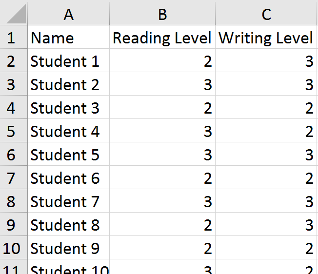
Except, I forgot something important. Many students have the same scores. For example, on the left, we can see that students 3, 6, and 9 all scored in the "at/near" (2) range in both reading and writing. When we plot their points on the chart, they overlap and appear as a single point instead of three students. This was no good. Part of what the principal wanted to be able to see were hot spots---areas of the chart where the school would need to focus for next year. He also wanted to get information about individual students.

I should probably stop my story for a moment here and say that I do not think this---or any other---chart is necessary for the goals the principal stated. If you really just need a list of kids, put a filter on the columns and sort to find the students who are "below" in reading and writing. I suppose that if you really needed to get fancy, you could use a pivot table to summarize things. If you had to have a chart that gave you an idea of the size of the problem, a bubble chart might do. Or, possibly a heat map. I called my friend back and we talked about this. This issue is always the biggest challenge with translating someone's vision into practice. It also gets back to the question I am best known for in my district: What is the problem you are trying to solve? While my colleague agreed with me about the lack of general usefulness of the chart the principal had sketched, she still wanted to produce it. Maybe after looking at it, he'd have a better idea of what he was really after.

So, back to the drawing board for me. I know...I could have left her in the lurch ("Good luck!"), but I appreciate a challenge. Excel was not going to win this one, dammit.

It was then that I decided to jitter the data points. Jittering introduces a tiny bit of randomness to the values so that the points don't overlap so much.

I added two columns (C, E) for the jittered points. You can now see that students 3, 6, and 9 have values that are just a tiny bit different from one another.

The formula in C2 is =B2+(RAND()-0.5)/5. The purpose is to combine the original value with a randomly generated number. It uses the RAND function to create the random values. In this case, I didn't want a lot of noise added to the data, just enough to separate things on the chart. Once in place, the formula is copied down through the rest of Column C, and then applied in Column E to the writing data.

This is what the jittered plots look like, with a minor adjustment made to the axes. Now that I have a few values less than 1 and greater than 3, I needed to ensure those showed up on the chart. The new axis ranges are .5 - 3.5. After making that change, I deleted the labels and used text boxes to add back the original wording. For the data points, I assigned some transparency to the fill so we could better see the overlaps.

We now have a chart that reflects the principal's request. I sent off the file with the sample data and chart to my friend and hoped that it might spur some discussion with the administrator about whether or not this was the right tool for the job he had in mind. Just because we can use Excel doesn't mean we should.

https://twitter.com/fleurdevie/status/2810755338
I don't mean to discount the principal's intentions. Yes, a simple list of students would get you to the same place (and a lot more quickly). But it doesn't necessarily have the same impact as a visual. It may well be that the type of scatter plot shown above engenders some productive conversation with his staff. He has a story in mind that he needs to tell. In that case, maybe Excel is the right hammer for this particular nail.

Monday, November 9, 2015

The Agony and the Ecstasy

Am I the only one who agonizes over the best way to represent a data set? Is there a 12-step program for those of us who are occasionally paralyzed by all of the visualization options? If this sounds familiar to you, read on for my latest struggle in bringing a data story to life.

Several weeks ago, I was asked by my superintendent for information on the achievement gap. For those of you who might not know this particular piece of eduspeak, it refers to the difference in achievement levels between populations of students. For example, white students often perform better on standardized tests than black students. This difference is referred to as the achievement gap.

This request should have been a piece of cake. I have the data (scores and student demographics). I'd done a similar project last year. But I felt like the bar charts I'd used were lacking. They show differences in performance plainly enough, and yet it's difficult to capture information for various populations in a single, easy to read report.

I started as I usually do, hand drawing some possible layouts and then building a few models using the data.


These examples all show longitudinal information for males and females at a particular grade level and in a certain subject area. The particulars are not too important here. What I discovered in doing these, even before cleaning up the charts, is that none of them were satisfactory. They all showed the data accurately, but none of them captured "the gap" in a way that caused any sort of interest or reaction.

Back to the drawing board.

I realized that I needed Excel to show me the percentages on one axis, like a number line, so the space...the gap...became visible. Here is what I ended up with:


This is a bit out of context, so let me tell you a bit more about what you're looking at. This chart only shows 2015 data for one grade level. The horizontal line is the number'ish line: 0 - 100%. The vertical line shows the overall percentage of students who met the standard on a particular assessment. The placement of populations (shown by orange or blue triangles) provides a general relationship to that overall level of achievement, as well as shows the gap between the populations. I do include the actual n sizes and percentages in a table below the charts.

Here's a broader view:


I am not going to show you the data tables, due to FERPA issues---some of the subgroups shown above have fewer than 10 students. I need to stay within the bounds of federal privacy laws in this public space, but just know that they exist to provide detail to data users in our district.

I'm really happy with this layout, however. It gives, at a glance, an easily readable view of the achievement gap at a grade level. When looking at these over several grades, patterns begin to emerge. This is especially important for those groups where the n size is very small for a grade level. For example, having only one black student in a grade might not tell you much if they didn't meet the standard, but when you see that our small handful of black students at every grade level all fall well below their peers, it's alarming. It's also easy to cover up either the orange or the blue markers and get a quick picture of who is or is not successful.

While I still have the longitudinal view to consider, it's simple enough to build similar charts for a few years of data and then align them to provide a similar glance at trends.

I apologized to my superintendent for my tardiness in delivering the product, but I think the agonizing has given way to some ectasy over seeing things in a way that's clear and best represents the question to be answered.

I don't know that anyone, other than those of us struggling to represent data, understands why it takes so much time to build a report. Others don't see how many different charts we modeled...all of the colors we tried...or the variety of label placements (and label content) we viewed. They don't hear the conversations with have with people around the office to learn more about what is or isn't working for them in our draft visuals or how they want to interact with and use the information presented. But for those of you who are knee-deep in this process, I'm cheering you on from here.

Bonus Round
Like these charts? They're just scatter plots in Excel, with the vertical axis removed. Easy-peasy to make if you're on the hunt for something similar using your own data.

Wednesday, April 29, 2015

Hide and Seek

I want to circle back to an article I wrote a few years ago about my favourite data visualization.

Hierarchical Cluster Analysis by Alex J. Bowers from http://www.pareonline.net/pdf/v15n7.pdf
It shows all of the grades earned by students during their K - 12 journeys in two school districts. I love this chart because it finds a way to show all of the data in a dense, but succinct, format.

In The Visual Display of Quantitative Information, Edward Tufte states that Above all else, show the data. While the quote was applied to a different concept for visualizing data, when I look at the chart above, the quote rises to the surface of my thinking. Showing the data is no small task, and as educators, we spend a lot of time and energy not doing that. We summarize the data into neat little one letter grades or one number test scores. As teachers, we might see a set of scores...but we are the only ones to do so and we typically view them as numbers, not visual displays.Things hide in numbers and number sets.

But a recent paper shared in the Public Library of Science (PLoS) makes the case that things can be hidden in simple visuals, too.


CC-BY Weissgerber, Milic, Winham, Garovic

The authors of the article Beyond Bar and Line Graphs: Time for a New Data Presentation Paradigm assert that the ever-popular bar chart is a summary, and therefore "full data may suggest different conclusions from the summary statistics."  (It reminds me of Anscombe's quartet.) We often claim that pie charts are used to hide data. Et tu, bar charts?

I won't claim that the scatterplots and bump charts in the article are ground-breaking, but this paragraph in particular caught my interest (emphasis mine):

The infrequent use of univariate scatterplots, boxplots, and histograms is a missed opportunity. The ability to independently evaluate the work of other scientists is a pillar of the scientific method. These figures facilitate this process by immediately conveying key information needed to understand the authors’ statistical analyses and interpretation of the data. This promotes critical thinking and discussion, enhances the readers’ understanding of the data, and makes the reader an active partner in the scientific process. In contrast, bar and line graphs are “visual tables” that transform the reader from an active participant into a passive consumer of statistical information. Without the opportunity for independent appraisal, the reader must rely on the authors’ statistical analyses and interpretation of the data.

As educators, we might not view our work as a scientific process, but we must engage with our data. I feel pulled between the notion above that we may be oversimplifying our data presentations and some of the research about how an audience likes their data presented---which is typically charts that are the most familiar. This is not the Great Divide, mind you. We can bring these two things together with some education in the area of data literacy.

Or perhaps we underestimate our audience. I've introduced cluster maps, bump charts, and box-and-whisker diagrams to various groups this year. The first two required very little explanation. Box-and-whiskers did require a bit more orientation, but I never felt like the group using them struggled with the interpretation. I do think that concept of engagement between the visualization and the reader, as posed by the article is important. It's a different way to view interaction---a key piece of a good quality visual. It's not that the visual need be physically interactive...people don't have to be able to click, sort, or filter every chart---but we need to at least cause some thinking about what is presented.

After reading the PLoS article, I'm more convinced than ever that we need to when and why we share all the data. Bar and line charts may well be the fast food version of data viz, but we can begin to add to our visual diet by finding ways to show all of the ingredients.

Bonus Round
If you view the article on PLoS, you will have access to two Excel workbooks to help you make the charts presented in the article.

I'll share some of my own attempts to "show the data" in coming posts. Visit bump charts and cluster charts to learn more.

Tuesday, January 8, 2013

Mind the Gap

I want to share an idea I saw at a conference last month. Presented by Paul Stern of the Vancouver Public Schools, it was one of two very intriguing concepts for working with assessment data. Fair or unfair, schools are the subject of a lot of comparisons---how well they perform against other schools in their area, state, or even nationally and internationally, as well as internal comparisons that look at scores from year to year. We can think of lots of reasons why these "apples to oranges" discussions are cagey---everything from the populations schools draw from, to the curriculum used, to teacher quality, parent involvement, and so forth.

Perhaps the biggest of these---in terms of what school staff discuss or dismiss---is the percent of students eligible for free/reduced lunch (FRL). Often used as a measure of poverty, the greater the percentage in a given school, the greater the population living at or below the poverty line. There are some quarrels with using this. For example, the percentage decreases as grade levels increase---that is, there are far more students in kindergarten who are eligible vs. high school seniors. This may be due to underreporting at upper grade levels (a kid doesn't want to appear different in front of peers, and so the paperwork doesn't get turned in), or simply that as children age and become more independent, it's more likely to find two working parents outside the home (and therefore more income). But, we'll set this aside for today's discussion.

So, here's a chart that will serve as the starting point for us.

The dots on this chart represent every school in the state of Washington for which data were available on performance of 8th graders on the state math test and percent of students eligible for free or reduced price meals. The dark orange trendline tells us about what we'd expect: the greater the percent of students eligible for FRL, the lower the percentage of students meeting the standard (a/k/a "passing the test"). They straight beige line shows the statewide percentage for meeting the standard on the 8th grade math test.

Looking at this might engender some questions about schools that don't fit the overall model. In the lower lefthand corner, we have schools with a low percent of FRL...but poor performance on the test. And in the upper righthand corner, we have a few schools with a large percent of FRL, but are doing better than the statewide performance. What are those schools doing, I wonder?

But let's say that you're in a large district, like Seattle. It's likely there are conversations about students achievement at the middle school as it relates to poverty, but we can dig deeper than that. We might expect a certain level of performance, based on the model shown above. But using the model to supply a context will allow us to remove poverty from the discussion---in other words, what is the gap in performance between the predictive model and the actual score?

Here is the same chart, with Seattle schools highlighted (click to embiggen):


As we can see, some schools, are below the trendline---they didn't score as well as predicted. Others are above the trendline---they performed better than predicted. To help visualize this a little better, let's zoom in on two of the schools.


The arrows point to the predicted performance of McClure and Pathfinder. Based on their percentage of students eligible for free/reduced lunch, we would have expected them to score around the state level (~55%). However, McClure scored 13 points above this...and Pathfinder 6 points below.

We can also build a chart to take a broader look at the various gaps between predicted and actual performance. Using the handy-dandy formula for slope that Excel provides for this trendline (y = -0.362x + 68.088), we can substitute the percent of FRL for x and find the predicted performance based on the trendline (y).

See? Your Algebra teacher knew learning about slope would come in handy someday.

Using one of the stock charts in Excel, we can visualize this to get a better idea of the differences in performance.The schools are organized, left to right, by their predicted performance. The dot at the end of each line represents their actual performance. The length of the lines shows the difference.


This chart helps us see things in a new way. For example, Madrona has the highest percentage of FRL out of these schools, but their gap in terms of expected performance is certainly not as big as Cascade or Orca. Hamilton has the lowest percentage of FRL and the highest actual math scores in the district, but it is not the school that best outperformed expectations. This also allows us to see that schools like Jane Addams and Madison, while still performing below the state average, are outperforming expectations (if only by a small margin). We don't celebrate our successes nearly enough in education. Maybe that's because we don't look for them like this.

Again, the idea here is to remove poverty levels as the focus for explaining the differences between schools. Doing so allows us to look for deeper answers about curriculum and instruction. This is not to say that socioeconomic status has no impact---just that dismissing low performance because of is not the whole story.

I've used public data available here to model these charts, but you could substitute other indicators. Education is certainly not all about the test---and schools shouldn't be judged on a single measure. But I do think that this could be a powerful starting point for schools and districts.