Friday, November 4, 2016

Two: A Month in the Board Room

When I first shared this month's topic for a data story, I received a lot of quizzical looks in return. A month in the board room? Whaaaa? Why would anyone care about that? But I didn't know why anyone---including me---would care. I wasn't sure what I'd see. However, that is one of my larger goals with this project. I want to find out what happens when we pay attention to data that are typically ignored.

A Month in the Board Room is the second in my "10 for 10" challenge I have set for myself this year. It is my goal to tell ten new data stories in ten months. Truth be told, I'm running a bit behind. There is a huge learning curve with these. What I have in my head is never quite what appears on the board and on the web. I try to remind myself that perfect is the enemy of the good. It is more important to finish and post something rather than wait until everything is just right. If I go that route, I might manage to put up only one of these. I am learning more each month. Maybe by the time I get to number ten---whatever and whenever that will be---I'll be a well-oiled machine in terms of getting things posted.

Working with the Data
On the right, you'll see a mini-version of the display that I built from the data. After selecting a month (February), the data were exported from an Outlook calendar into Excel. Each meeting was coded into one of nine categories after reviewing the full list: teacher/principal evaluation, curriculum, assessment, operations, parent meetings, private groups, special services, district office, and administration.

A basic layout, with time of day across the top and days of the month down the left side, was set up with blocks of time for each meeting in the calendar.

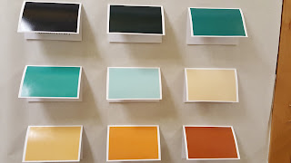
I went through several iterations of color coding. There were several combinations of colors I tried that I actually liked better than the one shown at the right. However, while they looked lovely together in some other types of charts, they looked terrible as big bars. This version seemed not only pleasing on the eyes, but also allowed me to divide the information into things that are initiated from within our department (green) and things that are generated elsewhere (brown).

I knew that I had hit on the right display when I showed it to my boss. He appreciates and supports the work I do, but really isn't all that into data. But when he saw this, he actually started engaging and noticing things. After a minute or two, I pointed out to him that he was talking about data...at which point, he smiled and left. Gotcha.

Offline
Just like last month, there is an offline component to the data display---a bulletin board outside my office. The graphic you see above was sent to Costco in two parts and printed as two 16 x 20" photos. A swatch of each color was also sent to be printed as 4 x 6" photos.


This photo is of the board in progress. We have some explanatory text on the left...the poster in the middle (there's more coming) and the "legend" on the right. Each of the swatches is on a card that viewers can lift to see more information about a category, including its name. We decided not to put the names of the categories on the front of the card to encourage viewers to spend some time first trying to interpret or make sense of what they see in the larger poster.

The additions to this display include a second large poster attached over the one you see. The top one has some of the bars turned into options that open and reveal details of the meetings represented. We also have data about occupancy and other meeting spaces attached to the board.

Online
Our companion web page uses an embedded PowerPoint to enable users to see details of every meeting, including links to additional documents and sites. Users can also download a larger data set to explore on their own.
It is my goal to prompt conversation and reflection about data. I am encouraged by the comments I have received about the project and some of the discussions I've had. For example, a couple of people suggested that I not represent weekends on this month's data display. Those days do contribute to a lot of blank space, but it is also an opportunity to think about the importance of what we choose to represent...and what it means when we don't represent something. Sure, our board room is rarely used on weekends, but it just makes me wonder about what activities we might see if we represented what people did when they weren't at work.

Bonus Round
So, what did we learn by representing the data? Maybe no large insights, but it does make it easier to see how different groups access the space. Parent groups are only there in the evenings. Administrators meet either before or after the school day. Special Services only uses the room when no subs would be required. Work around curriculum (science, math, career and technical education, and so on) is the heaviest user. In terms of what we don't see, students are rarely in that space. This is not a surprise. Neither is the lack of meetings around construction and infrastructure---we have a ton of those due to ongoing bond work around the district, but those involved don't need such a large meeting space. If I'd plotted things over the course of the year, I'm sure there would be different patterns revealed, but someone else can take that on.

I am already planning the next one, even as the paint is barely dry on this. At some point in the future, I will have a high school stats class help design a story...and there are plenty of other ideas cooking in the background. I hope that we'll push our data discussions far beyond simple red, yellow, and green-filled cells representing assessment results and into more well-rounded conversations about what we value...and what we do when we don't see those values on display.

Sunday, October 2, 2016

One: If the District Were 100 Students

After attending Tapestry earlier this year, I decided that I wanted to showcase some different data stories. In my day job, I mostly work with student data---test scores, demographics, attendance, discipline, and so on. All good stuff in its own way. But there are lots of things that we collect and don't share, either because of student privacy concerns or just lack of trying.

It is my goal this year to tell ten new data stories in ten months. And while I'm a little later in getting the first one up and running, it's happening. Every story will have an online component with links to programs, data sets, or interactive views. Each one will also have an offline component. I've commandeered one of the bulletin boards in our district office. My goal with that piece is to make "touchable" data, and data displays that can be viewed and experienced regardless of Internet access. Out of all of this, I hope that we bring to light some new understanding to different audiences and create some interest in increasing the visibility of some our underrepresented students.

For (late) September, our focus is "If the district were 100 students." Maybe not the most original topic; however, it has given us a safe place to figure out how to put it all together.

Offline


For the main presentation, we selected six demographic attributes: homeless, low income, absences, dropouts, English language learners, and students of color.  Each of the squares you see has 100 push pins, with the colored ones representing the percent of students in that group.

For three of the groups, we created callouts that provide more detail. For example, our English language learners might only be 2% of our students, but more than 25 languages are represented by that group.

It's been fun to see and hear about people who touch the pins. I'm glad that they feel like they can. I have grand plans in the coming months to employ various paper pop-ups and other things that will invite some exploration with more than the eyes. I had someone comment that seeing the purple pins (representing low income) made her sad. So much of the time, we look at data as numbers on a page. It didn't make the same impact for her as seeing the display.

The rest of the display is devoted to information on enrollment changes, along with some projections by the district and city about the future of our demographics. None of this is earth-shattering or super-fancy, but it feels good to put it out there. It's time to start some different conversations about data.

Online
Each month, we're building a companion web page. This month, I created some simple waffle charts (to reflect the offline displays) and a line graph that users can interact with via Excel slicers. There is a QR code on the bulletin board which links directly to the online options.

A big focus for me this year is on being more transparent about the ethics involved in the choices made about these displays---from which data are (or are not) represented, to downloadable data sets, to the reasons behind the specific charts. It is a privilege for me to have access to the data that I have. It's also a lot of power...and somehow, I need to make sure that I publicly acknowledge that and invite comment.

Bonus Round
Next month...which is really sometime this month...I'll be presenting data related to a month in our board room. I know, that doesn't sound very sexy, but I think the Outlook calendars for that room will reveal a lot about our priorities and partnerships. It's not something we've ever looked at, which is why I think it will be an ideal candidate for this project.

Are you trying something new this year?

Wednesday, September 7, 2016

Cheater Bullet Charts

Another school year has started. That means the last month has looked something like this for me:

Art by Allie Brosh
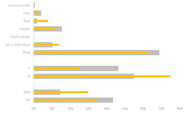
One thing I wanted to try this year was building bullet charts in Excel. We have some change in test scores to represent and I thought this would be a meaningful and compact way to represent the data.

As you likely know, there is no bullet chart option in Excel. Bummer. There is no shortage of workarounds on the web. Many people, who are far smarter than I, have posted tutorials. The one by Jon Peltier is, of course, the most thorough, but Stephanie Evergreen has written about her easy version and Jon Schwabish has offered another idea. They are all worthwhile to review and I thought about them a lot. I just had one problem. I was too lazy to work through all the steps.

Bill Gates has been attributed as saying that "I choose a lazy person to do a hard job. Because a lazy person will find an easy way to do it." And if that's true, then when it comes to building bullet charts, I must be the go to person. Because I found an even easier way to get them done in Excel.

Are you ready? Here's my secret: Make two charts that are the same size. Lay one on top of the other, ensuring that the fill on the top one has been set to transparent and change the gap width to make one set of bars skinnier than another. That's it. That's all you need.

No fancy finagling. Just one data set represented on the bottom and one on the top, as god Few intended.

You can change the widths of the bars, of course (might be better if I made the bottom ones a little wider..."Fat-bottomed bars you make the rockin' world go round..."). Need a third data point to show a target? Why not? Just make another chart with transparent fill and plop it on top of these. I won't tell you no.

Any cheats you've discovered as of late? What have I missed while I've had my nose stuck in the back end of Excel for the last several weeks?

Saturday, June 11, 2016

Eyeo 2016 Recap

I attended the Eyeo Festival this week. It brings together "creative coders, data designers, artists, and attendees." I have been wanting to go for a couple of years as a way to pull myself in a different direction. It's easy to get into a rut, or at least into a routine that doesn't allow you to ponder other possibilities. This was a very different conference from others that I've attended. Here, I came away feeling creative and inspired. At others, I've walked away with learning to apply. It's not that one outcome is better than another---they each have a role.

I am looking forward to the videos from the festival being posted. In the meantime, here are some of the highlights.

Emergence
Nicky Case kicked things off. His focus was on emergence, a concept where the sum is different from the parts. I can't say that he shared anything new in terms of his ideas, but what I liked was seeing a young adult share his process of learning that there is a lot of grey area in the world. I worked with teenagers for nearly 20 years, and the black/white worldview was pretty normal. It takes time and experience to learn that there are lots of answers to any question. As a young 20-something, Case is showcasing the transition to a more experienced lens on the world.

The keynote by Paola Antonelli, which was the next evening, shared an even more advanced take on this theme with her views on quantum design: "ambiguous states, in the spaces ‘in between’—between digital and physical, high-tech and crafts, old and new, nature and artifice, developed and emerging world." Beauty is not just in the eye of the beholder, meaning is derived from the eye of the observer.

Transformation
A second theme was about the transformative nature of data. Paolo Ciuccarelli of Density Design spoke about the poetics of data visualization. He pointed to the need to design data experiences that "generate poesis within a space of wonder."

from http://www.densitydesign.org/research/brain-houses-three-interieurs-stories/

One of my favourite ideas that he shared was this concept of a panorama, like the one shown above. I love the idea of embedding the data within a larger context. I highly recommend having a look at the Raw tool for generating visualizations.

Moritz Stefaner gave a talk on his Data Cuisine project. One of the things I liked most about this project was the idea that the dimensions of food (ingredients, presentation, cooking method, etc.) can be used to represent dimensions of data. This leads to a very different sort of interactive experience.

Transformation also appeared in how artists used materials in different ways. Whether it was Anouk Wipprecht combining her love of couture and robots or Tania Candiani speaking about the intersection of combination, serendipity and translation, I was blown away by the creative thought processes that were shared.


This is not the sort of end product I get at education conferences---where sharing one's thinking is not considered good enough. At those conferences, there is an expectation of audience involvement and tangible takeaways. With Eyeo, the feeling that is created through the presentation is the goal. I can't talk about this conference in terms what I learned, but rather, how it made me feel. This brings me to the last major theme.

Instruments of Power
There was a strong focus on equity at this conference, from the range of speakers, to topics, to the code of conduct. Part of that is an understanding of privilege as it applies to how we collect, use, and represent data.

Marek Tuszynski from the Tactical Technology Collective shared their recent exhibition: The View from the White Room. (E.g. looking out from an Apple store.) The show looked at questions such as What does it mean to live in a quantified society? and What is the value of data privacy when it becomes something you can buy? Lots of powerful things to think about from this session---I had to get out and take a walk after it. Part of the exhibit included something called Big Mama, based on the quote from a government official justifying surveillance that he did it because "I love you all." and the perception that the contribution of data leads to a harmonious society. Take a deeper look at Unfit-bits, Me and My Shadow, Security in a Box, and Exposing the Invisible. It is not that these concepts are new or unknown, but it's their application within our personal and professional contexts that make them worth revisiting.

As much as we talk about the power data visualization has to reveal, we rarely talk about how it can also be used to hide. In the best talk I saw, Josh Begley shaped conversation around what the work is that data visualization does. In one example, he talked about the geography of incarceration. As part of that, he made the comment that "most photos today are taken by machines for other machines to see." Satellites, drones, and other tools capture far more images than anything humans post to Instagram, Flickr, or other sites. Josh works on projects that bridge what machines are doing with what we notice. Do we want to be as connected to our foreign policy as we are to our phones? Check out his work on the Dronestream App or Officer Involved Shootings as ways to explore how the things we don't represent are still powerful enough to evoke emotion.

There were other presentations, keynotes, and sessions that I attended. There were also some I didn't get to attend due to having to get to the airport...including one I was looking forward to the most by Lynn Cherny. However, I enjoyed exploring a bit of Minneapolis, getting to meet several data viz heroes in person, and being able to think about some very different concepts for awhile. This spring has been a real drag in terms of work demands. I am looking forward to working on some new projects that are being spurred by this recent boost to my sense of creativity.

What have you seen recently that inspires you?

Sunday, April 10, 2016

Changing the Narrative

One presentation from the Tapestry Conference has kept me thinking long after the end of the event. It was a short story presented by Trina Chiasson, and explored the rise of the Data Selfie.


Trina talks about the importance of the user being able to see themselves within the data set. At minimum the data should support a personal goal or help solve a problem by revealing new insight. In this world, data become the jumping off point into a Choose Your Own Adventure style of story. I like this idea from the standpoint that part of audience engagement is a sense of personal relevance or connection with the data. 

One of the examples Chiasson gave was this interactive graphic from the New York Times that shows The Jobless Rate for People Like You.


There are tons of similar examples out on the interwebs---ones where if you fit the descriptors shown (male, female, white, black, Hispanic...), you get a chance to participate with the data and create that data selfie.

But what if you don't see yourself reflected in those descriptors? If I'm Asian, for example, I have to be content with "all other races." Beyond that, there's a lot of nuance missing. Does it matter if I have one college degree or three? It all counts the same.

What I think might be more disconcerting is what happens if you do see yourself in the data and don't like what you see. Using the NYT site shown above, if I'm a black male, the jobless rate is double the national average...but there isn't anything I can do about being a black male. I can't change that narrative. So then what?

I realize were talking about an example involving adults, but I can't help but think of the K - 12 world I live in. What if I did build something like this to show the graduation rate for people like you? I have the data. I know the demographics of our students and graduation rates. Not a big thing to put it together. But in posting it, what am I saying to the parents of black child in third grade? Your kid has  a 50-50 shot of making it to graduation in our district. What are the options to create a different story for him or her? Will it change before your son or daughter reaches high school? After all, dropping out is a process, not an event. Is it already too late to try? I can't imagine anyone would tell a child to just give up in third grade because data reveal that they're not going to get a diploma. But what is the takeaway for a child, parents, community, or teacher who sees just that in the data?

Sometimes, these aren't data selfies. They're system selfies. If the jobless rate for black males is twice the national average, that says something about us as a society...not those individuals. Ditto for my imaginary graduation rate display. It seems to me there is greater power in supporting individuals become critical consumers of their own data. Perhaps, as Chiasson suggests, it's tracking health or working toward a personal goal. But when we connect it to something larger ("People who lost 10 pounds also ate three carrot sticks a day!"), it stops being personal and projects a Fate you might not feel you are able to escape. Can we develop ways to effectively share data and use trends for insight without disenfranchising the most vulnerable among us? How do we balance the rise of the data selfie with the need for systemic change?

Sunday, March 13, 2016

Stories, Not Atoms

This is the 100th post for this blog, and while it has not always featured Excel, it has always tried to keep a focus on telling the best stories we can with data. I've been thinking about the future...how storytelling with data may evolve. The recent Tapestry Conference was just what I needed to spur me creatively and think about the next stories to tell.

I have a few conference posts to share in the coming weeks, but will wait to publish them until the videos are available. I hope that you will appreciate the presentations as much as I did for the diverse lenses represented and how presenters tell stories with their data. We all have our challenges with data quality, helping our peers and audience become more data literate, and the storytelling process. For now, I'd like to share my takeaways and next steps.


Continue Sketching
I draw very poorly. I haven't had an art class since elementary school, and I assure you that was many many years ago. But I find that when working with data, drawing things by hand is a critical part of the storytelling process. I keep a notebook and coloured pens with me nearly all the time. The notebook is a place to just dump ideas. I find myself jotting down various things while I'm in meetings, out for a bite to eat, or even on the plane home from the conference. Not all ideas make it into production, but having them captured in one place is extremely useful.

Thinking about how to display attendance

Catherine Madden and Nick Sousanis both spoke to the importance of recording and communicating with visuals. More on this in other posts, but if you're not using sketches to draft or sort through your data, I encourage you to try it. No one has to see these. They'll just be pleasantly amazed at the final product.


Be Open with Your Audience
This seems obvious, but the presenters at Tapestry put some new spin on the idea. Alan Smith spoke about supporting our peers in becoming competent critics, Enrico Bertini implored academics and practitioners to connect and collaborate, and Eva Galanes-Rosenbaum encouraged us to be transparent about the sources and quality of our data.

Photo by Ben Jones from Bertini's presentation; This slide has good advice for educators, too.
This sense of openness really does need to be mutual. It's one thing to tell an audience that your story is missing some data or is of dubious provenance...and it's another for the audience that you tell the story in specific ways. Scott Klein presented a nice timeline of how data visualization has developed as a journalistic endeavor. This includes educating readers on how to interpret a line chart. Jessica Hullman talked about the types of sequencing with visuals that readers prefer. These lessons are useful, but they are not the whole picture. As an audience, we have a responsibility to be open to new types of visuals and stories. We have to be willing to engage and grow.


Seek New Territory to Explore
I met a lot of people this week. Some I've only known from an online presence, others I would never have connected with had Tapestry not brought us together. It was good for me to get out of my little box that is normal life, but this also applies to the wide variety of boxes in which we work. Sousanis showed us how comics and graphic novels encourage narratives to bleed over the edges to create new directions. This message was a little at odds with Jessica Hullman's presentation on her research on how to generate the right sequence for stories, as well as Trina Chiasson's look into creating data selfies. We like things that are predictable...but we are creatures that like novelty, too.

The opening slide at Tapestry quoted Muriel Rukeyser: The universe is made of stories, not atoms. As I continue to think about this push-pull between staying safe in the universe we create and the need to explore beyond those borders, I've come up with an idea to try for next year. Maybe you'd like to play along, too.

I'd like to tell ten new stories about my school district next year---one for each month we have classes. It's convenient that we have ten schools, but I don't know that they have to based that way. Maybe there should be a month about attendance or early learning. The views of different stakeholders could be featured. Or perhaps something more Dear Data-like, capturing a month of meetings in the board room. I want to use a bulletin board in our district office for some offline data viz...as well as links to some online data to explore.

That's my ambition, anyway. I'm using my sketchbook to gather all kinds of ideas now and maybe this summer I can start putting the structure in place. By putting this goal out here...making it public...I hope you'll keep me honest and on target with it. And of course, you're more than welcome to do something similar in your own school.

So here's to the next 100 posts for this blog. There are lots of stories left to be told.

Wednesday, March 9, 2016

Go Tell It on the Mountain

I am stretching this week beyond the comfort and confines of my typical environment in P-12 public education. I'm at a convening of data storytellers from a large variety of industries. It's the first time I've been to a conference that is not specific to education.

About 100 of us are safely tucked away at the Stanley Hotel (you know, the one the inspired The Shining?) in Estes Park, Colorado, for the Tapestry Conference. As far as I know, I'm the only public ed person skulking around---although there are several higher education representatives. It is odd, for me, to meet and greet with people from Zillow, Comcast, ProPublica, or NBC News. Every face is new to me, although I finally met Robert Kosara and Naomi Robbins...both of whom I've been wanting to meet for a long time.  I love that everyone is passionate about the same goal of effective storytelling with data.

I have that interest and commitment to quality communications using data. But why else am I here? After all, I am definitely in the "one of these things is not like the others" category. I am here because public education needs to connect with everyone. It's public, for crying out loud. Everyone's tax dollars are funding it. Regardless of the industry you represent, there is a connection with public education. I hear all the time from educators who are tired of how others message our work. We can change that, but not by sticking to our own circles of influence and expecting the rest of the mountain to come to us. Sometimes, we have to go to the mountain.

Beyond this idea, however, is a more personal one for me: I need to learn and grow in my professional work. I get an opportunity to do that through education conferences---they help me learn about my job. But there is something beyond that...something that speaks to the purpose of what I do and feeds my spirit for it. That is what I am hoping Tapestry will be for me. This is not about the nuts and bolts of my day-to-day job. This is about helping me inspire and grow others when I return to the office.

Learning is my life's work. It is easy to lose focus on that with a sea of emails, ever-present to do lists, and a calendar full of meetings. It is critical for me to set all of that aside for a couple of days and just immerse myself in learning. Networking with others is great, too, and a change of scenery doesn't hurt. But most of all, this is an opportunity to just be in that moment of growing my knowledge base.

We are not so different, educators. We may have small-batch, artisanal data sets and handcraft our visualizations in Excel, but we face the same challenges as Big Data when it comes to data quality, effective communication, messaging, and design. We have the same issues around helping people ask good questions of their data and identifying the most critical aspects for action and attention. Perhaps we have a better chance of finding solutions together, rather than isolating ourselves as educators. Together, we can move mountains.

Sunday, March 6, 2016

Pretty Is As Pretty Does

I am often told that my work is pretty. I always find this to be a strange comment. I have to admit I've felt a little insulted by it at times. My goal is to communicate clearly using data...not make a pretty picture. No one talks about a sentence being pretty just because there's a capital at the beginning and a punctuation mark at the end. Why should it be any different for a visual that follows some basic rules of the road?

I've been thinking about this push and pull between what the story is in our data and how the story is presented because I will be heading out to the Tapestry Conference this week. The purpose of the conference is to "advance interactive online data storytelling [by bringing] different viewpoints together with the goal of generating a rich conversation about data storytelling."

What is the role of pretty data in such a conversation?

Is it an unnecessary add-on? Could we communicate with data just as effectively without paying attention to the finer points of layout, colour, and line? After all, the data visualization is not the end goal---it's what we do with what we see in it. Meanwhile, it is possible to have aesthetic and no meaning at all. Chad Hagen illustrates this with his nonsensical infographics.


We could also point to examples that look great, have real data that tell a story, but still don't mean anything. For example, Tyler Vigen's Spurious Correlations.


At the other end of the spectrum are arguments that the art of data must be present in order to create meaning. Both Giorgia Lupi in Beautiful Reasons and Moritz Stefaner in Little Boxes make the case that form and function, as well as art and design, are integral to deep understanding of our data.

I am learning to smile and say "thank you" when people tell me the data I show them are pretty. I am learning that the meaning behind the comment is one that can refer to clarity or deep understanding. I am hoping that the audience makes enough sense of things to see that pretty is as pretty does.

Thursday, February 25, 2016

Making Sense

Earlier this week, I had an opportunity to share three sets of data with building administrators. You've had a preview of some of the visuals: a new way to represent the achievement gap, cluster charts, and small multiples. The administrators had not, although I have shared lots of data in lots of other ways with them. This was our opportunity for some in-depth work.

With each round of data presented, I did a little bit of instruction so that they understood how to read the charts. Each table had some paper copies and a few focusing questions to get the conversation rolling. And then the real fun began.

I have never had a chance to watch people learn with new-to-them data representations. Bar charts, line charts, and scatter plots are commonplace. When you share these types of visuals, everyone already knows the drill. But hand people sheets with small multiples and a few of them will overlay the pages and hold them up to the light. Give them a set of line plots showing gaps among student groups, and they will spread them across the table to organize the pieces in different patterns. Hand over some cluster charts and watch and people fold the paper along various lines to build new learning.

It was absolutely fascinating.

As a way to gauge their engagement with the new charts, I tried the Talking Mats which were recently shared by Andy Kirk.


I provided three different colors of sticky dots, one with each round of data, and asked the administrators to place their dot when we transitioned to the next part of the workshop. In addition to watching them interact with the data---which was very powerful learning for me---the Talking Mats provided valuable feedback at the end. These are visuals for me, created by the audience, which have told me a lot about which charts gave the biggest bang for the buck. I'll know where to focus my time and work in the future.

A few people struggled with looking at the forest of data represented by small multiples, instead of the trees. Some made connections across the data sets. Still others wanted to argue with data because they were unnerved by what they were seeing for the first time. By the end, though, there was a very rich conversation about the meaning we'd been able to make from all of the data.

For the first time since I started this job, I had many public compliments about the work I shared. My favourite has been "Thanks for presenting data in a way that helps me learn." Here's to more opportunities to use Excel to support us in making sense of things.

Friday, February 12, 2016

Living Large with Small Multiples

In the poem Song of Myself, Walt Whitman writes "Do I contradict myself? Very well then, I contradict myself. I am large, I contain multiples." And while Excel might not be considered to be as sexy as Whitman's prose, they do have some things in common. They both can contain multiples.

Small multiples use a series of similarly scaled charts. The purpose is to allow for easy comparison across time or groups. When you use these charts, you are looking at the forest and not necessarily the trees. You don't want to focus on details as much as you search for larger patterns to investigate.

I built the example below this week. It's a series of scatter plots. Each tiny blue dot is a student, and their positions on the charts represent the point where their percent attendance and scale score on the state assessment intersect. An orange line shows the linear regression for the data set in the chart. The line tells us a couple of things. It provides a quick visual on the range, as well as the basic trend.

What kinds of things do we notice? Maybe it's how students who score in Level 1, regardless of grade level, don't have much of a discernible pattern. Level 3 students tend to clump---their rates of attendance and scores are very similar to one another. Maybe we have a conversation about those areas where the line slopes downward. How do we explain a trend where the more you come to school, the worse your do on the assessment? Or maybe even the overall picture isn't what we might predict. Even those trend lines that have an upward slope aren't very steep. Wouldn't we think that better attendance leads to better scores? And maybe we need to talk about what's happening when kids get to sixth grade and attendance starts to get a lot more worse for students at all score levels.

Because you likely can't read the itty-bitty labels, I will confess that I have broken a cardinal rule when building this: the y-axes are scaled identically for each grade level, but not among all the grade levels. Percent attendance is plotted along the x-axis and is the same for all of the charts. But the range for scores changes. The higher the grade level, the higher the possible score. I've tried to mitigate this by keeping the y for each grade at about 400 points. If I'd had to make in the entire score range identical for all grade levels, the information represented was too squeezed to make sense of things.

There are thousands of students represented on this single graphic. While focusing on an individual is critical to the daily work of the classroom, small multiples serve a different purpose. This time, it's about the herd.

What will school principals see when I show this to them in a couple of weeks? I'm not sure. I'll have to provide a little support in learning to read it, but I think they'll catch on quickly enough. The chart will be part of a larger conversation around student performance...one piece of a puzzle where they will apply context. As for me, I've enjoyed looking at this because I see something different every time.

Are you using small multiples in your work? How have they been useful?

Bonus Round
To build this, I organized the necessary data and then used a pivot table and slicers to pull attendance and scale scores by grade and score level. Dynamic ranges were used for the charts, allowing for expansion/contraction of the number of data points.

Each chart was pasted into PowerPoint. This allowed me to size and position all of the charts and labels, as well as easily share the document.

Sunday, January 24, 2016

Ethical Communications Using Data

Much of the data we collect as educators is subject to various federal, state, or local regulations about who can see the data and for what purposes. These ethical considerations most often apply to data points that connect with an individual or very small groups. Once aggregated, we tend to slide into our own version of ethics. We make decisions about how the data are presented and annotated. We choose the stories, the focus points, and even the audiences we share with. What are the questions we should be asking ourselves as we make these choices?

A recent forum on Responsible Data Use generated some categories and avenues of inquiry around this topic. I've read through the summary several times now, and with each glance through the list, I find new things that I'd like to discuss. Here are a few that catch my eye:

Communicating uncertainty
  • How do we communicate uncertainty in data?
  • In metadata?
  • How do we represent gaps in the data?
  • What if our knowledge of the uncertainty in the data is anecdotal?
  • How can visuals show “no answer”?
  • How can data visualization promote ambiguity?
Literacy
  • How do we improve everyone’s data visualization literacy, as creators and as viewers?
  • How do we educate people about the data they create?
  • Which people most need data literacy?
  • Can we provide interactive tools that let viewers adjust data visualizations in real time as a means of improving literacy?
  • How can we support grassroots groups to create better data visualization?
  • Is there a need for basic design principles and data viz 101 resources?
  • How do we navigate a fear of numbers?
BAD data viz
  • Is meaningless data visualization worth anything?
  • What about when people make decisions based on bad data viz?
  • If raw data is unrepresentative, will visualizations on it be bad?
  • We should collect examples of unethical data visualization.
Audience
  • How do we involve the audience?
  • Who is the audience, and why?
  • How do we create community ownership of a data viz?
  • How do we allow a data viz to speak to multiple disparate audiences?

Some of these questions are easier to answer than others---we can think of a few ways to represent a lack of data. Others, like those in the "BAD data viz" group, are not so simple, but would be fun to kick around and see where we get. What would be your priorities in your workplace?

The summary with all of the categories and questions also has links to a variety of resources and notes connected with the forum. They are well worth exploring, if you have a few moments.

Sunday, January 17, 2016

New Frontiers

I have probably shared this before, but this tweet from Hilary Mason is something I think a lot about:

https://twitter.com/hmason/status/488382950128754688

Within my own work, I continue to raise conversations about equity. How will students and teachers be empowered by the data we collect and review? How do we provide opportunity for marginalized voices to be heard? How do we elevate their needs and concerns?

I am starting to collect resources around both equity in data visualization. Here are a few that you might be interested in, too:


In other news, I have been working on a little behind the scenes cleanup on this site. I've refreshed the information on the various pages, as well as the front page side bar. I also recently purged my Delicious site, deleting dead or irrelevant links and reorganizing the remaining ones. If you're searching for Excel info, research, tools, or anything else related to data viz (including equity), please head over to that site. There, you can sort links by a variety of tags.

I'm heading to the Tapestry Conference and Eyeo Festival this year. I am feeling the need to stretch and grow beyond the field of education. I do my best to connect with others in a digital space to learn about how they are using data, but I would like to do some in-person networking, as well. Will any other readers be at either of these events?