Can we talk?
I have an unabashed love for Excel, but the charts it produces are butt-ugly. And I've seen all too many data presentations where the presenter exhibited this effluence as the prize cabbage from the state fair.
But no more. Enough is enough. Excel might hand you lemons, but you can bring the Patrón and salt and celebrate your data in style. It doesn't take very many clicks to make an Excel chart sparkle. You can do it in less time than it will take you to read this post.
Let's start here with a simple data set from the five largest school districts in Washington. All of the data shown, except for the made-up Spokane numbers, are from here.
Now, we have Excel make a line graph for us, so we can visualize the change in scores. And this, my friends, is what the cat drags in:
This is embarrassing. We have different colours of lines, but do the colours really mean anything? The labels and axes are funky. And the (fictional) story of what is happening in Spokane is hidden. Let's take care of the simple stuff first. I want my grid and axis lines, but they don't need to be so prominent. Use the Layout Tab (or right click on the chart) to activate menus for the axes and grid.
Change the color to the lightest shade of grey and set the "outside tickmarks" to none. Now we're starting to make some progress. Now, the lines in the graph stand out and are easier to read:
Next up, let's do something about the labels. I really don't need them bold. You can play with the font size and style if you like, but don't make it the focus of the graphic.
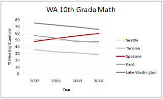
Finally, we need to change the colours of the lines. If you're doing presentations for a school or district, you can always work with their colour scheme. If not, and there is a particular data set to show off, then use red for that one and grey out the others.
In this example, I've ordered the shades of grey according to the legend on the right of the graph. Compare this version with what we've started with. In under a minute, we've gone from drab to fab. Now, data designers, get out there and make it work.
Bonus Round: If you don't like the fact that the red line data is in front of some data, but behind others, you can easily bring it to the front by reordering the data set so that the data for the red line is listed last. Excel will layer the lines such that the bottom of the row of data is the top line in the chart.


No comments:
Post a Comment