Showing posts with label stats. Show all posts

Sunday, June 17, 2012

As If!

"And then he asked if I wanted to see his spreadsheet..."
In previous posts, we've looked at IF statements. We've used COUNTIF and IFERROR. But there are even more variations of IF hidden within Excel. (Did you know that you can even "What If?" with it?)

The IF clan helps you choose and play through different kinds of scenarios. So, let's pull up our workbook for basic statistics again (review it here; download it here) and give our IFs a workout. You don't have to be clueless any longer.

Since you're already familiar with COUNTIF, let's start with its brother, COUNTIFS: a way to count something based on multiple criteria. If you recall, we have a spreadsheet that has a list of students from two schools, along with their scores and achievement levels for tests in reading, writing, and 'rithematic.

Suppose you need to know how many students at School A scored in Level 2 of the Reading and Writing tests so you can set up some tutoring. If it was just one condition (e.g., how many students scored in Level 2 of Reading), COUNTIF would work just fine. But to get a number of students that satisfy both cases, we need to call in reinforcements. Notice that we need three columns of data: A (name of school), D (reading level), and F, (writing level). We also need three different identifiers: "A" for the school, and 2 for the reading and writing levels. We have data in rows 2 - 517 to count. To use COUNTIFS, find an empty cell and add =COUNTIFS(A2:A517,"A",D2:D517,2,F2:F517,2). Our answer? 32.

We can also make use of AVERAGEIF and AVERAGEIFS. If I just need to know the average score of the students meeting the math standards (levels 3 and 4), I can ask Excel to AVERAGEIF(G2:G517,">400"). But, if I want to find out the average score at School B on the math test, I need to AVERAGEIFS(G2:G517,A2:A517,"B"). We can add more conditions, too.

Why would you do that? As if!
And finally, there is SUMIF and SUMIFS. While there is not a good application of these formulas with the current data set, let's pretend for a moment. Whatever. Suppose we want to compare the total scores for reading, writing, and math for each school. To find the total number of points for Reading at the A school, for example, we can use SUMIF: =SUMIF(A2:A517,"A",C2:C517). But if I want to only find the total score points for students in Reading at School A if they scored at least 17 points on the Writing test, I can add conditions using SUMIFS:  =SUMIFS(C2:C517,A2:A517,"A",E2:E517,">17").

So, add these IFs to your Excel rotation. If you're having trouble keeping them straight, just remember the "IFS" versions---they will still work with only one condition, just like the versions that end in "IF."

Sunday, June 3, 2012

Rebuild, Reuse, Recycle

As part of an upcoming workshop, I've been rebuilding a spreadsheet developed by someone else to use as a communication tool. The good news is that I was handed most of the necessary formulas. The bad news was that I needed to completely start from scratch with the design, and I still had a lot to learn along the way. This spreadsheet was like Steve Austin, even if it wasn't a $6M spreadsheet.


Here was my to do list:
  • How do you get Excel to display ordinal numbers?
  • Can you make something that looks like a number line...and add dynamic data to it?
  • How do you display a normal curve...and add dynamic data to it?
Fortunately, between Google, YouTube, and Twitter, I was able to make short work of this list. Here is how everything is coming together. This is very much a work in progress---so if you have ideas to help make this awesome, I'd love to hear them.

The goal here is to allow a user to input a value for Effect Size and see how that relates to a variety of other measures: an Improvement Index, the standard deviation, and variance.


Below the space for input, I have set up the space for the other measures.

Before we talk nuts and bolts, I want to talk a little about design here. This is a tool that will be handed off for others to use---and has to enable them to communicate with their own stakeholders. Whatever gets placed in the workbook has to be both rich in meaning and self-explanatory. I want a very simple layout and colour scheme to help direct the eye. I also want to be sure that even if someone is not comfortable with statistics that they could still gain some insight from the graphics. The baseline information in the sheet remains grey; values turn green. This is what a user would see if the effect size is .4:


So far, I like it. I'm wondering about adding some conditional formatting to indicate the strength of an effect. In other words, is an r value of .2 "good"? It may be too much to put here, but it would be great to have a way to help people compare or evaluate what they see. For example, in the education world, an effect size of .4 is the average. Anything below that still represents something effective, but if you're looking to make a big impact in the classroom, perhaps that particular strategy might not be the best. Is this important to add? What about other explanations/resources?


Okay, so let's take a bionic jump into the nuts and bolts and the questions I had above. The first one, about ordinal numbers, came from developing the text shown on the right. The sentence you see is based on a formula: some text in quotes, the "&" symbol, and cells with the dynamic values (in this example, 66% and 66th). But Excel has no function for displaying ordinal versions of numbers. So, how do you tell Excel when to use st, nd, rd, or th at the end of a number?

According to Teh Googles, you use this formula =A1&MID("thstndrdth",MIN(9,2*RIGHT(A1)*(MOD(A1-11,100)>2)+1),2), where "A1" equals the cell with the number you want to add the ordinal ranking to. I grabbed the formula from here, and the post also includes an awesome explanation of why it works. In my spreadsheet, I used three cells for this. The first was for the actual calculation using the NORM.DIST function (=NORM.DIST(EffectSize,0,1,TRUE). Even though I can choose to display the results of that cell using two digits, Excel is sneaky and remembers the whole string. So, as an intermediate step, I had Excel take the contents of the cell and change it into text =TEXT((D2*100),"0"). Now it can't use a long trailing decimal. Take that! I used the contents of this cell for the ordinal formula.

A magic button to insert a normal distribution is missing, too. Are we or are we not living in the 21st century? No flying cars. No "normal" chart in Excel. WTH? My kludge, in this case, was taken from a YouTube video and workbook that I grabbed information from ExcelIsFun. I copied values from the workbook and created a basic area graph. For the dynamic green region, I used the following formula =IF(H3<=Variance,I3,""), where "H3" was the cell with the value for the x-axis of the graph (I had to make all values positive) and I3 had the value I copied from the workbook---the one matching the grey graph. This creates a very narrow range of data points around 0 standard deviations, which are then added to the graph.

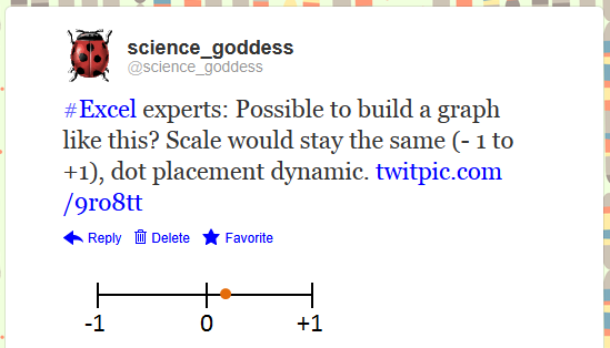
The answer for the final piece, the line-type graph for variance, came from a Twitter shout-out.
https://twitter.com/science_goddess/status/208628563790925826
I drew what I wanted, attached it to the tweet, and crossed my fingers for brilliant ideas to head my way. Here are the two I received:

https://twitter.com/BlaskEric/status/208635776714543104
https://twitter.com/Jon_Peltier/status/208748764951875585
I ended up deciding to just have the scale go from 0 to +1. There are negative correlations, but with the formula I was using from the original spreadsheet, there was no possibility of ending up with a negative result.

This has been a great small project to work on. It's also been a reminder that you don't have to know everything about Excel to get where you want to go. There's lots of help available from those who have previously solved problems. Makes it easy to rebuild, reuse, recycle the worksheets you have.

We can rebuild our workbooks. We have the technology. We have the capability to make the world's best spreadsheet. Our workbook will have that spreadsheet. Better than it was before. Better...stronger...faster...


Bonus Round
If you want to play around with the workbook, you can download it here. The final version will be made available at a workshop in two weeks, so if you have any feedback or improvements to suggest, get on it.

Sounds from the Bionic Woman and Six Million Dollar Man from here.

Sunday, May 27, 2012

Statistically Speaking with Excel: Basic Descriptive Stats

If you want to do some heavy statistical analysis, there are better programs than Excel for doing so. But, let's say that you aren't into #bigdata and just want to do some small scale divination. Excel can totally be your bff for that.

Educators are most familiar with descriptive statistics: the ways we describe a set of data. What is the shape of the distribution of values? Where is the "middle"? What can we say about the population of values and their relationship to one another?

I have pulled a new data set to play with...one with test scores for about 500 students. While you can do statistical analysis with your gradebook---and let's face it, most teachers do in terms of how they assign final grades for students---I am a little squeamish about doing so. There may be no magic number that applies to every sample size, but I want us to play with something we can have a little more confidence in than the basic gradebook I've posted here. You can download the test scores workbook here.

This is the basic set up:


I have divided the data set into two schools: A and B. Each student is identified by their first name, and in some cases, a last initial. There is a raw score for reading, writing, and math, as well as a level of performance (1, 2, 3, 4). The range of score points for each level plays out like this:

You may look at this and wonder about what appears to be missing points (Why can't anyone get a 399 on the reading or math test?!) and why writing has a different scale. There are reasons...good ones...but I'm not going to get into them at the moment. These data do come from (old) state test results: first names of students are unchanged, but I did fill in some missing scores. We're going to play along with the rules that were originally applied to determine the scores. So, do your best to overlook the oddities of these scales for now. For these tests, a score in Level 3 would mean a student can meet the standard (Level 4 = exceeds, Levels 1 and 2 = below standard).

Let's start with measures of central tendency (mean, median, and mode) for our reading data (C2: C517). For the mean, Excel uses the AVERAGE function...for median, oddly enough, we can use MEDIAN...and for the mode, it depends on which version of Excel you have. In olden versions, the MODE function worked just fine, but starting with 2010, you have choices. To just get "the" mode, use the MODE.SINGL function. To get multiple modes from an array of data, you can use the MODE.MULT function---a very handy improvement. Not every data set is bell-shaped. So, here is what we have for the reading scores. I placed the formulas in the table on the right so you can see the syntax.

What does this mean? Well, first of all, our mean, median, and mode are all about the same. It's not necessary for your measures of central tendency to agree. After all, each one is a different way to identify the "middle." It's up to you to determine which is most appropriate. However, in this example, no matter which one you choose, you'll be fine.

If you want to graph this data set, it's not so friendly in its current form. We'd be better off building a frequency table first. This will allow us to find out how many students are in each category, then create a graph to visualize the distribution. To keep things simple, let's find out how many students scored in each level for the reading test. Build a simple table first, then select the empty cells:

Now you're ready to add your formula---a single formula ("array formula") which will fill all the cells at once. Then belly on up to the formula bar (too bad you can't pull a beer from here) and start entering the formula:

The "data_array" will be the column of data (not including the header) with the data about reading levels. The "bins_array" refers to the cells that have the labels for the reading levels---in this example, the 1, 2, 3, 4 you see in to the left of the cells selected in the table above. The final formula looks like this (plus a close parenthesis at the end):


When you've finished entering this information, you need to use a command to fill in all of the cells in the table. Plain old ENTER will not work. You have to use CONTROL + SHIFT + ENTER. And poof! We now have a frequency table:


If this scares you, you can use a simple COUNT function in each cell, but hey, you're ready to use big kid functions. Give FREQUENCY a try. Use the filters in Excel and compare School A with School B.

This is a good spot to stop for today, but we'll come back to this data set another day to see other descriptive statistics in Excel...and then move on to inferential analysis.

Bonus Round
Did you know that Excel has a whole category of statistics functions? Get in there and play!