Monday, November 12, 2012

The Exhausted, The Design-minded, The Few

Last month, I had the privilege of spending three days at a workshop by Stephen Few. I had a five-hour commute each day to the workshop, which made for a very long week, but I'm grateful I made the effort.

It was quite a contrast with the Tufte experience. Instead of a room of 600, I found a room of 60. This led to a lot more interaction between participants and with the presenter, something I appreciated. One of the biggest differences between Tufte and Few is their purpose in talking about design. Tufte is much more academic and esoteric---design as more form than function, in some ways. But Few, like most of us, recognizes that while it's all well and good to talk about what design should be, at some point, we have to get practical about things. This is his purpose in writing and presenting.

Another contrast between the two gurus is how they view the audience. Tufte's reflects his Ivory Tower existence, with a basic premise that you present the data and the audience decides how they want to evaluate and use it. Interactivity is great, I think, but most of the people I work with are not data literate. And judging from the conversation I had with several others at the Few workshop, their co-workers and audience are no better with data. Few's view of the interaction between designer and audience is that the designer should listen to what the audience needs/wants---and give that to them in a way selected by the designer that is the best format for the data. I find this to be a much more practical approach.

Organization
Each morning started with a "pop quiz"---a series of questions about the upcoming ideas for the day. I thought this was a great way to get things going, not just from a management perspective (latecomers didn't interrupt the presentation), but as a teaching strategy. I wish he'd set aside time at the end of the day for everyone to review their answers. Not doing so misses a fabulous opportunity for people to reflect on what they'd learned throughout the day.

Most of the day was a traditional lecture format, with a one-time small group assignment included. I would have liked him to break up the lecture with a few pauses for people to have some partner talk about ideas. There was a lot of material to process along the way. I have no beef that all of the examples were business focused---the workshops were targeted for that walk of life, and I am but a humble educator. But not everyone works with profits and losses. The principles of good data design may apply across the board, but not everyone's roles are the same. If we really want to make changes in the way we use data to communicate, there needs to be opportunity to think about how to apply new learning.

Lessons Learned 
He didn't share anything that you couldn't learn from reading his books, which was my only real disappointment. Not to say that his ideas about data design aren't worth a second (or third) tour through the material, but I believe that presenters should use "live" opportunities to extend their thinking. If we're there, we've probably read the material---help us take the next step.

All that being said, this was a worthwhile opportunity to learn---my quibbles are more about the way things were said than what was said. I would recommend the workshop to anyone interested in the basics of data design. Here are a few of my takeaways:
  • I liked that nearly all of his examples were built in Excel. As he pointed out, Excel is not a design tool; however, it is a data tool that nearly everyone has...and if you can make something look good with Excel, then you have no reason not to make your data shine elsewhere.
  • For Few, what makes a dashboard unique (vs. other reporting tools), is it's purpose: monitoring. It should allow the audience to scan the big picture, zoom in on specifics, and link to supporting details. He really pushes the idea that there should be no scrolling---the dashboard should fit a single screen---but in a time where you can't guarantee which device will be used to view the data, I don't know that you can make no-scroll a "must." The best you can do is limit it by being thoughtful about what you present.
  • Details matter. I think this is the one piece that is most misunderstood by most people. The colors you choose, the lines you use, the way your organize content should be just as agonized over as the data quality going in and the questions you draw out. Typically, this piece is tossed aside. If it wasn't, there would be so many crappy visualizations out there.
I'll share a bit more in the next two posts. Come back for a look at Few's most recent design contest (with a classroom focus) and my take on one of the visuals presented.

Bonus Round
Hadn't seen this clip from The Onion before...but it was the very first thing shared at the workshop. Thought you might enjoy it, too.

Friday, October 19, 2012

A Voice from the Wilderness and the Tufte Course

Even if I don't have much to show here over the last few months, it's been a busy time of things with data viz and Excel for me. Time to catch up, don't you think?

I want to start with July, when I had the opportunity to attend a workshop by Edward Tufte---the godfather of data visualization. Business types probably don't blink at a $380 fee for a one-day course, but for someone who works in education, I was a bit worried about the cost. I looked around online for reviews of his presentations. Surely someone had attended one and blogged about it, right? But my Google Fu was weak and I didn't find one. Robert Kosara (a/k/a Eager Eyes) attended the same day I did and has posted an excellent review. I agree with many of his observations, but I also have a few notes of my own to share.

I didn't expect to be in a room with 600 people. (You don't have to bust out your spreadsheet to immediately understand that Tufte is making some serious bank with these tours.) A room this size makes the presenter more remote in some ways---you know there is no hope of any sort of personal connection. This made it all the more interesting that Tufte started the day with a little speech about how presentation is a moral act and his philosophy as a presenter. I kinda liked this idea. For years, I included my philosophy of grading as part of a syllabus, but I admit that I never really talked with students about how I see my role as a teacher (or how they saw themselves as learners...let alone how we viewed one another). While he spoke, this video played on the screen:


A lovely visual to start the day.

The rest of the day was organized around various pieces of text from his books and other videos. Tufte is very anti-presentation software...and while he called out PowerPoint in particular, there was nothing in his comments that wouldn't have applied to Keynote or Prezi. His rejection was not so much about its misuse/abuse, but rather that paper is superior because it has a higher resolution than a screen and you can include more information in a smaller space. I agree---but I also think there is room for both. They have different purposes for communication.

One of the points Tufte made throughout the day is that the onus of understanding is on the viewer. I think this is an intriguing philosophy...one that seems at odds with one of the primary purposes of data visualization. I understand the reason behind making visualizations interactive and engaging for the audience, but unless you are certain about the level of data literacy they have, leaving interpretation completely open is asking for problems.

I was disappointed in a few parts of the "workshop." One was a 30-minute commercial for his other pursuits just before lunch and another was a 45-minute discussion of big data after lunch. I felt like the former was uncalled for (dude, you already have our money) and the second seemed out of place and a bit misguided (again, assuming that the audience for data is literate about research methodology and data in general).

Am I glad I went to the workshop? Yes---not so much for the information given, but because hearing from the original person about their own ideas provides a context you can't get anywhere else. Doesn't mean I liked or agreed with everything I heard, just that my understanding has been fleshed out. Would I go again? Probably not. Presentation quality was not good and nothing new was brought to the table. Perhaps he doesn't think he owes his audience the effort---people will buy his stuff and elevate his work regardless of what he does in a workshop. But I find that disappointing.

This experience didn't stop me from going to see another guru a couple of weeks ago: Stephen Few. More on that to come.

Sunday, June 17, 2012

As If!

"And then he asked if I wanted to see his spreadsheet..."
In previous posts, we've looked at IF statements. We've used COUNTIF and IFERROR. But there are even more variations of IF hidden within Excel. (Did you know that you can even "What If?" with it?)

The IF clan helps you choose and play through different kinds of scenarios. So, let's pull up our workbook for basic statistics again (review it here; download it here) and give our IFs a workout. You don't have to be clueless any longer.

Since you're already familiar with COUNTIF, let's start with its brother, COUNTIFS: a way to count something based on multiple criteria. If you recall, we have a spreadsheet that has a list of students from two schools, along with their scores and achievement levels for tests in reading, writing, and 'rithematic.

Suppose you need to know how many students at School A scored in Level 2 of the Reading and Writing tests so you can set up some tutoring. If it was just one condition (e.g., how many students scored in Level 2 of Reading), COUNTIF would work just fine. But to get a number of students that satisfy both cases, we need to call in reinforcements. Notice that we need three columns of data: A (name of school), D (reading level), and F, (writing level). We also need three different identifiers: "A" for the school, and 2 for the reading and writing levels. We have data in rows 2 - 517 to count. To use COUNTIFS, find an empty cell and add =COUNTIFS(A2:A517,"A",D2:D517,2,F2:F517,2). Our answer? 32.

We can also make use of AVERAGEIF and AVERAGEIFS. If I just need to know the average score of the students meeting the math standards (levels 3 and 4), I can ask Excel to AVERAGEIF(G2:G517,">400"). But, if I want to find out the average score at School B on the math test, I need to AVERAGEIFS(G2:G517,A2:A517,"B"). We can add more conditions, too.

Why would you do that? As if!
And finally, there is SUMIF and SUMIFS. While there is not a good application of these formulas with the current data set, let's pretend for a moment. Whatever. Suppose we want to compare the total scores for reading, writing, and math for each school. To find the total number of points for Reading at the A school, for example, we can use SUMIF: =SUMIF(A2:A517,"A",C2:C517). But if I want to only find the total score points for students in Reading at School A if they scored at least 17 points on the Writing test, I can add conditions using SUMIFS:  =SUMIFS(C2:C517,A2:A517,"A",E2:E517,">17").

So, add these IFs to your Excel rotation. If you're having trouble keeping them straight, just remember the "IFS" versions---they will still work with only one condition, just like the versions that end in "IF."

Sunday, June 3, 2012

Rebuild, Reuse, Recycle

As part of an upcoming workshop, I've been rebuilding a spreadsheet developed by someone else to use as a communication tool. The good news is that I was handed most of the necessary formulas. The bad news was that I needed to completely start from scratch with the design, and I still had a lot to learn along the way. This spreadsheet was like Steve Austin, even if it wasn't a $6M spreadsheet.


Here was my to do list:
  • How do you get Excel to display ordinal numbers?
  • Can you make something that looks like a number line...and add dynamic data to it?
  • How do you display a normal curve...and add dynamic data to it?
Fortunately, between Google, YouTube, and Twitter, I was able to make short work of this list. Here is how everything is coming together. This is very much a work in progress---so if you have ideas to help make this awesome, I'd love to hear them.

The goal here is to allow a user to input a value for Effect Size and see how that relates to a variety of other measures: an Improvement Index, the standard deviation, and variance.


Below the space for input, I have set up the space for the other measures.

Before we talk nuts and bolts, I want to talk a little about design here. This is a tool that will be handed off for others to use---and has to enable them to communicate with their own stakeholders. Whatever gets placed in the workbook has to be both rich in meaning and self-explanatory. I want a very simple layout and colour scheme to help direct the eye. I also want to be sure that even if someone is not comfortable with statistics that they could still gain some insight from the graphics. The baseline information in the sheet remains grey; values turn green. This is what a user would see if the effect size is .4:


So far, I like it. I'm wondering about adding some conditional formatting to indicate the strength of an effect. In other words, is an r value of .2 "good"? It may be too much to put here, but it would be great to have a way to help people compare or evaluate what they see. For example, in the education world, an effect size of .4 is the average. Anything below that still represents something effective, but if you're looking to make a big impact in the classroom, perhaps that particular strategy might not be the best. Is this important to add? What about other explanations/resources?


Okay, so let's take a bionic jump into the nuts and bolts and the questions I had above. The first one, about ordinal numbers, came from developing the text shown on the right. The sentence you see is based on a formula: some text in quotes, the "&" symbol, and cells with the dynamic values (in this example, 66% and 66th). But Excel has no function for displaying ordinal versions of numbers. So, how do you tell Excel when to use st, nd, rd, or th at the end of a number?

According to Teh Googles, you use this formula =A1&MID("thstndrdth",MIN(9,2*RIGHT(A1)*(MOD(A1-11,100)>2)+1),2), where "A1" equals the cell with the number you want to add the ordinal ranking to. I grabbed the formula from here, and the post also includes an awesome explanation of why it works. In my spreadsheet, I used three cells for this. The first was for the actual calculation using the NORM.DIST function (=NORM.DIST(EffectSize,0,1,TRUE). Even though I can choose to display the results of that cell using two digits, Excel is sneaky and remembers the whole string. So, as an intermediate step, I had Excel take the contents of the cell and change it into text =TEXT((D2*100),"0"). Now it can't use a long trailing decimal. Take that! I used the contents of this cell for the ordinal formula.

A magic button to insert a normal distribution is missing, too. Are we or are we not living in the 21st century? No flying cars. No "normal" chart in Excel. WTH? My kludge, in this case, was taken from a YouTube video and workbook that I grabbed information from ExcelIsFun. I copied values from the workbook and created a basic area graph. For the dynamic green region, I used the following formula =IF(H3<=Variance,I3,""), where "H3" was the cell with the value for the x-axis of the graph (I had to make all values positive) and I3 had the value I copied from the workbook---the one matching the grey graph. This creates a very narrow range of data points around 0 standard deviations, which are then added to the graph.

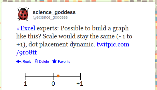
The answer for the final piece, the line-type graph for variance, came from a Twitter shout-out.
https://twitter.com/science_goddess/status/208628563790925826
I drew what I wanted, attached it to the tweet, and crossed my fingers for brilliant ideas to head my way. Here are the two I received:

https://twitter.com/BlaskEric/status/208635776714543104
https://twitter.com/Jon_Peltier/status/208748764951875585
I ended up deciding to just have the scale go from 0 to +1. There are negative correlations, but with the formula I was using from the original spreadsheet, there was no possibility of ending up with a negative result.

This has been a great small project to work on. It's also been a reminder that you don't have to know everything about Excel to get where you want to go. There's lots of help available from those who have previously solved problems. Makes it easy to rebuild, reuse, recycle the worksheets you have.

We can rebuild our workbooks. We have the technology. We have the capability to make the world's best spreadsheet. Our workbook will have that spreadsheet. Better than it was before. Better...stronger...faster...


Bonus Round
If you want to play around with the workbook, you can download it here. The final version will be made available at a workshop in two weeks, so if you have any feedback or improvements to suggest, get on it.

Sounds from the Bionic Woman and Six Million Dollar Man from here.

Wednesday, May 30, 2012

Housekeeping

In a fit of spring cleaning, I've reorganized some content for this blog. If you're viewing this post via RSS, you won't notice a thing. For visitors to the site, you will notice some updates.

Pages


I have created three new pages, all with their own permalinks. Depending upon the content of future posts (stats? add-ins?), I may add more pages. I do plan to take advantage of the more dynamic nature of the pages to update content.

All of the posts about building and using a gradebook in Excel are now in one place. Sure, you can use the gradebook tag on any of those posts to see all of them, but the new page houses things chronologically and with some additional text to help guide users. I've also moved the various resources off the sidebar and built a page just for Books and Links.  Finally, I've deleted the blogger profile info from the sidebar and built an About page with a statement about the blog, my contact info, and some backstory.


Blogroll

I've refreshed the blogroll with some great new reads. I hope that you'll check them out:
  • chartsnthings is the (personal) blog of data sketches from the New York Times graphics department. I love the metacognitive aspect of this blog---a peek into the thinking of designers as they build visualizations.
  • "Data Remixed is a blog dedicated to exploring data and sharing insights in an engaging way."
  • Visit Tableau's Viz of the Day for a variety of visuals built by users like you. 

Subscriptions

I've added to the choices you have for getting information from and about this blog. You can still use RSS, but now you can use the buttons on the sidebar to follow me on Twitter, add this blog to your Facebook feed, or add my YouTube channel. Just click and go!

If you have additional suggestions to make the site easier to navigate or links/tools/resources that should be included, let me know.

Sunday, May 27, 2012

Statistically Speaking with Excel: Basic Descriptive Stats

If you want to do some heavy statistical analysis, there are better programs than Excel for doing so. But, let's say that you aren't into #bigdata and just want to do some small scale divination. Excel can totally be your bff for that.

Educators are most familiar with descriptive statistics: the ways we describe a set of data. What is the shape of the distribution of values? Where is the "middle"? What can we say about the population of values and their relationship to one another?

I have pulled a new data set to play with...one with test scores for about 500 students. While you can do statistical analysis with your gradebook---and let's face it, most teachers do in terms of how they assign final grades for students---I am a little squeamish about doing so. There may be no magic number that applies to every sample size, but I want us to play with something we can have a little more confidence in than the basic gradebook I've posted here. You can download the test scores workbook here.

This is the basic set up:


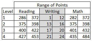
I have divided the data set into two schools: A and B. Each student is identified by their first name, and in some cases, a last initial. There is a raw score for reading, writing, and math, as well as a level of performance (1, 2, 3, 4). The range of score points for each level plays out like this:

You may look at this and wonder about what appears to be missing points (Why can't anyone get a 399 on the reading or math test?!) and why writing has a different scale. There are reasons...good ones...but I'm not going to get into them at the moment. These data do come from (old) state test results: first names of students are unchanged, but I did fill in some missing scores. We're going to play along with the rules that were originally applied to determine the scores. So, do your best to overlook the oddities of these scales for now. For these tests, a score in Level 3 would mean a student can meet the standard (Level 4 = exceeds, Levels 1 and 2 = below standard).

Let's start with measures of central tendency (mean, median, and mode) for our reading data (C2: C517). For the mean, Excel uses the AVERAGE function...for median, oddly enough, we can use MEDIAN...and for the mode, it depends on which version of Excel you have. In olden versions, the MODE function worked just fine, but starting with 2010, you have choices. To just get "the" mode, use the MODE.SINGL function. To get multiple modes from an array of data, you can use the MODE.MULT function---a very handy improvement. Not every data set is bell-shaped. So, here is what we have for the reading scores. I placed the formulas in the table on the right so you can see the syntax.

What does this mean? Well, first of all, our mean, median, and mode are all about the same. It's not necessary for your measures of central tendency to agree. After all, each one is a different way to identify the "middle." It's up to you to determine which is most appropriate. However, in this example, no matter which one you choose, you'll be fine.

If you want to graph this data set, it's not so friendly in its current form. We'd be better off building a frequency table first. This will allow us to find out how many students are in each category, then create a graph to visualize the distribution. To keep things simple, let's find out how many students scored in each level for the reading test. Build a simple table first, then select the empty cells:

Now you're ready to add your formula---a single formula ("array formula") which will fill all the cells at once. Then belly on up to the formula bar (too bad you can't pull a beer from here) and start entering the formula:

The "data_array" will be the column of data (not including the header) with the data about reading levels. The "bins_array" refers to the cells that have the labels for the reading levels---in this example, the 1, 2, 3, 4 you see in to the left of the cells selected in the table above. The final formula looks like this (plus a close parenthesis at the end):


When you've finished entering this information, you need to use a command to fill in all of the cells in the table. Plain old ENTER will not work. You have to use CONTROL + SHIFT + ENTER. And poof! We now have a frequency table:


If this scares you, you can use a simple COUNT function in each cell, but hey, you're ready to use big kid functions. Give FREQUENCY a try. Use the filters in Excel and compare School A with School B.

This is a good spot to stop for today, but we'll come back to this data set another day to see other descriptive statistics in Excel...and then move on to inferential analysis.

Bonus Round
Did you know that Excel has a whole category of statistics functions? Get in there and play!

Monday, May 21, 2012

Using Add-ins: MapCite

Out of the box, Excel is awesome all by itself. And yet there are those who endeavour to kick things up a notch by inventing add-ins...a kind of extreme macro. This specialized code enables Excel to do all sorts of new tricks. In previous posts, we've looked at Sparklines and ASAP Utilities.

I was recently pointed toward MapCite and made some time to give it a try. With MapCite, you can visualize your data using a Bing map embedded in Excel. The add-in looks something like this*:

*See the Bonus Round at the bottom of this post for more information.

For my data set, I pulled from one we've seen here before, the 5th grade state science test results from 2011. I added district address information.


Now, we're ready to "Geocode Data." Select the data---not the columns, or MapCite will tell you it can't handle that much work---for the addresses. Then click the "Geocode Data" button.
 

 In the pop-up window, fill in the information. Then, click "Geocode."

 Holy cow! We've just generated a whole new set of data:

There's more where that came from...
Now, you can add the mapping features. Select the data in the Latitude and Longitude columns, then click "Add Data."

In the pop-up window, indicate the required information and click "Finish."

Let's have a look at what we have wrought. Click on the "Show/Hide Map Pane" button. Here is our first view:


Not too exotic, but that's because MapCite automatically clusters the pins so things don't look messy.  Here's an unclustered look. Note that when you click on one of the pins, the row in the worksheet with the matching data is automatically highlighted. Keep in mind that you can also change the base map that is used.


You can also use the HeatMap feature to take a look:


You may be wondering why I bothered using science data when we just used the addresses of all the districts. It is a bit of a head-scratcher. But, with filtering tools in Excel, you can choose which groups to look at: small schools, those which scored above the state average, etc. You can also add GPX data (data that shows a route that was followed).

What I like about the add-in is that it's easy to use and that I can see the map in my spreadsheet. I don't have to upload my data elsewhere and pull it into another application. However, at this point, MapCite is fairly limited in features. You can make different pins for different pieces of a data set, but you can't show more than one set at a time. It's great to have things on a map, but I need to derive more meaning than just concentration. As such, classroom applications (other than what students might look at it) are limited. I think new features will come in time. I've been promised an upgrade to a Pro account when it's ready for release, and will let you know what else you can do.

Have a look around the MapCite website or YouTube channel for additional information. Better yet, give it a try for yourself.

Bonus Round
I say "like this," because I couldn't get the add-in to install properly. Although MapCite was very responsive to my inquiry for tech support, we couldn't figure out why Excel was making the add-in invisible. I ended up kludging things by creating a new tab for the ribbon called "MapCite," then dragging the groups from the tab-that-refused-to-show into my kludged one. Tech support said that they haven't had any issues similar to this one, so don't let my experience put you off. Also, if you have any clue why Excel shows the MapCite add-in as being active, but won't put it on the ribbon, I'd love to hear how to fix this.