Time for another mailbag question. Jason sends the following about the non-academic behaviors workbook: I am wondering if you know of a way to account for a high number of
absences on the report? Obviously, if a student is not in class, they do
not receive any points. In essence, that is added in to the total
points for the marking period as a zero. Is there a way to modify the
point levels on the report that only accounts for days that the student
is present? For example, can you put a percentage of days present to
equal to a level 1, 2, 3, or 4?
Of course you can. Excel lives to serve, after all.
Let's start by revisiting the original set up. Here's a sample from the "Work Ethics" page.
For each student there are six weeks (M - F) of scores, each based on a four-point scale. Blank cells indicate that the student was absent---no points were earned.
Now, let's hide some of the columns so we can look at formulas:
The Total is a simple sum of the points for the student. The Level is determined by comparing the Total to a range of possibilities ("1" is for less than 59 points, "2" is between 60 and 79 points...).
Jason is interested in a percentage. We can do this by (1) changing the formula for "Total" to one that represents a percentage of points from when the student was present and (2) changing the cut values for the four Levels.
Here is one way to solve the first step:
We still need to keep the sum, but we want Excel to give us the percentage out of the points available, not including days absent. In this grading period, there were 30 days, each with 4 points possible. This gives us the 120 to start the formula in the denominator. Now, we tell Excel to count the number of blank cells in that range, multiply that by the four possible points, and subtract it from 120. We can also tell Excel to format the cell as a percentage.
For the second piece, we only need to update the cuts for each Level. Here is one way to do that:
Note that you will need to express each percentage as a decimal---in this example, .3, .45, .6, and .7.
Beyond this, you would also need to recalibrate the report to use the percentages, as opposed to a raw total of points. But we'll stop here for now.
Need to make other adaptations to the workbooks? Drop me a line and let me know how to help.
Showing posts with label countif. Show all posts
Friday, December 14, 2012
Sunday, June 17, 2012
As If!
![]() |
| "And then he asked if I wanted to see his spreadsheet..." |
The IF clan helps you choose and play through different kinds of scenarios. So, let's pull up our workbook for basic statistics again (review it here; download it here) and give our IFs a workout. You don't have to be clueless any longer.
Since you're already familiar with COUNTIF, let's start with its brother, COUNTIFS: a way to count something based on multiple criteria. If you recall, we have a spreadsheet that has a list of students from two schools, along with their scores and achievement levels for tests in reading, writing, and 'rithematic.
Suppose you need to know how many students at School A scored in Level 2 of the Reading and Writing tests so you can set up some tutoring. If it was just one condition (e.g., how many students scored in Level 2 of Reading), COUNTIF would work just fine. But to get a number of students that satisfy both cases, we need to call in reinforcements. Notice that we need three columns of data: A (name of school), D (reading level), and F, (writing level). We also need three different identifiers: "A" for the school, and 2 for the reading and writing levels. We have data in rows 2 - 517 to count. To use COUNTIFS, find an empty cell and add =COUNTIFS(A2:A517,"A",D2:D517,2,F2:F517,2). Our answer? 32.
We can also make use of AVERAGEIF and AVERAGEIFS. If I just need to know the average score of the students meeting the math standards (levels 3 and 4), I can ask Excel to AVERAGEIF(G2:G517,">400"). But, if I want to find out the average score at School B on the math test, I need to AVERAGEIFS(G2:G517,A2:A517,"B"). We can add more conditions, too.
![]() |
| Why would you do that? As if! |
So, add these IFs to your Excel rotation. If you're having trouble keeping them straight, just remember the "IFS" versions---they will still work with only one condition, just like the versions that end in "IF."
Sunday, May 6, 2012
Ain't Misbehavin'
In the last post, we looked at one way to display information about non-academic behaviors in the classroom---things like work ethic, participation, and attendance. These are student attributes that we value and want to report on, but need to be separated from grades and other measures of learning.
Even though I am sure that I will revisit these ideas and fine tune the data displays over time, I thought I would lift the curtain to reveal the workbook innards. No doubt some of you would like to play, too.
Before we jump into the guts, I want to say that all of the attributes and scales are just examples. We could have a lively discussion about which attributes to measure, how you (or your students) could collect these data, and what the cut scores should be in order to be in the range of performance we'd like to see. These are critical pieces to consider...ones that I hope you ponder and kick around with your colleagues and students. I am going to set them aside in this post and strictly focus on the nuts and bolts.
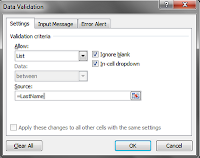
On the Report Sheet, I set up a data validation for the students last names. I started by selecting the range of last names on the Attendance/Grade worksheet. I named the range "LastName." Then, on the Report worksheet in the cell where I wanted the dropdown to appear, I chose Data Validation on the Data tab. In the dialogue box, I selected List from the "Allow" dropdown and then in the "Source" box, I added a formula using my named range. For the "First Name" area on the Report worksheet and the selections at the bottom of each of the other worksheets, I used our old friend, the INDEX/MATCH formula.
Let's move on to a few new tricks. Most teachers keep attendance records by marking who is absent---not who is present. But on my graph, I wanted to chart attendance as a positive measure. There are a few ways to do this. The simplest would be to change the way we keep attendance. Mark students when they're present and just count up the number of days at the end of the grading period. I didn't take the easy way out. Instead, I left each "A" for Absent just where it fell. To get the total number of days present, I used this formula: =30-(COUNTIF(C6:AF6,"A")). In other words, count the A's in a particular row (in this example, row 6 for Cathy Andrews) and subtract that number from the number of available days in the grading period (30). However, this swap won't work for creating the graphs. I need numbers to work with---not text. But a simple IF statement makes short work of that: =IF(C18=0,1,0), where "C18" is the cell from the INDEX/MATCH result for a particular student.
I also used a nested IF to have Excel convert the number of days attended (or points earned) into a level of performance. For example, here is the one that goes with the worksheets for Work Ethic, Participation, and Behavior: =IF(AG6<=59,1,IF(AG6<=79,2,IF(AG6<=99,3,IF(AG6>=100,4))))
It looks worse than it really is. (Don't most things?) Notice the repeating "AG6," which is the cell with the total number of points I want Excel to use as a comparison. In the first part of the statement, we tell Excel that if that number is less than or equal to 59, to put a 1 in the cell. If not, Excel moves on to the next part of the statement. Even though we know that "30" is less than or equal to all of the cutoffs in the equation, Excel considers only one at a time.
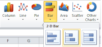
Shall we talk about the graphs? I used the stacked bar from the charts menu. No doubt some of you out there will want to use a regular bar chart. That is appropriate, too. I picked the stacked bar for two reasons. One was that I wanted to do more than show a comparison. I wanted to illustrate a proportion. A viewer can certainly make that inference with a regular bar chart, but it's a little less work with the stacked bar. My second reason was purely about the aesthetics. I knew I was going to want a line graph in each of the four areas (attendance, participation, work ethic, behavior). The vertical real estate claimed by a bar chart threw off the look of things.
Anyhoo, after you select your data for the graph, don't fall apart of it looks like this:
Simply hit the "Switch Row and Column" option and you will see the stacked bar. After that, you can clean up the graph.
I won't go into detail with the line graph. What I will share is that it does take time to create the labels, standardize the sizes, and get everything in place. Take your time. Don't assume that Excel knows best. It's important to make things look good---otherwise, you are missing your chance to truly communicate with the data.
The radar/star/spider chart is found in the "Other Charts" menu. Again, this chart is not everyone's cup of tea. One of the ed research articles I read mentioned using the chart with college students as a form of feedback---and they hated it. This seemed to be due to the lack of familiarity with reading these types of graphs. We see line graphs and bar charts all the time. Radar charts? Not so much. There are other reasons not to choose this type of chart. For example, it works better with cyclical data. And, the area of the graph becomes distorted with the scale. For every point increase of the scale, the size of the area becomes squared.
I would suggest that if you select this type of chart to use with students (or parents) that you spend some time talking about how to read them. Show them how to look at the connections between the spokes and the area covered by the graph. Why did I choose it, given the difficulty in interpretation? Because the attributes of student performance are not simply about comparing them. There needs to be a broader view of what is happening in a classroom---how is the student performing in light of the overall goals...and more importantly, how might non-academic factors be affecting one another (as well as student learning)? I think that you lose some of these capabilities with a clustered bar graph.
What would you do differently with this workbook and these graphs? Would you choose to put the line graphs all on one chart for easier comparison? Do you like the idea of bar charts better than a stacked bar...and clustered columns instead of the radar graph? How would you organize the workbook?
Even though I am sure that I will revisit these ideas and fine tune the data displays over time, I thought I would lift the curtain to reveal the workbook innards. No doubt some of you would like to play, too.
Before we jump into the guts, I want to say that all of the attributes and scales are just examples. We could have a lively discussion about which attributes to measure, how you (or your students) could collect these data, and what the cut scores should be in order to be in the range of performance we'd like to see. These are critical pieces to consider...ones that I hope you ponder and kick around with your colleagues and students. I am going to set them aside in this post and strictly focus on the nuts and bolts.
On the Report Sheet, I set up a data validation for the students last names. I started by selecting the range of last names on the Attendance/Grade worksheet. I named the range "LastName." Then, on the Report worksheet in the cell where I wanted the dropdown to appear, I chose Data Validation on the Data tab. In the dialogue box, I selected List from the "Allow" dropdown and then in the "Source" box, I added a formula using my named range. For the "First Name" area on the Report worksheet and the selections at the bottom of each of the other worksheets, I used our old friend, the INDEX/MATCH formula. Let's move on to a few new tricks. Most teachers keep attendance records by marking who is absent---not who is present. But on my graph, I wanted to chart attendance as a positive measure. There are a few ways to do this. The simplest would be to change the way we keep attendance. Mark students when they're present and just count up the number of days at the end of the grading period. I didn't take the easy way out. Instead, I left each "A" for Absent just where it fell. To get the total number of days present, I used this formula: =30-(COUNTIF(C6:AF6,"A")). In other words, count the A's in a particular row (in this example, row 6 for Cathy Andrews) and subtract that number from the number of available days in the grading period (30). However, this swap won't work for creating the graphs. I need numbers to work with---not text. But a simple IF statement makes short work of that: =IF(C18=0,1,0), where "C18" is the cell from the INDEX/MATCH result for a particular student.
I also used a nested IF to have Excel convert the number of days attended (or points earned) into a level of performance. For example, here is the one that goes with the worksheets for Work Ethic, Participation, and Behavior: =IF(AG6<=59,1,IF(AG6<=79,2,IF(AG6<=99,3,IF(AG6>=100,4))))
It looks worse than it really is. (Don't most things?) Notice the repeating "AG6," which is the cell with the total number of points I want Excel to use as a comparison. In the first part of the statement, we tell Excel that if that number is less than or equal to 59, to put a 1 in the cell. If not, Excel moves on to the next part of the statement. Even though we know that "30" is less than or equal to all of the cutoffs in the equation, Excel considers only one at a time.
Shall we talk about the graphs? I used the stacked bar from the charts menu. No doubt some of you out there will want to use a regular bar chart. That is appropriate, too. I picked the stacked bar for two reasons. One was that I wanted to do more than show a comparison. I wanted to illustrate a proportion. A viewer can certainly make that inference with a regular bar chart, but it's a little less work with the stacked bar. My second reason was purely about the aesthetics. I knew I was going to want a line graph in each of the four areas (attendance, participation, work ethic, behavior). The vertical real estate claimed by a bar chart threw off the look of things.
Anyhoo, after you select your data for the graph, don't fall apart of it looks like this:
Simply hit the "Switch Row and Column" option and you will see the stacked bar. After that, you can clean up the graph.
I won't go into detail with the line graph. What I will share is that it does take time to create the labels, standardize the sizes, and get everything in place. Take your time. Don't assume that Excel knows best. It's important to make things look good---otherwise, you are missing your chance to truly communicate with the data.
The radar/star/spider chart is found in the "Other Charts" menu. Again, this chart is not everyone's cup of tea. One of the ed research articles I read mentioned using the chart with college students as a form of feedback---and they hated it. This seemed to be due to the lack of familiarity with reading these types of graphs. We see line graphs and bar charts all the time. Radar charts? Not so much. There are other reasons not to choose this type of chart. For example, it works better with cyclical data. And, the area of the graph becomes distorted with the scale. For every point increase of the scale, the size of the area becomes squared.
I would suggest that if you select this type of chart to use with students (or parents) that you spend some time talking about how to read them. Show them how to look at the connections between the spokes and the area covered by the graph. Why did I choose it, given the difficulty in interpretation? Because the attributes of student performance are not simply about comparing them. There needs to be a broader view of what is happening in a classroom---how is the student performing in light of the overall goals...and more importantly, how might non-academic factors be affecting one another (as well as student learning)? I think that you lose some of these capabilities with a clustered bar graph.
What would you do differently with this workbook and these graphs? Would you choose to put the line graphs all on one chart for easier comparison? Do you like the idea of bar charts better than a stacked bar...and clustered columns instead of the radar graph? How would you organize the workbook?
Labels:
countif,
design,
gradebook,
graph,
if,
index,
layout,
match,
radar,
report,
stacked bar,
visualization
Sunday, February 5, 2012
The Zero Effect
And...we're back. Great to see you all again.
This week, I was building an Excel workbook for teachers. The idea was to create a tool for analyzing student performance on a single assessment. In my case, I was developing for a particular scoring tool (like the example below), but a teacher could make a similar version for a test, allowing one cell per item/point.
At first, this looks like a fairly straightforward affair. I have a list of students down the side. I break down each point of a rubric into the columns in the middle, then have a place to total the points and equate them to a level of performance (e.g., below standard, at standard, above standard) at the end.
Heck, I even added some fancy-schmancy conditional formatting so that the cells with the attribute points would change colour. Note that if more than one point is entered, the cell is highlighted with a border change.
But it was too good to last. Excel just had to throw down the gauntlet. Because when I put in the "SUM" formula for the total column, I got a great big zero sitting in the cell---even though there were no numbers in the row to total. I understand that the sum of nothing is nothing...but I don't need the zero there. In fact, as a teacher, I'd prefer that it's blank so I can distinguish between students that haven't done the assessment vs. ones who completed (and bombed) it.
I begged. I pleaded. Please, Excel, let my zeros go. At first, I went in and changed the Options such that zeros didn't show up.
This sorta fixed things. See, Excel didn't show the zeros, but it acted as if they were still there. This became an issue for the final column. I used a nested IF statement to do the equating (0 - 4 points = below basic, 5 - 6 = basic, 7 - 8 = at standard, 9 - 11 = above standard). And even though no numbers were in any of the preceding columns...and even though I used a "" as the final alternative in the IF statement, Excel didn't care about my personal problem.
So, I set out on a hunt for an answer. Surely I was not the first person in the history of spreadsheets who wanted Excel to not fill its nothingness with zeros. I read many forum posts by people who didn't want zero included for various reasons, but the bottom line was that there was no simple answer to this issue...no magic command to make Excel do my bidding. However, I did find two workarounds that kept invisible zeros at bay.
First dealt with the Total column. I really wanted to leave the option on for showing zero, if a student "earned" it. Originally, I had used the basic SUM function: =SUM(D5:N5). But one YouTube source provided this idea: =IF(COUNT(D5:N5),SUM(D5:N5),""). In other words, tell Excel to count what is in the previous columns...if there's something in them, total them...if not, leave the cell blank. Huzzah!
But this didn't solve the column with the Performance Levels. For this one, I had to use ISBLANK. This function has to be used at the very beginning of a statement. It consists of ISBLANK(value). The "value" refers to a cell. So, by starting my formula with ISBLANK and then following with the nested IF, I knocked out problem #2.
All was shiny and happy until I got to the point where I wanted to summarize the number of students in each of the performance levels. Here is the formula I was using to total the number of students in Level One: =COUNTIF(P5:P14,"1 = Below Basic")...and the result. I tried ISBLANK at the beginning with the P5:P14 range. It did make the zeros go away, but also kept any other number from appearing. Ditto for the COUNT function at the beginning. And so, my friends, if you have any suggestions, I would love to hear them. (Update: We found the answer! See bottom of post and comments.)
Anyway, here is what the workbook looks like when ready to use:
Bonus Round
Update: I did find an answer (similar to one suggested by a commenter) to the problem above. It is included in the updated spreadsheet. Use the same link to download. Thank you to Jamie for the inspiration!
This week, I was building an Excel workbook for teachers. The idea was to create a tool for analyzing student performance on a single assessment. In my case, I was developing for a particular scoring tool (like the example below), but a teacher could make a similar version for a test, allowing one cell per item/point.
At first, this looks like a fairly straightforward affair. I have a list of students down the side. I break down each point of a rubric into the columns in the middle, then have a place to total the points and equate them to a level of performance (e.g., below standard, at standard, above standard) at the end.
Heck, I even added some fancy-schmancy conditional formatting so that the cells with the attribute points would change colour. Note that if more than one point is entered, the cell is highlighted with a border change.
![]() |
| Ooooo. Aahhhh. |
![]() |
| WTH, Excel? |
I begged. I pleaded. Please, Excel, let my zeros go. At first, I went in and changed the Options such that zeros didn't show up.
![]() |
| Take that! |
![]() |
| Bummer |
So, I set out on a hunt for an answer. Surely I was not the first person in the history of spreadsheets who wanted Excel to not fill its nothingness with zeros. I read many forum posts by people who didn't want zero included for various reasons, but the bottom line was that there was no simple answer to this issue...no magic command to make Excel do my bidding. However, I did find two workarounds that kept invisible zeros at bay.
First dealt with the Total column. I really wanted to leave the option on for showing zero, if a student "earned" it. Originally, I had used the basic SUM function: =SUM(D5:N5). But one YouTube source provided this idea: =IF(COUNT(D5:N5),SUM(D5:N5),""). In other words, tell Excel to count what is in the previous columns...if there's something in them, total them...if not, leave the cell blank. Huzzah!
But this didn't solve the column with the Performance Levels. For this one, I had to use ISBLANK. This function has to be used at the very beginning of a statement. It consists of ISBLANK(value). The "value" refers to a cell. So, by starting my formula with ISBLANK and then following with the nested IF, I knocked out problem #2.
![]() |
| Le Sigh |
Anyway, here is what the workbook looks like when ready to use:
And here is an example of a completed version:
If you want this sample workbook to play around with, you can download it here. Or, if you want to try before you buy, you can play with it in the window below (it may be easier to click the button on the bottom right to view the workbook full screen, but you won't be able to make edits in that window):
Bonus Round
Yes, Virginia, there are graphs for this spreadsheet. They will autoupdate as you add information. There is one graph for the attribute points, so a teacher can look at the distribution and consider where to place additional instruction. The other graph shows the number of students performing in each category. This one could be useful for comparing pre- and post-assessments. Both would be good starting points for reflection on instructional practice.
Labels:
conditional formatting,
countif,
if,
ISBLANK,
SUM
Friday, September 9, 2011
Everything Old Is New Again
In high school---I think it was my sophomore year---I ended up in a computer science class. Keep in mind that this was the mid-80's. The Earth was still cooling in terms of the personal computing age. I don't really know how I ended up in such a class, other than going to a very small school (had 59 people in my graduating class) meant electives were few and far between. This is not to say the experience was regrettable, just the things one notices when one is 15 are not always the most meaningful. For example, the teacher loved coffee and cigarettes and we were forever offering mints and gum in those desperate moments when we had to ask for help with our BASIC programming. I can still smell her breath every time I think about that class. And I have been thinking about it a lot this week. I finally broke down and bought my first guide to Visual Basic for Applications (VBA). My job is not centered around Excel, but I am reaching a point with a couple of projects where the formulas are getting ridiculous. When you need a dozen just to generate the right data for a simple bar graph, there has to be a better way. VBA is an evolution of the BASIC programming language. So, as I launch into this next phase of learning, I'm glad to see that it's my class from high school, all grown up (even if I am not) and sweet smelling.
Fast forward five years, when I am now a college graduate (srsly). The DOS star is rising from the Pacific Northwest. Windows has yet to be invented. If you wanted to use a computer program, you also had to know enough DOS to be dangerous. Do you remember how you could use an asterisk to search for files? (If you are too young to remember, I don't want to know.) The asterisk was the ultimate Scrabble blank. For example, "*.doc" would show you all the files with that extension, regardless of how many (of the 8 maximum possible characters) came before the extension. So much more handy than "?," which acted as a one-character wildcard.
Maybe you've forgotten about this, but Excel has not. And you know what? It makes for a pretty handy search item. I got to whip out this trick this week when a few of us were considering Excel as a tool to collect and organize some data.
How It Works
Use the "*" in a COUNTIF formula where you're not sure how many times something occurs. COUNTIF uses a range (for example, a column of data) and criteria (either numbers or text) and gives you a total. The formula looks like this: =COUNTIF(range,criteria) Let's say you've been using Excel to keep a record of students' behaviour in your class and you want to find out if the number of tardies has been reduced. You can use the COUNTIF function to find all of the instances.
What It Looks Like
Your records would be more extensive than this---a mix of observations over a given time period. But for example purposes, this will do. I have five records with the word "tardy" in a mix of places. You can see the formula in the formula bar at the upper right and the result in the highlighted A7 box.
Uh-oh. Excel didn't find any of the words "tardy." WTF? I can totally see the word "tardy." But Excel doesn't. It's looking for the word "tardy" all by its lonesome---not in a crowd of words.
This is where the * comes to save the day. We can place the symbol at the beginning of the text string to find all of the instances where the word "tardy" occurs last:
Or at the end of the string, to find all the instances where the word "tardy" is first:
Or we can go both ways, so to speak, to find all the cells which have the word "tardy" anywhere in them:
If you're wondering if the formula is case-sensitive, it's not. Look at cells A2 and A4 now, as well as the result of using the COUNTIF function.
What other uses for this little formula can you think of?
Bonus Round
You can also add conditional formatting to highlight the instances for you, for example all the times first period is mentioned:
Fast forward five years, when I am now a college graduate (srsly). The DOS star is rising from the Pacific Northwest. Windows has yet to be invented. If you wanted to use a computer program, you also had to know enough DOS to be dangerous. Do you remember how you could use an asterisk to search for files? (If you are too young to remember, I don't want to know.) The asterisk was the ultimate Scrabble blank. For example, "*.doc" would show you all the files with that extension, regardless of how many (of the 8 maximum possible characters) came before the extension. So much more handy than "?," which acted as a one-character wildcard.
Maybe you've forgotten about this, but Excel has not. And you know what? It makes for a pretty handy search item. I got to whip out this trick this week when a few of us were considering Excel as a tool to collect and organize some data.
How It Works
Use the "*" in a COUNTIF formula where you're not sure how many times something occurs. COUNTIF uses a range (for example, a column of data) and criteria (either numbers or text) and gives you a total. The formula looks like this: =COUNTIF(range,criteria) Let's say you've been using Excel to keep a record of students' behaviour in your class and you want to find out if the number of tardies has been reduced. You can use the COUNTIF function to find all of the instances.
What It Looks Like
Your records would be more extensive than this---a mix of observations over a given time period. But for example purposes, this will do. I have five records with the word "tardy" in a mix of places. You can see the formula in the formula bar at the upper right and the result in the highlighted A7 box.
Uh-oh. Excel didn't find any of the words "tardy." WTF? I can totally see the word "tardy." But Excel doesn't. It's looking for the word "tardy" all by its lonesome---not in a crowd of words.
This is where the * comes to save the day. We can place the symbol at the beginning of the text string to find all of the instances where the word "tardy" occurs last:
Or at the end of the string, to find all the instances where the word "tardy" is first:
Or we can go both ways, so to speak, to find all the cells which have the word "tardy" anywhere in them:
If you're wondering if the formula is case-sensitive, it's not. Look at cells A2 and A4 now, as well as the result of using the COUNTIF function.
What other uses for this little formula can you think of?
Bonus Round
You can also add conditional formatting to highlight the instances for you, for example all the times first period is mentioned:
Labels:
conditional formatting,
countif,
Excel,
VBA
Subscribe to:
Posts (Atom)


