Showing posts with label stacked bar. Show all posts

Sunday, June 3, 2012

Rebuild, Reuse, Recycle

As part of an upcoming workshop, I've been rebuilding a spreadsheet developed by someone else to use as a communication tool. The good news is that I was handed most of the necessary formulas. The bad news was that I needed to completely start from scratch with the design, and I still had a lot to learn along the way. This spreadsheet was like Steve Austin, even if it wasn't a $6M spreadsheet.


Here was my to do list:
  • How do you get Excel to display ordinal numbers?
  • Can you make something that looks like a number line...and add dynamic data to it?
  • How do you display a normal curve...and add dynamic data to it?
Fortunately, between Google, YouTube, and Twitter, I was able to make short work of this list. Here is how everything is coming together. This is very much a work in progress---so if you have ideas to help make this awesome, I'd love to hear them.

The goal here is to allow a user to input a value for Effect Size and see how that relates to a variety of other measures: an Improvement Index, the standard deviation, and variance.


Below the space for input, I have set up the space for the other measures.

Before we talk nuts and bolts, I want to talk a little about design here. This is a tool that will be handed off for others to use---and has to enable them to communicate with their own stakeholders. Whatever gets placed in the workbook has to be both rich in meaning and self-explanatory. I want a very simple layout and colour scheme to help direct the eye. I also want to be sure that even if someone is not comfortable with statistics that they could still gain some insight from the graphics. The baseline information in the sheet remains grey; values turn green. This is what a user would see if the effect size is .4:


So far, I like it. I'm wondering about adding some conditional formatting to indicate the strength of an effect. In other words, is an r value of .2 "good"? It may be too much to put here, but it would be great to have a way to help people compare or evaluate what they see. For example, in the education world, an effect size of .4 is the average. Anything below that still represents something effective, but if you're looking to make a big impact in the classroom, perhaps that particular strategy might not be the best. Is this important to add? What about other explanations/resources?


Okay, so let's take a bionic jump into the nuts and bolts and the questions I had above. The first one, about ordinal numbers, came from developing the text shown on the right. The sentence you see is based on a formula: some text in quotes, the "&" symbol, and cells with the dynamic values (in this example, 66% and 66th). But Excel has no function for displaying ordinal versions of numbers. So, how do you tell Excel when to use st, nd, rd, or th at the end of a number?

According to Teh Googles, you use this formula =A1&MID("thstndrdth",MIN(9,2*RIGHT(A1)*(MOD(A1-11,100)>2)+1),2), where "A1" equals the cell with the number you want to add the ordinal ranking to. I grabbed the formula from here, and the post also includes an awesome explanation of why it works. In my spreadsheet, I used three cells for this. The first was for the actual calculation using the NORM.DIST function (=NORM.DIST(EffectSize,0,1,TRUE). Even though I can choose to display the results of that cell using two digits, Excel is sneaky and remembers the whole string. So, as an intermediate step, I had Excel take the contents of the cell and change it into text =TEXT((D2*100),"0"). Now it can't use a long trailing decimal. Take that! I used the contents of this cell for the ordinal formula.

A magic button to insert a normal distribution is missing, too. Are we or are we not living in the 21st century? No flying cars. No "normal" chart in Excel. WTH? My kludge, in this case, was taken from a YouTube video and workbook that I grabbed information from ExcelIsFun. I copied values from the workbook and created a basic area graph. For the dynamic green region, I used the following formula =IF(H3<=Variance,I3,""), where "H3" was the cell with the value for the x-axis of the graph (I had to make all values positive) and I3 had the value I copied from the workbook---the one matching the grey graph. This creates a very narrow range of data points around 0 standard deviations, which are then added to the graph.

The answer for the final piece, the line-type graph for variance, came from a Twitter shout-out.
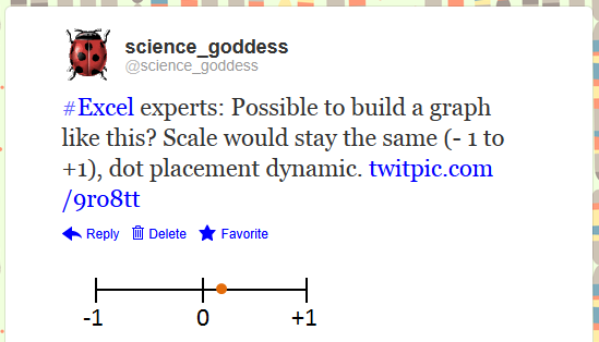
https://twitter.com/science_goddess/status/208628563790925826
I drew what I wanted, attached it to the tweet, and crossed my fingers for brilliant ideas to head my way. Here are the two I received:

https://twitter.com/BlaskEric/status/208635776714543104
https://twitter.com/Jon_Peltier/status/208748764951875585
I ended up deciding to just have the scale go from 0 to +1. There are negative correlations, but with the formula I was using from the original spreadsheet, there was no possibility of ending up with a negative result.

This has been a great small project to work on. It's also been a reminder that you don't have to know everything about Excel to get where you want to go. There's lots of help available from those who have previously solved problems. Makes it easy to rebuild, reuse, recycle the worksheets you have.

We can rebuild our workbooks. We have the technology. We have the capability to make the world's best spreadsheet. Our workbook will have that spreadsheet. Better than it was before. Better...stronger...faster...


Bonus Round
If you want to play around with the workbook, you can download it here. The final version will be made available at a workshop in two weeks, so if you have any feedback or improvements to suggest, get on it.

Sounds from the Bionic Woman and Six Million Dollar Man from here.

Sunday, May 6, 2012

Ain't Misbehavin'

In the last post, we looked at one way to display information about non-academic behaviors in the classroom---things like work ethic, participation, and attendance. These are student attributes that we value and want to report on, but need to be separated from grades and other measures of learning.

Even though I am sure that I will revisit these ideas and fine tune the data displays over time, I thought I would lift the curtain to reveal the workbook innards. No doubt some of you would like to play, too.

Before we jump into the guts, I want to say that all of the attributes and scales are just examples. We could have a lively discussion about which attributes to measure, how you (or your students) could collect these data, and what the cut scores should be in order to be in the range of performance we'd like to see. These are critical pieces to consider...ones that I hope you ponder and kick around with your colleagues and students. I am going to set them aside in this post and strictly focus on the nuts and bolts.
 
On the Report Sheet, I set up a data validation for the students last names. I started by selecting the range of last names on the Attendance/Grade worksheet. I named the range "LastName." Then, on the Report worksheet in the cell where I wanted the dropdown to appear, I chose Data Validation on the Data tab. In the dialogue box, I selected List from the "Allow" dropdown and then in the "Source" box, I added a formula using my named range. For the "First Name" area on the Report worksheet and the selections at the bottom of each of the other worksheets, I used our old friend, the INDEX/MATCH formula.

Let's move on to a few new tricks. Most teachers keep attendance records by marking who is absent---not who is present. But on my graph, I wanted to chart attendance as a positive measure. There are a few ways to do this. The simplest would be to change the way we keep attendance. Mark students when they're present and just count up the number of days at the end of the grading period. I didn't take the easy way out. Instead, I left each "A" for Absent just where it fell. To get the total number of days present, I used this formula:  =30-(COUNTIF(C6:AF6,"A")). In other words, count the A's in a particular row (in this example, row 6 for Cathy Andrews) and subtract that number from the number of available days in the grading period (30). However, this swap won't work for creating the graphs. I need numbers to work with---not text. But a simple IF statement makes short work of that: =IF(C18=0,1,0), where "C18" is the cell from the INDEX/MATCH result for a particular student.

I also used a nested IF to have Excel convert the number of days attended (or points earned) into a level of performance. For example, here is the one that goes with the worksheets for Work Ethic, Participation, and Behavior:  =IF(AG6<=59,1,IF(AG6<=79,2,IF(AG6<=99,3,IF(AG6>=100,4))))
It looks worse than it really is. (Don't most things?) Notice the repeating "AG6," which is the cell with the total number of points I want Excel to use as a comparison. In the first part of the statement, we tell Excel that if that number is less than or equal to 59, to put a 1 in the cell. If not, Excel moves on to the next part of the statement. Even though we know that "30" is less than or equal to all of the cutoffs in the equation, Excel considers only one at a time.

Shall we talk about the graphs? I used the stacked bar from the charts menu. No doubt some of you out there will want to use a regular bar chart. That is appropriate, too. I picked the stacked bar for two reasons. One was that I wanted to do more than show a comparison. I wanted to illustrate a proportion. A viewer can certainly make that inference with a regular bar chart, but it's a little less work with the stacked bar. My second reason was purely about the aesthetics. I knew I was going to want a line graph in each of the four areas (attendance, participation, work ethic, behavior). The vertical real estate claimed by a bar chart threw off the look of things.

Anyhoo, after you select your data for the graph, don't fall apart of it looks like this:

Simply hit the "Switch Row and Column" option and you will see the stacked bar. After that, you can clean up the graph.

I won't go into detail with the line graph. What I will share is that it does take time to create the labels, standardize the sizes, and get everything in place. Take your time. Don't assume that Excel knows best. It's important to make things look good---otherwise, you are missing your chance to truly communicate with the data.

The radar/star/spider chart is found in the "Other Charts" menu. Again, this chart is not everyone's cup of tea. One of the ed research articles I read mentioned using the chart with college students as a form of feedback---and they hated it. This seemed to be due to the lack of familiarity with reading these types of graphs. We see line graphs and bar charts all the time. Radar charts? Not so much. There are other reasons not to choose this type of chart. For example, it works better with cyclical data. And, the area of the graph becomes distorted with the scale. For every point increase of the scale, the size of the area becomes squared.

I would suggest that if you select this type of chart to use with students (or parents) that you spend some time talking about how to read them. Show them how to look at the connections between the spokes and the area covered by the graph. Why did I choose it, given the difficulty in interpretation? Because the attributes of student performance are not simply about comparing them. There needs to be a broader view of what is happening in a classroom---how is the student performing in light of the overall goals...and more importantly, how might non-academic factors be affecting one another (as well as student learning)? I think that you lose some of these capabilities with a clustered bar graph.

What would you do differently with this workbook and these graphs? Would you choose to put the line graphs all on one chart for easier comparison? Do you like the idea of bar charts better than a stacked bar...and clustered columns instead of the radar graph? How would you organize the workbook?

Thursday, May 3, 2012

Oh, Behave!

There are two broad categories of grading practices in the great wide world these days. One is termed "hodgepodge," referring to the mixing of student learning and behaviors (e.g., work ethic, attendance...) into a single score. The standards-based version of grading does not crunch scores for learning with student behaviors. There are variations within each category, of course. Even though this blog has modeled various ways to look at student data within a standards-based context, we've never considered options for visualizing student behavior. Time to change that.

I've built a model workbook that tracks four types of non-academic factors: attendance, work ethic, participation, and behavior. Each of the worksheets looks a lot like the gradebook. Names are on the left, but there is a series of dates across the top. There are six weeks (30 days) in the model.

Yeah, Baby

And, there's a reporting page which pulls information from each of the four worksheets. A data-validation dropdown menu for the "Last Name" automagically updates the sheet for each student. Here is what I'm thinking about for the display:


The top graph shows proportions. Attendance displays the number of days, the others the ratio of points earned. For the purposes of this tool, I've assumed that a four-point scale is available for each factor (work ethic, participation, behavior) each day. No points were assigned on days when the students were absent, as it is not possible to observe student behaviors when you aren't in the same room. The line graph below each stacked bar provides a sense of the 30-day trend. Gaps in the line represent days when the student was absent. Whatever was happening with Lucy here, looks like she had a real low point about mid-way through the grading period, but was starting to get back on track with her work ethic and participation by the end.

But I thought it might be interesting to consider the interaction between these factors...and a student's grade. So, the bottom of the report has a radar/spider/star chart. Most people are not fans of this type of graph. I'm a bit ambivalent about them, too. However, student achievement is not just about comparing categories, it's about looking for the confluence of all parts of learning to make decisions about instruction. To make the chart, I converted the total number of points earned in each category into a 4-point scale. I made up a summary grade.

So, here is Lucy's chart:

Lucy Van Pelt

Hmm. Lucy seems to have pretty good attendance and work ethic...but her grade isn't reflecting those strengths. Is her behavior in class keeping her from learning?

What about Dick Tracy, who appears to be living up to his name? Ahem.

Your name wouldn't happen to be "Dick," would it?

This looks like a student who could make a teacher pull his/her hair out. They show up nearly every day and act like a terror when they're there. What do we do about a problem like Dick Tracy? How do we channel his energy into something more productive?

For a final example, here's Flash Gordon.

Flash, ah-ah!

Good attendance, behavior, and work ethic...participation isn't great, but is happening. What's the deal with his grade?

In the next post, I'll lift the curtain and talk about some of formulas behind this beast, but if you're ready to play, you can download the workbook here. Let me know what you think about the graphs. Too much or too little information? Other ideas for the display?

Bonus Round
I've tried to give each student a story with the data. If you're looking for something to start some PLC conversations, you can also use the workbook that way.

Tuesday, October 18, 2011

How Stacked Bars Stack Up

I'm starting to put together a workshop on Excel dashboards that will be in December. I'm playing around with a few different data sets and options, and have a quandary I'd like your help with: What is the best layout option when using stacked bar charts?

If you don't know what a stacked bar chart is, here is an example:
There is one bar representing 100% of whatever is being measured: numbers of students, percentage of scores, speeds of African and European swallows, and so forth. In the stacked bar chart shown above, there are four categories which have been numbered. Instead of each category having its own private bar, they get together and party in one space. The size of the categories, indicated by different shades of green in the example, shows their proportion of the 100%. It is a simple way to compare the relative sizes of categories...and all without some ridiculous pie chart.

But stacked bar graphs do not have to take things lying down. They can be vertical, too. Which leads me to my problem: When should you use the horizontal format...and when should you use the vertical format? My Google Fu hasn't turned up any rules. Seems like everyone is just letting it all hang out.

There are three layout options shown below. I know I don't have the categories labeled, but I just want to consider layout at the moment. Just FYI, the data represent scores on the 2011 Washington state test for reading. The shades of green, from lightest to darkest, show the percent of students at a school who scored at Levels 1, 2, 3, and 4.

The first layout has a very traditional look:


Labels for each grade are to the left. The graphs are (more or less) placed so that you can make a quick comparison among the grade levels. But is this better?


Same data. Same graphs. Just rotated 90 degrees. I don't know about you, but I find this easier to "read" when looking across the grade levels. It's true that there would be some issues with how closely the graphs can be pushed together due to the labels, but the overall format is okay.

And finally, my least favourite, but deserving of discussion is this:

Considering that there will be more graphs for mathematics, science, and writing, would it be more important to look at performance for a subject area across and review data for a grade level along a vertical axis (not shown here, but imagine there are stacked bar charts for the other subject areas underneath). 

What do you think? Just from the standpoint of layout, which format is most meaningful for you?