This weekend, I am at ASCD's annual conference, now referred to as Empower. This is not the fourth year that I've attended (and presented...but more on that in another post), but it is the fourth time I've wandered through the exhibit hall with an eye toward what various companies are promoting to schools. The versions from 2013, 2014, and 2015 are available, if you'd like a trip down memory lane. In fact, that might not be a bad idea, because (Spoiler alert!) there was nothing particularly new or outstanding.
Data management and reports
There are no stand-alone systems here this year. Lots of vendors who focus on assessment and grading, however, do have displays and reports for managing student information. I asked the same question that I have asked for the last five years: Who builds your displays and reports? And yes, of course the developers make the magic happen behind the scenes, but there is still the same disturbing number of companies out there where that is the only answer. Or, there may be something along the lines of "we got feedback from teachers." This is all well and good---I support user involvement. I also know that developers and teachers are not data designers. People are spending a lot of time on these products, but they don't care enough to make the effort to ensure that effective communication with the data actually happens.
In one particular exchange, the project creator told me that all her charts were a result of her research. I have no doubt that the project is spawned from many years of hard work with teachers...but I know that she does no research with data design or communication. In fact, she was a little upset that anyone would ask about how she came to make her choices. I won't link to it here, but it's a new partnership with ASCD that you can look for, if you're interested.
Student assessment
There were some different displays this year for various flavours of student assessment. Scantron is making a big show this year. I chatted with them a bit and they have a few sessions this weekend. Perhaps I just hadn't noticed before that they are more than the "bubble sheet" company, but it looks like they're diversifying and growing into student assessment. I can't speak to the quality of this new content, but in an age of apps, google tools, and other options, it seems wise to be more than a company involved with scoring assessments.
Pacific Metrics is a content aggregators for various assessment banks, like the ACT or district-developed items. It produces no reports---it just integrates with existing school information systems. I think this is a desirable option for a lot of districts, especially smaller ones who may not have the resources to develop their own content. If someone else has valid and reliable items for you...and those can be automagically scored and then imported into your gradebook...it could be helpful. It's not a replacement for professional judgment---teachers would still need to ensure that the assessment matches the content.
The product I liked best came from Exemplars K - 12. This company provides not only rich tasks for the classroom, but also scoring tools and anchor papers. This last piece is incredibly valuable. These exemplars are representative of actual student work and can show teachers how to implement the rubrics. While I will always advocate for teachers to come together to develop tasks, score student work, and engage in conversations about student learning as a result, I can't deny that these banks would also support good teaching. I think this is especially important for rural or small districts, or schools with a high rate of turnover so that new teachers have a consistent framework in place.
Have you seen something this year for student data or assessment that you like?


Showing posts with label tool. Show all posts
Showing posts with label tool. Show all posts
Sunday, March 26, 2017

Sunday, March 22, 2015
ASCD 2015: Data Tools
This is the third year that I've been on the hunt for high-quality data tools in the Exhibit Hall at the ASCD annual conference. The first year (2013) was downright depressing. Last year was better---I ran across a couple of promising tools, although neither are represented at the conference this year. Here are the trends I'm seeing this spring.
Data Capture
This is a brand new theme this year. I saw three different tools yesterday that are meant to support teachers in recording student conversations or other "in the moment" data points and then associate those with a gradebook or spreadsheet. I am intrigued by these. I think their benefit may be somewhat limited right now. Teachers would need to be outfitted with tablet devices and know how to seamlessly integrate those with their classroom work. I suspect that more and more teachers fit that description each year, but my school district is not quite there yet. One thing that I really like about these tools, however, is that they put the power of assessment back into the hands of teachers. In an age where we large-scale district and state assessments carry the weight and propel the discussions, these tools give teachers another way to show student learning. Yes, these demonstrations were always there, but now there are supports for teachers to share the very important daily learning with others. The best tool of the bunch? Just open Sesame.
Item Development
With the advent of new online assessments in many states, such as Smarter Balanced and PARCC, there is a new emergence of tools that allow classroom teachers to build items and assessments that have many of the features of their large-scale brethren. SchoolCity was the first one I saw last year, but there are a couple of new players showing their wares at this year's conference. The best one of these is Edulastic. Most of these tools promise integration with your gradebook or data warehouse. I think we have to be cautious, however, that just because you can make all sorts of new-fangled items for kids to answer doesn't mean you should. If your goal is just to have kids practice responding to particular sorts of items (e.g., drag-and-drop) for "The Test," then I hope you'll think a bit harder before purchasing this kind of software. We also need to support teachers with the basic assessment literacy required to write good items to measure student learning. We haven't done that much with paper/pencil tests---and online forms mean we have even more background knowledge to build.
Design Is Better
Most of the tools I saw yesterday show some thoughtful design. As a whole, they're far better than they were two years ago, but there is still a long way to go. I didn't find a single vendor who uses a data designer for their displays---they all depend on developers to code whatever charts and visualizations they have. Some claim that their charts are "designed by teachers." This is also a bad answer. Teachers and other educators should definitely have input---they are the end users for the tool, but they are not data designers. Listen to the stories classroom experts need to have told, then create the interface to communicate in a powerful way.
One vendor has the biggest, ugliest, exploded 3D pie chart on their screen. I asked them why they had chosen it. The rep wasn't sure. I probed further: Why is it in 3D when you only have two dimensions of data? His reply: Because it looks cool. No, honey...it doesn't.
We have to demand better from our vendors.

If you're in Houston in the next day or so, swing by the conference and check out all the new data tools for the classroom. Or, if you've already wandered through the vendor area, feel free to leave your new favourite option in the comments.
Data Capture
This is a brand new theme this year. I saw three different tools yesterday that are meant to support teachers in recording student conversations or other "in the moment" data points and then associate those with a gradebook or spreadsheet. I am intrigued by these. I think their benefit may be somewhat limited right now. Teachers would need to be outfitted with tablet devices and know how to seamlessly integrate those with their classroom work. I suspect that more and more teachers fit that description each year, but my school district is not quite there yet. One thing that I really like about these tools, however, is that they put the power of assessment back into the hands of teachers. In an age where we large-scale district and state assessments carry the weight and propel the discussions, these tools give teachers another way to show student learning. Yes, these demonstrations were always there, but now there are supports for teachers to share the very important daily learning with others. The best tool of the bunch? Just open Sesame.
Item Development
With the advent of new online assessments in many states, such as Smarter Balanced and PARCC, there is a new emergence of tools that allow classroom teachers to build items and assessments that have many of the features of their large-scale brethren. SchoolCity was the first one I saw last year, but there are a couple of new players showing their wares at this year's conference. The best one of these is Edulastic. Most of these tools promise integration with your gradebook or data warehouse. I think we have to be cautious, however, that just because you can make all sorts of new-fangled items for kids to answer doesn't mean you should. If your goal is just to have kids practice responding to particular sorts of items (e.g., drag-and-drop) for "The Test," then I hope you'll think a bit harder before purchasing this kind of software. We also need to support teachers with the basic assessment literacy required to write good items to measure student learning. We haven't done that much with paper/pencil tests---and online forms mean we have even more background knowledge to build.
Design Is Better
Most of the tools I saw yesterday show some thoughtful design. As a whole, they're far better than they were two years ago, but there is still a long way to go. I didn't find a single vendor who uses a data designer for their displays---they all depend on developers to code whatever charts and visualizations they have. Some claim that their charts are "designed by teachers." This is also a bad answer. Teachers and other educators should definitely have input---they are the end users for the tool, but they are not data designers. Listen to the stories classroom experts need to have told, then create the interface to communicate in a powerful way.
One vendor has the biggest, ugliest, exploded 3D pie chart on their screen. I asked them why they had chosen it. The rep wasn't sure. I probed further: Why is it in 3D when you only have two dimensions of data? His reply: Because it looks cool. No, honey...it doesn't.
We have to demand better from our vendors.
If you're in Houston in the next day or so, swing by the conference and check out all the new data tools for the classroom. Or, if you've already wandered through the vendor area, feel free to leave your new favourite option in the comments.
Monday, March 24, 2014
Lookin' for Data Love
I recently attended (and presented) at the 69th annual ASCD conference. If you're unfamiliar with the acronym, ASCD is one of the largest and oldest professional organizations for educators. The letters used to stand for the Association for Supervision and Curriculum Development, but that definition was scuttled a few years ago when the organization outgrew its original boundaries. The acronym was kept for branding purposes.
You might remember that I went hunting last year for data tools in the exhibit hall. I did so again, along with attending a couple of presentations on how data is being used in schools. So, here's the wrap-up.
Vendors
I looked at three different tools in the exhibit hall. None were quite to the level of a student information system, but all integrated assessment and performance data. Two are not worthy of further discussion (one, in fact, admitted that they do no testing/accommodations for accessibility).
A third, Schoolzilla, didn't totally blow me away; however, they are using Tableau to build their reports. The reports follow the Shneiderman mantra of "Overview first...then zoom and filter...details on demand." To be fair, I don't expect any product to knock my socks off in an exhibit hall setting and where I spend <5 minutes at a booth. However, Schoolzilla may be worth a more in-depth look, if your district is on the hunt for that sort of thing.
I also spent a chunk of time at another venue chatting with a rep from SchoolCity. Their product is recently undergoing a complete redesign, but I got a behind the scenes peek at things. I suspect that this product may well be worth a second look in the coming months.
Presentations
Again, my socks remained firmly on my legs. Okay, so they were imaginary socks---the conference was in Los Angeles and it was too warm to wear such things---but let's just go with the metaphor here. The presentations I attended were focused on sharing how a particular school or program was using data. The common thread among all these was that no one starts with a question---and I find this worrisome.
While it's good practice for student assessment to guide the next steps in teacher instruction, it is impossible to use every single piece of data derived in the classroom. We have to focus---we need to be picky about where we dig. I know it isn't as simple as that. The hardest part of any analysis is that very first step: Asking a good question---the one most worth asking.
I was pleased to hear one presenter talk about how too many teachers see the purpose of data as sorting and selecting. I became worried, however, when she mentioned how "all the data is spewed across the wall in the War Room." My colleague often says that we have to get beyond admiring the problem. Data can be used in strategic ways, to be sure, but that means respecting what we collect and being thoughtful about how we move forward with it. There is something troublesome, for me, in any terminology that involves spewing and war.
As for me, my presentation went well enough---I even ran short, although no one complained about getting away early. :) The next morning, this happened (well, after the earthquake):
This data woman hopes to see you at the 70th annual ASCD conference in Houston next year!
You might remember that I went hunting last year for data tools in the exhibit hall. I did so again, along with attending a couple of presentations on how data is being used in schools. So, here's the wrap-up.
Vendors
I looked at three different tools in the exhibit hall. None were quite to the level of a student information system, but all integrated assessment and performance data. Two are not worthy of further discussion (one, in fact, admitted that they do no testing/accommodations for accessibility).
A third, Schoolzilla, didn't totally blow me away; however, they are using Tableau to build their reports. The reports follow the Shneiderman mantra of "Overview first...then zoom and filter...details on demand." To be fair, I don't expect any product to knock my socks off in an exhibit hall setting and where I spend <5 minutes at a booth. However, Schoolzilla may be worth a more in-depth look, if your district is on the hunt for that sort of thing.
I also spent a chunk of time at another venue chatting with a rep from SchoolCity. Their product is recently undergoing a complete redesign, but I got a behind the scenes peek at things. I suspect that this product may well be worth a second look in the coming months.
Presentations
Again, my socks remained firmly on my legs. Okay, so they were imaginary socks---the conference was in Los Angeles and it was too warm to wear such things---but let's just go with the metaphor here. The presentations I attended were focused on sharing how a particular school or program was using data. The common thread among all these was that no one starts with a question---and I find this worrisome.
 |
| https://twitter.com/science_goddess/status/444960747974455296 |
While it's good practice for student assessment to guide the next steps in teacher instruction, it is impossible to use every single piece of data derived in the classroom. We have to focus---we need to be picky about where we dig. I know it isn't as simple as that. The hardest part of any analysis is that very first step: Asking a good question---the one most worth asking.
 |
| https://twitter.com/science_goddess/status/444955206690684928 |
I was pleased to hear one presenter talk about how too many teachers see the purpose of data as sorting and selecting. I became worried, however, when she mentioned how "all the data is spewed across the wall in the War Room." My colleague often says that we have to get beyond admiring the problem. Data can be used in strategic ways, to be sure, but that means respecting what we collect and being thoughtful about how we move forward with it. There is something troublesome, for me, in any terminology that involves spewing and war.
As for me, my presentation went well enough---I even ran short, although no one complained about getting away early. :) The next morning, this happened (well, after the earthquake):
 |
| https://twitter.com/science_goddess/status/445559513274273792 |
This data woman hopes to see you at the 70th annual ASCD conference in Houston next year!
Monday, December 24, 2012
Have an Excel-lent Christmas
These days, even Santa uses the power of data to manage his work. Two recent posts highlight the role spreadsheets and big data play in his workshop.
IBM shares an interview with Santa on their Big Data Hub blog: Santa Claus and the Data-Driven Christmas. As you can imagine, an operation as one as large as Santa's requires a significant data center and analysis software. He has big plans for the future, too.
"So, for example, moving forward we will keep using geo-location, mapping, mobile device and third-party data to help create ideal transportation paths for my sleigh route on Christmas Eve. We call it 'chimney mapping,' and it provides optimal delivery patterns to ensure that we get every gift delivered on time. Imagine if FedEx had to deliver all of their packages processed during the year… in a matter of 12 hours. That takes a lot of data, a lot of advanced analytics, and a fair amount of strategic planning. (Not to mention a dash or two of Christmas magic!)"

Meanwhile, over at Scientific American, Bonnie Swoger shares the importance of metadata. She advises us to "Be like Santa and make sure your data is findable and re-usable."
Bonnie seems to think that Santa is a fan of Google Docs. But let's not quarrel.
"I think we can agree that Santa would use sound data management practices, including the creation and use of proper metadata, to keep track of his gift giving and logistical data. He would want the rest of us to use good metadata so we can always locate that 30 year old picture of him, too."
 |
| from Santa Claus & the DD Xmas |
"So, for example, moving forward we will keep using geo-location, mapping, mobile device and third-party data to help create ideal transportation paths for my sleigh route on Christmas Eve. We call it 'chimney mapping,' and it provides optimal delivery patterns to ensure that we get every gift delivered on time. Imagine if FedEx had to deliver all of their packages processed during the year… in a matter of 12 hours. That takes a lot of data, a lot of advanced analytics, and a fair amount of strategic planning. (Not to mention a dash or two of Christmas magic!)"
 |
| from What Is Metadata |
Bonnie seems to think that Santa is a fan of Google Docs. But let's not quarrel.
"I think we can agree that Santa would use sound data management practices, including the creation and use of proper metadata, to keep track of his gift giving and logistical data. He would want the rest of us to use good metadata so we can always locate that 30 year old picture of him, too."
I wonder how these interface with Santa's Privacy Policy. Hmmm...
Merry Christmas to you and yours!
Wednesday, November 30, 2011
Making It Up As I Go Along
Necessity is known as the Mother of Invention. What is less well-known, however, is that she is also responsible for a son: Justin Time. Over the years, Invention’s attention-seeking behaviors and drama queen ways have meant that Justin has labored away in obscurity. But no more. Today we celebrate Justin Time and his contributions to new learning. Without him, I might never have been prodded into developing my first Excel project using VBA.
For those of you Excel Ninjas out there who wield VBA like a weapon, my paltry excursion will not look like much. But we all have to start somewhere…and these are my humble beginnings.
One reason why Justin has not been given proper credit is that he is more commonly known as “You want me to do what? I don’t know how to do that.” But his advantage is that with Justin, you only have to learn something new to you---not new for everyone. And this is what I realized when I was asked to replicate the function of this website using Excel:

It’s a calculator for schools/districts to use to figure out one variable (number of tests, number of computers needed, number of test sessions, number of test days) if they know the other three. The calculations themselves aren’t all that sophisticated. The first variable (number of student tests) is the product of the other three. So, a bit of basic algebra will tell you how to calculate the others.
In Excel, each of the buttons you see—such as “Calculate Minimum Days of Testing Required”—needs to be assigned to a different formula. And, we need some way to update the information when schools want to test out different scenarios (e.g. change the number of test sessions from two to three). It’s possible to do something similar without resorting to writing your own macros. You could use a dropdown menu to allow users to pick the variable they wanted to calculate, then populate a table below based on that (fill in the other variables, assign a formula). But the people who wanted this calculator wanted something sexy. They wanted Justin.
I started by setting up the basic layout of the calculator. I found out later that this is extra important, because when you move cells around on the worksheet, the formula in VBA does not autoupdate the way a formula within the worksheet will. It’s not an insurmountable issue. It just means you’ll have to go back and update some of the code. Whatever you can do to plan ahead now will mean less work later. So, here’s what I’m starting with:

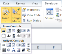
For the next part, I needed Justin Time. So, here is what he taught me about creating the buttons (you can read about my learning-to-learn strategies here). On the Developer ribbon, click on Design Mode in the Controls area. Then click on Insert. This will bring up a menu of items you can use to build a form. If you’ve created a form in MS Word, then this part won’t look new to you. Then, click the item in the upper lefthand corner to create a button. Draw your button on the worksheet. Don’t worry too much about getting the size or other attributes right. You can go in and make changes later. When Excel brings up a dialog box to assign a macro, hit “Cancel” for now. We’ll go back and deal with this after we create the macro. You’ll now have a generic box like this one to use:

Now comes the fun part. It’s time to write the code. On the lefthand side of the Developer ribbon, you’ll find the “Visual Basic” button. Be brave and click it. It will open up a new window where you can tell Excel what to do. We will then assign this code to the button on our worksheet. In the VBA window, click Insert and then Module. This will open another window for you to place the code. Here is what we are going to write:

“Sub” at the beginning stands for “subroutine.” (We all live in a yellow subroutine…) The word “students” follows in order to name this subroutine. The second line tells Excel what to do. Range(“C2”) tells Excel that we want things placed in cell C2 of the worksheet. We then say to execute a Formula. Finally, we have to include what that formula will be. This looks like a formula we would write for the worksheet itself: =C4*C6*C8. Notice the placement of quotation marks and the use of two equals signs. Finally, we tell Excel that we have reached the End of the Subroutine (End Sub).
 Now we’re ready to assign the module to the button on our worksheet. Right-click the button and select “Assign Macro.” You should see the “students” macro. Select it and click “OK.” Your button is now ready to use. Fill in the other three variables and see what happens. Don’t like the name “Button 1”? Right-click on the button and edit the text. You’re ready to build the modules for the other three buttons.
Keep in mind that when you save this workbook, you need to save it as an Excel Macro-Enabled Workbook:

Uh-Oh
I discovered that after you calculate one of the variables and then clear out the box, you get ugliness like this:

And this is where Justin let me down. I tried inserting IFERROR as part of the formula statement in the macro, and Excel barfed it up. I looked and looked to find out why or what I could do instead and didn’t have any luck. At least not yet. If you have VBA wisdom to share about this issue, I’d appreciate learning from you.
My workaround was to create a “Clear Contents” button so that users could start over. This one I built a little differently. In the Developer ribbon, I selected “Record Macro.” This brought up a new window where I could name the macro (e.g. “Clear Contents”). Then, I used control+click to select cells C2, C4, C6, and C8, then hit the Delete button on my keyboard. After that, I clicked on “Stop Recording.” Now, I could associate the macro with the Clear Contents button, just like I did the other buttons.

Here is the link to download the completed workbook, if you need a place to play around with the VBA and don’t want to torture your own spreadsheet.
Invention may get all the credit out there---and she deserves some of what occurs when Necessity comes knocking at our door. But don’t forget about Justin Time and the learning he provides along the way. I’m hoping, however, that Necessity will find out about family planning in the near future.
For those of you Excel Ninjas out there who wield VBA like a weapon, my paltry excursion will not look like much. But we all have to start somewhere…and these are my humble beginnings.
One reason why Justin has not been given proper credit is that he is more commonly known as “You want me to do what? I don’t know how to do that.” But his advantage is that with Justin, you only have to learn something new to you---not new for everyone. And this is what I realized when I was asked to replicate the function of this website using Excel:

It’s a calculator for schools/districts to use to figure out one variable (number of tests, number of computers needed, number of test sessions, number of test days) if they know the other three. The calculations themselves aren’t all that sophisticated. The first variable (number of student tests) is the product of the other three. So, a bit of basic algebra will tell you how to calculate the others.
In Excel, each of the buttons you see—such as “Calculate Minimum Days of Testing Required”—needs to be assigned to a different formula. And, we need some way to update the information when schools want to test out different scenarios (e.g. change the number of test sessions from two to three). It’s possible to do something similar without resorting to writing your own macros. You could use a dropdown menu to allow users to pick the variable they wanted to calculate, then populate a table below based on that (fill in the other variables, assign a formula). But the people who wanted this calculator wanted something sexy. They wanted Justin.
I started by setting up the basic layout of the calculator. I found out later that this is extra important, because when you move cells around on the worksheet, the formula in VBA does not autoupdate the way a formula within the worksheet will. It’s not an insurmountable issue. It just means you’ll have to go back and update some of the code. Whatever you can do to plan ahead now will mean less work later. So, here’s what I’m starting with:


For the next part, I needed Justin Time. So, here is what he taught me about creating the buttons (you can read about my learning-to-learn strategies here). On the Developer ribbon, click on Design Mode in the Controls area. Then click on Insert. This will bring up a menu of items you can use to build a form. If you’ve created a form in MS Word, then this part won’t look new to you. Then, click the item in the upper lefthand corner to create a button. Draw your button on the worksheet. Don’t worry too much about getting the size or other attributes right. You can go in and make changes later. When Excel brings up a dialog box to assign a macro, hit “Cancel” for now. We’ll go back and deal with this after we create the macro. You’ll now have a generic box like this one to use:

Now comes the fun part. It’s time to write the code. On the lefthand side of the Developer ribbon, you’ll find the “Visual Basic” button. Be brave and click it. It will open up a new window where you can tell Excel what to do. We will then assign this code to the button on our worksheet. In the VBA window, click Insert and then Module. This will open another window for you to place the code. Here is what we are going to write:

“Sub” at the beginning stands for “subroutine.” (We all live in a yellow subroutine…) The word “students” follows in order to name this subroutine. The second line tells Excel what to do. Range(“C2”) tells Excel that we want things placed in cell C2 of the worksheet. We then say to execute a Formula. Finally, we have to include what that formula will be. This looks like a formula we would write for the worksheet itself: =C4*C6*C8. Notice the placement of quotation marks and the use of two equals signs. Finally, we tell Excel that we have reached the End of the Subroutine (End Sub).

Keep in mind that when you save this workbook, you need to save it as an Excel Macro-Enabled Workbook:

Uh-Oh
I discovered that after you calculate one of the variables and then clear out the box, you get ugliness like this:

And this is where Justin let me down. I tried inserting IFERROR as part of the formula statement in the macro, and Excel barfed it up. I looked and looked to find out why or what I could do instead and didn’t have any luck. At least not yet. If you have VBA wisdom to share about this issue, I’d appreciate learning from you.
My workaround was to create a “Clear Contents” button so that users could start over. This one I built a little differently. In the Developer ribbon, I selected “Record Macro.” This brought up a new window where I could name the macro (e.g. “Clear Contents”). Then, I used control+click to select cells C2, C4, C6, and C8, then hit the Delete button on my keyboard. After that, I clicked on “Stop Recording.” Now, I could associate the macro with the Clear Contents button, just like I did the other buttons.
Here is the link to download the completed workbook, if you need a place to play around with the VBA and don’t want to torture your own spreadsheet.
Invention may get all the credit out there---and she deserves some of what occurs when Necessity comes knocking at our door. But don’t forget about Justin Time and the learning he provides along the way. I’m hoping, however, that Necessity will find out about family planning in the near future.
Saturday, October 1, 2011
Pick a Chart...But Not Just Any Chart
Recently, I was working with some educators who didn't know a pie chart from a hole in the ground. It was actually worse than that, but as we see more and more information communicated via charts, graphs, and other data visualizations, there is also a corresponding literacy needed to read and write these. And while my internal monologue may run along the lines of "OMG...you can't interpret a bar graph?!", my overall goal is to make data viz accessible to educators. Sometimes, that means I will have to start at the beginning.
But fret not if you don't know a bar chart from a scatter plot---let alone when to use one. Tuck a copy of the Choosing a Good Chart diagram in your back pocket and you'll be ready for action.
 Featured on the Extreme Presentation Method blog, the chart is available in several languages. What I like about this tool is that it starts with "What would you like to show?" The purpose of the communication is front and center. This can really guide the thinking of beginners. Even if they're not familiar with all of the charts they see on the page, it's a way to broaden their view beyond pie charts and line graphs.
Bonus Round
For a more interactive way to select a chart, try the Chart Chooser over at Juice Analytics.
But fret not if you don't know a bar chart from a scatter plot---let alone when to use one. Tuck a copy of the Choosing a Good Chart diagram in your back pocket and you'll be ready for action.

Bonus Round
For a more interactive way to select a chart, try the Chart Chooser over at Juice Analytics.
Subscribe to:
Posts (Atom)