Showing posts with label data. Show all posts

Saturday, March 28, 2020

The Next Wave

In February and early March, I had the opportunity to teach my first college-level course. My audience was student teachers and the topic was effective data use.

I was both excited and a little terrified. It was a great opportunity to share some learning on an important topic that doesn't often get much attention as teachers prepare to join the workforce. But, it was designated as a 10-hour elective, so I made myself think of it as an extended workshop. A few years ago, I did a Data Academy in my district that consisted of six 90-minute sessions...so it didn't feel like too big of a stretch to do five 2-hour sessions. Since the Data Academy, I have also developed and presented a lot of other content at various conferences and in other spaces. The twist on all of this was that I needed to target an entirely new audience.

Syllabus
I used a framework from this article to organize the course: Mandinach, E. B., & Gummer, E. S. (2016). What does it mean for teachers to be data literate: Laying out the skills, knowledge, and dispositions. Teaching and Teacher Education, 60, 366-376. During the first session, I had the students identify their level of familiarity with each of the five major areas of the framework, along with the items under each that they'd most like to learn. This provided me with some direction for the rest of the sessions.

You can access my course materials here: https://github.com/tlricherson/TESC_MIT_Data.

How it all went down
I didn't do much in the way of assignments. I asked them to read two research articles and we used two examples from Observe, Collect, Draw to provide them with some practice collecting and representing data. I really just wanted them to immerse themselves in the discussions during our time together. It was, after all, an elective...and they were plenty stressed out with other coursework. I wanted them to have a positive experience with data.

We also did some activities modified from the Data Therapy project. These included the paper spreadsheet, find a story, and build a sculpture. I had been wanting to try some of these for awhile and hadn't had a group for this. My favourite was the sculpture activity. I've had the coloured blocks and tiles for a couple of years and it was great to provide them, along with some data, and have small groups of students physically model a story they thought was important to tell from the data. I didn't allow them to write or annotate until the very end. (We did three rounds of data/revision.) I really enjoyed hearing their thoughts about that experience. Many of them noticed the same things that I have about manipulating data physically with your hands. It's such a powerful and personal experience. Magical.

Lessons learned
I think I did an okay job. Most of the time, I paced things well and brought the right resources. As always, I should have aimed for "Less me, more them." I would have liked to structure the discussions a bit better and given them more time to practice using data when we were together. We didn't have access to a computer lab and not everyone had a laptop, so I didn't spend any time on Excel basics, which I think would have been one of the most useful things to send them out the door with. But, I did give them some rich opportunities to think with data...and that will serve them well.

I heard from a professor in the program that students talked about my class a lot in their other classes...that they were showing her lots of great pictures of their work...and that a few had said it was the highlight of the winter quarter for them. The students themselves gave me a wonderful thank you card, a $50 gift card, and a little notebook to use for capturing data. Very sweet of them!

I don't know if I'll get the opportunity to teach the class again. This particular format was brand new for the university and they will need to evaluate its success before making decisions about next year. I am so grateful for the opportunity...and also that I was able to finish the class just moments before the transition to all classes being online. I greatly enjoyed being with these almost-beginning teachers. The next wave coming to our classrooms is going to be amazing.


I was taking a break from presenting this year. And then I got asked to share some of my data stories at a conference session in December...and asked to develop this university course...and a couple of other things, too. I said "Yes" to all of them, even if they were daunting. I am glad that as the world becomes more closed for the next year or so that I had the opportunity to reach out in those ways. I have to believe that there will be chances to do so again. I hope all of you are finding ways to share and connect and celebrate learning from wherever you are holding in place.

Saturday, March 21, 2020

Pause. Breathe. Rest. Fight.

Well, there is apparently one thing that can stop a dream in its tracks: COVID-19.

After months of planning and getting ready for our big community data story for the spring Arts Walk...it's canceled. And while I am in 100% supportive of the decision to cancel the event, I also know that it is okay to express personal disappointment. I am grateful that I'm (currently) healthy...as are all my friends and extended family...but I admit that I'm quite sad about having to postpone things.

I know it isn't forever. When this pandemic is over, there will be other Arts Walk. We will finish the project, even if it doesn't go on display for awhile.

So, let me tell you just how far we got and what we've been learning along the way. If you need to catch up on the background of this project, you can read an overview or my first reflection on the process.


During the month of February, my assistant and I built relationships with all of the six Boys and Girls Clubs in our county. We visited each one in person to talk about the project and get input from directors about the needs they were seeing with students. By the end of the month, we had returned to four of the clubs to conduct focus groups with K - 12 students. Our conversations were framed around the role of neighbours and friends in their lives. For older students, we also devoted part of the conversation to the community at large.

Some interesting things came out of these conversations. For example, in every group a single (and unexpected) statement was made: We had to move because our neighbours were too loud. We heard this from urban students who live in apartments and rural kids who live in trailers that are out in the woods. We heard it from homeless kids and ones from homes with a stable income. And while we didn't lean into that statement, we did wonder what it was code for. Did it mean their parents couldn't make the rent and didn't want kids to worry...so they just blamed the move on the neighbours? Did it refer to domestic violence or drugs or other environmental factors? Or was it really just plain noise? Another thing that was consistently said across groups had to do with dogs. Kids everywhere talked about being barked at, bitten by, and generally displeased with dogs. Maybe you have a very good boy at home...but a lot of kids are having to manage community spaces where they are feeling threatened by these animals.While neither of these pieces made it into our final survey, they will be reflected in our final display.

Also during that time frame, we worked with a carpenter to build the six frames (one example is above) and 12 boards (one is in the background of the picture above). We partnered with a local upholstery shop to test out different threads and put in our order for our final choice. We secured the rest of the materials we thought we'd need.

By the first week in March we transitioned to the individual surveys. Here are five questions we identified:
  1. I am in grades Kindergarten, 1, 2, 3, 4, or 5.
  2. If I see someone new at school, I introduce myself.
  3. It is important to me to know my neighbors.
  4. I try to build relationships with my neighbors.
  5. I do things in my community that make a difference.
Because the beads are on a ring, we needed a way to consistently tell which question was the first one. But this wasn't quite enough, because even if you could identify question number one, you couldn't tell which was question two. So, we ended up creating two questions with binary answers and using two sets of colours (white, grey for Q1 and beige, brown for Q2) to start things off. Questions 3, 4, and 5 use a three-response option (often, sometimes, rarely).


We were able to get one afternoon of surveying in before schools were closed. If things were different...if this pandemic was something that would have swept through in a month and been gone...then we did have a plan to capture more data. Our Boys and Girls Clubs are open to provide childcare for first responders and other emergency service workers (in addition to their regular clientele...in groups of no more than 50) and we could have asked them to do paper surveys and then string the beads later.

We also identified the questions from our statewide Healthy Youth Survey to pull from district-level data. Here are the questions we intend to showcase for each of the six districts, as a way to compliment the data from the six clubs in their respective areas:
  1. There are adults in my neighborhood or community I could talk to about something important.
  2. My neighbors notice when I am doing a good job and let me know.
  3. There are people in my neighborhood who encourage me to do my best.
  4. There are people in my neighborhood or community who are proud of me when I do something well. 

We did not write the five questions for the community survey during Arts Walk (the interactive part with the string). We do intend to have one question that is the same for both the K - 12 survey and the adult survey. I suspect it will be question 3 or 4.

I won't pretend that the answers for six months from now won't be vastly different. At least, I suspect they will be after we get through this crisis. I think we will look at neighbours and our roles and responsibilities to the community very differently. I kinda wish we'd been able to finish this display before the outbreak...and then do something to look at these same questions through the lens of "after." 

For now, everything is frozen in time. The display...the launch of my bigger dream (The Data Lab)...and more. I am not the only one to find themselves in this situation. For all of us, we're in a type of stasis while other things get sorted out. I am trying to remind myself that this time to pause and reflect and rest will provide the resources to fight hard later.

And I will.

Monday, January 13, 2020

Coming Soon: The Data Lab


I know it's been quiet here...but I'm still around, thinking and working on various things. My latest data story will be complete this week. It's taken a few months to represent nearly 10,000 data points, but it is looking good. More on that soon.

But today, I want to commit publicly to what's next.

It's been a challenging year at work. I still enjoy my job a lot, but not necessarily the conditions I have to currently work under. Enough said. So, as I've been talking with others about this and pondering what I want to do, I have found myself thinking about what I want. What would my job look like? And in the midst of all that, I developed what I started calling "Crazy Idea #1" and "Crazy Idea #2."

Crazy Idea #1: Community-based Data Story
I've pushed out our district data stories into the community for the last couple of years, but what if I helped the community push out one of its own? What if I worked with an organization that needed community input on their strategic plan or other goals? What if we linked with other districts to leverage our data and resources?

And, crazy or not, this idea is in motion. I've identified an organization that is working to help students in our area build their capacity to connect with their neighbourhoods and community. I've talked with my counterparts in other districts about some data that we have in common to share. And soon, I'll be working with a few thousand students to create a data story that we will share at our city's spring arts walk. It's terrifying and inspiring...the perfect intersection of emotions to get me excited about going to work (regardless of whoever and whatever else is there).

But most importantly, I plan to use Crazy Idea #1 to launch something even crazier.

Crazy Idea #2: The Data Lab
You see, what I really want to do is support people in using data to answer their own questions and tell their own stories. And while not all of those stories need to take a physical shape, I can honestly say that getting your hands involved builds understanding. So, to that end, I want to develop a physical space for people to come and work with data.

I see this as a storefront in our downtown area. The front would have some retail options—journals, art supplies, all manner of sticky notes, and anything else you might need for capturing and representing ideas with data. But the biggest part of the store would be a conference space...something with flexible furniture, idea paint on the walls, carts with materials, a large screen, and anything else needed for learning. I see this as a place to host workshops on all sorts of topics, data walks, group work/planning, and more. It will be a lab for building stories. I want it to have a 3D printer and laser engraver and band saw.

And my audience? Being in the state capital, there are plenty of options—from lobbyists to state agencies to schools to community-based organizations. Most importantly, I want it to be a place where all are welcome and that underrepresented groups can have their voices lifted. I want to support and grow others.

But to get there, I have to build my reputation outside of school districts and demand among other organizations. I need some time to build capital (social and monetary) through consulting so I can have enough momentum to launch the physical space. Crazy Idea #1 is going to be one of those steps.

In the meantime, I have commissioned the logo you see above. (It's not finalized yet...we're still making a few edits.) I am teaching a class on data use at a local university this spring, and that will give me an opportunity to test out some hands-on workshop ideas. I've purchased a couple of domains. And I'm off to meet with the local center for women in business to try and get smart about that side of things.

When I talk about this idea with people who know me and know my work, they all see the potential. And while I know that they're biased (as am I), I've also never been so clear on what I want in my life...not even when I picked teaching for a career. I realize that there will be lots of twists and turns on the path ahead...plenty of setbacks and disappointments...and that the final product will be different from the vision I have now. But I accept that as part of the bargain.


What do you think? Any feedback on the logo or ideas? Are there people I should talk to who do similar work? What else would you advise?

Friday, April 20, 2018

Seven: Care to Comment?


What do we say about our students? Do our values align with the words we use? Do they reflect what parents think is important about what happens in the classroom?

In this data story, we take a closer look at 3,694 comments written about 2,862 K - 5 students on their winter report cards.

The Data
Similar to last time, there wasn't anything especially fancy in terms of getting the data. We have reports in our student information system that will gather the information and spit it out into a spreadsheet. After that, I added student demographics and program information from another student file using trusty old INDEX/MATCH.

The big challenge part was getting the data clean...or, at least, cleanish. You see, I didn't want student names. Why not? In part because I wanted to make some of the data available to others. This means I needed to strip out identifying information from the text. Also, the names interfered with some of the frequency counting and comparisons I wanted to make. (Aside: Do you realize how many kids are go by the name "Maddie"? I didn't.)

I did a first pass using the SUBSTITUTE function in Excel. I had Excel replace any occurrences of a student's first name with "" to blank it out. However, this only worked when a teacher used the actual name of the student. Many kids go by nicknames, shortened versions of their names, first and middle names, etc. I'm sure there must be better ways than looking through things row by row, but that's what I ended up doing.

The Analysis
After the spreadsheets were all cleaned up and ready for church, I looked at some different options for doing the text analysis. I don't have any real experience with this, and while I looked as some fancy options like Overview, KH Coder, and Emosaic, I just didn't have the time to devote to digging into them right now. Instead, I used the WordCounter and SameDiff options over at DataBasic.io.

The WordCounter provided the basis for the word cloud you see in the picture at the top of this page. I used SameDiff to compare lists of comments for male and female students, for example.


There are also comparisons for students who receive special services (vs. those who don't), students eligible for free/reduced lunch (vs. those who aren't), and students of colour (vs. white).

I also used a couple of pivot tables in Excel to summarize and sort through the data—for example, the total number of comments per grade level or per student population.

The Build
Compared to the last few data stories we've built out in the hallway, this one is less complicated. There's a lot of paper and stickers, with some foam to help provide dimension to the word cloud.


I knew I wanted the background to be yellow...something bright for spring, but neutral enough that the black lettering could pop. We put the word cloud in the center of the board. It has the 50 most commonly used words. On the outside, we have the four pairs of lists with words that are only found in comments for students in a particular group. The list for our students who receive special services is particularly depressing.

But wait, there's more...


This is our first data story which uses two boards. On the second board, we have information for our students in secondary grades (6 - 12). There are two middle schools and two high schools. Teachers have a list of "canned" comments at each school that they can assign—two per class per grading period—as opposed to the freeform comments elementary teachers create. For these students, we did some simple counts of how many comments per student and then underneath those charts are lists of the most common and least common comments selected. On the right of the board, we have an area for people to leave comments for us.

This second board isn't as sexy as the one for elementary, but I'm still excited that we have represented something for every school and every K - 12 student (even if they received no comments).

Lessons Learned
This is one project where I would have loved to have rejected the null hypothesis: the idea that there isn't any difference between student groups. But even with this very basic analysis, I couldn't. Even though most of the text is pretty much the same across student groups at the elementary level, the bottom line is there are some differences in how we talk about boys and girls...and for students of colour...and students from low-income backgrounds...and those who receive special services.

We may never eliminate bias, but if we don't bring it to light, we can't start to address it. While it's great that our district is taking on several initiatives around inclusion and cultural competency, but these are useless if we only use them to pat ourselves on the back for starting them. If we can't change the system in meaningful ways for students, we are just as complicit as those who built the structures in the first place. This display is one way to raise some awareness of what we're up against.

To see more pictures of this project, or view frequency tables of the comments, please visit the page for this data story. As always, comments welcome!

Thursday, January 11, 2018

Six: Ready or Not


This (school) year, I have built a story about our high school seniors...and one for our sixth graders...and now I'm moving down to kindergarten. For our sixth data story, we are looking at early learning data. What does it mean to be kindergarten ready?

As usual, I didn't set out to tell this particular tale. I was totally going down a different path, thinking about student absences and creating some sort of strip plot...and as I doodled over dinner on the longest night of the year, The Muse came calling. And in about 10 minutes, I had the whole thing in mind about how to present our early learning data.

Our district has been participating in the state-mandated WaKIDS assessment for three years. Teachers collect observational data about each student's development in six categories: social-emotional, physical, cognitive, language, literacy, and math. There is a 9-level scale for each item, with birth to age 1 being the lowest and third grade being the highest. Only eight of these are shown below, as no child in our district was rated the lowest level in any category.


The Data
This story was one of the easiest in terms of managing the data files. The state provides us with a file of everything submitted by teachers, and then I merged in a few other demographic and program pieces. This time around, there were no statistical shenanigans, just total counts for each category and level.

The Build
Do you remember these? Usually built with pony beads, they have made various appearances throughout the years to signify friendship, solidarity, remembrance, or another purpose. Perhaps you wore them on your shoelaces or the lapel of a jacket.

If you haven't seen these sorts of things, they are constructed from safety pins and beads. I remembered them when I was still pondering the strip plot idea and veered off into how I might be able to string or hang beads from a line. Once I thought of the safety pins, I made an immediate connection to early learning (even if we don't use safety pins for diapers anymore).

After I had the concept, I knew I could build a safety pin with beads for each of our 486 kindergartners. Some back of the envelope calculations showed that I could fit 6 beads (at .5 - .6 mm each) on a 2" safety pin. This would allow me to show all six data points of the assessment, using beads with colours matching the developmental levels indicated by the teacher.


But what else could I encode, I wondered?

In divining the entrails of the data, I noticed that there were a few student attributes that might be worthy of further attention. First was gender. It is not uncommon to hear parents talking about "red shirting" young boys to give them an additional year to mature...but do the data bear this out? I ordered two types of safety pins to help us look at this: gold for girls and silver for boys. The second piece was a student's birthdate. We have a cutoff of September 1. If a student is not 5 years old by then, they can't enroll. But does that really matter---are older students more "ready"? I decided to encode this using different colours of map pins to attach the safety pins to the display. I picked red (because it was not one of the 8 colours of beads) for students who had a birthdate less than six months prior to the first day of school and white pins for older students. Finally, what about low income status? I didn't want to mark this by individual student, due to privacy issues; but, as I organized the pins by school, I decided to order the schools by their overall percentage of students who have low income status. That would give a general comparison. I did look at and consider race; however, I did not represent it with this display because (a) it was actually not as influential a factor as the others for this particular data set and (b) I couldn't represent it as accurately as it deserves. By this, I mean that with student privacy laws, by the time I made a pin showing race and gender, it could become very easy to associate the data with a particular child...especially as most of our schools might only have only one kindergarten student of a particular race. (Yes, we are very white.)

So here, is the final display:


The pins are organized in the space for each school by those kindergartners who were reported as most ready (all purple---or better---in the six categories) to least ready. As you can see in this broad shot, the school with the greatest percentage of low income students (PGS) has a lot lower proportion of all purple pins as compared to BLE, our school with the lowest percentage of low income students.

Here you can see the red vs. white map pins. Do you notice how many white are at the top and how many red are toward the bottom? This seems to tell us that age does matter a bit. Older kids are more ready. And I like seeing this, because while we might be able to talk about potential bias when it comes to gender, teachers don't have birthdays memorized or have an obvious way to connect them while working with students.

It's harder to see in the picture at the left (but you can click to embiggen), but gender also seems to play a role in how students are viewed in terms of readiness. Remember, gold pins represent girls...and by the time we get down to the bottom two rows, there is a lot of silver showing. I do wonder whether bias factors in here. I also noticed when I put the pins together that many of the girls were not rated as highly in math as they were in other areas. Hmmm.

Finally, you might notice the labels beneath each board. These are actually little booklets for each school with charts that show aggregate data. Viewers can look at the distributions for each category or for the demographics of the school. If you would like to see these charts, additional photos, or explore the web-based data workbook, please visit our district web site for this display.

Lessons Learned
One of my colleagues has said that this is his favourite story that I've built. I am very happy with it---we encoded a lot of information into a small space and were able to include every child. The pins jingle and move. The paper sparkles and feels sandy. Light refracts through the beads to make them glitter in the light. I think folding in elements of touch and sound is a critical piece of this work. I know that those aspects don't represent anything in particular about the data, but they invite people to ponder...and that's what I'm after: Engagement.

I also think it's interesting to compare schools and see how they used the scale for this assessment. One school (LRE) only used three levels---all of their pins only have purple, blue, or green beads. Another school (PGS) used eight levels and really differentiated. One school (MTS) is very large (106 kinders), but only 2 were rated as being kindergarten ready in all six areas, while all the other schools had a much larger proportion.

As we get ready to work with our community about registering kindergartners for next year, it will be interesting to think about how this display impacts our conversations. I already had one co-worker spend some time looking at it as she thinks about whether or not to enroll her son with a July birthday in school next year.

I am more than halfway through this project of building large-scale, analog, interactive data displays. My goal is to build ten...and I have four more to dream up and construct. The Muse will be back. I don't know when or what she'll bring, but I will be ready.

Monday, November 6, 2017

Five: On the Bubble

Student achievement data is among the most public data sets that exist for education. Scores from annual summative tests wind up in all sorts of places, from the front page of the newspaper to Zillow. Because of that, I've been shying away from using these data as the source of a data story. They already get enough attention, right?

But then I started hearing some conversations in my district that piqued my interest. (You can read about that on my other blog.) So I pulled scores for our current sixth grade students. I looked at their scale scores and performance levels from third, fourth, and fifth grade in the area of English language arts. I was interested in a few different things:
  • What is the average growth students made between grades 3 and 5?
  • What are the common characteristics of students who are persistently low-performing (or high-performing)? What about the ones in the middle (a/k/a "the bubble")?
  • What do we mean when we refer to groups of students as red kids or bubble kids?

The Data
Calculating the growth was easy: just subtract the 2015 score from the 2017 score. But understanding the significance of that change was a bit more challenging. Is it better to gain 75 points vs the 70 necessary to show two grade levels of growth? Probably, but how much better? I wasn't ready to just declare an arbitrary cut. I was going to need some stats to guide me.

Now, all you stats lovers out there can probably think of several ways to represent this (and maybe a few will leave comments to tell me how I can do it mo betta)...but in the end, I decided to do something very simple. I transformed the values representing the amount of change in scores to z-scores. I normalized them. Why? Because this gave me a quick idea of how many students had performance that was relatively typical to their peers (within one standard deviation) and which ones had even larger amounts of change (two or three deviations from the mean).

The Build
Once I had the various groups (-3, -2, -1, 1, 2, 3 SD), I thought more about how to represent this. But to back up a little bit, I have to say that my favourite starting idea was to cut different diameters of dowel rods into lengths that represented the amount of change for each students performance. Since we often talk about bubble kids, I wanted the data to look like bubbles. However, I don't have a saw that would make this simple work...and thinking about all the measurement involved and sorting things out made me a little queasy. I wanted a round shape, though. Lucky for me, Amazon sells bags of wooden disks in 1", 2", and 3" sizes. A-ha! Now I had something that corresponded to the calculated SDs and could easily paint them to match the level of student performance.

I still wanted to work in the concept of change. In other words, do students tend to stay at one particular level of academic performance? To represent this, I decided to stack the disks. If a student had spent only one out of the last three years at the most recent performance level, they got one disk. Two years at a level was shown by two, and three years with three disks.

Another challenge was to represent negative change. The raw difference between 2015 scores and 2017 scores ranged between -101 and +226. Although I could still place the disk on the display according to the 2017 score, I decided to paint the disks black to represent the "hole" in performance over time. Then, a roofing nail was attached to the back and the raw score written on the edge for placement reference.

The other materials for the build included five shades (orange, yellow, green, blue...and black) of shiny enamel paint in sample sized cans, wood glue and super glue, .75" roofing nails (leftover from the last story), fabric with small circles to reflect the bubble theme, and glittery grey paper for the lettering. My assistant and I punched 1" discs in the paper and used an enlarged dot matrix font to guide the creation of the letters. We slid the template for the words behind the fabric on the bulletin board, which was enough for us to see where to peel and stick each dot before sliding the template back out.

The "bubbles" were pushed into the board like oversized push pins, using the y-axis of the board as a guide for placing each disk in position (axis ranged from 2200 - 2800, with 2502 = met standard). There was no particular value assigned to the x-axis. We placed disks in that direction purely based on aesthetics of the overall display.


Lessons Learned
When I get an idea for one of these, it comes together very quickly. This one took a week from inception of idea to final product. And yes, that includes a lot of weekend time to pull, clean, organize, and transform the data. But I am always grateful to The Muse, when she deigns to visit, and willing to give in to the compulsion to create these works. I am also grateful to have an enthusiastic and supportive working environment for these. I try to keep them cost effective (the last two have included ~$100 in materials) and am always sure to keep up with my regular work while cranking out this other stuff.

These builds include a lot of trial and error. I am embarrassed to share how long it took us to figure out that we could just slide a patterned piece of paper behind the fabric on the board to use a template for the letters. We had googled for ideas for paper-to-fabric transfer. We plotted different ideas using a measuring stick and T-square. We drew things in PowerPoint. And then, duh, we figured it out. We did try different types of glue to see which was best for getting the non-pointy end of a nail to stick to wood. And so on. The lesson here is that even when you have to kill your darlings during the ideation phase, you can't give up during the build. Keep going.

To learn more about this data story, please visit the companion page for the analog build.

Wednesday, August 2, 2017

Four: The Class of 2018

This time around, we are not looking at one story, but 605 of them. This untidy display shows the pathway all of our incoming seniors are taking to graduation. Will we put a nice little bow on their K - 12 career...or will we leave them hanging this year?


The display is a Sankey diagram made of nails, mason line, foam board, ribbon, paper, and an untold number of swear words. Starting on the left side of the photo you see above, there are four blocks of colour, each one representing one of the high schools in our district. Each block is labeled with the name of the high school and the number of students/strands leading off to the right. The strands then weave through three different graduation requirements. First is passing the state math test, then the state English test, and finally being on track for earning at least 22 credits by the end of this year. Students who have met a particular requirement are grouped at the top...and those who have missed one or more requirements run along the bottom of the display.

I just put the story up on Tuesday, and already I've had a lot of questions and interest in it...more than any other story (so far). It is a bit of a mess, I realize, but so is the process of learning and making one's way through high school. And if you've tried to make 600+ individual strands behave, you'd probably agree that I've managed to do a pretty good job.

Inspiration
Honestly, I hadn't planned on this particular story. I've been thinking about one related to transportation for months...but my Muse wasn't having it. And then I got pissed off. You see, our state legislature and superintendent of public instruction worked out a deal to weaken graduation requirements...starting with those pesky tests that some students struggle to pass (along with the alternatives). But kids in our district don't finish high school mainly because of credit issues. Among last year's senior class, only 3 were in danger of not graduating because they hadn't met the state standards. I can't change the law, but I can call some attention to the facts.

I pulled the data for our incoming seniors and the numbers reflected what I'd noticed last year. More kids have met the math requirement than any other. We hear all the time how students struggle in math, but these kids are all right.

I wish I understood more about how my Muse works. I seem to go weeks (or even months) at a time where I can't quite capture magic in a bottle...and then I get the right idea and feel compelled to complete it. I did most of the work for this particular story while I was on vacation in late July. As I was putting this display up, I had more than one person ask where I get my ideas. I really don't know. I have a general area or purpose I want to explore...and I tag different displays that intrigue me on Twitter or elsewhere...but when it comes to how the analog/physical stories shake out, it's all just figuring it out as I go along. After the Muse makes a deposit, that is.

The Build
My dining table is five feet long, so I used it as a template for
the strands of mason line. I wound them around and then cut each end. From there, I tied two strands to 1.75" roofing nails. I chose these nails because they had a sizeable head to keep the line in place and because they were shiny. I wanted something that looked nice.

Next, I used a nail and some grid paper to punch the requisite number of holes for each school into foam board. After removing the paper, I used a hammer to place the nails in, ensuring that all the string was pulled in the same direction.

I used picture hangers on the back of each foam board that was at the top of a section and white ribbon to connect the various areas, such as the schools or the "yes/no" for meeting standards or credit requirements.

I grouped the strands for each school using the data...sorting the correct number of strands into each category. Then, I tied each group so that I could transport it easily to work.


Lessons Learned
These projects are exercises in solving one problem at a time. Some problems are related to the data. Others are engineering issues, for example, "How I am going to attach this to a bulletin board without incurring the wrath of the facilities administrator?"

As I've noted with previous stories, I have to let go of my tendency to want everything perfect. At some point, it's more important to just get something out into the world. I have a million other things I need to do (at least it feels that way), but also manage this compulsion to put out this particular data tale. I am very excited about two more ideas I have in the pipeline. My original goal was to produce ten of these. I have a ways to go, but I'm learning more with each one.

I still have to build the companion web page for this display, but can work on that over the weekend. I want to share some data related to which students are not being successful and are in danger of not graduating in June. This, plus what's on the bulletin board outside my office will make for good conversation starters as we gear up for the school year ahead.

Saturday, June 3, 2017

When Excel Is Your Hammer

Last week, a counterpart in a neighbouring school district sent me the picture you see at the right.

She'd been talking with a principal about their data and he'd been sketching what it was that he thought needed to have represented.The administrator wants to compare student performance on the reading strand of the state test with their performance on the writing strand of the same test. Although his drawing shows four levels of each, there are really only three reported: below, at/near, and above. Her question for me: Could this be done in Excel?

Um, sure...why not? We're just talking a scatterplot here. Replace the text of the labels with numbers (1, 2, 3) for reading and writing, then just get all up in that scatter chart's business. I sent my friend some basic ideas about how I would approach it, and said I would pull some sample data to model things.

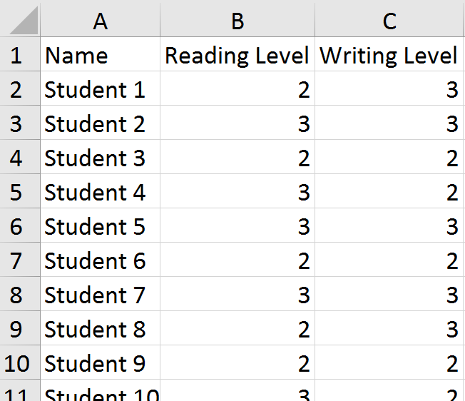
I grabbed some information on 50 of my own students as a start. I replaced the levels reported for each student with numbers (above = 3, at/near = 2, below = 1). Then, I selected the columns with the numerical data and inserted a scatter chart. Easy-peasy, right?

Except, I forgot something important. Many students have the same scores. For example, on the left, we can see that students 3, 6, and 9 all scored in the "at/near" (2) range in both reading and writing. When we plot their points on the chart, they overlap and appear as a single point instead of three students. This was no good. Part of what the principal wanted to be able to see were hot spots---areas of the chart where the school would need to focus for next year. He also wanted to get information about individual students.

I should probably stop my story for a moment here and say that I do not think this---or any other---chart is necessary for the goals the principal stated. If you really just need a list of kids, put a filter on the columns and sort to find the students who are "below" in reading and writing. I suppose that if you really needed to get fancy, you could use a pivot table to summarize things. If you had to have a chart that gave you an idea of the size of the problem, a bubble chart might do. Or, possibly a heat map. I called my friend back and we talked about this. This issue is always the biggest challenge with translating someone's vision into practice. It also gets back to the question I am best known for in my district: What is the problem you are trying to solve? While my colleague agreed with me about the lack of general usefulness of the chart the principal had sketched, she still wanted to produce it. Maybe after looking at it, he'd have a better idea of what he was really after.

So, back to the drawing board for me. I know...I could have left her in the lurch ("Good luck!"), but I appreciate a challenge. Excel was not going to win this one, dammit.

It was then that I decided to jitter the data points. Jittering introduces a tiny bit of randomness to the values so that the points don't overlap so much.

I added two columns (C, E) for the jittered points. You can now see that students 3, 6, and 9 have values that are just a tiny bit different from one another.

The formula in C2 is =B2+(RAND()-0.5)/5. The purpose is to combine the original value with a randomly generated number. It uses the RAND function to create the random values. In this case, I didn't want a lot of noise added to the data, just enough to separate things on the chart. Once in place, the formula is copied down through the rest of Column C, and then applied in Column E to the writing data.

This is what the jittered plots look like, with a minor adjustment made to the axes. Now that I have a few values less than 1 and greater than 3, I needed to ensure those showed up on the chart. The new axis ranges are .5 - 3.5. After making that change, I deleted the labels and used text boxes to add back the original wording. For the data points, I assigned some transparency to the fill so we could better see the overlaps.

We now have a chart that reflects the principal's request. I sent off the file with the sample data and chart to my friend and hoped that it might spur some discussion with the administrator about whether or not this was the right tool for the job he had in mind. Just because we can use Excel doesn't mean we should.

https://twitter.com/fleurdevie/status/2810755338
I don't mean to discount the principal's intentions. Yes, a simple list of students would get you to the same place (and a lot more quickly). But it doesn't necessarily have the same impact as a visual. It may well be that the type of scatter plot shown above engenders some productive conversation with his staff. He has a story in mind that he needs to tell. In that case, maybe Excel is the right hammer for this particular nail.

Sunday, March 26, 2017

ASCD 2017: Data Tools

This weekend, I am at ASCD's annual conference, now referred to as Empower. This is not the fourth year that I've attended (and presented...but more on that in another post), but it is the fourth time I've wandered through the exhibit hall with an eye toward what various companies are promoting to schools. The versions from 2013, 2014, and 2015 are available, if you'd like a trip down memory lane. In fact, that might not be a bad idea, because (Spoiler alert!) there was nothing particularly new or outstanding.

Data management and reports
There are no stand-alone systems here this year. Lots of vendors who focus on assessment and grading, however, do have displays and reports for managing student information. I asked the same question that I have asked for the last five years: Who builds your displays and reports? And yes, of course the developers make the magic happen behind the scenes, but there is still the same disturbing number of companies out there where that is the only answer. Or, there may be something along the lines of "we got feedback from teachers." This is all well and good---I support user involvement. I also know that developers and teachers are not data designers. People are spending a lot of time on these products, but they don't care enough to make the effort to ensure that effective communication with the data actually happens.

In one particular exchange, the project creator told me that all her charts were a result of her research. I have no doubt that the project is spawned from many years of hard work with teachers...but I know that she does no research with data design or communication. In fact, she was a little upset that anyone would ask about how she came to make her choices. I won't link to it here, but it's a new partnership with ASCD that you can look for, if you're interested.

Student assessment
There were some different displays this year for various flavours of student assessment. Scantron is making a big show this year. I chatted with them a bit and they have a few sessions this weekend. Perhaps I just hadn't noticed before that they are more than the "bubble sheet" company, but it looks like they're diversifying and growing into student assessment. I can't speak to the quality of this new content, but in an age of apps, google tools, and other options, it seems wise to be more than a company involved with scoring assessments.

Pacific Metrics is a content aggregators for various assessment banks, like the ACT or district-developed items. It produces no reports---it just integrates with existing school information systems. I think this is a desirable option for a lot of districts, especially smaller ones who may not have the resources to develop their own content. If someone else has valid and reliable items for you...and those can be automagically scored and then imported into your gradebook...it could be helpful. It's not a replacement for professional judgment---teachers would still need to ensure that the assessment matches the content.

The product I liked best came from Exemplars K - 12. This company provides not only rich tasks for the classroom, but also scoring tools and anchor papers. This last piece is incredibly valuable. These exemplars are representative of actual student work and can show teachers how to implement the rubrics. While I will always advocate for teachers to come together to develop tasks, score student work, and engage in conversations about student learning as a result, I can't deny that these banks would also support good teaching. I think this is especially important for rural or small districts, or schools with a high rate of turnover so that new teachers have a consistent framework in place.

Have you seen something this year for student data or assessment that you like?

Sunday, October 2, 2016

One: If the District Were 100 Students

After attending Tapestry earlier this year, I decided that I wanted to showcase some different data stories. In my day job, I mostly work with student data---test scores, demographics, attendance, discipline, and so on. All good stuff in its own way. But there are lots of things that we collect and don't share, either because of student privacy concerns or just lack of trying.

It is my goal this year to tell ten new data stories in ten months. And while I'm a little later in getting the first one up and running, it's happening. Every story will have an online component with links to programs, data sets, or interactive views. Each one will also have an offline component. I've commandeered one of the bulletin boards in our district office. My goal with that piece is to make "touchable" data, and data displays that can be viewed and experienced regardless of Internet access. Out of all of this, I hope that we bring to light some new understanding to different audiences and create some interest in increasing the visibility of some our underrepresented students.

For (late) September, our focus is "If the district were 100 students." Maybe not the most original topic; however, it has given us a safe place to figure out how to put it all together.

Offline


For the main presentation, we selected six demographic attributes: homeless, low income, absences, dropouts, English language learners, and students of color.  Each of the squares you see has 100 push pins, with the colored ones representing the percent of students in that group.

For three of the groups, we created callouts that provide more detail. For example, our English language learners might only be 2% of our students, but more than 25 languages are represented by that group.

It's been fun to see and hear about people who touch the pins. I'm glad that they feel like they can. I have grand plans in the coming months to employ various paper pop-ups and other things that will invite some exploration with more than the eyes. I had someone comment that seeing the purple pins (representing low income) made her sad. So much of the time, we look at data as numbers on a page. It didn't make the same impact for her as seeing the display.

The rest of the display is devoted to information on enrollment changes, along with some projections by the district and city about the future of our demographics. None of this is earth-shattering or super-fancy, but it feels good to put it out there. It's time to start some different conversations about data.

Online
Each month, we're building a companion web page. This month, I created some simple waffle charts (to reflect the offline displays) and a line graph that users can interact with via Excel slicers. There is a QR code on the bulletin board which links directly to the online options.

A big focus for me this year is on being more transparent about the ethics involved in the choices made about these displays---from which data are (or are not) represented, to downloadable data sets, to the reasons behind the specific charts. It is a privilege for me to have access to the data that I have. It's also a lot of power...and somehow, I need to make sure that I publicly acknowledge that and invite comment.

Bonus Round
Next month...which is really sometime this month...I'll be presenting data related to a month in our board room. I know, that doesn't sound very sexy, but I think the Outlook calendars for that room will reveal a lot about our priorities and partnerships. It's not something we've ever looked at, which is why I think it will be an ideal candidate for this project.

Are you trying something new this year?

Saturday, June 11, 2016

Eyeo 2016 Recap

I attended the Eyeo Festival this week. It brings together "creative coders, data designers, artists, and attendees." I have been wanting to go for a couple of years as a way to pull myself in a different direction. It's easy to get into a rut, or at least into a routine that doesn't allow you to ponder other possibilities. This was a very different conference from others that I've attended. Here, I came away feeling creative and inspired. At others, I've walked away with learning to apply. It's not that one outcome is better than another---they each have a role.

I am looking forward to the videos from the festival being posted. In the meantime, here are some of the highlights.

Emergence
Nicky Case kicked things off. His focus was on emergence, a concept where the sum is different from the parts. I can't say that he shared anything new in terms of his ideas, but what I liked was seeing a young adult share his process of learning that there is a lot of grey area in the world. I worked with teenagers for nearly 20 years, and the black/white worldview was pretty normal. It takes time and experience to learn that there are lots of answers to any question. As a young 20-something, Case is showcasing the transition to a more experienced lens on the world.

The keynote by Paola Antonelli, which was the next evening, shared an even more advanced take on this theme with her views on quantum design: "ambiguous states, in the spaces ‘in between’—between digital and physical, high-tech and crafts, old and new, nature and artifice, developed and emerging world." Beauty is not just in the eye of the beholder, meaning is derived from the eye of the observer.

Transformation
A second theme was about the transformative nature of data. Paolo Ciuccarelli of Density Design spoke about the poetics of data visualization. He pointed to the need to design data experiences that "generate poesis within a space of wonder."

from http://www.densitydesign.org/research/brain-houses-three-interieurs-stories/

One of my favourite ideas that he shared was this concept of a panorama, like the one shown above. I love the idea of embedding the data within a larger context. I highly recommend having a look at the Raw tool for generating visualizations.

Moritz Stefaner gave a talk on his Data Cuisine project. One of the things I liked most about this project was the idea that the dimensions of food (ingredients, presentation, cooking method, etc.) can be used to represent dimensions of data. This leads to a very different sort of interactive experience.

Transformation also appeared in how artists used materials in different ways. Whether it was Anouk Wipprecht combining her love of couture and robots or Tania Candiani speaking about the intersection of combination, serendipity and translation, I was blown away by the creative thought processes that were shared.


This is not the sort of end product I get at education conferences---where sharing one's thinking is not considered good enough. At those conferences, there is an expectation of audience involvement and tangible takeaways. With Eyeo, the feeling that is created through the presentation is the goal. I can't talk about this conference in terms what I learned, but rather, how it made me feel. This brings me to the last major theme.

Instruments of Power
There was a strong focus on equity at this conference, from the range of speakers, to topics, to the code of conduct. Part of that is an understanding of privilege as it applies to how we collect, use, and represent data.

Marek Tuszynski from the Tactical Technology Collective shared their recent exhibition: The View from the White Room. (E.g. looking out from an Apple store.) The show looked at questions such as What does it mean to live in a quantified society? and What is the value of data privacy when it becomes something you can buy? Lots of powerful things to think about from this session---I had to get out and take a walk after it. Part of the exhibit included something called Big Mama, based on the quote from a government official justifying surveillance that he did it because "I love you all." and the perception that the contribution of data leads to a harmonious society. Take a deeper look at Unfit-bits, Me and My Shadow, Security in a Box, and Exposing the Invisible. It is not that these concepts are new or unknown, but it's their application within our personal and professional contexts that make them worth revisiting.

As much as we talk about the power data visualization has to reveal, we rarely talk about how it can also be used to hide. In the best talk I saw, Josh Begley shaped conversation around what the work is that data visualization does. In one example, he talked about the geography of incarceration. As part of that, he made the comment that "most photos today are taken by machines for other machines to see." Satellites, drones, and other tools capture far more images than anything humans post to Instagram, Flickr, or other sites. Josh works on projects that bridge what machines are doing with what we notice. Do we want to be as connected to our foreign policy as we are to our phones? Check out his work on the Dronestream App or Officer Involved Shootings as ways to explore how the things we don't represent are still powerful enough to evoke emotion.

There were other presentations, keynotes, and sessions that I attended. There were also some I didn't get to attend due to having to get to the airport...including one I was looking forward to the most by Lynn Cherny. However, I enjoyed exploring a bit of Minneapolis, getting to meet several data viz heroes in person, and being able to think about some very different concepts for awhile. This spring has been a real drag in terms of work demands. I am looking forward to working on some new projects that are being spurred by this recent boost to my sense of creativity.

What have you seen recently that inspires you?

Sunday, April 10, 2016

Changing the Narrative

One presentation from the Tapestry Conference has kept me thinking long after the end of the event. It was a short story presented by Trina Chiasson, and explored the rise of the Data Selfie.


Trina talks about the importance of the user being able to see themselves within the data set. At minimum the data should support a personal goal or help solve a problem by revealing new insight. In this world, data become the jumping off point into a Choose Your Own Adventure style of story. I like this idea from the standpoint that part of audience engagement is a sense of personal relevance or connection with the data. 

One of the examples Chiasson gave was this interactive graphic from the New York Times that shows The Jobless Rate for People Like You.


There are tons of similar examples out on the interwebs---ones where if you fit the descriptors shown (male, female, white, black, Hispanic...), you get a chance to participate with the data and create that data selfie.

But what if you don't see yourself reflected in those descriptors? If I'm Asian, for example, I have to be content with "all other races." Beyond that, there's a lot of nuance missing. Does it matter if I have one college degree or three? It all counts the same.

What I think might be more disconcerting is what happens if you do see yourself in the data and don't like what you see. Using the NYT site shown above, if I'm a black male, the jobless rate is double the national average...but there isn't anything I can do about being a black male. I can't change that narrative. So then what?

I realize were talking about an example involving adults, but I can't help but think of the K - 12 world I live in. What if I did build something like this to show the graduation rate for people like you? I have the data. I know the demographics of our students and graduation rates. Not a big thing to put it together. But in posting it, what am I saying to the parents of black child in third grade? Your kid has  a 50-50 shot of making it to graduation in our district. What are the options to create a different story for him or her? Will it change before your son or daughter reaches high school? After all, dropping out is a process, not an event. Is it already too late to try? I can't imagine anyone would tell a child to just give up in third grade because data reveal that they're not going to get a diploma. But what is the takeaway for a child, parents, community, or teacher who sees just that in the data?

Sometimes, these aren't data selfies. They're system selfies. If the jobless rate for black males is twice the national average, that says something about us as a society...not those individuals. Ditto for my imaginary graduation rate display. It seems to me there is greater power in supporting individuals become critical consumers of their own data. Perhaps, as Chiasson suggests, it's tracking health or working toward a personal goal. But when we connect it to something larger ("People who lost 10 pounds also ate three carrot sticks a day!"), it stops being personal and projects a Fate you might not feel you are able to escape. Can we develop ways to effectively share data and use trends for insight without disenfranchising the most vulnerable among us? How do we balance the rise of the data selfie with the need for systemic change?

Wednesday, March 9, 2016

Go Tell It on the Mountain

I am stretching this week beyond the comfort and confines of my typical environment in P-12 public education. I'm at a convening of data storytellers from a large variety of industries. It's the first time I've been to a conference that is not specific to education.

About 100 of us are safely tucked away at the Stanley Hotel (you know, the one the inspired The Shining?) in Estes Park, Colorado, for the Tapestry Conference. As far as I know, I'm the only public ed person skulking around---although there are several higher education representatives. It is odd, for me, to meet and greet with people from Zillow, Comcast, ProPublica, or NBC News. Every face is new to me, although I finally met Robert Kosara and Naomi Robbins...both of whom I've been wanting to meet for a long time.  I love that everyone is passionate about the same goal of effective storytelling with data.

I have that interest and commitment to quality communications using data. But why else am I here? After all, I am definitely in the "one of these things is not like the others" category. I am here because public education needs to connect with everyone. It's public, for crying out loud. Everyone's tax dollars are funding it. Regardless of the industry you represent, there is a connection with public education. I hear all the time from educators who are tired of how others message our work. We can change that, but not by sticking to our own circles of influence and expecting the rest of the mountain to come to us. Sometimes, we have to go to the mountain.

Beyond this idea, however, is a more personal one for me: I need to learn and grow in my professional work. I get an opportunity to do that through education conferences---they help me learn about my job. But there is something beyond that...something that speaks to the purpose of what I do and feeds my spirit for it. That is what I am hoping Tapestry will be for me. This is not about the nuts and bolts of my day-to-day job. This is about helping me inspire and grow others when I return to the office.

Learning is my life's work. It is easy to lose focus on that with a sea of emails, ever-present to do lists, and a calendar full of meetings. It is critical for me to set all of that aside for a couple of days and just immerse myself in learning. Networking with others is great, too, and a change of scenery doesn't hurt. But most of all, this is an opportunity to just be in that moment of growing my knowledge base.

We are not so different, educators. We may have small-batch, artisanal data sets and handcraft our visualizations in Excel, but we face the same challenges as Big Data when it comes to data quality, effective communication, messaging, and design. We have the same issues around helping people ask good questions of their data and identifying the most critical aspects for action and attention. Perhaps we have a better chance of finding solutions together, rather than isolating ourselves as educators. Together, we can move mountains.

Thursday, February 25, 2016

Making Sense

Earlier this week, I had an opportunity to share three sets of data with building administrators. You've had a preview of some of the visuals: a new way to represent the achievement gap, cluster charts, and small multiples. The administrators had not, although I have shared lots of data in lots of other ways with them. This was our opportunity for some in-depth work.

With each round of data presented, I did a little bit of instruction so that they understood how to read the charts. Each table had some paper copies and a few focusing questions to get the conversation rolling. And then the real fun began.

I have never had a chance to watch people learn with new-to-them data representations. Bar charts, line charts, and scatter plots are commonplace. When you share these types of visuals, everyone already knows the drill. But hand people sheets with small multiples and a few of them will overlay the pages and hold them up to the light. Give them a set of line plots showing gaps among student groups, and they will spread them across the table to organize the pieces in different patterns. Hand over some cluster charts and watch and people fold the paper along various lines to build new learning.

It was absolutely fascinating.

As a way to gauge their engagement with the new charts, I tried the Talking Mats which were recently shared by Andy Kirk.


I provided three different colors of sticky dots, one with each round of data, and asked the administrators to place their dot when we transitioned to the next part of the workshop. In addition to watching them interact with the data---which was very powerful learning for me---the Talking Mats provided valuable feedback at the end. These are visuals for me, created by the audience, which have told me a lot about which charts gave the biggest bang for the buck. I'll know where to focus my time and work in the future.

A few people struggled with looking at the forest of data represented by small multiples, instead of the trees. Some made connections across the data sets. Still others wanted to argue with data because they were unnerved by what they were seeing for the first time. By the end, though, there was a very rich conversation about the meaning we'd been able to make from all of the data.

For the first time since I started this job, I had many public compliments about the work I shared. My favourite has been "Thanks for presenting data in a way that helps me learn." Here's to more opportunities to use Excel to support us in making sense of things.