Showing posts with label charts. Show all posts

Saturday, June 3, 2017

When Excel Is Your Hammer

Last week, a counterpart in a neighbouring school district sent me the picture you see at the right.

She'd been talking with a principal about their data and he'd been sketching what it was that he thought needed to have represented.The administrator wants to compare student performance on the reading strand of the state test with their performance on the writing strand of the same test. Although his drawing shows four levels of each, there are really only three reported: below, at/near, and above. Her question for me: Could this be done in Excel?

Um, sure...why not? We're just talking a scatterplot here. Replace the text of the labels with numbers (1, 2, 3) for reading and writing, then just get all up in that scatter chart's business. I sent my friend some basic ideas about how I would approach it, and said I would pull some sample data to model things.

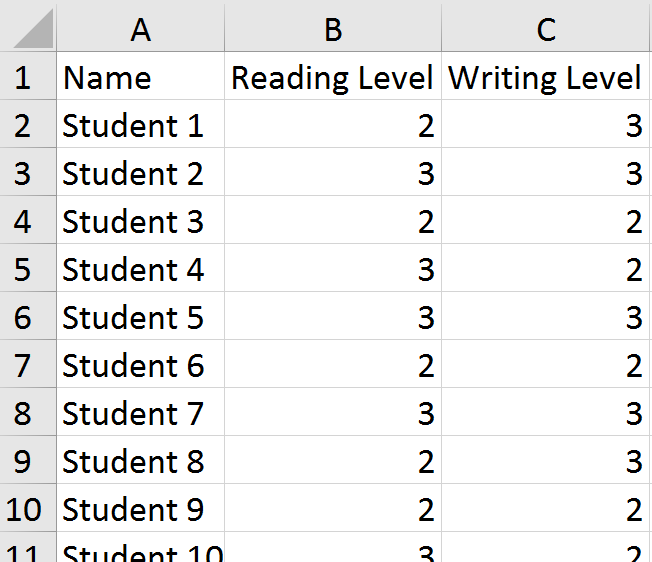
I grabbed some information on 50 of my own students as a start. I replaced the levels reported for each student with numbers (above = 3, at/near = 2, below = 1). Then, I selected the columns with the numerical data and inserted a scatter chart. Easy-peasy, right?

Except, I forgot something important. Many students have the same scores. For example, on the left, we can see that students 3, 6, and 9 all scored in the "at/near" (2) range in both reading and writing. When we plot their points on the chart, they overlap and appear as a single point instead of three students. This was no good. Part of what the principal wanted to be able to see were hot spots---areas of the chart where the school would need to focus for next year. He also wanted to get information about individual students.

I should probably stop my story for a moment here and say that I do not think this---or any other---chart is necessary for the goals the principal stated. If you really just need a list of kids, put a filter on the columns and sort to find the students who are "below" in reading and writing. I suppose that if you really needed to get fancy, you could use a pivot table to summarize things. If you had to have a chart that gave you an idea of the size of the problem, a bubble chart might do. Or, possibly a heat map. I called my friend back and we talked about this. This issue is always the biggest challenge with translating someone's vision into practice. It also gets back to the question I am best known for in my district: What is the problem you are trying to solve? While my colleague agreed with me about the lack of general usefulness of the chart the principal had sketched, she still wanted to produce it. Maybe after looking at it, he'd have a better idea of what he was really after.

So, back to the drawing board for me. I know...I could have left her in the lurch ("Good luck!"), but I appreciate a challenge. Excel was not going to win this one, dammit.

It was then that I decided to jitter the data points. Jittering introduces a tiny bit of randomness to the values so that the points don't overlap so much.

I added two columns (C, E) for the jittered points. You can now see that students 3, 6, and 9 have values that are just a tiny bit different from one another.

The formula in C2 is =B2+(RAND()-0.5)/5. The purpose is to combine the original value with a randomly generated number. It uses the RAND function to create the random values. In this case, I didn't want a lot of noise added to the data, just enough to separate things on the chart. Once in place, the formula is copied down through the rest of Column C, and then applied in Column E to the writing data.

This is what the jittered plots look like, with a minor adjustment made to the axes. Now that I have a few values less than 1 and greater than 3, I needed to ensure those showed up on the chart. The new axis ranges are .5 - 3.5. After making that change, I deleted the labels and used text boxes to add back the original wording. For the data points, I assigned some transparency to the fill so we could better see the overlaps.

We now have a chart that reflects the principal's request. I sent off the file with the sample data and chart to my friend and hoped that it might spur some discussion with the administrator about whether or not this was the right tool for the job he had in mind. Just because we can use Excel doesn't mean we should.

https://twitter.com/fleurdevie/status/2810755338
I don't mean to discount the principal's intentions. Yes, a simple list of students would get you to the same place (and a lot more quickly). But it doesn't necessarily have the same impact as a visual. It may well be that the type of scatter plot shown above engenders some productive conversation with his staff. He has a story in mind that he needs to tell. In that case, maybe Excel is the right hammer for this particular nail.

Sunday, April 2, 2017

Backwards Bar Charts

Recently, someone shared a visualization from Periscopic about the Trump Emoto-coaster. While the subject matter itself was not of particular interest to me, I did like the presentation of it.

Strap yourselves in. Your hands must be this small to ride this ride.
The line chart at the top made me think about the rises and falls within a school year. March seems like an especially cruel month, with teachers' tempers growing short. (Just ask me about how I ended up in a conversation with a five-year old about why we need to wear pants at school.) How do attendance and discipline intertwine? And, when I looked at the horizontal bar cum sparkline plots shown above, it also made me wonder what we would see if we plotted individual classrooms over time. Maybe something like this:

Let's say there are four teachers at a particular grade level in a school. If we looked at the number of student absences and office referrals from the beginning of the year to the end of the year...what might we see?

If I was a principal, I might use something like this to either look for "hot spots" in my school that I might not know about...or monitor how well my school improvement initiatives are being implemented at the classroom level...or even to show staff for input. If I was a teacher, this might give me a general way to compare outcomes in my classroom. It might also piss me off (This just shows you that I have ALL of the bad kids!).

My challenge was how to build this. At its most basic level, this is a floating bar chart. And Ann Emery has a great tutorial for doing just that in Excel. But I didn't take that particular route this time because of how I need these charts to lay out. You see, absences for any given classroom total no more than 70 in a month...but referrals are no more than 13. Excel isn't going to let me push the edge of the chart off the lefthand side of the worksheet if I keep the x-axis the same on both sides, meaning I ended up with a ton of blank space. I suppose I could put attendance on the left and discipline on the right, but hey, what's Excel without some challenges?

So, how do you build a backwards bar chart?

Create your horizontal bar chart the usual way, then fuss a little bit with the axis settings.
Once you do this, then remove the gridlines and axes themselves, you'll be able to position this bar smackdab against the other one. You know it's worth it...you can work it. Just put that chart down, flip it, and reverse it.

Holla!
Another to know about this chart is the addition of the line down the middle. Since I deleted the gridlines and axes, I need some sort of visual between the bars. So, a simple line shape in grey 1.5 pt is all that was added.

In terms of labels, I'm going to leave them off. If you understand how one is laid out, then you can understand a whole school's worth. The numbers themselves aren't the big idea with this visual. It's the patterns and comparisons we're after. When we've identified those, we're ready to ask some deeper questions and dig into the numbers in a different way. These charts are the starting point for conversations...not the end...even if that seems a little backwards.

Friday, November 4, 2016

Two: A Month in the Board Room

When I first shared this month's topic for a data story, I received a lot of quizzical looks in return. A month in the board room? Whaaaa? Why would anyone care about that? But I didn't know why anyone---including me---would care. I wasn't sure what I'd see. However, that is one of my larger goals with this project. I want to find out what happens when we pay attention to data that are typically ignored.

A Month in the Board Room is the second in my "10 for 10" challenge I have set for myself this year. It is my goal to tell ten new data stories in ten months. Truth be told, I'm running a bit behind. There is a huge learning curve with these. What I have in my head is never quite what appears on the board and on the web. I try to remind myself that perfect is the enemy of the good. It is more important to finish and post something rather than wait until everything is just right. If I go that route, I might manage to put up only one of these. I am learning more each month. Maybe by the time I get to number ten---whatever and whenever that will be---I'll be a well-oiled machine in terms of getting things posted.

Working with the Data
On the right, you'll see a mini-version of the display that I built from the data. After selecting a month (February), the data were exported from an Outlook calendar into Excel. Each meeting was coded into one of nine categories after reviewing the full list: teacher/principal evaluation, curriculum, assessment, operations, parent meetings, private groups, special services, district office, and administration.

A basic layout, with time of day across the top and days of the month down the left side, was set up with blocks of time for each meeting in the calendar.

I went through several iterations of color coding. There were several combinations of colors I tried that I actually liked better than the one shown at the right. However, while they looked lovely together in some other types of charts, they looked terrible as big bars. This version seemed not only pleasing on the eyes, but also allowed me to divide the information into things that are initiated from within our department (green) and things that are generated elsewhere (brown).

I knew that I had hit on the right display when I showed it to my boss. He appreciates and supports the work I do, but really isn't all that into data. But when he saw this, he actually started engaging and noticing things. After a minute or two, I pointed out to him that he was talking about data...at which point, he smiled and left. Gotcha.

Offline
Just like last month, there is an offline component to the data display---a bulletin board outside my office. The graphic you see above was sent to Costco in two parts and printed as two 16 x 20" photos. A swatch of each color was also sent to be printed as 4 x 6" photos.


This photo is of the board in progress. We have some explanatory text on the left...the poster in the middle (there's more coming) and the "legend" on the right. Each of the swatches is on a card that viewers can lift to see more information about a category, including its name. We decided not to put the names of the categories on the front of the card to encourage viewers to spend some time first trying to interpret or make sense of what they see in the larger poster.

The additions to this display include a second large poster attached over the one you see. The top one has some of the bars turned into options that open and reveal details of the meetings represented. We also have data about occupancy and other meeting spaces attached to the board.

Online
Our companion web page uses an embedded PowerPoint to enable users to see details of every meeting, including links to additional documents and sites. Users can also download a larger data set to explore on their own.

It is my goal to prompt conversation and reflection about data. I am encouraged by the comments I have received about the project and some of the discussions I've had. For example, a couple of people suggested that I not represent weekends on this month's data display. Those days do contribute to a lot of blank space, but it is also an opportunity to think about the importance of what we choose to represent...and what it means when we don't represent something. Sure, our board room is rarely used on weekends, but it just makes me wonder about what activities we might see if we represented what people did when they weren't at work.

Bonus Round
So, what did we learn by representing the data? Maybe no large insights, but it does make it easier to see how different groups access the space. Parent groups are only there in the evenings. Administrators meet either before or after the school day. Special Services only uses the room when no subs would be required. Work around curriculum (science, math, career and technical education, and so on) is the heaviest user. In terms of what we don't see, students are rarely in that space. This is not a surprise. Neither is the lack of meetings around construction and infrastructure---we have a ton of those due to ongoing bond work around the district, but those involved don't need such a large meeting space. If I'd plotted things over the course of the year, I'm sure there would be different patterns revealed, but someone else can take that on.

I am already planning the next one, even as the paint is barely dry on this. At some point in the future, I will have a high school stats class help design a story...and there are plenty of other ideas cooking in the background. I hope that we'll push our data discussions far beyond simple red, yellow, and green-filled cells representing assessment results and into more well-rounded conversations about what we value...and what we do when we don't see those values on display.

Wednesday, September 7, 2016

Cheater Bullet Charts

Another school year has started. That means the last month has looked something like this for me:

Art by Allie Brosh
One thing I wanted to try this year was building bullet charts in Excel. We have some change in test scores to represent and I thought this would be a meaningful and compact way to represent the data.

As you likely know, there is no bullet chart option in Excel. Bummer. There is no shortage of workarounds on the web. Many people, who are far smarter than I, have posted tutorials. The one by Jon Peltier is, of course, the most thorough, but Stephanie Evergreen has written about her easy version and Jon Schwabish has offered another idea. They are all worthwhile to review and I thought about them a lot. I just had one problem. I was too lazy to work through all the steps.

Bill Gates has been attributed as saying that "I choose a lazy person to do a hard job. Because a lazy person will find an easy way to do it." And if that's true, then when it comes to building bullet charts, I must be the go to person. Because I found an even easier way to get them done in Excel.

Are you ready? Here's my secret: Make two charts that are the same size. Lay one on top of the other, ensuring that the fill on the top one has been set to transparent and change the gap width to make one set of bars skinnier than another. That's it. That's all you need.

No fancy finagling. Just one data set represented on the bottom and one on the top, as god Few intended.

You can change the widths of the bars, of course (might be better if I made the bottom ones a little wider..."Fat-bottomed bars you make the rockin' world go round..."). Need a third data point to show a target? Why not? Just make another chart with transparent fill and plop it on top of these. I won't tell you no.

Any cheats you've discovered as of late? What have I missed while I've had my nose stuck in the back end of Excel for the last several weeks?

Thursday, February 25, 2016

Making Sense

Earlier this week, I had an opportunity to share three sets of data with building administrators. You've had a preview of some of the visuals: a new way to represent the achievement gap, cluster charts, and small multiples. The administrators had not, although I have shared lots of data in lots of other ways with them. This was our opportunity for some in-depth work.

With each round of data presented, I did a little bit of instruction so that they understood how to read the charts. Each table had some paper copies and a few focusing questions to get the conversation rolling. And then the real fun began.

I have never had a chance to watch people learn with new-to-them data representations. Bar charts, line charts, and scatter plots are commonplace. When you share these types of visuals, everyone already knows the drill. But hand people sheets with small multiples and a few of them will overlay the pages and hold them up to the light. Give them a set of line plots showing gaps among student groups, and they will spread them across the table to organize the pieces in different patterns. Hand over some cluster charts and watch and people fold the paper along various lines to build new learning.

It was absolutely fascinating.

As a way to gauge their engagement with the new charts, I tried the Talking Mats which were recently shared by Andy Kirk.


I provided three different colors of sticky dots, one with each round of data, and asked the administrators to place their dot when we transitioned to the next part of the workshop. In addition to watching them interact with the data---which was very powerful learning for me---the Talking Mats provided valuable feedback at the end. These are visuals for me, created by the audience, which have told me a lot about which charts gave the biggest bang for the buck. I'll know where to focus my time and work in the future.

A few people struggled with looking at the forest of data represented by small multiples, instead of the trees. Some made connections across the data sets. Still others wanted to argue with data because they were unnerved by what they were seeing for the first time. By the end, though, there was a very rich conversation about the meaning we'd been able to make from all of the data.

For the first time since I started this job, I had many public compliments about the work I shared. My favourite has been "Thanks for presenting data in a way that helps me learn." Here's to more opportunities to use Excel to support us in making sense of things.

Friday, February 12, 2016

Living Large with Small Multiples

In the poem Song of Myself, Walt Whitman writes "Do I contradict myself? Very well then, I contradict myself. I am large, I contain multiples." And while Excel might not be considered to be as sexy as Whitman's prose, they do have some things in common. They both can contain multiples.

Small multiples use a series of similarly scaled charts. The purpose is to allow for easy comparison across time or groups. When you use these charts, you are looking at the forest and not necessarily the trees. You don't want to focus on details as much as you search for larger patterns to investigate.

I built the example below this week. It's a series of scatter plots. Each tiny blue dot is a student, and their positions on the charts represent the point where their percent attendance and scale score on the state assessment intersect. An orange line shows the linear regression for the data set in the chart. The line tells us a couple of things. It provides a quick visual on the range, as well as the basic trend.

What kinds of things do we notice? Maybe it's how students who score in Level 1, regardless of grade level, don't have much of a discernible pattern. Level 3 students tend to clump---their rates of attendance and scores are very similar to one another. Maybe we have a conversation about those areas where the line slopes downward. How do we explain a trend where the more you come to school, the worse your do on the assessment? Or maybe even the overall picture isn't what we might predict. Even those trend lines that have an upward slope aren't very steep. Wouldn't we think that better attendance leads to better scores? And maybe we need to talk about what's happening when kids get to sixth grade and attendance starts to get a lot more worse for students at all score levels.

Because you likely can't read the itty-bitty labels, I will confess that I have broken a cardinal rule when building this: the y-axes are scaled identically for each grade level, but not among all the grade levels. Percent attendance is plotted along the x-axis and is the same for all of the charts. But the range for scores changes. The higher the grade level, the higher the possible score. I've tried to mitigate this by keeping the y for each grade at about 400 points. If I'd had to make in the entire score range identical for all grade levels, the information represented was too squeezed to make sense of things.

There are thousands of students represented on this single graphic. While focusing on an individual is critical to the daily work of the classroom, small multiples serve a different purpose. This time, it's about the herd.

What will school principals see when I show this to them in a couple of weeks? I'm not sure. I'll have to provide a little support in learning to read it, but I think they'll catch on quickly enough. The chart will be part of a larger conversation around student performance...one piece of a puzzle where they will apply context. As for me, I've enjoyed looking at this because I see something different every time.

Are you using small multiples in your work? How have they been useful?

Bonus Round
To build this, I organized the necessary data and then used a pivot table and slicers to pull attendance and scale scores by grade and score level. Dynamic ranges were used for the charts, allowing for expansion/contraction of the number of data points.

Each chart was pasted into PowerPoint. This allowed me to size and position all of the charts and labels, as well as easily share the document.

Tuesday, December 29, 2015

Show the Data: Distributions

Last spring, we looked at a couple of ways to show the data: Cluster diagrams and bump(s) charts. The idea here is that when we summarize data and represent it in bar or line charts, we miss nuance. Instead, when possible, we should look for ways to show all of the data.

I had this in mind when I recently tried to tell a story about student performance in my school district. The district does a pretty good job with about 80% of its students, and because that's far better than the state average, no one asks the hard questions about the remaining 20%. Shouldn't they learn to read and graduate from high school, too? I certainly think so...but I often run into roadblocks when I try and raise this conversation. Maybe I need a different visual to use as persuasion.

I remembered some information for another post about recent research in using distributions to replace bar charts and thought I might give it a try.

Here is Exhibit One:

This is typically what we provide to schools (and the public) regarding student performance. This chart represents one grade level at one of our elementary schools. Levels 1 and 2 (L1, L2) represent the percent of students who did not meet the standards ("pass"), while Levels 3 and 4 show the percent of stuents who met (L3) or exceeded (L4) the standards for English Language Arts. Generally speaking, this doesn't look so bad. Lots of kiddos did well enough, and L1 is the smallest category. Yea, Team!

But who are these kids in each category? Do we have the same distribution in performance if we look at student demographics? Let's find out.

Here is Exhibit Two:

A little orientation to this beast. We still have levels of performance (1, 2, 3, 4) on the x-axis, but the y-axis shows the actual scale scores. In other words, for this grade level and subject, Level One is actually made up of scores in the range of 2114 - 2366, Level Two ranges between 2367 and 2431, Level Three is represented by 2431 - 2489, and Level Four includes performance between 2490 and 2623 (source). Every child's score (n = 69) is represented by a circle on the chart.

It might be interesting in itself to just look at the distributions. But I've added some information based on student ethnicity. The grey circles that you see represent students who are white (n = 54). The pink circles represent students of color (n = 15). Overall, only one-third of scores from students of color are in Levels 3 or 4, while about two-thirds of the white student performance are in those levels. And, one-third of all students of color are in the lowest category (Level One).

If you're wondering about why I am not representing different groups (American Indian, Asian, Black, Hispanic, Pacific Islander, Two or More Races, White) with different colors...well, I can tell you that I wrestled with that decision quite a bit. Our district has very small numbers of students of different races. For example, for the school and grade represented above, there are no black students. There is one American Indian student shown on the chart (I can't tell you where, due to FERPA restrictions). This student as an individual is important and worthy of all of our best efforts. When represented by a score, conversations become problematic because there is no way to compare it with others in the same group.  Disaggregation of the data at the grade and school levels does not cause the sorts of inquiry that it should because "it's just one score." Trust me---I've heard that refrain quite a bit. But when I add the "just one score" with others in a building who represent non-white students, there's a bigger argument to be made. Your mileage may vary, based on the populations you are working with. All that being said, I am very open to feedback on this. What are some other options I should consider that will balance tiny n-size against the overall story to be told? Stacked bars, perhaps?

I realize that that two charts I've shown in the post represent different things. One is just the overall percentage by category...while the other is distribution by category. So, one isn't necessarily a replacement for the other. Even if I altered things a bit by showing numbers of students in the first one, it would result in the same chart. But I think there is some real power in looking at the second chart---even if it was not coded---and understanding that every child is there. It's not a blob of summary performance...and goes beyond a simple count of who is in each box.

So, here's looking at you, kid. (Especially if you aren't white.)

Bonus Round
The distribution of performance chart shown above was built in Excel (of course). It is a basic scatter plot chart, with specific scores selected and colored either grey or pink. If you visit the research site I mentioned earlier (Beyond Bar and Line Charts), they have some workbooks you can download and easily modify.

Sunday, August 16, 2015

Anatomy of a Design Build

Like many school districts, we have new data this fall. The state has changed to Smarter Balanced assessments to measure student knowledge and skills with Common Core State Standards. One of the challenges associated with presenting these data is the inevitable effort to compare them with scores from previous years. But they do not represent the same things. And so began the challenge to develop this report:


Subject areas are organized across the top. Grade levels are on the horizontal. The blue squares represent grades and subjects assessed in 2015. The large numbers in the center show the percent of students meeting the standard, with the distribution of scores shown by the column charts at the bottom of the square. Historical data are shown by the line graphs in the grey squares.

It is built in Excel (of course). On another sheet is a table listing the various schools, grade levels assessed, subjects, school years, and scores. A pivot table with this information feeds the report you see above.

I'm mostly happy with this layout and format. I would still like to tweak some of the colours, but overall, I think I've solved most of the issues with representing the data. But it took awhile to get this far.

In the beginning, there was a suggestion from one of my supervisors to offer something like what you see on the right. This is what another district in the area provides to schools and the public. I showed it to one of our principals and he said it made his eyes bleed. I agreed with that sentiment. We can do better, I said.

It's not that the information provided here is bad, it's that a pdf of a spreadsheet does not take advantage of what data visualization can offer to make meaning. It has much of the same information I developed for my version. We just used two different approaches.

Originally, I started with something similar. I pulled  demographic and program data and added some sparklines and arrows to show change.

But I decided that this was a stupid idea before I got too far down the road with it. It was way too hard to scale the graphs along the same axes. This is an important thing to do to enable comparisons. But there is just too large of a range to represent in a small space. Not to mention this layout is boring. Seriously. Yes, I know it's half finished, but no bells and whistles involving fonts and headers are going to make this version anything other than a snoozefest.

So, I tried something else.

This is where I started to play with the idea of tiles. I wanted a cool color (as opposed to a warm one) and decided to look at purple as an option. This version is slightly better, but not by a lot. Looking at it, I realized something very important: Almost none of this information is useful. Does anyone, especially a school leader, really care about the year-by-year percentages of Asian students (for example)? It's not actionable data. You're not going to go out and recruit more Asian children if you notice your percentage slipping. There's no action plan a school would make to decrease the enrollment of girls. This is not to say that viewing overall change wouldn't yield some insights, but the year-by-year review isn't very helpful. So I started over. Again.

Third time's the charm, right?


I won't claim this is perfect, but we've come a long way, baby. All that demographic and program data? Now in one tidy bar chart on the left (under "% of overall enrollment"). The five-year change is shown on the far right. The stuff in the middle? All new. Kids are more than the sum of their test scores. So, I've included some additional demographic information about absences and discipline. Now we have some conversation starters.

I did the achievement data next. This is the page at the beginning of this post. I played around a bit with colors and format, but the tiles have been a constant.

Feedback has been mostly positive, but I'm still tweaking things. What would you want to see? How should we show it? Anything we should remove or represent differently?

Thursday, May 7, 2015

Show the Data: Cluster Charts

In the last post, we explored the idea of adding bump(s) charts to our rotation of how we communicate our data. It's one way to show all of the data in a particular set. Another one I've been using quite a bit is a cluster chart. Full disclosure here, these are my own take on displaying data---a bastardized heat map, and certainly not based on heavy-duty math like real hierarchical cluster charts. So, really, I'm not sure what to call these...but in my current role, we're finding them to be very useful and I'm just rolling with cluster charts as my category.

This spreadsheet will eat your soul.
I get a lot of spreadsheets sent to me that look like the one on the right. I hate these with a fiery passion for a variety of reasons:
  • Too much "ink" in the data-to-ink ratio. With all of those little boxes, I don't know where to look.
  • And the colors. I feel like a circus came to town. But beyond that, the red and green are not particularly friendly to those with color vision issues...and I do work with some who are color blind. Are we really asking them to try and make decisions on student learning  based on this?
  • Not to mention that all of the data is colored in. What's the point?
  • And we have both numbers and colors. I'm not saying that you can't have both...or that they don't serve different purposes...but it's distracting. I'm constantly trying to make sense of the number patterns for each color.
I also think these data aren't useful because of the way they are organized. Alphabetical order is great for gradebooks, but not so much for trying to make sense of the data. Plus, we don't have any context---what if we're missing some signal in the noise? Suppose all of our low-performing students are boys...or in a minority group?

But let's say you are interested in showing both the progress students have made over time, as well as the characteristics of the students involved. We can reorganize the data by ranking the percentages on the second assessment (this is the "cluster" part). Then we can color code some additional information, such as gender or participation in a particular program. I also change the properties of the conditional formatting so that the fill and text are the same color, making the values seem invisible. Finally, I add thick white borders around all of the cells and resize the rows and columns. Here is a small part of the final product:


These are all the students who scored in the top level of our fictional grade 5 winter math assessment. Three of them improved a little, from light blue to a darker blue...others improved from lower on the scale (orange). But when we look at gender and program, another story emerges. Most of the students in the top category are female, not on free or reduced lunch, not in special education, and do not receive additional interventions through a Title I program.


See the difference when we look at students who have scored at the bottom for both fall and winter? Our population is mostly male and nearly everyone participates in one or more federal programs.

Maybe this representation doesn't necessarily hold any surprises, especially as we factor in free/reduced lunch. Children living in poverty typically do not perform as well as their peers. But one of the things I take away from this way to visualize that story is that we may need different interventions to support these students. Consider Student 39 on the right. He is receiving free or reduced lunch, special education and Title I services...and he's still ranked fourth from the bottom out of nearly 70 students. It doesn't mean that the school (and the student) aren't working as hard as they can. I do think it might mean that there are additional factors at work here that aren't (and can't be) addressed through the school. Perhaps the family is homeless or transient. Maybe the parents are going through a divorce...or the student has some medical issues. These are community-based issues and require different interventions to help close the gap for the student. I won't get up on my left coast soapbox about this right now. I'll just say that we have to work together on behalf of the whole child.

One of the pieces of information that is not represented in the visuals above is the number one item on teacher wishlists when it comes to reporting scores: progress. Sure, we have a bunch of students performing at the lowest level in the picture above, but that doesn't mean that they didn't make some growth.

This time around, I left the gender and program pieces coded the same, but I calculated the percent change between fall and spring and represented those in the leftmost column.

Look at Student 39 now. He's 12th from the top. Woo-hoo!

When we consider progress, we start to get a more equitable pattern---everyone is growing, and more often than not, it's our lowest performers who are making the biggest gains, even if they're still in the lowest part of the score breakdown.

By clustering similarly performing students together, either by scores or by progress, we get a much more useful pattern than we do with a spreadsheet that looks like a clown exploded on it. And, more importantly, we can show the data. In a very compact space, I can display everyone's scores and whatever demographic or program information is most relevant. And, I can fit the whole grade level on a single page.

I have no doubt that as we move forward, smarter people than me (I?) will continue to find new charts that help share everything we know about a group. Summary stats and charts will never go away---and they have their own purpose to serve. But sometimes we want the full version, not the Cliff's Notes. When we do, bump and cluster charts will be there.

Bonus Round
Want to see just how challenging colored squares can be? Play this online game. The rules are easy: just click on the one square that is different.

Monday, May 4, 2015

Show the Data: Bump Charts

This is a bump(s) chart, a/k/a slope graph. If you poke around online, you'll find a variety of examples and names. Some have multiple data points for each line...and some are simpler, like the one on the right.

Typically, the lines are labeled on each end, often with then name of the data series and sometimes with the data value. I do have a version of this one with the lines labeled, but since these represent real data points, it's best to keep things anonymous for this example.

But let me give you a little context here for what I'm showing. Each line represents a teacher---the entire chart shows the entire staff for a school. On the left is each teacher's percent of Ds and Fs assigned to students for the first semester of the 2013 - 14 school year. On the right is the value for the 2014 - 15 school year.

We want to use this chart to look at two things. First of all, what is the general trend within the school? In this case, most of the lines are sloping downward. This may connect to initiatives, such as changes in grading practices, tutorial options, or improvements in instruction. Whatever the story is behind this chart, it's looking positive.

Next, we want to consider the steepness of the slopes we observe. Sure, we could add a trendline, but if you're just using the chart for exploratory purposes, we can eyeball things. In this case, we might note that most of the downward sloping lines, especially for the upper percentages on the 2014 side of the house, have had significant decreases.

Typically, when I present these charts, I include a summary of the data. For example, between the 2014 and 2015 school years, 30 teachers assigned fewer Ds and Fs to students, 7 teachers had very little change in the percentage of Ds and Fs assigned to students, and 3 teachers showed an increase in the percentage of Ds and Fs assigned to students. Because these charts are new to many of the people in my audience, this brief summary is enough to get them oriented to the chart. They can then begin to focus on the details. This might start with the slope of the lines, but then I see them begin to dig into the labels: Are some teachers in new-to-them assignments this year? Are the lines showing little change all in one content area, such as math? What might we see next year---is there a goal around our percentages?

And now, a musical interlude...


Let's take a look at another of these beasts. This is a different school, but in the same district.

We see a lot of increases compared to the other school; but, if you look at the scale on the lefthand side, you'll see that none have a higher percentage than the other school. Generally speaking, teachers in this school assign a lower percentage of Ds and Fs vs. the other school.

The overall changes at this location aren't as dramatic, either. The slopes are more gentle.

What might account for the differences? Again, you'd have to poke further using knowledge specific to the school: Is this a more veteran staff that is has more expertise or are more resistant to change? Are the increases due to an unexpected change in student population---were the enrollment boundaries changed?

You could, with additional information, make some other comparisons between the two schools. What if you built graphs just showing one department, such as math? It would make the charts less busy and comparisons between buildings a lot easier.

The big idea with these charts, of course, is to show the data. Sure, we could just write the summary and do a simple bar chart or line chart to compare totals...but we're missing a lot of the story in doing so. When we go bumpin', we get a much richer picture of what is happening.

Next time, we'll take a look at another way to show the data using cluster charts.

Bonus Round
These charts are super-simple to make in Excel. Jon Peltier has an excellent tutorial on his web site. You can also download a template from the article I profiled in the last post.

Music credit: "Bumpin Bumpin" by Kreayshawn (c) 2011.

Wednesday, April 29, 2015

Hide and Seek

I want to circle back to an article I wrote a few years ago about my favourite data visualization.

Hierarchical Cluster Analysis by Alex J. Bowers from http://www.pareonline.net/pdf/v15n7.pdf
It shows all of the grades earned by students during their K - 12 journeys in two school districts. I love this chart because it finds a way to show all of the data in a dense, but succinct, format.

In The Visual Display of Quantitative Information, Edward Tufte states that Above all else, show the data. While the quote was applied to a different concept for visualizing data, when I look at the chart above, the quote rises to the surface of my thinking. Showing the data is no small task, and as educators, we spend a lot of time and energy not doing that. We summarize the data into neat little one letter grades or one number test scores. As teachers, we might see a set of scores...but we are the only ones to do so and we typically view them as numbers, not visual displays.Things hide in numbers and number sets.

But a recent paper shared in the Public Library of Science (PLoS) makes the case that things can be hidden in simple visuals, too.


CC-BY Weissgerber, Milic, Winham, Garovic

The authors of the article Beyond Bar and Line Graphs: Time for a New Data Presentation Paradigm assert that the ever-popular bar chart is a summary, and therefore "full data may suggest different conclusions from the summary statistics."  (It reminds me of Anscombe's quartet.) We often claim that pie charts are used to hide data. Et tu, bar charts?

I won't claim that the scatterplots and bump charts in the article are ground-breaking, but this paragraph in particular caught my interest (emphasis mine):

The infrequent use of univariate scatterplots, boxplots, and histograms is a missed opportunity. The ability to independently evaluate the work of other scientists is a pillar of the scientific method. These figures facilitate this process by immediately conveying key information needed to understand the authors’ statistical analyses and interpretation of the data. This promotes critical thinking and discussion, enhances the readers’ understanding of the data, and makes the reader an active partner in the scientific process. In contrast, bar and line graphs are “visual tables” that transform the reader from an active participant into a passive consumer of statistical information. Without the opportunity for independent appraisal, the reader must rely on the authors’ statistical analyses and interpretation of the data.

As educators, we might not view our work as a scientific process, but we must engage with our data. I feel pulled between the notion above that we may be oversimplifying our data presentations and some of the research about how an audience likes their data presented---which is typically charts that are the most familiar. This is not the Great Divide, mind you. We can bring these two things together with some education in the area of data literacy.

Or perhaps we underestimate our audience. I've introduced cluster maps, bump charts, and box-and-whisker diagrams to various groups this year. The first two required very little explanation. Box-and-whiskers did require a bit more orientation, but I never felt like the group using them struggled with the interpretation. I do think that concept of engagement between the visualization and the reader, as posed by the article is important. It's a different way to view interaction---a key piece of a good quality visual. It's not that the visual need be physically interactive...people don't have to be able to click, sort, or filter every chart---but we need to at least cause some thinking about what is presented.

After reading the PLoS article, I'm more convinced than ever that we need to when and why we share all the data. Bar and line charts may well be the fast food version of data viz, but we can begin to add to our visual diet by finding ways to show all of the ingredients.

Bonus Round
If you view the article on PLoS, you will have access to two Excel workbooks to help you make the charts presented in the article.

I'll share some of my own attempts to "show the data" in coming posts. Visit bump charts and cluster charts to learn more.

Saturday, February 28, 2015

Neither Smart nor Balanced

I'm on a crusade against bad data viz in education. For an industry so consumed with being "data-driven," we don't display it very respectfully. Vendors out there don't help. Instead of hiring data designers to develop visualizations that support educators in getting the most information from their data, we instead get things like this:

from http://www.smarterbalanced.org/news/smarter-balanced-states-approve-achievement-level-recommendations/


Can we talk about this chart from Smarter Balanced?

Here's a brief list of things that make this chart difficult to use:
  • The title is centered. In the western world, we start reading at the top left. When you change that for a chart (or slide or document) then the audience has to use time and cognitive processing to figure out how things are organized...leaving less "head space" to interpret the information.
  • The y-axis label needs to be turned 90 degrees so we can read it easily.
  • There is way too much ink here in relationship to the data. We don't need tickmarks on the outside of the chart. The "%" signs in the stacked bars are redundant---we've already said they're percentages in the title. Axis titles don't need to be bold. We also don't need the y-axis scaled by 10.
  • The colors are awful. Not only do we have the ubiquitous red-yellow-green, which is not very accessible for all vision types, the shades selected here are particularly gaudy. Are we clowns? Do we amuse you?
  • Finally, humans do best at judging length and position (out of all the pre-attentive attributes). This chart takes advantage of neither.

So, let's fix those things.

 Okay, we're getting there...but we still have a problem. It's very difficult to make any comparisons among the groups represented. This is an issue common to stacked bars---in either vertical or horizontal forms.

What if we line up the bars at the division between not meeting and meeting standard?


When we "float" the bars on the chart, we not only have all the information we need, we can more easily dig a little deeper for comparisons between grade levels. (If you like this sort of chart, there's a tutorial on Ann K. Emery's blog.) I could probably improve this one a bit by playing with the x-axis, this one is still a vast improvement over the original...if I do say so myself.

Here is a before and after comparison---same data, different presentations:


So, Smarter Balanced, what do you say? Can you start making an effort for us and get some meaningful data visualizations to go with the new system?

You can also download my workbook for this chart.

Tuesday, January 7, 2014

What's the Story, Morning Glory?

The tagline for this blog is Use data to tell your story. In fact, that is also the title of a few presentations I've been doing in 2013 (and am scheduled for in 2014). Whether you use Excel, R stats, Google Apps, or other tools, finding the story in a data set is a complex set of circumstances. Sometimes, you feel like you are trying to divine meaning from a set of numeric entrails. It's often difficult to know where to begin...or, when you're finally at the end, to feel 100% confident that you have honored the best story.

It's important that you be the storyteller. Yes, I know, many of you work in districts where some sort of software will spit out reports for you. Maybe it's your gradebook or benchmark testing. Those reports can be very convenient, but I would like to remind you that they are a developer's idea of what you need---they may not provide the level of insight (or quality of visualization) that supports your work. I know they save time, but with so much riding on the decisions made from these, shouldn't they be all that they can be? Don't settle for this junk. Own your story.

Exhibit OMG: Typical DIBELS Report

But where to start? Whether it's the scores from your gradebook, the annual data dump from state testing, monthly fiscal updates from the business office, or a download from a benchmark testing site, we're all faced with the same question: Now what?

Here's the deal. Working with data is messy. I'm not going to give you any hard and fast rules here ("When you have x data, always do y!"), because frankly, they don't exist. However, we can look at some workflow ideas that will build your capacity to interact with your data. I promise that you won't have to reinvent the wheel everytime. If you know you're going to get DIBELS data every two weeks...and report card scores every six...take the time to figure out your strategies once and then apply them consistently.

So, let's start with the same data set as the previous two posts. It has both categorical (ethnicity; staff and student) and longitudinal (2004 - 2013) data. You may work with a lot of data that has similar features. For example, a gradebook has both categories and time-bound information. So does a fiscal spreadsheet a school business manager might use. You can download the workbook for this post here.

Clean the Data
This idea needs a separate post, but for now, let's just acknowledge that you often get stuck with "dirty data" that you will have to spank into shape. Are the numbers formatted as numbers? Do you have missing data points...and is that okay? Is it organized and labeled, ready for use in charts? What about data quality---are the data valid and accurate? (This last idea is also another post unto itself, which we will save for later.)

Explore the Data
When you have a new-to-you data set, and it's all tidied up and ready for church, make a few different charts. Remember, the reason we make charts and graphs, instead of only using tables, is because we are reducing the cognitive demand while increasing the amount of understanding. By this, I mean that it would be very difficult, at best, to keep all the numbers in the table in your head while simultaneously interpreting the results. A picture really is worth 1000 numbers. 

Which ones, you ask? Do you start with a line chart? A column/bar chart? A scatter plot? You may have to try more than one. I always recommend the Chart Chooser as a starting point.

It's not the only tool out there to help you think through what you might want to look at. You might also like the Visualization Options over at Many Eyes. Or the Classification of Chart Types over at the Excel Charts blog. If you really want a deep dive, bigger ideas than just the charts themselves, read Resonate by Nancy Duarte (it's free!). Find something that helps you think through what you want to show (e.g., part-to-whole, relationships...).

Get in there and make a couple of pictures. At this stage, it's okay if they're ugly---they won't be your final products. You just need to see what story to pull out.

We did this in previous posts. We looked at a column/bar chart using these data and a line chart. They're totes ugly. However, they do show us a couple of things. First of all, we can see that only one population of students has had consistent growth over time (Hispanic), another has had a significant decrease (White), and the rest have remained about the same. For staff, there is not as big of a story, but it echoes what we see with the student data. The number of Hispanic teachers is increasing (3.5 to 4.9%), the number of White staff is decreasing (90.4 to 87.6%), while the rest remain steady.

So, now we have a better idea. We need something that highlights the two changes (or at least one of them for further discussion).


Tell the Tale, Nightingale
A lot of people think making a basic chart is the end. Even if you see what you need to see, be sure to clean them up. Beyond that, extend your thinking about the best way to show the data.

What about a "win-loss" chart for these data?


This is just a basic column/bar chart in Excel, except I've had it plot the overall change, instead of year-by-year. There may be times when we care about the data for in-between years---when we're trying to spot patterns in the fluctuations among groups. But perhaps it's better to just cut to the chase using a chart like this one. The drawback to a chart like this is that it doesn't give you a perspective on the proportions of each population as a part of the whole. Sure, white kids aren't as numerous as before, but what we can't see is that they're still close to 60% of the total.

Or, what do we notice if we plot the data as small multiples?

This type of chart is a combo of several charts, allowing you to make comparisons among groups. (Jon Schwabish has a great tutorial for creating small multiples using Excel.) The big thing here is to keep the axes among all the charts the same and to line up your charts so it is easy to compare across groups. I could have also done this version as a column/bar chart or even separated students from staff. These charts could even be reduced further to sparkline form, and we'd still get the idea. I always find small multiples to be a very busy way to present data, but they do allow you to spot patterns---and, especially, common patterns---much more easily. For example, in every case except White, there is a greater percentage of students than staff for a particular ethnicity.

Which one is the "right" one? No hard and fast answers here. Like any story you tell, you need to consider your audience and purpose. Sometimes, the audience is just you, the teacher, trying to decide where you need to go with your instruction tomorrow. Other times, you are trying to build a case for a school board to allot money for a capital project. Or influence policy. But the students we serve deserve the best stories we can share. Take the time to develop the best one you can.

Bonus Round
Did you know about HelpMeViz? It's a place where you can both give and receive support for data visualization. Go have a look, offer your ideas, or seek feedback on a project of your own.

You might also enjoy accidental aRt, a tumblr devoted to visualizations that turned out a little more interesting than anticipated.

Wednesday, January 1, 2014

When Excel Gives You Lemons, Part II: Line Charts

In our last post, we looked at how to take a default column (bar) chart in Excel. Most of the same "clicks" we used can also be applied to a line chart. Keep in mind that these are not hard and fast rules, just some guidelines to help you along.
  • Add a title with description and label axes, using simple text/numbers.
  • Reduce the data-to-ink ratio by reducing the intensity (e.g lightening up) axis and grid lines, axis labels, and font colors; and, removing tick marks.
  • Use color and data labels to emphasize main points.
If we start with the same data set on the ethnicity of Washington K-12 staff and students from 2004 - 2013, we get this as a default line chart:

Who needs eyebleach? Maybe a unicorn chaser?
I don't like a line chart for these data any more than I liked the basic column/bar graph. There's nothing wrong with using a line chart, per se. It shows all the data points---both categorical and over time. But because of the way our brain automatically assigns differences to groups of items vs. individual, it really draws the eye to the "white" data. And if that was the story we needed to tell, that would be okay...but it isn't. We'll get back to this in another post.

So, let's talk about this line chart for a moment. The default colors here are really a problem. If we're going to display staff and students on the same chart (and there are good reasons not to), then even a basic clean up of the line colors can help the audience make some comparisons between staff and students of a particular ethnic group. I also recommend labeling the lines, instead of using a legend. If we do these things (the bulleted list above and these additions), here's what we get:

Ahhh...that's better.

That's not too shabby. While I still don't like a line chart for these data, I do think that it does a good job of showing the relative proportion of the ethnicities and gives a bit more story. The populations of Asian,  Black, and American Indian students have held fairly steady over the last 10 year and kept their rank (by number) over that time. (I.e., Asians have always had the third largest population of students...Native American the smallest.)

Do we need the marker points and all of the data labels? Personally, I don't think it's necessary with this particular chart. Why not? Because we're not trying to make direct comparisons between the groups. It's not the big idea. That being said, if you wanted to add marker points, I wouldn't fuss. If you really need all the data labels and your chart is looking too busy, consider adding a table with the data for those who need the deets.

Meh.

Again, with less than five minutes of work on a basic chart, you can have a big impact with your message. We still have some digging to do. What is the best way to present these data? What is the "So what?" of student populations rising/declining---do we also need to consider professional development needs of teachers, test scores, geospatial data (is the effect the same throughout the state), and so forth? But all of these start somewhere, usually with a data dump like the one we've used here. The more you do to communicate and present your data effectively, the more clearly the next steps will appear.

Bonus Round
You can download my anatomy of the redesign here. Again, it is not intended as a "Thou shalt...," but is offered to provide a reference of where to click and ideas to consider as you build charts of your own.