Showing posts with label color. Show all posts

Saturday, February 28, 2015

Neither Smart nor Balanced

I'm on a crusade against bad data viz in education. For an industry so consumed with being "data-driven," we don't display it very respectfully. Vendors out there don't help. Instead of hiring data designers to develop visualizations that support educators in getting the most information from their data, we instead get things like this:

from http://www.smarterbalanced.org/news/smarter-balanced-states-approve-achievement-level-recommendations/


Can we talk about this chart from Smarter Balanced?

Here's a brief list of things that make this chart difficult to use:
  • The title is centered. In the western world, we start reading at the top left. When you change that for a chart (or slide or document) then the audience has to use time and cognitive processing to figure out how things are organized...leaving less "head space" to interpret the information.
  • The y-axis label needs to be turned 90 degrees so we can read it easily.
  • There is way too much ink here in relationship to the data. We don't need tickmarks on the outside of the chart. The "%" signs in the stacked bars are redundant---we've already said they're percentages in the title. Axis titles don't need to be bold. We also don't need the y-axis scaled by 10.
  • The colors are awful. Not only do we have the ubiquitous red-yellow-green, which is not very accessible for all vision types, the shades selected here are particularly gaudy. Are we clowns? Do we amuse you?
  • Finally, humans do best at judging length and position (out of all the pre-attentive attributes). This chart takes advantage of neither.

So, let's fix those things.

 Okay, we're getting there...but we still have a problem. It's very difficult to make any comparisons among the groups represented. This is an issue common to stacked bars---in either vertical or horizontal forms.

What if we line up the bars at the division between not meeting and meeting standard?


When we "float" the bars on the chart, we not only have all the information we need, we can more easily dig a little deeper for comparisons between grade levels. (If you like this sort of chart, there's a tutorial on Ann K. Emery's blog.) I could probably improve this one a bit by playing with the x-axis, this one is still a vast improvement over the original...if I do say so myself.

Here is a before and after comparison---same data, different presentations:


So, Smarter Balanced, what do you say? Can you start making an effort for us and get some meaningful data visualizations to go with the new system?

You can also download my workbook for this chart.

Wednesday, January 1, 2014

When Excel Gives You Lemons, Part II: Line Charts

In our last post, we looked at how to take a default column (bar) chart in Excel. Most of the same "clicks" we used can also be applied to a line chart. Keep in mind that these are not hard and fast rules, just some guidelines to help you along.
  • Add a title with description and label axes, using simple text/numbers.
  • Reduce the data-to-ink ratio by reducing the intensity (e.g lightening up) axis and grid lines, axis labels, and font colors; and, removing tick marks.
  • Use color and data labels to emphasize main points.
If we start with the same data set on the ethnicity of Washington K-12 staff and students from 2004 - 2013, we get this as a default line chart:

Who needs eyebleach? Maybe a unicorn chaser?
I don't like a line chart for these data any more than I liked the basic column/bar graph. There's nothing wrong with using a line chart, per se. It shows all the data points---both categorical and over time. But because of the way our brain automatically assigns differences to groups of items vs. individual, it really draws the eye to the "white" data. And if that was the story we needed to tell, that would be okay...but it isn't. We'll get back to this in another post.

So, let's talk about this line chart for a moment. The default colors here are really a problem. If we're going to display staff and students on the same chart (and there are good reasons not to), then even a basic clean up of the line colors can help the audience make some comparisons between staff and students of a particular ethnic group. I also recommend labeling the lines, instead of using a legend. If we do these things (the bulleted list above and these additions), here's what we get:

Ahhh...that's better.

That's not too shabby. While I still don't like a line chart for these data, I do think that it does a good job of showing the relative proportion of the ethnicities and gives a bit more story. The populations of Asian,  Black, and American Indian students have held fairly steady over the last 10 year and kept their rank (by number) over that time. (I.e., Asians have always had the third largest population of students...Native American the smallest.)

Do we need the marker points and all of the data labels? Personally, I don't think it's necessary with this particular chart. Why not? Because we're not trying to make direct comparisons between the groups. It's not the big idea. That being said, if you wanted to add marker points, I wouldn't fuss. If you really need all the data labels and your chart is looking too busy, consider adding a table with the data for those who need the deets.

Meh.

Again, with less than five minutes of work on a basic chart, you can have a big impact with your message. We still have some digging to do. What is the best way to present these data? What is the "So what?" of student populations rising/declining---do we also need to consider professional development needs of teachers, test scores, geospatial data (is the effect the same throughout the state), and so forth? But all of these start somewhere, usually with a data dump like the one we've used here. The more you do to communicate and present your data effectively, the more clearly the next steps will appear.

Bonus Round
You can download my anatomy of the redesign here. Again, it is not intended as a "Thou shalt...," but is offered to provide a reference of where to click and ideas to consider as you build charts of your own.


Saturday, December 28, 2013

When Excel Gives You Lemons

Earlier this month, I was presenting to a room full of educators. The focus was on all the things that go into communicating effectively with charts. This was certainly no in-depth workshop...we could have spent days kicking around ideas and working through all the questions. It was more of a discussion about why we (in general) do a crap job presenting data when there is so much riding on these.

But, I digress.

After the presentation, someone asked me if I had a "cheat sheet" of what to click in Excel to do some basic tidying up. In other words, if Excel gives you a lemon chart, how do you add a splash of tequila and a dash of salt to make something more palatable? Brilliant idea...and no, I don't have one.

There are lots of great books out there about building effective charts (Read them!), and I won't claim that these can (or should) be condensed into a one-sheet you can post above your desk. But let's say you have five minutes to spend on improving a default chart in Excel. What would you choose? Where do you click on the toolbar? What settings can you change? I'm also going to set aside, for now, how you pick the chart...even though this is really the first step: What story should be told? We'll come back to some tools and resources for that in another post.

So, let's start with some data. You can download the Excel version here. The data are from Washington's Statewide Longitudinal Data System. This table shows the percent of staff and students, identified by ethnicity, for the years 2004 - 2013.


If you select the data and have Excel make you a column graph, here is what you get:
Go home, Excel. You're drunk.


For now, you'll just have to trust me that the line chart version isn't much better, because I want to talk about the options for those sorts of charts in another post. There are a few stories we could pull out of this data set to tell better (e.g. Hispanic students and teachers are the only populations with consistent growth over the past ten years), but sometimes, you have to start with a representation like this so you can figure out where to go with the story.

We're going to accomplish most of our work using the "Chart Tools" in the Excel toolbar--specifically, the Layout tab. If you don't see these, click on the chart and they should appear. You can also right-click on the chart to activate some of the dialog boxes.
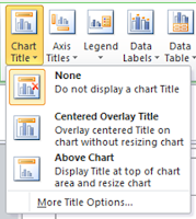

Let's start at the top. We could use a title. And, if there's something specific you want people to pay attention to, you can also add a sentence with that information. As you can see, the default is None. (Thanks, Excel.) Personally, I prefer the Above Chart option to keep things clean. Once you select that, a text box will appear and you will be able to add your title. You can also change the font and its appearance. Note that your chart will resize to accommodate the title. If this skews the overall perspective, just drag things around until the ratios are better.


Okay, how are we doing? It's a start. For this title, I un-bolded the text (it will be bold by default) and took the font size down on the second line, as well as lightened the text to a dark gray, making things a bit easier to read. You don't have to go this far.
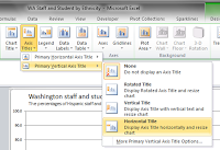


Let's talk axes next. Add them just as you did your chart title, using the next box on the toolbar. I recommend changing the default (bold) to regular text and lightening it up, too. When it comes to your vertical axis, make the choice to have a horizontal title. Although Excel will dump it in an undesirable spot, we can drag it into place. The thing here is that we're trying to make it easy for your audience to read the axis label. Don't make them tilt their heads like dogs to read sideways text. It doesn't take any more time to label it correctly from the start.

Now, let's move the legend to above (or below) the chart. I prefer to do this because it orders the legend the same way as what's shown in the chart. Like making the axis titles horizontal, doing so with your legend will ease the burden on your audience.

In about 10 clicks, we now have a chart that looks like this:


We still have plenty of time for a few more fixes. Let's attack those axes. Bring up the dialog box.

There are three options I almost always make use of. My purpose here, like un-bolding text and lightening up font colors, is to change up the data-to-ink ratio. That is, if the data are the stars of the show, then make them stand out. The lines and labels are important, but are supporting players. They can still provide value while being part of the background.

For both the horizontal and vertical axes, I remove the tickmarks and change the line color to a light grey. For this chart, I also change the numbering of the vertical axis so there are no digits after the decimal. Our purpose here isn't to have people notice the difference at that level. It may also be useful to play around with the units for the vertical axis. Do we need to have it cross at every 10...or is every 20 or 25 percent enough? I'm leaving things at 10, even though I think it's a bit busy, it also helps provide some better context about the size of the populations and their relative changes.

After I close the dialog box, I also click on the axis itself and lighten the font and reduce its size.

Finally, let's lighten up those gridlines. Some people would argue that you could eliminate them in most cases.

So, another 10'ish clicks, and we've really made some headway.


Yes, it's still a bit of an ugly duckling due to the default color choices of the bars, but if you had to run down the hall to a meeting with this, you'd be okay. You've added lots of context with your labeling, made the overall chart easier to read, and showcased the data.

When you have a style that you like, remember that you can save things as a template. Very handy for those times when you're asked to pull together some data on the fly.


In our next post, we'll take a look at the basic line graph settings. Later, we'll get into choosing a story for this data and exploring some color options. Y'all come back now, ya' here?

Bonus Round
Do you have a few more minutes to play with this chart? Without changing the style of the chart, what else can we do to make it tell the story a bit better? I know, it's a challenge...especially when we should probably spend more time developing a different chart for our story. But let's give it a go. I know many of you are often so pressed for time, you just have to go with the basics.

What about doing something like this?


In this case, select all the columns and change their fill to grey. Then, select the individual bars you want to fill. You can add data labels (and even add supplemental text to show the years) to provide additional context. Finally, delete the chart legend and change the colors in the chart title to match the fill color in the bars. In another 20 clicks, we've helped direct our audience a bit more.

You can download the anatomy of this redesign (pdf) here.

Download Me
In five minutes or less, you can take a basic column/bar chart in Excel and make it more meaningful for your audience. What other formatting would you apply?

Thursday, December 27, 2012

Do You See What I See?

While driving to work the other day, I heard that men only see one shade of red; therefore, women shouldn't spend so much effort picking the "right" shade of lipstick. Now, I don't believe everything I hear on the radio any more than what I read on the Internet. But the tidbit did get me thinking.

I taught biology for many years. Every year when the genetics unit rolled around, we looked at sex-linked traits. These get their name from the genes being physically located on the X chromosome (one of the chromosomes involved in determining gender). Generally speaking, human males have one X and one Y chromosome...and females have two X chromosomes. Because men end up with only one X, any bad code on it will be expressed. Women have a "spare," so a mutated gene doesn't matter so much---the good copy will always pump out the right stuff. Color-blindness is a sex-linked trait, appearing far more often in men because the genes that support color perception are on the X chromosome. If you're male and get a bad copy from mom, you're doomed. This is the incredibly oversimplified way we teach about (a) sex determination (b) being able to see a full range of colors, and (c) sex-linked traits.

The reality, of course, is far more complex. I think it's worth exploring in a bit more depth because of the impact this has on how we design our data displays.

I should say at the outset here, that this is really about color perception, not vision. There are people who have perfectly formed retinas, capable of capturing the full range of wavelengths, but who are color blind because of dain bramage...er, brain damage. There are a few different parts of the brain involved with interpreting the wavelengths that activate the retina and assigning a color/name to them. (For a friendly, but in-depth analysis, I recommend Island of the Colorblind by Oliver Sacks.) But perception happens in the eye.

Remember this from your high school bio textbook?

from here
Light comes in the pupil, hits the back of the eye where the retina is, and those little red, green, and blue "cones" in the back (far right of above diagram). If the cones are stimulated, a nerve signal travels to the brain for further processing. Again, I'm oversimplifying...but the part to really pay attention to are those three cartoonish-looking cones in the diagram. Each one contains a protein that responds to different wavelengths of light...and each of those proteins is determined by a specific gene. And those genes? Somewhere on a chromosome.

Only the genes for the pigments used in red and green color perception are on the X chromosome. They sit right next to one another at the end of the long arm of chromosome.
You are here! (image from here)
Captain K gets a lecture re: Green Jeans (source)
You might remember from your high school biology days that chromosomes engage in something called "crossing over." This has nothing to do with death or getting to the other side, but a way to make new combinations of genes. Variety really is the spice of life, especially at the molecular level. During crossing over, matching parts of chromosomes swap genes. Sometimes, this leads to pieces getting lost, put in the wrong place, or inserted backward. This crossing-over-gone-wild (not the technical term) is the source of most red-green color perception problems. But over the generations, it has also resulted in an extraordinary variety of "red" genes---about 3 times the number of variations in most other human traits (source). Meanwhile, most of us have multiple copies of the green gene, all lined up in a row, but only the one next to the red gene gets used. So, even if there are lots of dittos for green sitting around, if the first one is messed up, your color perception is hosed (source).

So what?

Remember, men only get one copy of this chromosome...women get two. The variations mean that women are more likely to see a wider range of colors, especially in the red part of the spectrum. It may be that 60% of women actually have four different types of cones in their retinas, but research has not yet identified successful ways to test what this means in terms of what these women see. And fellas? It doesn't mean that they only see one shade of red, but the range of wavelengths perceived may differ from man to man. With ~85 different versions of the gene, there are a lot of possibilities.

When developing data displays, you will never really know if someone can "see" them the same way you do. There's no way to know which gene variant is present and which wavelengths will be activated. But perhaps there are some lessons to learn about using color. Here is a diagram of the wavelengths our cones respond to (the dotted line is a curve for the rhodopsin used in night vision...just ignore it):

If you only have genes for S&M, do you see 50 shades of grey? (image from here)
Notice that there is some overlap between the S (for short wavelength; blue), M (for medium wavelength; green), and L (for long wavelength; red) curves. You might not be able to guarantee that your viewer will see the same color as you, but you will probably stimulate some activity in the cones if you need to differentiate your data if you stick within a particular range. So ladies, go ahead and choose any color of lip rouge you like---there will be some guy out there who can see it just like you.

Does this mean that you should go to extremes when developing your design? No. Most people (~92% of men and 99% of women) have fully functional cones. They might not be activated at exactly the same wavelength as yours, but it's a pretty good bet that it will be close. But it is important to remember that if you have a critical point to make, you should choose a color that is highly visible to anyone who needs the information. (Oddly enough, medical illustrations and charts about color vision seem to rely on red/green. Hmmm.)

All of this reminds me of the Color Survey done by xkcd, where people were asked to assign names to colors...and the ensuing interpretations, like this one from Doghouse Diaries:

from here

Perhaps the variety of genes and combinations in women mean that they see more subtle variations in color. No way to prove that's the explanation for the difference in results, but another idea to ponder.

Bonus Round
What about ole blue? The pigment that responds to blue wavelengths resides on a regular chromosome (one not involved with sex determination). Because everyone inherits two copies of the gene, this variation of color blindness is not as common (i.e., everybody's got a spare). Blue-yellow colorblindness affects 1 in 10,000 people, its effects distributed equally between men and women.