But, I digress.
After the presentation, someone asked me if I had a "cheat sheet" of what to click in Excel to do some basic tidying up. In other words, if Excel gives you a lemon chart, how do you add a splash of tequila and a dash of salt to make something more palatable? Brilliant idea...and no, I don't have one.
There are lots of great books out there about building effective charts (Read them!), and I won't claim that these can (or should) be condensed into a one-sheet you can post above your desk. But let's say you have five minutes to spend on improving a default chart in Excel. What would you choose? Where do you click on the toolbar? What settings can you change? I'm also going to set aside, for now, how you pick the chart...even though this is really the first step: What story should be told? We'll come back to some tools and resources for that in another post.
So, let's start with some data. You can download the Excel version here. The data are from Washington's Statewide Longitudinal Data System. This table shows the percent of staff and students, identified by ethnicity, for the years 2004 - 2013.
If you select the data and have Excel make you a column graph, here is what you get:
 |
| Go home, Excel. You're drunk. |
For now, you'll just have to trust me that the line chart version isn't much better, because I want to talk about the options for those sorts of charts in another post. There are a few stories we could pull out of this data set to tell better (e.g. Hispanic students and teachers are the only populations with consistent growth over the past ten years), but sometimes, you have to start with a representation like this so you can figure out where to go with the story.
 We're going to accomplish most of our work using the "Chart Tools" in the Excel toolbar--specifically, the Layout tab. If you don't see these, click on the chart and they should appear. You can also right-click on the chart to activate some of the dialog boxes.
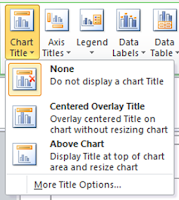
 Let's start at the top. We could use a title. And, if there's something specific you want people to pay attention to, you can also add a sentence with that information. As you can see, the default is None. (Thanks, Excel.) Personally, I prefer the Above Chart option to keep things clean. Once you select that, a text box will appear and you will be able to add your title. You can also change the font and its appearance. Note that your chart will resize to accommodate the title. If this skews the overall perspective, just drag things around until the ratios are better.
Okay, how are we doing? It's a start. For this title, I un-bolded the text (it will be bold by default) and took the font size down on the second line, as well as lightened the text to a dark gray, making things a bit easier to read. You don't have to go this far.
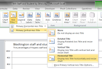
 Let's talk axes next. Add them just as you did your chart title, using the next box on the toolbar. I recommend changing the default (bold) to regular text and lightening it up, too. When it comes to your vertical axis, make the choice to have a horizontal title. Although Excel will dump it in an undesirable spot, we can drag it into place. The thing here is that we're trying to make it easy for your audience to read the axis label. Don't make them tilt their heads like dogs to read sideways text. It doesn't take any more time to label it correctly from the start.
Now, let's move the legend to above (or below) the chart. I prefer to do this because it orders the legend the same way as what's shown in the chart. Like making the axis titles horizontal, doing so with your legend will ease the burden on your audience.
In about 10 clicks, we now have a chart that looks like this:
We still have plenty of time for a few more fixes. Let's attack those axes. Bring up the dialog box.
There are three options I almost always make use of. My purpose here, like un-bolding text and lightening up font colors, is to change up the data-to-ink ratio. That is, if the data are the stars of the show, then make them stand out. The lines and labels are important, but are supporting players. They can still provide value while being part of the background.
For both the horizontal and vertical axes, I remove the tickmarks and change the line color to a light grey. For this chart, I also change the numbering of the vertical axis so there are no digits after the decimal. Our purpose here isn't to have people notice the difference at that level. It may also be useful to play around with the units for the vertical axis. Do we need to have it cross at every 10...or is every 20 or 25 percent enough? I'm leaving things at 10, even though I think it's a bit busy, it also helps provide some better context about the size of the populations and their relative changes.
After I close the dialog box, I also click on the axis itself and lighten the font and reduce its size.
Finally, let's lighten up those gridlines. Some people would argue that you could eliminate them in most cases.
So, another 10'ish clicks, and we've really made some headway.
Yes, it's still a bit of an ugly duckling due to the default color choices of the bars, but if you had to run down the hall to a meeting with this, you'd be okay. You've added lots of context with your labeling, made the overall chart easier to read, and showcased the data.
When you have a style that you like, remember that you can save things as a template. Very handy for those times when you're asked to pull together some data on the fly.
In our next post, we'll take a look at the basic line graph settings. Later, we'll get into choosing a story for this data and exploring some color options. Y'all come back now, ya' here?
Bonus Round
Do you have a few more minutes to play with this chart? Without changing the style of the chart, what else can we do to make it tell the story a bit better? I know, it's a challenge...especially when we should probably spend more time developing a different chart for our story. But let's give it a go. I know many of you are often so pressed for time, you just have to go with the basics.
What about doing something like this?
In this case, select all the columns and change their fill to grey. Then, select the individual bars you want to fill. You can add data labels (and even add supplemental text to show the years) to provide additional context. Finally, delete the chart legend and change the colors in the chart title to match the fill color in the bars. In another 20 clicks, we've helped direct our audience a bit more.
You can download the anatomy of this redesign (pdf) here.
 |
| Download Me |


Nice redesign! I like the gray, blue, and orange colors.
ReplyDeleteHave you tried a small multiples chart? I wonder if it would help identify some additional patterns in this dataset. Or, it could look cluttered, not sure.
I have tried one---it will be part of this week's post. It is a little busy (as those charts often are), but still valuable. I actually like a "win/loss" chart best for these data.
ReplyDelete