A couple of weeks ago, David Napoli shared this link to a Metro Style Dashboard by Erik Svensen. And while I couldn't directly use the information (I don't have Excel 2013 yet), it did get me thinking about how to update the look of my project---and more importantly, it let me know that slicers work with the Excel Web App.
 Slicers, you ask? If you're new to Excel...or if you are still using a pre-2010 version...you might not have seen these. They go along with pivot tables (a piece of Excel magic that we haven't talked about in this space) to "slice" (filter) your data set into all sorts of views. It's probably easier to show you, so my example is below. It uses the same spreadsheet as the Shaggy Dog.
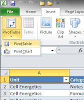
Start by highlighting the first cell in a table, then from the Insert tab, choose Pivot Table. When prompted, I added the pivot table to a new worksheet. This is the easiest way to wrangle your table, because it will be a dynamic item. Depending upon what you want to look at, the items showing in the table will change.
On the left is my pivot table...to the right of it is a dialog box I can use to build the pivot table. Notice that the headings from my original table (Unit, Category, Title, Description) are in the list of fields. I picked the first three for this project. Excel automatically placed them as rows, but I could drag these into any arrangement or hierarchy that I want.
I should share that this pivot table is unusual in that there are no numbers associated with it. Most people use pivot tables to look at the results of different groups...and this is very handy for teachers looking at student data, too. But for this project, I only have text. We'll talk about building pivot tables for your other data in another post.
Okay, now I can add Slicers. If your pivot table is highlighted, you can insert slicers from the Options tab on the ribbon.
Otherwise, just go to the Insert tab and choose "Slicer." You'll get a dialog box---just like the fields from the pivot table---to choose from. I picked the first two options this time, so here is what Excel gave me:
Slicers are like remote controls for your pivot tables. By clicking on any combination of buttons in the Slicers, you can call up any combination of data from the table. They also can move around in the workbook, meaning we can add them to a reporting tool. The defaults on the Slicers, like most things in Excel, are not very sexy. But, fear not, there are a lot of ways you can dress them up.
Now, I can build a report. I'm not going into the full details in this post, but you can download the workbook if you want to see the innards. With the exception of the pivot table and the interface you see below, it's all the same data set and formulas as the Shaggy Dog. I moved my Slicers and built a simple display.
The slicers are on top, in a two-by-two arrangement. Depending on the buttons selected, the list of items changes. Better yet, you can upload this workbook to a SkyDrive account and put it on the web. Like this:
You can click the "View Full Size Workbook" button in the lower right corner of the window if you don't want to deal with the scrolling. (When you embed workbooks, you can change the size that shows, but we have some other design constraints here based on my blog design.)
This is a very simple application, but you can certainly take it a lot further. The one I (re)built for work has a block of color to show the user how many resources are available. If you used a tool like this to get a view of what was happening across classes (or classrooms), you could also build it out with a variety of charts or other visuals.
It's spring. Get out and play!


