Thursday, February 13, 2020

We're Going to Need a Bigger Dream

There is an exchange between the two main characters in the 1954 version of A Star Is Born that often sticks out in my mind. James Mason's "Norman Maine" has just discovered Judy Garland's "Vicki Lester." And as they get to know each other, the dialogue goes like this:

Vicki Lester: [Norman has finished looking through her scrapbook] You know as much about me as I do myself. But... you see how long it's taken me to get this far. Now, all I need is just a little luck.

Norman Maine: What kind of luck?

Vicki Lester: Oh, the kind of luck that every girl singer with a band dreams of - one night a big talent scout from a big record company might come in and he'll let me make a record.

Norman Maine: Yes, and then?

Vicki Lester: Well, the record will become number one on the Hit Parade, it'll be played on the jukeboxes all over the country... and I'll be made

[laughs self-deprecatingly at the implausibility]

Vicki Lester: End of dream.

Norman Maine: There's only one thing wrong with that.

Vicki Lester: I know - it won't happen!

Norman Maine: No, it might happen pretty easily - but the dream isn't big enough. 
 
Someone once reminded me that we don't all have James Mason character's in our lives...someone who suggests that you shouldn't settle for the little dream...that you should move on to the bigger one. And this has been sitting with me as I've started down this road of the community-based data story that I described in the previous post. With every conversation, the dream gets bigger. This is mostly because it isn't just my dream anymore. Each person breathes a little more life into it and it is slowly inflating like a beautiful balloon. It also feels so much lighter and easier to carry as it grows. And while this seemed counter-intuitive to me at first, I have realized that with more and more hands to lift it, maybe it does make sense that my part isn't as heavy. I have also noticed that when I start to feel tired or overwhelmed by this whole thing that someone else steps up to offer to schedule the next meeting or make the next phone call. It is not dependent solely upon my focus and energy. Others are going to ensure that it happens.

I have never had this experience before, and I have to say that it feels pretty magical. It still feels a bit terrifying at times...like, can we really do this? And I also have brief periods of disbelief...like, is this really happening? But I am treating this like an adventure, or at least a journey of sorts. I am meeting all sorts of characters along the way. I am learning, sometimes the hard way, about questions I should ask and things I should have prepared for. Yet, we are moving forward with this grand design. A very chatty carpenter is building a display. A local car dealership donated all the keyrings we needed. The owner of an upholstery shop has helped us find the right thread, after reminiscing about the designs he used to make. 

This is at once the most challenging, yet most fulfilling, thing I've ever done. There is power and energy here to make a difference and a lot of conversations about the future. It is exhausting, but oh so satisfying. Onward we go.


Monday, February 3, 2020

Creating Connections

I usually write about the data stories I build when they are complete. But this one is a little different and so I am starting its documentation at the beginning.

Inception
A few months ago, I was unhappy at work. The change in leadership has not been a positive one. I still love my job (and those people I have worked with over the years), which creates an interesting challenge. Some friends suggested that I just wait out the bad seed, as those never grow for very long. But I am 50 years old now. I have spent nearly all of my working life waiting for some dude to move on. I'm tired of that...and it doesn't do anything to create a better system for younger women, people of colour, or others from underrepresented groups.

So I pondered my options:
  1. Wait it out, as suggested. Hope new leadership is competent and supportive
  2. Look for a similar job to what I have now, since I like the work
  3. Do something different
But, why choose when you can have them all? Just going with Option 1 is untenable; however, I can't just up and quit, either. So, I'll just keep my head down and work and have as little interaction as possible with the leadership at hand. I'm not particularly interested in Option 2, as it would mean uprooting my entire life. There is a similar job to my current one that is posted in a district north of Seattle...and pays $50K more a year than I make now. On one hand, it seems silly not to apply for it. And, on the other, chasing money for its own sake is also silly. Option 3 is even riskier. Not that I haven't taken leaps before or that I feel too old to do so now. But I had to spend time really thinking about what that would be. If I could have any job I wanted, what would make me happiest? I realized that what I like the very best about my current job is working with people to use data to answer their own questions and tell their own stories.

Are there jobs like this...at least in how I envision them? Kinda. There are things like We All Count, and DataKind, and The Data Lodge. They all have some pieces I like. I've described a bit of what I want in a previous post. As I thought more about putting something like this together, I realized that I would need to build up some demand for it. I would probably need to keep my day job (sigh) and do consulting work on the side until I reached a tipping point of time and money to make the jump to "dream job" full time. And as much as I want it now, I also recognize that I just need 5 years to maximize my retirement options with the state. If I build capacity in the next few years, I can leave education knowing that when I reach retirement age, I will have all the benefits waiting for me.

How would I create the demand, I wondered? And then I thought about an idea that's been in the back of my mind for a year or two. People who have my role in other school districts often tell me that they wish they could build these stories, too...or at least that we could do one together. Why not start now? Better yet, what if we connected the work with a community-based organization (CBO) that was working on a strategic plan or needed some large-scale input? I remembered that I knew someone who was leading just such an organization. We had coffee one morning and the idea was off and running. I chatted with people in my role in neighbour districts...and the idea grew longer legs.

The final piece was to find a space for a display of the data story. Our town has an Arts Walk at the end of April, which seemed like a good opportunity. But what about the right place to host? I made a short list of spots in the middle of the event that I thought would have enough floor space for the design we had in mind. I reached out to the first one—our city's performing arts center—not expecting them to say "Yes." But they did, teaching me a very valuable lesson about being careful what you wish for...'cause you just might get it. They expect foot traffic of about 2000 people. 👀

Last week, I measured the space...met with one of the school districts involved (as well as the branch of the CBO we're working with in that area)...and tried not to be terrified of the enormity of what I've started. I am beyond excited about all of this, but it has been so long since anything positive has happened in my working life that I'm not sure how to mentally process this turn of events.

The Story
In my conversation with the leader of the CBO, he identified three major areas the advisory group of his organization had identified as issues students across the county are facing:
  1. Needs for support with mental health
  2. Lack of connection to others and community
  3. Lack of a sense of purpose or direction
It's important to note that the advisory group consists of people from the county courts, school districts, and business community—all of whom work with K - 12 students, but from different angles. They all see these issues as critical to address. My connection at the CBO said that he thought the second one was most important because working on that could lead to some gains in the other two areas.

Connection is a very powerful concept. Not only was there a ready-made analogy with all of the players for this data story, but it's something that everyone (regardless of background or age) can comment on.

The Plan
Yeah, yeah, I know. For my first time out, you think I could have picked a smaller bite to take. But that isn't how I roll. It's a good thing that I am a planner and I have a lot of support.

We'll spend the next month doing some focus groups and identifying 3 - 5 questions for an individual student survey. In March, we'll have 2,000 - 3,000 students respond to the survey by building a ring with pony beads, like the one shown at the right.
The colours of the beads will represent a scale, as yet to be identified. The rings are zinc wire keyrings. Each one is about 1" in size. We think we can make these items for about $200.

We're supplying frames with wire in them—much like a window screen, but much larger gauge. When a kid completes their survey, they will be able to attach it to the frame. There are six clubs/districts, so we'll have six sets of these. We'll connect these with some additional information supplied by districts to form a much larger structure.

And then, in April, we'll work on building the community response piece. Our plan is to do something like this:

https://datastori.es/data-stories-58-domestic-data-streamers/2-data-strings-pcp/

The actual questions and categories will also be driven out from the focus groups. But the Arts Walk participants will add the strings as they pass through the space.

After the event, we plan to repurpose the student pieces into smaller, tabletop versions that are specific to a school district and can be displayed in other places for other conversations.

And then we'll see.  I'll keep you updated as this project continues to move forward. I have done this enough now to know that I need to stay flexible and that things never go 100% according to plan. There will be all sorts of things I haven't anticipated. Either this will be the starting point to a different world for me, or I will fail spectacularly. I am very much committed, regardless of the outcome. I will be footing the bill for this project out of my own pocket. I have skin in the game. Keep those good thoughts headed this direction.

Sunday, February 2, 2020

Data Stories: The Next Chapter

When I started my data stories project in 2016, my goal was to build 10 stories in 10 months. Silly me. I had no idea of how ambitious a goal that was...or the twists and turns my journey would take along the way. Here I am in my fourth year of building these, and I have finally completed number 10. But I think about possible ideas for more all the time, so maybe I should update my goals and vision for this work.

Will I stop building these for my school district? Probably not. I do see 10 as a milestone, mainly because it was the original intent of the project. But I love doing them and their impact on others has surpassed anything I'd imagined. I will tell you that women and people of colour engage with them far more than the white males in my organization. That is not an indictment of that group or how they best engage with data. I've just come to realize that I'm not making these stories for them...and that's okay. They have plenty of other data representations that they like. But for everyone else, there is a sense of wonder and recognition in their eyes...an awakening of sorts. I am making it sound more dramatic than it really is. It's just hard to describe how people who aren't pale males look at these stories and talk about them...as if until that moment, they hadn't realized that this was the thing they were missing and someone finally showed it to them. Anyhoo, now that I've wallowed around in trying to learn how to build these things, I want to make sure I empower and equip others to do this, too.

Here are some ideas I'm thinking about pursuing in future stories...
  • I want to find a student or two in each school to give me a tour. I don't want the compliant, good-grade, class president type kid to do this. I want the one who is always asking for a hall pass. I want to see a school through the eyes of a first grader—what is the purpose of various rooms? what's the best part of the playground? I think these maps would be very interesting.
  • In a similar vein, I'd like to shadow students at different grade levels and track all of the things they touch during a school day. I wonder if I could build a physical tree map of these data—a shadow box with paper, wood, metal, and other materials in the proportion that students use them.
  • Thanks to data walking and participatory walks from Elastic City, I am thinking about what this could look like for our district. What sort of community data walk could I put together?
  • I continue to be intrigued by the concept of a "good school." I think there might be ways to capture data in the wild about this—the conversations that happen in the grocery store or at soccer games...the ones where parents and the community talk about us and come to their own conclusions. 
There are bigger things on the horizon, although they are still shrouded in fog. I would love a job where I work with groups to help them develop meaningful goals and ways to use related data (and have started on creating The Data Lab). I am interested in building more personal data stories to share (or sell). What would a novel look like? The life of a historical figure? My notebook is overflowing while my time allowance is not. Transitioning away from a steady paycheck and benefits toward the unknown is also not realistic at this time, but I continue to look for opportunities. I'm open to figuring it out. Dreams need time and space to breathe themselves into existence. In putting them out there, I am committed to seeing them develop.

For now, I am grateful for all I've learned over the last few shares...and the opportunity to share it with others. I am looking forward to the next chapter of the story and whatever is found on that page. I am already enmeshed in another data story project involving six school districts, our county-wide Boys and Girls Club, and city Arts Walk. I'll document some things along the way as we move data stories out further in the great wide world.

Thursday, January 30, 2020

Ten: The Turning Point

In the fall of 2016, I set out to tell 10 data stories in 10 months. It was an ambitious, but naȉve goal. Oh, I suppose I could have done it as long as I told tiny tales (short stories?). That's not what happened. With each story I built, things got both larger and more detailed. The materials I used were a better quality. I learned to dance with The Muse, understanding that it could be weeks or months in between the visits that would generate ideas and propel me forward. I shared with others and it has all become so much larger than some little side project. It's become a way of thinking and discipline and a path forward into what I want to do next with my life.

So, here we are in the winter of January 2020. And 3.5 years after I started this whole thing, we have finally reached the 10th story...but certainly not the end.

This is a story about how well our district serves students who have only attended our schools.

The Data
There was a lot of data with this one...the most I have ever tried to represent. And while 18,500 data points might not be overly large if you're working with them in a digital format...trying to show them physically is a time-sucking nightmare. In the end, I think I found an efficient way.

I pulled longitudinal (grades K - 12) data for current seniors who have only ever attended a school in our district. There were 175 of them (out of ~600). I wrestled with which data sources to use for quite awhile. Part of the challenge is that 13 years is a lot of opportunity for data systems and data collection to change. In the end, I was able to gather attendance, discipline, health room visits, enrollment in special education or the free/reduced lunch program, and performance on state assessments.

Now, out of the 18,500 possible data points, "only" 10,000 or so had something that might require representation. For example, not every student received special services (and those who did were not necessarily served every year), we didn't start using our information system to collect health room visits until these students were in third grade, and state testing doesn't happen at every grade level.

But 10,000 is still a lot. And while two of these areas (special education, free/reduced lunch) were binary, the other four had quite a range. I had to decide what sorts of ranges might be important. For a couple of these (attendance, performance), there were some already established parameters (e.g., "chronically absent" = missing 10% of the days in a year). For discipline and health, I developed some reasonable, but arbitrary, ranges. Although this might be a little indefensible, it also has the benefit of protecting student privacy.


The Build
I went round and round with this one for a long time. I really wanted to build something like a game board and with the various stops (grade levels) to the end (graduation) I wanted to share some additional information about that year and the changes to both school system and the world at large. I still think this is a great idea for a future story, but I just couldn't make it fit this one.

Somewhere along the way, someone shared a link to work by Caren Garfen. Some of her data representations use buttons or dollhouse plates or other tiny objects. I think these are so very interesting. And while I didn't end up moving in that particular direction, it did inspire me to do some sort of series of objects. This is where I finally (!) had my big a-ha. What was a small object that had six sides for my six data sets? Sure, you're probably thinking of dice now...but I thought of a pencil. What a perfect object to use. Pencils are long enough to hold longitudinal data, but small enough that 175 of them will still fit in a reasonable space.

I marked the pencils in 1 cm increments, starting at the eraser, to represent each grade level. I put one to six dots on each side of the pencil (toward the end that could be sharpened) to designate which data set was represented on that side. Then, I used leftover paint from the On the Bubble story to encode the data. This was incredibly tedious and not as precise as I would have liked, but I made it work. I sharpened the pencils that represented students who were on track to graduate at the end of the year.

After the pencils were ready, I covered six 24" x 36" cork boards with material. Five of these were designated to hold the pencils and the other for annotations. I used painters tape at measured intervals
to mark the places where cup hooks would be to hold the pencils. I used a drill to create 350 tiny holes in the boards and screwed in the hooks. All that was left was placing the pencils, adding the annotations, and hanging the boards.

This is the most interactive visualization I have ever built. Each pencil can be independently turned so that viewers can investigate and see whatever story they want. I tried to be strategic about the sides of the pencils and which data sets were there. Attendance and performance are next to one another. Health room visits and participation in the free/reduced lunch program and neighbours. A viewer can look at the same side of every pencil at once, or pick a section (e.g., at-risk students) and look for commonalities. There's also a certain gestalt associated with seeing each elementary and how many students started there and are still with us. Even taking mobility out of the equation, there are very definitely some catchment areas where the overall instability is having some sort of impact on the ones who stay.

I thought a lot about labels for this story. For obvious (i.e., legal) reasons, I did not want to add anything to the pencils that would indicate gender, race, etc. I considered some summary data—for example, numbers or percent of females/males. But in the end, I decided to let the students label themselves. I emailed all of them and asked them for their five-word stories. Not all of them wanted to contribute, which was fine, but I liked the idea of pairing how they define themselves vs. how the system sees them. It's been awesome to read what they have to share.


Lessons Learned
This story took months. I first pulled data in early October...and it was just over three months before the final product was complete. My biggest lesson along the way had to do with  figuring out what happens when you have too much data. Just use a sample? Find a different story? Aggregate things? I won't claim I found the best solution, but it has been a very valuable thought experiment.

I also just had to trust the process with this one. There were several times when I wasn't 100% convinced I was on the right track. But I ended up with something incredibly personal, detailed, and very cool. The addition of student input has also been valuable. Kids have said how honored they feel to be represented, but I hope that in the long run, they will think about the imprints they leave behind and how those do or do not represent them accurately. Doing these data stories has certainly left an impression on me over these last few years...and in the next post, I'll share more about how I plan to use them to leave an even bigger impression in our community.

If you'd like to see more pictures or learn more about our data stories project in our school district, please visit the companion page on our district web site.

Monday, January 13, 2020

Coming Soon: The Data Lab


I know it's been quiet here...but I'm still around, thinking and working on various things. My latest data story will be complete this week. It's taken a few months to represent nearly 10,000 data points, but it is looking good. More on that soon.

But today, I want to commit publicly to what's next.

It's been a challenging year at work. I still enjoy my job a lot, but not necessarily the conditions I have to currently work under. Enough said. So, as I've been talking with others about this and pondering what I want to do, I have found myself thinking about what I want. What would my job look like? And in the midst of all that, I developed what I started calling "Crazy Idea #1" and "Crazy Idea #2."

Crazy Idea #1: Community-based Data Story
I've pushed out our district data stories into the community for the last couple of years, but what if I helped the community push out one of its own? What if I worked with an organization that needed community input on their strategic plan or other goals? What if we linked with other districts to leverage our data and resources?

And, crazy or not, this idea is in motion. I've identified an organization that is working to help students in our area build their capacity to connect with their neighbourhoods and community. I've talked with my counterparts in other districts about some data that we have in common to share. And soon, I'll be working with a few thousand students to create a data story that we will share at our city's spring arts walk. It's terrifying and inspiring...the perfect intersection of emotions to get me excited about going to work (regardless of whoever and whatever else is there).

But most importantly, I plan to use Crazy Idea #1 to launch something even crazier.

Crazy Idea #2: The Data Lab
You see, what I really want to do is support people in using data to answer their own questions and tell their own stories. And while not all of those stories need to take a physical shape, I can honestly say that getting your hands involved builds understanding. So, to that end, I want to develop a physical space for people to come and work with data.

I see this as a storefront in our downtown area. The front would have some retail options—journals, art supplies, all manner of sticky notes, and anything else you might need for capturing and representing ideas with data. But the biggest part of the store would be a conference space...something with flexible furniture, idea paint on the walls, carts with materials, a large screen, and anything else needed for learning. I see this as a place to host workshops on all sorts of topics, data walks, group work/planning, and more. It will be a lab for building stories. I want it to have a 3D printer and laser engraver and band saw.

And my audience? Being in the state capital, there are plenty of options—from lobbyists to state agencies to schools to community-based organizations. Most importantly, I want it to be a place where all are welcome and that underrepresented groups can have their voices lifted. I want to support and grow others.

But to get there, I have to build my reputation outside of school districts and demand among other organizations. I need some time to build capital (social and monetary) through consulting so I can have enough momentum to launch the physical space. Crazy Idea #1 is going to be one of those steps.

In the meantime, I have commissioned the logo you see above. (It's not finalized yet...we're still making a few edits.) I am teaching a class on data use at a local university this spring, and that will give me an opportunity to test out some hands-on workshop ideas. I've purchased a couple of domains. And I'm off to meet with the local center for women in business to try and get smart about that side of things.

When I talk about this idea with people who know me and know my work, they all see the potential. And while I know that they're biased (as am I), I've also never been so clear on what I want in my life...not even when I picked teaching for a career. I realize that there will be lots of twists and turns on the path ahead...plenty of setbacks and disappointments...and that the final product will be different from the vision I have now. But I accept that as part of the bargain.


What do you think? Any feedback on the logo or ideas? Are there people I should talk to who do similar work? What else would you advise?

Wednesday, August 7, 2019

Nine: Chart a Course

I'm so excited to share this project with you. It's been a long time since I felt like there was some magic in the air...and when The Muse came back, she did so with a vengeance.

This is a story about whether students who have similar paths (in the form of schools, teachers, and courses) experience similar outcomes (in the form of performance).

The Data
There are a lot of data packed into the representation of each student: gender, race, with/without disability, eligible/not eligible for free/reduced lunch, performance level for grades 3 - 7 on the state math assessment, teacher for grades 3 - 7. I built a template to pull these pieces from our student information system, but beyond that, I did not need to transform any of the data—no formulas, pivot tables, etc.

I did generate an alias for every student and teacher, because I fed their connections (which student had which teacher/course) into the Connect the Dots tool on databasic.io. I will explain the reason for this later on in this post.

The Build
The entire display is paper and glue, with map pins to attach each "student" to a board. That's it. The representations were built by quilling paper. I love that these data look fragile, but I have to tell you that the pieces are strong and resilient...much like our students. Also like our students, nearly all of them are unique.

Here's what you're looking at for a student. The star is made of 5 rays, representing the five grade levels (3 - 7). Grade 3 is in the 12 o'clock position, and the rest follow as you move clockwise around the star. If a student didn't attend one of our schools for a given grade level, there is no ray at that position.


The paper colour for each ray shows what the performance level was on the state math assessment for that grade. Orange is level one (well below standard), yellow is level two (below standard), light blue is level three (at standard), and dark blue is level four (above standard). Each ray is wrapped in a piece of coloured paper to indicate a particular teacher/school. We have six elementary schools serving grades 3 - 5, so there are six sets of colours: orange, purple, green, blue, red, and yellow. There are two middle schools serving grades 6 - 7, represented by blue and red. If a student attended one of our schools at a given grade level, but didn't take the test, the ray has the outer wrapper and is empty for the performance level.

On the inside of each star are four round disks of paper in white (w) and grey (g).


Note that we did not have any non-binary students at this grade level last year, so male and female were the only categories. I also collapsed our students of colour into one category, and while I strongly believe that this is not best practice, I am also legally obligated to protect personally identifiable information about students. At this grade level, we have some racial populations with only two or three students. When faced with a choice of leaving race out of the conversation completely or summarizing it into two categories...I chose Option B. Certainly, there are other data points I could have selected here, such as attendance or discipline. But I like that the center of the star includes some "internal" attributes that students bring with them, while the outer rays represent the "external" pieces in the form of teachers and system outcomes.

Here is a small group of students that shows the variations by missing grade levels, missing scores, gender, etc:


Now that I had 452(!) of these objects, I needed to figure out the connections between them. This is where the Connect the Dots tool helped. For each school, I uploaded a coded list of students and teachers. The online tool produced a network diagram like the one below, but more importantly, it provided me with a table showing me who was in each group, as well as the connections.

I selected the stars in each group and laid them out as a constellation. I placed stars that had teachers/courses in common closer together. Most of our elementary schools had 6 or 7 constellations. Here is one of them (before labels).


Each elementary school was organized on its own 24" x 36" cork board that had been covered in fabric. Stars were attached with map pins and then annotations were added to share what the group had in common. The six schools were organized into two sets of three, because we have two feeder patterns into middle school. This allows a look across the district.


Lessons Learned
When people use the phrase "labour of love," I will now know what they mean. I personally wove every piece of paper used in this display. I spent about 300 hours total building this story out of 3200 pieces of paper and a bottle of glue. Most of the work was done during my summer vacation: early mornings, late nights, weekends, at home and while visiting others. I drank a ton of coffee (mostly decaf, I promise). I got glue all over everything—my computer, my dining table, me. I have never devoted so much time and energy to creating one of these stories. But it was all worth it. This is the most beautiful display I've ever built. But beyond that, it is fascinating to look at. There is so much meaning packed into this. It captures and holds one's attention.

One of the things I have to remind myself is that when I uploaded the information about students and teachers, that was it—no information about gender, race, etc. And yet, it is obvious with some of groups that they have some of these attributes in common. In other words, the system either does or does not support certain types of kids. Now, this is not new learning, especially at a large scale level. But we are talking about small groups here. Let me give you one example. For students who take the advanced math track on one side of our district, one school only placed males there...the second nearly all males...but the third placed about even numbers by gender. What was most interesting about this third school is that nearly every girl who was in this track and successful in math had the same third grade teacher. That one teacher was the common denominator...and that group was different from every other in the district. And until I built this display, I would never have seen this. I was also surprised at how different every student appeared. Yes, I know that every child is an individual, but this display really drives it home. While there are a few (but not many!) students who had the same five teachers, they did not have the same internal attributes or the same outcomes.

If you'd like to see more pictures or learn more about our data stories project in our school district, please visit the companion page on our district web site.

Tuesday, August 6, 2019

Eight: Unmasking LAP

I have had this post in my queue for a few months. Last school year was a hard year, for a variety of reasons...and I didn't feel like publishing to create any reminders of it. But I have something super-special (finally!) to share tomorrow, so I'm pushing this one out the door today.


I finally built and shared my first data story for the 2018 - 2019 school year. While I originally had some big plans for data stories this year — including community involvement — this has not turned out to be anything like a normal school year. I'll spare you the gory details, but just say that the impact of all the turmoil has been that I mostly don't feel interested in creating anything...even though my passion for this project remains. So, over the last three months, I have been chipping away at doing something and hoping that this will rekindle some joy.


Background
I have been wanting to look at our intervention data. In our state, supplemental funding is provided via the Learning Assistance Program (LAP). The goal is to work with students who are at least one grade level behind in reading or math and accelerate their learning so they can meet grade level expectations. Our district uses nearly all this funding in our elementary schools to buy teacher and paraeducator time. These interventionist use a "pull out" model where students come to a separate space each day for up to 30 minutes of extra instruction, tutoring, and support. Each school determines which grade levels to serve, which area (reading or math), how to group students, and what materials to use. There are a lot of variables, but the bottom line is really about outcomes.

What I've noticed over the last several years is that once a student is identified for LAP services, they rarely make enough progress to exit the program. The primary reason why they leave the program is that it's the end of the school year and there's no more time. However, the news isn't all bad, but it's still challenging to identify what it means for the program to be effective.

The Data
For this story, I pulled student performance data from fall and winter for every K - 5 student who has been served in LAP this year. I wanted to look at both growth and proficiency across schools. I also wanted to show some of the difference in the populations we serve — for example, a student with low-performance might receive support at one school, but not another, just because of program capacity and the volume of students to serve.

After I pulled assessment data for each of these students, I found the raw difference between the number of points earned between fall and winter. I compared that with the amount of growth necessary to maintain an "at grade level" performance between those two time points and identified each of the LAP students as having less than or at least that amount of growth.

The Build
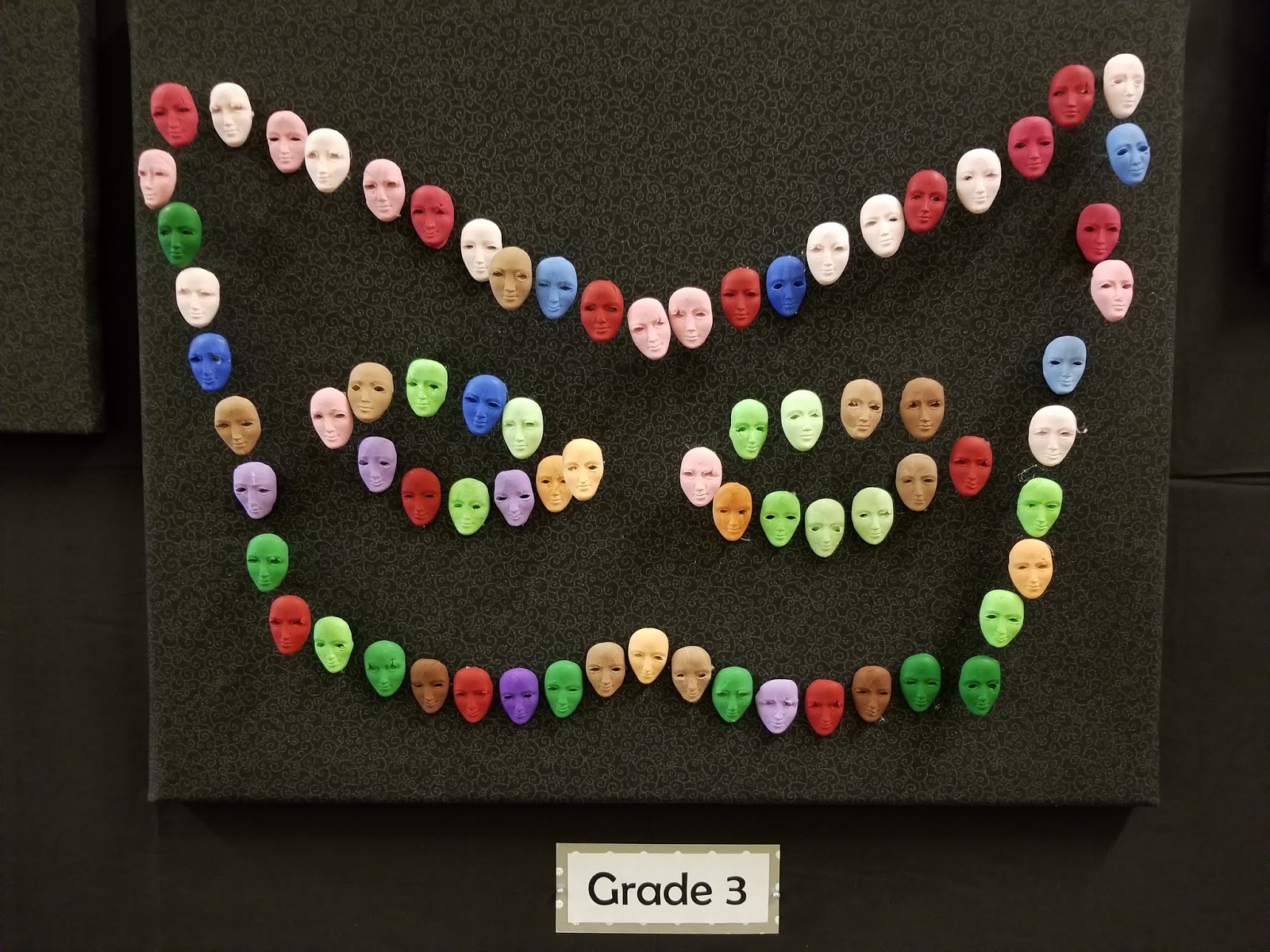
I used Sculpey clay and a mold to create a face for each student. We have six elementary schools, so six colours (orange, blue, purple, red, green, brown) were used. The clay was tinted to create a gradation of each colour to represent the number of years the student had spent in the intervention program. More years equaled a darker hue. Faces representing students who had made more than the required amount of grade level growth were attached to a pin so they would stick out from the board, creating a 3D effect.

 I used six boards, one for each grade level. Students were placed on the board based on how much overall growth they had made between fall and winter. This was not an exact placement—I used a bit of artistic license to group students. My goal was to create a mask shape with the faces, with the idea that we were trying to reveal something about the program.


Lessons Learned
I have to admit that this was not my favourite project to do. It was important from the standpoint that I needed to get back into producing stories again and this forced me to at least think about communicating with data. However, it did reveal some things about our intervention program, including that it's not particularly effective. Considering the state gives us nearly 2 million dollars to run it, I'm not convinced it's a good investment of taxpayer dollars. This is not to say that students don't grow or that for some individuals it provides good support. It doesn't mean that there aren't some adults in our buildings busting their rears to make a difference for students. But if the goal is to get every child to be able to perform at grade level for reading...well, there's not a lot of good news in this story. When I think about the students who have spent multiple years in the program, I wonder why we keep exposing them to the same intervention and expecting a different outcome. What should we be doing instead? We still haven't had that conversation in our district and honestly, I don't know if anyone is interested in doing that.