Charts and graphs are used to tell a story to an audience. And as with any good tale, you may want to parcel out one chapter at a time. There are lots of tools to help you get the job done, but today we're just going to look at moving your graphs into PowerPoint.
Last year, one of the presentations I was giving was about using cell phones in the classroom. At the beginning of the presentation, I was sharing some data about how students access the Internet. I had pulled data from two different Pew Internet studies. One had data comparing access to computers and cell phones, based on family income. The other had data reporting how teens used cell phones to access the Internet, also based on family income. There is a bit of a surprise in the data, so although I wanted to show the big picture, I wanted to portion it out so people would get the "A-ha!".
The easiest way to do this is to build three different slides: one for the first data set, one for the second, and one for both. But why do it the easy way? Instead, you can use some simple animation to reveal each piece of the puzzle.
Start by building the graph. I prefer to do this in Excel and then copy it into PowerPoint. Here is the full meal deal slide:
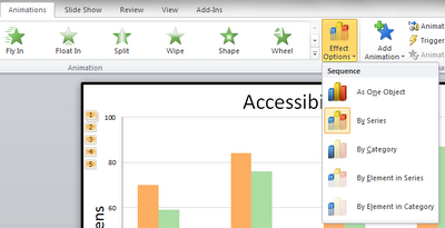
Now, I'm ready to add animation. At the beginning, I don't want the blue bars to show. The orange and green show what you might expect. As household income increases, so does access to a computer. Access to a cell phone is similar, but not as dramatic. To make the orange and green bars show first, select them and go to the animation tab. Then, select "By Series" under "Effect Options." I don't recommend fancy animations. Just because you can add spins and flashes doesn't mean you should. A simple fade is plenty.
This will make the first view people have of the slide look like this:
Then, "Add Animation" for the next series (the blue one) to appear...and for the orange series to disappear. Ah, now we can see something interesting: Students from lower income families use their phones the most for going online. (PS---don't you love how the green bars don't look like they're the same shade as the ones above? They're the exact same, but it's a good example of how colour is influenced by context.)
Finally, bring the orange series back for the final comparison.
If you want to see the finished product, you can use the embedded view below. The vagaries of SkyDrive mean that you will need to choose the full screen option to make the animations work. Once it opens, just use your right arrow or page down key to view the results.


You should be teaching a course at your local university. Love your tips. Of course I'll have to buy some additional I.Q. points to put them to work! :D
ReplyDeleteThanks for the vote of confidence! I hope that someone will take an interest in these ideas. Would love to have access to other audiences.
ReplyDelete